Webサイトの主要な道案内役となる「navタグ」は、SEOやアクセシビリティを向上させる上で欠かせないHTML要素です。
本記事では、navタグの意味や基本構造、CSSを用いたメニューデザイン、他のタグとの使い分けを解説します。
navタグとは:意味と役割
Webサイトの構造を検索エンジンに正しく伝えるHTML5のセマンティックタグとして、サイト内の道案内役として機能するのが「navタグ」です。
ここでは、ナビゲーションタグの使い方、リストとの組み合わせ、複数配置のルールを解説します。
- ナビゲーションリンクを表す
navタグの使い方 ul・liタグ(リスト)と組み合わせる書き方- 1ページに複数配置する場合のルール
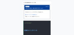
ナビゲーションリンクを表すnavタグの使い方
<nav>タグは、「ナビゲーション(Navigation)」の略であり、サイト内の主要なページへ移動するリンクのまとまりを囲むために使用します。
<nav>は「主要なナビゲーション」にのみ使用します。
具体的には、以下のようなものが対象となります。
- サイト全体のグローバルナビゲーション(ヘッダーのメニュー)
- ページ内の目次(TOC)
- パンくずリスト
- ページネーション(次へ・前へ・ページ番号)
重要ではない細かいリンク群には、<div>や<ul>を使用するのがよいです。
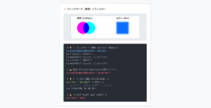
⭕️ 主要なメニュー(navを使う)
❌ 細かなリンク群(navは使わない)
<nav>
<a href=”/”>ホーム</a>
<a href=”/about”>会社概要</a>
</nav>
<!– ❌ 不正解:フッターの細々したリンクはdivで十分 –>
<nav> <!– ここはnavである必要はない –>
<a href=”/terms”>利用規約</a>
</nav>
HTMLコード表示
<div class="hnav-sec1-wrapper">
  <div class="hnav-sec1-demo-area">
    <div class="hnav-sec1-box">
      <div class="hnav-sec1-label">🧭 navタグの正しい使い分け</div>

      <div class="hnav-sec1-visual">
        <p style="font-size:12px; color:#198754; font-weight:bold; margin:0 0 5px 0;">⭕️ 主要なメニュー(navを使う)</p>
        <nav class="hnav-sec1-mock-nav">
          <span>ホーム</span>
          <span>サービス</span>
          <span>会社概要</span>
          <span>お問い合わせ</span>
        </nav>

        <p style="font-size:12px; color:#dc3545; font-weight:bold; margin:20px 0 5px 0;">❌ 細かなリンク群(navは使わない)</p>
        <div class="hnav-sec1-mock-footer">
          <span>利用規約</span> | <span>プライバシーポリシー</span> | <span>特定商取引法</span>
        </div>
      </div>

      <div class="hnav-sec1-code">
        <!-- ⭕️ 正解:主要なメニューはnavで囲む --><br>
        <span class="hnav-sec1-hl-green"><nav></span><br>
          <a href="/">ホーム</a><br>
          <a href="/about">会社概要</a><br>
        <span class="hnav-sec1-hl-green"></nav></span><br><br>
        <!-- ❌ 不正解:フッターの細々したリンクはdivで十分 --><br>
        <span class="hnav-sec1-hl-red"><nav></span> <!-- ここはnavである必要はない --><br>
          <a href="/terms">利用規約</a><br>
        <span class="hnav-sec1-hl-red"></nav></span>
      </div>
    </div>
  </div>
</div>
CSSコード表示
.hnav-sec1-wrapper {
background-color: #f8f9fa;
padding: 20px;
border: 1px solid #dee2e6;
border-radius: 4px;
font-family: sans-serif;
}
.hnav-sec1-demo-area {
display: flex;
justify-content: center;
}
.hnav-sec1-box {
background-color: #ffffff;
border: 2px dashed #adb5bd;
padding: 25px;
width: 100%;
max-width: 500px;
border-radius: 4px;
}
.hnav-sec1-label {
font-size: 15px;
font-weight: bold;
margin-bottom: 20px;
color: #333;
}
.hnav-sec1-visual {
background-color: #f1f3f5;
padding: 20px;
border-radius: 8px;
margin-bottom: 20px;
border: 1px solid #dee2e6;
}
.hnav-sec1-mock-nav {
background-color: #212529;
color: #fff;
padding: 10px;
display: flex;
gap: 15px;
border-radius: 4px;
font-size: 13px;
justify-content: center;
border: 2px solid #198754;
}
.hnav-sec1-mock-footer {
background-color: #e9ecef;
color: #6c757d;
padding: 10px;
display: flex;
gap: 10px;
border-radius: 4px;
font-size: 11px;
justify-content: center;
border: 1px dashed #dc3545;
}
.hnav-sec1-code {
background-color: #282c34;
color: #abb2bf;
padding: 15px;
font-family: monospace;
font-size: 13px;
border-radius: 4px;
line-height: 1.6;
border-left: 4px solid #198754;
}
.hnav-sec1-hl-green {
color: #98c379;
font-weight: bold;
}
.hnav-sec1-hl-red {
color: #e06c75;
font-weight: bold;
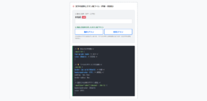
}ul・liタグ(リスト)と組み合わせる書き方
実務において、ナビゲーションメニューを作る際は、<nav>の直下に<a>タグをそのまま並べるのではなく、箇条書きリストである<ul>と<li>を組み合わせるのが標準ルールです。
メニューは「リンク項目のリスト(一覧)」であると意味付けし、nav > ul > li > aの構造で記述します。
リスト特有の「・(黒丸)」をlist-style: none;で消し、Flexboxで横並びにするのがWeb制作の基本型です。
⭕️ リスト(ul/li)を使って横並びにしたメニュー
<nav class=”global-nav”>
<ul>
<li><a href=”#”>HOME</a></li>
<li><a href=”#”>ABOUT</a></li>
</ul>
</nav>
/* 💡 CSSの基本設定 */
.global-nav ul {
list-style: none; /* ★箇条書きの「・」を消す */
margin: 0;
padding: 0;
display: flex; /* ★横に並べる */
gap: 20px; /* ★項目間の隙間 */
}
HTMLコード表示
<div class="hnav-sec2-wrapper">
  <div class="hnav-sec2-demo-area">
    <div class="hnav-sec2-box">
      <div class="hnav-sec2-label">📋 navとul/liの標準的な組み合わせ</div>

      <div class="hnav-sec2-visual">
        <p style="font-size:12px; color:#0d6efd; font-weight:bold; margin:0 0 5px 0;">⭕️ リスト(ul/li)を使って横並びにしたメニュー</p>

        <nav class="hnav-sec2-mock-menu">
          <ul class="hnav-sec2-mock-list">
            <li class="hnav-sec2-mock-item"><a href="#">HOME</a></li>
            <li class="hnav-sec2-mock-item"><a href="#">ABOUT</a></li>
            <li class="hnav-sec2-mock-item"><a href="#">SERVICE</a></li>
            <li class="hnav-sec2-mock-item"><a href="#">CONTACT</a></li>
          </ul>
        </nav>
      </div>

      <div class="hnav-sec2-code">
        <!-- 💡 HTMLの黄金構造:nav > ul > li > a --><br>
        <span class="hnav-sec2-hl-blue"><nav class="global-nav"></span><br>
          <span class="hnav-sec2-hl-green"><ul></span><br>
            <li><a href="#">HOME</a></li><br>
            <li><a href="#">ABOUT</a></li><br>
          <span class="hnav-sec2-hl-green"></ul></span><br>
        <span class="hnav-sec2-hl-blue"></nav></span><br><br>
        /* 💡 CSSの基本設定 */<br>
        <span class="hnav-sec2-hl-blue">.global-nav</span> <span class="hnav-sec2-hl-green">ul</span> {<br>
          <span class="hnav-sec2-hl-blue">list-style: none;</span> /* ★箇条書きの「・」を消す */<br>
          margin: 0;<br>
          padding: 0;<br>
          <span class="hnav-sec2-hl-blue">display: flex;</span>    /* ★横に並べる */<br>
          gap: 20px;        /* ★項目間の隙間 */<br>
        }
      </div>
    </div>
  </div>
</div>
CSSコード表示
.hnav-sec2-wrapper {
  background-color: #f8f9fa;
  padding: 20px;
  border: 1px solid #dee2e6;
  border-radius: 4px;
  font-family: sans-serif;
}

.hnav-sec2-demo-area {
  display: flex;
  justify-content: center;
}

.hnav-sec2-box {
  background-color: #ffffff;
  border: 2px dashed #adb5bd;
  padding: 25px;
  width: 100%;
  max-width: 500px;
  border-radius: 4px;
}

.hnav-sec2-label {
  font-size: 15px;
  font-weight: bold;
  margin-bottom: 20px;
  color: #333;
}

.hnav-sec2-visual {
  background-color: #f1f3f5;
  padding: 20px;
  border-radius: 8px;
  margin-bottom: 20px;
  border: 1px solid #dee2e6;
}

.hnav-sec2-mock-menu {
  background-color: #0d6efd;
  border-radius: 4px;
  padding: 0 15px;
}

.hnav-sec2-mock-list {
  list-style: none;
  margin: 0;
  padding: 0;
  display: flex;
  justify-content: center;
  gap: 15px;
}

.hnav-sec2-mock-item a {
  display: block;
  color: #fff;
  text-decoration: none;
  font-size: 13px;
  font-weight: bold;
  padding: 12px 10px;
  transition: opacity 0.2s;
}

.hnav-sec2-mock-item a:hover {
  opacity: 0.7;
}

.hnav-sec2-code {
  background-color: #282c34;
  color: #abb2bf;
  padding: 15px;
  font-family: monospace;
  font-size: 13px;
  border-radius: 4px;
  line-height: 1.6;
  border-left: 4px solid #0d6efd;
}

.hnav-sec2-hl-green {
  color: #98c379;
  font-weight: bold;
}

.hnav-sec2-hl-blue {
  color: #61afef;
  font-weight: bold;
}ulタグ・liタグ・olタグといったリストの使い方を詳しく知りたい人は「【html&css】ul・li・olの使い方とおしゃれなデザインリスト」を一読ください。
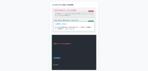
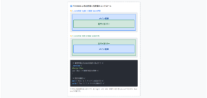
1ページに複数配置する場合のルール
「<nav>タグは、ページ全体で1回しか使ってはいけない」と思い込んでいる人がいますが、それは誤りです。
1つのページ内に複数の<nav>要素を配置することは、HTML5の仕様で許可されています。
1つのページに複数の<nav>を配置する場合は、aria-label属性を付与し、それぞれのナビゲーションが「何の役割を持っているか」を機械に伝わるように明示してください。
⭕️ aria-labelで各navの役割を明示する
<nav aria-label=”グローバルナビゲーション”>
<ul>…</ul>
</nav>
<!– 💡 2つ目:パンくずリスト –>
<nav aria-label=”パンくずリスト”>
<ol>
<li><a href=”/”>ホーム</a></li>
<li>会社概要</li>
</ol>
</nav>
<!– 💡 3つ目:ページネーション(次へ・前へ) –>
<nav aria-label=”ページ送り”>
<ul>…</ul>
</nav>
HTMLコード表示
<div class="hnav-sec3-wrapper">
  <div class="hnav-sec3-demo-area">
    <div class="hnav-sec3-box">
      <div class="hnav-sec3-label">🚥 複数のnavを配置する際のアクセシビリティ対策</div>

      <div class="hnav-sec3-visual">
        <p style="font-size:12px; color:#198754; font-weight:bold; margin:0 0 5px 0;">⭕️ aria-labelで各navの役割を明示する</p>

        <div class="hnav-sec3-layout-mock">
          <div class="hnav-sec3-mock-header">
            <span style="font-size:10px; color:#666;">[メインナビゲーション]</span>
            <nav style="margin-top:5px;">HOME | ABOUT | CONTACT</nav>
          </div>

          <div class="hnav-sec3-mock-breadcrumb">
            <span style="font-size:10px; color:#666;">[パンくずリスト]</span>
            <nav style="margin-top:5px; font-size:11px;">HOME > ABOUT</nav>
          </div>
        </div>
      </div>

      <div class="hnav-sec3-code">
        <!-- 💡 1つ目:メインのグローバルメニュー --><br>
        <nav <span class="hnav-sec3-hl-red">aria-label="グローバルナビゲーション"</span>><br>
          <ul>...</ul><br>
        </nav><br><br>
        <!-- 💡 2つ目:パンくずリスト --><br>
        <nav <span class="hnav-sec3-hl-red">aria-label="パンくずリスト"</span>><br>
          <ol><br>
            <li><a href="/">ホーム</a></li><br>
            <li>会社概要</li><br>
          </ol><br>
        </nav><br><br>
        <!-- 💡 3つ目:ページネーション(次へ・前へ) --><br>
        <nav <span class="hnav-sec3-hl-red">aria-label="ページ送り"</span>><br>
          <ul>...</ul><br>
        </nav>
      </div>
    </div>
  </div>
</div>
CSSコード表示
.hnav-sec3-wrapper {
  background-color: #f8f9fa;
  padding: 20px;
  border: 1px solid #dee2e6;
  border-radius: 4px;
  font-family: sans-serif;
}

.hnav-sec3-demo-area {
  display: flex;
  justify-content: center;
}

.hnav-sec3-box {
  background-color: #ffffff;
  border: 2px dashed #adb5bd;
  padding: 25px;
  width: 100%;
  max-width: 500px;
  border-radius: 4px;
}

.hnav-sec3-label {
  font-size: 15px;
  font-weight: bold;
  margin-bottom: 20px;
  color: #333;
}

.hnav-sec3-visual {
  background-color: #f1f3f5;
  padding: 20px;
  border-radius: 8px;
  margin-bottom: 20px;
  border: 1px solid #dee2e6;
}

.hnav-sec3-layout-mock {
  background-color: #fff;
  border: 1px solid #ced4da;
  border-radius: 4px;
  padding: 10px;
}

.hnav-sec3-mock-header {
  background-color: #e9ecef;
  padding: 10px;
  border: 2px solid #198754;
  border-radius: 4px;
  margin-bottom: 10px;
  text-align: center;
  font-weight: bold;
  font-size: 12px;
}

.hnav-sec3-mock-breadcrumb {
  background-color: #f8f9fa;
  padding: 5px 10px;
  border: 2px dashed #0d6efd;
  border-radius: 4px;
  font-size: 12px;
}

.hnav-sec3-code {
  background-color: #282c34;
  color: #abb2bf;
  padding: 15px;
  font-family: monospace;
  font-size: 13px;
  border-radius: 4px;
  line-height: 1.6;
  border-left: 4px solid #dc3545;
}

.hnav-sec3-hl-red {
  color: #e06c75;
  font-weight: bold;
}
navと他タグ(div・header・menu)の違い
ナビゲーションを意味するnavタグは、divタグやheaderタグなど誤った使い方が実務のコードでも散見されます。
ここでは、SEOやアクセシビリティに直結するタグの選び方と実務でよくある勘違いを解説します。
navタグとdivタグとの違いnavタグとheaderタグとの違いnavタグとmenuタグとの違いと使い分け
navタグとdivタグとの違い
navタグとdivタグとの違いは、「検索エンジンに意味を伝えたいか、ただの箱として使いたいか」に尽きます。
<nav>
サイト内の「主要な」道案内(グローバルメニューやパンくずリスト)のみ使います。<div>
レイアウトやデザインの都合で要素をグループ化したいだけの「意味を持たない箱」として使います。
主要ではないリンク集はdivとul/liで組むのがよいです。
<nav aria-label=”メインメニュー”>
<ul>…</ul>
</nav>
<!– 💡 SNS等の関連リンクはただの「div(箱)」でOK –>
<div class=”sns-links”>
<ul>…</ul>
</div>
HTMLコード表示
<div class="hnav-diff1-wrapper">
  <div class="hnav-diff1-demo-area">
    <div class="hnav-diff1-box">
      <div class="hnav-diff1-label">📦 navとdivの正しい使い分け</div>

      <div class="hnav-diff1-visual">
        <p style="font-size:12px; color:#198754; font-weight:bold; margin:0 0 5px 0;">⭕️ 主要なメニュー(navの出番)</p>
        <nav class="hnav-diff1-mock-nav">
          <ul class="hnav-diff1-mock-list">
            <li><a href="#">TOP</a></li>
            <li><a href="#">ABOUT</a></li>
          </ul>
        </nav>

        <p style="font-size:12px; color:#0d6efd; font-weight:bold; margin:20px 0 5px 0;">⭕️ 単なるリンクのまとまり(divの出番)</p>
        <div class="hnav-diff1-mock-div">
          <ul class="hnav-diff1-mock-sns">
            <li><a href="#">🐦 Twitter</a></li>
            <li><a href="#">📷 Instagram</a></li>
          </ul>
        </div>
      </div>

      <div class="hnav-diff1-code">
        <!-- 💡 主要な道案内は「nav」で意味付け --><br>
        <span class="hnav-diff1-hl-green"><nav aria-label="メインメニュー"></span><br>
          <ul>...</ul><br>
        <span class="hnav-diff1-hl-green"></nav></span><br><br>
        <!-- 💡 SNS等の関連リンクはただの「div(箱)」でOK --><br>
        <span class="hnav-diff1-hl-blue"><div class="sns-links"></span><br>
          <ul>...</ul><br>
        <span class="hnav-diff1-hl-blue"></div></span>
      </div>
    </div>
  </div>
</div>
CSSコード表示
.hnav-diff1-wrapper {
  background-color: #f8f9fa;
  padding: 20px;
  border: 1px solid #dee2e6;
  border-radius: 4px;
  font-family: sans-serif;
}

.hnav-diff1-demo-area {
  display: flex;
  justify-content: center;
}

.hnav-diff1-box {
  background-color: #ffffff;
  border: 2px dashed #adb5bd;
  padding: 25px;
  width: 100%;
  max-width: 500px;
  border-radius: 4px;
}

.hnav-diff1-label {
  font-size: 15px;
  font-weight: bold;
  margin-bottom: 20px;
  color: #333;
}

.hnav-diff1-visual {
  background-color: #f1f3f5;
  padding: 20px;
  border-radius: 8px;
  margin-bottom: 20px;
  border: 1px solid #dee2e6;
}

.hnav-diff1-mock-nav {
  background-color: #198754;
  border-radius: 4px;
  padding: 10px;
}

.hnav-diff1-mock-list {
  list-style: none;
  margin: 0;
  padding: 0;
  display: flex;
  gap: 15px;
  justify-content: center;
}

.hnav-diff1-mock-list a {
  color: #fff;
  text-decoration: none;
  font-size: 13px;
  font-weight: bold;
}

.hnav-diff1-mock-div {
  background-color: #e9ecef;
  border: 1px dashed #0d6efd;
  border-radius: 4px;
  padding: 10px;
}

.hnav-diff1-mock-sns {
  list-style: none;
  margin: 0;
  padding: 0;
  display: flex;
  gap: 15px;
  justify-content: center;
}

.hnav-diff1-mock-sns a {
  color: #0d6efd;
  text-decoration: none;
  font-size: 13px;
}

.hnav-diff1-code {
  background-color: #282c34;
  color: #abb2bf;
  padding: 15px;
  font-family: monospace;
  font-size: 13px;
  border-radius: 4px;
  line-height: 1.6;
  border-left: 4px solid #198754;
}

.hnav-diff1-hl-green {
  color: #98c379;
  font-weight: bold;
}

.hnav-diff1-hl-blue {
  color: #61afef;
  font-weight: bold;
}divタグの使い方を詳しく知りたい人は「【HTML】divタグの使い方:横並びや中央寄せ・CSS装飾」を一読ください。
navタグとheaderタグとの違い
navタグとheaderタグは対立構造で考えがちですが、この2つは役割が違うだけで共存できる関係です。
headerは「そのセクションの導入部分(ロゴやタイトル)」を示すタグであり、その中にナビゲーションを含めるのは正解です。
HTML5の構造において、「<header>の中に<nav>を入れる」のが実務のスタンダードです。
ヘッダー(導入部)の構成要素の「一部」として、メニュー(道案内)が存在するという正しい入れ子構造を意識してください。
<header>
<!– ヘッダーの一部であるロゴ –>
<h1><a href=”/”>My Logo</a></h1>
<!– ヘッダーの一部であるメニュー –>
<nav>
<ul>
<li><a href=”#”>メニュー1</a></li>
</ul>
</nav>
</header>
HTMLコード表示
<div class="hnav-diff2-wrapper">
  <div class="hnav-diff2-demo-area">
    <div class="hnav-diff2-box">
      <div class="hnav-diff2-label">🏢 headerの中のnav(正しい構造)</div>

      <div class="hnav-diff2-visual">
        <header class="hnav-diff2-mock-header">
          <div style="font-size:10px; color:#666; margin-bottom:5px;"><header> 領域</div>

          <div class="hnav-diff2-header-inner">
            <div class="hnav-diff2-mock-logo">
              My Logo
            </div>

            <nav class="hnav-diff2-mock-nav">
              <span style="font-size:10px; color:#fff; display:block; margin-bottom:2px;"><nav> 領域</span>
              <ul class="hnav-diff2-mock-list">
                <li><a href="#">メニュー1</a></li>
                <li><a href="#">メニュー2</a></li>
              </ul>
            </nav>
          </div>
        </header>
      </div>

      <div class="hnav-diff2-code">
        <!-- 💡 完璧なHTML5の構造 --><br>
        <span class="hnav-diff2-hl-blue"><header></span><br>
          <!-- ヘッダーの一部であるロゴ --><br>
          <h1><a href="/">My Logo</a></h1><br><br>
          <!-- ヘッダーの一部であるメニュー --><br>
          <span class="hnav-diff2-hl-green"><nav></span><br>
            <ul><br>
              <li><a href="#">メニュー1</a></li><br>
            </ul><br>
          <span class="hnav-diff2-hl-green"></nav></span><br>
        <span class="hnav-diff2-hl-blue"></header></span>
      </div>
    </div>
  </div>
</div>
CSSコード表示
.hnav-diff2-wrapper {
background-color: #f8f9fa;
padding: 20px;
border: 1px solid #dee2e6;
border-radius: 4px;
font-family: sans-serif;
}
.hnav-diff2-demo-area {
display: flex;
justify-content: center;
}
.hnav-diff2-box {
background-color: #ffffff;
border: 2px dashed #adb5bd;
padding: 25px;
width: 100%;
max-width: 500px;
border-radius: 4px;
}
.hnav-diff2-label {
font-size: 15px;
font-weight: bold;
margin-bottom: 20px;
color: #333;
}
.hnav-diff2-visual {
background-color: #f1f3f5;
padding: 20px;
border-radius: 8px;
margin-bottom: 20px;
}
.hnav-diff2-mock-header {
border: 2px solid #0d6efd;
background-color: #e7f1ff;
padding: 10px;
border-radius: 4px;
}
.hnav-diff2-header-inner {
display: flex;
justify-content: space-between;
align-items: center;
}
.hnav-diff2-mock-logo {
font-weight: bold;
font-size: 16px;
color: #084298;
}
.hnav-diff2-mock-nav {
background-color: #198754;
padding: 5px 10px;
border-radius: 4px;
}
.hnav-diff2-mock-list {
list-style: none;
margin: 0;
padding: 0;
display: flex;
gap: 10px;
}
.hnav-diff2-mock-list a {
color: #fff;
text-decoration: none;
font-size: 11px;
}
.hnav-diff2-code {
background-color: #282c34;
color: #abb2bf;
padding: 15px;
font-family: monospace;
font-size: 13px;
border-radius: 4px;
line-height: 1.6;
border-left: 4px solid #0d6efd;
}
.hnav-diff2-hl-green {
color: #98c379;
font-weight: bold;
}
.hnav-diff2-hl-blue {
color: #61afef;
font-weight: bold;
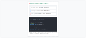
}navタグとmenuタグとの違いと使い分け
<nav>
別のページやページ内の別の場所へ「移動する(リンクする)」メニュー。<menu>
ユーザーが操作を行う「コマンド(機能)の集まり」のためのタグ。
例えば、Webアプリ上の「コピー」「貼り付け」「保存」といったツールバーのボタンを並べる用途に特化しています。
⭕️ nav:場所を移動する(リンク)
⭕️ menu:操作を実行する(ボタン・ツール)
<nav>
<ul>
<li><a href=”/home”>ホームへ</a></li>
</ul>
</nav>
<!– 💡 ボタン(buttonタグ)の集まりは menu –>
<menu>
<li><button onclick=”copy()”>コピー</button></li>
</menu>
HTMLコード表示
<div class="hnav-diff3-wrapper">
  <div class="hnav-diff3-demo-area">
    <div class="hnav-diff3-box">
      <div class="hnav-diff3-label">🕹️ nav(リンク)とmenu(アクション)</div>

      <div class="hnav-diff3-visual">
        <p style="font-size:12px; color:#198754; font-weight:bold; margin:0 0 5px 0;">⭕️ nav:場所を移動する(リンク)</p>
        <nav class="hnav-diff3-mock-nav">
          <a href="#">🏠 トップページへ</a>
          <a href="#">✉️ お問い合わせへ</a>
        </nav>

        <p style="font-size:12px; color:#dc3545; font-weight:bold; margin:20px 0 5px 0;">⭕️ menu:操作を実行する(ボタン・ツール)</p>
        <menu class="hnav-diff3-mock-menu">
          <button>✂️ カット</button>
          <button>📋 コピー</button>
          <button>💾 保存</button>
        </menu>
      </div>

      <div class="hnav-diff3-code">
        <!-- 💡 リンク(aタグ)の集まりは nav --><br>
        <span class="hnav-diff3-hl-green"><nav></span><br>
          <ul><br>
            <li><span class="hnav-diff3-hl-blue"><a href="/home"></span>ホームへ<span class="hnav-diff3-hl-blue"></a></span></li><br>
          </ul><br>
        <span class="hnav-diff3-hl-green"></nav></span><br><br>
        <!-- 💡 ボタン(buttonタグ)の集まりは menu --><br>
        <span class="hnav-diff3-hl-red"><menu></span><br>
          <li><span class="hnav-diff3-hl-blue"><button onclick="copy()"></span>コピー<span class="hnav-diff3-hl-blue"></button></span></li><br>
        <span class="hnav-diff3-hl-red"></menu></span>
      </div>
    </div>
  </div>
</div>
CSSコード表示
.hnav-diff3-wrapper {
  background-color: #f8f9fa;
  padding: 20px;
  border: 1px solid #dee2e6;
  border-radius: 4px;
  font-family: sans-serif;
}

.hnav-diff3-demo-area {
  display: flex;
  justify-content: center;
}

.hnav-diff3-box {
  background-color: #ffffff;
  border: 2px dashed #adb5bd;
  padding: 25px;
  width: 100%;
  max-width: 500px;
  border-radius: 4px;
}

.hnav-diff3-label {
  font-size: 15px;
  font-weight: bold;
  margin-bottom: 20px;
  color: #333;
}

.hnav-diff3-visual {
  background-color: #f1f3f5;
  padding: 20px;
  border-radius: 8px;
  margin-bottom: 20px;
  border: 1px solid #dee2e6;
}

.hnav-diff3-mock-nav {
  background-color: #e7f1ff;
  border: 2px solid #0d6efd;
  padding: 10px;
  border-radius: 4px;
  display: flex;
  gap: 15px;
  justify-content: center;
}

.hnav-diff3-mock-nav a {
  color: #0d6efd;
  text-decoration: none;
  font-size: 13px;
  font-weight: bold;
}

.hnav-diff3-mock-menu {
  background-color: #f8d7da;
  border: 2px solid #dc3545;
  padding: 10px;
  margin: 0; /* menuタグ特有のデフォルトマージンを消す */
  border-radius: 4px;
  display: flex;
  gap: 10px;
  justify-content: center;
}

.hnav-diff3-mock-menu button {
  background-color: #fff;
  border: 1px solid #dc3545;
  color: #dc3545;
  padding: 5px 10px;
  border-radius: 4px;
  font-size: 12px;
  font-weight: bold;
  cursor: pointer;
}

.hnav-diff3-code {
  background-color: #282c34;
  color: #abb2bf;
  padding: 15px;
  font-family: monospace;
  font-size: 13px;
  border-radius: 4px;
  line-height: 1.6;
  border-left: 4px solid #198754;
}

.hnav-diff3-hl-green {
  color: #98c379;
  font-weight: bold;
}

.hnav-diff3-hl-blue {
  color: #61afef;
  font-weight: bold;
}

.hnav-diff3-hl-red {
  color: #e06c75;
  font-weight: bold;
}
CSSで作る:ナビゲーションバーのデザイン
HTMLの<nav>タグで構造を定義した後は、CSSを用いて「ナビゲーションバー」へと昇華させる作業に入ります。
Web開発において、ナビゲーションメニューは再利用可能なパーツとして設計されるのが一般的です。
ここでは、メニューの並び替え、中央寄せ、ドロップダウンやレスポンシブ対応を解説します。
- メニューを横並びや縦並びにする
- 中央寄せや文字色・配置の調整
- レスポンシブ対応とドロップダウンメニューの実装
メニューを横並びや縦並びにする
PCサイトのヘッダーではメニューを横並びにし、フッターやサイドバー、あるいはスマホ画面では縦並びにするレイアウトが基本です。
メニューを並べる際は、display: flex;(Flexbox)を使用してください。
横に並べるならそのまま、縦に並べるならflex-direction: column;を1行追加するだけでコントロールできます。
また、項目間の余白はmarginではなくgapプロパティを使うのがよいです。
1. 横並び(display: flex;)
2. 縦並び(flex-direction: column;)
.horizontal-nav ul {
list-style: none;
display: flex; /* ★これだけで横に並ぶ */
gap: 20px; /* ★項目の隙間を空ける */
}
/* 💡 2. 縦並びにする(Vertical) */
.vertical-nav ul {
list-style: none;
display: flex;
flex-direction: column; /* ★縦に並べる呪文 */
gap: 10px;
}
HTMLコード表示
<div class="hnav-css1-wrapper">

  <div class="hnav-css1-demo-area">
    <div class="hnav-css1-box">
      <div class="hnav-css1-label">↔️↕️ メニューの横並び(horizontal)と縦並び(vertical)</div>

      <div class="hnav-css1-visual">
        <p style="font-size:12px; color:#0d6efd; font-weight:bold; margin:0 0 5px 0;">1. 横並び(display: flex;)</p>
        <nav class="hnav-css1-mock-nav">
          <ul class="hnav-css1-horizontal-list">
            <li><a href="#">HOME</a></li>
            <li><a href="#">ABOUT</a></li>
            <li><a href="#">SERVICE</a></li>
          </ul>
        </nav>

        <p style="font-size:12px; color:#198754; font-weight:bold; margin:20px 0 5px 0;">2. 縦並び(flex-direction: column;)</p>
        <nav class="hnav-css1-mock-nav" style="width: 200px;">
          <ul class="hnav-css1-vertical-list">
            <li><a href="#">HOME</a></li>
            <li><a href="#">ABOUT</a></li>
            <li><a href="#">SERVICE</a></li>
          </ul>
        </nav>
      </div>

      <div class="hnav-css1-code">
        /* 💡 1. 横並びにする(Horizontal) */<br>
        <span class="hnav-css1-hl-blue">.horizontal-nav ul</span> {<br>
          list-style: none;<br>
          <span class="hnav-css1-hl-green">display: flex;</span> /* ★これだけで横に並ぶ */<br>
          <span class="hnav-css1-hl-green">gap: 20px;</span>     /* ★項目の隙間を空ける */<br>
        }<br><br>
        /* 💡 2. 縦並びにする(Vertical) */<br>
        <span class="hnav-css1-hl-blue">.vertical-nav ul</span> {<br>
          list-style: none;<br>
          <span class="hnav-css1-hl-green">display: flex;</span><br>
          <span class="hnav-css1-hl-red">flex-direction: column;</span> /* ★縦に並べる呪文 */<br>
          <span class="hnav-css1-hl-green">gap: 10px;</span><br>
        }
      </div>
    </div>
  </div>
</div>
CSSコード表示
.hnav-css1-wrapper {
  background-color: #f8f9fa;
  padding: 20px;
  border: 1px solid #dee2e6;
  border-radius: 4px;
  font-family: sans-serif;
}

.hnav-css1-demo-area {
  display: flex;
  justify-content: center;
}

.hnav-css1-box {
  background-color: #ffffff;
  border: 2px dashed #adb5bd;
  padding: 25px;
  width: 100%;
  max-width: 500px;
  border-radius: 4px;
}

.hnav-css1-label {
  font-size: 15px;
  font-weight: bold;
  margin-bottom: 20px;
  color: #333;
}

.hnav-css1-visual {
  background-color: #f1f3f5;
  padding: 20px;
  border-radius: 8px;
  margin-bottom: 20px;
  border: 1px solid #dee2e6;
}

.hnav-css1-mock-nav {
  background-color: #212529;
  border-radius: 4px;
  padding: 15px;
}

/* ★横並びのCSS */
.hnav-css1-horizontal-list {
  list-style: none !important;
  margin: 0 !important;
  padding: 0 !important;
  display: flex;
  gap: 20px;
}

.hnav-css1-horizontal-list li {
  margin: 0 !important;
  padding: 0 !important;
}

/* ★縦並びのCSS */
.hnav-css1-vertical-list {
  list-style: none !important;
  margin: 0 !important;
  padding: 0 !important;
  display: flex;
  flex-direction: column; /* 縦にする */
  gap: 10px;
}

.hnav-css1-vertical-list li {
  margin: 0 !important;
  padding: 0 !important;
  border-bottom: 1px solid #495057; /* 縦並び特有の区切り線 */
  padding-bottom: 10px !important;
}

.hnav-css1-vertical-list li:last-child {
  border-bottom: none;
  padding-bottom: 0 !important;
}

.hnav-css1-mock-nav a {
  color: #fff;
  text-decoration: none;
  font-size: 13px;
  font-weight: bold;
  transition: color 0.2s;
}

.hnav-css1-mock-nav a:hover {
  color: #0d6efd;
}

.hnav-css1-code {
  background-color: #282c34;
  color: #abb2bf;
  padding: 15px;
  font-family: monospace;
  font-size: 13px;
  border-radius: 4px;
  line-height: 1.6;
  border-left: 4px solid #198754;
}

.hnav-css1-hl-green {
  color: #98c379;
  font-weight: bold;
}

.hnav-css1-hl-blue {
  color: #61afef;
  font-weight: bold;
}

.hnav-css1-hl-red {
  color: #e06c75;
  font-weight: bold;
}displayプロパティの使い方を詳しく知りたい人は「【html&css】displayの種類は?flexやinline-blockの違い」を一読ください。
中央寄せや文字色・配置の調整
ナビゲーションを画面の中央に配置したい、文字色を変えたい、あるいはスクロールしても画面上部に固定しておきたいというデザイン調整の基本です。
- クリック範囲の拡大
余白(padding)や文字色(color)の指定は、<a>タグに対して行います。<a>タグをdisplay: block;に変更することで、余白部分も含めた箱全体がクリック可能になります。 - 中央寄せ
Flexboxを設定したulに対してjustify-content: center;を指定します。 - 固定配置(追従)
ヘッダーメニューをスクロールしても上部に固定したい場合は、navにposition: sticky; top: 0;を指定するのがよいです。
⭕️ 中央寄せ & 箱全体がクリックできるメニュー
nav ul {
display: flex;
justify-content: center; /* ★これで中央に寄る */
gap: 15px;
}
/* 💡 2. クリック範囲を広げる(超重要) */
nav ul li a {
display: block; /* ★aタグをブロック化する */
padding: 15px 20px; /* ★liではなくaタグに余白をつける */
color: #ffffff;
text-decoration: none;
background-color: #0d6efd;
}
HTMLコード表示
<div class="hnav-css2-wrapper">
  <div class="hnav-css2-demo-area">
    <div class="hnav-css2-box">
      <div class="hnav-css2-label">🎯 中央寄せとクリック範囲(aタグ)の最適化</div>

      <div class="hnav-css2-visual">
        <p style="font-size:12px; color:#198754; font-weight:bold; margin:0 0 5px 0;">⭕️ 中央寄せ & 箱全体がクリックできるメニュー</p>

        <nav class="hnav-css2-mock-nav">
          <ul class="hnav-css2-center-list">
            <li><a href="#">メニューA</a></li>
            <li><a href="#">メニューB</a></li>
            <li><a href="#">メニューC</a></li>
          </ul>
        </nav>
      </div>

      <div class="hnav-css2-code">
        /* 💡 1. 中央寄せにする(Flexbox) */<br>
        <span class="hnav-css2-hl-blue">nav ul</span> {<br>
          display: flex;<br>
          <span class="hnav-css2-hl-green">justify-content: center;</span> /* ★これで中央に寄る */<br>
          gap: 15px;<br>
        }<br><br>
        /* 💡 2. クリック範囲を広げる(超重要) */<br>
        <span class="hnav-css2-hl-blue">nav ul li a</span> {<br>
          <span class="hnav-css2-hl-red">display: block;</span> /* ★aタグをブロック化する */<br>
          <span class="hnav-css2-hl-green">padding: 15px 20px;</span> /* ★liではなくaタグに余白をつける */<br>
          color: #ffffff;<br>
          text-decoration: none;<br>
          background-color: #0d6efd;<br>
        }
      </div>
    </div>
  </div>
</div>
CSSコード表示
.hnav-css2-wrapper {
  background-color: #f8f9fa;
  padding: 20px;
  border: 1px solid #dee2e6;
  border-radius: 4px;
  font-family: sans-serif;
}

.hnav-css2-demo-area {
  display: flex;
  justify-content: center;
}

.hnav-css2-box {
  background-color: #ffffff;
  border: 2px dashed #adb5bd;
  padding: 25px;
  width: 100%;
  max-width: 500px;
  border-radius: 4px;
}

.hnav-css2-label {
  font-size: 15px;
  font-weight: bold;
  margin-bottom: 20px;
  color: #333;
}

.hnav-css2-visual {
  background-color: #f1f3f5;
  padding: 20px;
  border-radius: 8px;
  margin-bottom: 20px;
  border: 1px solid #dee2e6;
}

.hnav-css2-mock-nav {
  background-color: #fff;
  border-radius: 4px;
  border: 1px solid #ced4da;
  padding: 10px 0;
}

.hnav-css2-center-list {
  list-style: none !important;
  margin: 0 !important;
  padding: 0 !important;
  display: flex;
  justify-content: center; /* ★中央寄せ */
  gap: 15px;
}

.hnav-css2-center-list li {
  margin: 0 !important;
  padding: 0 !important;
}

/* ★aタグに余白と背景色をつける */
.hnav-css2-center-list a {
  display: block; /* ★必須 */
  padding: 12px 20px;
  color: #fff;
  background-color: #0d6efd;
  text-decoration: none;
  font-size: 13px;
  font-weight: bold;
  border-radius: 4px;
  transition: background-color 0.2s;
}

.hnav-css2-center-list a:hover {
  background-color: #0b5ed7;
}

.hnav-css2-code {
  background-color: #282c34;
  color: #abb2bf;
  padding: 15px;
  font-family: monospace;
  font-size: 13px;
  border-radius: 4px;
  line-height: 1.6;
  border-left: 4px solid #198754;
}

.hnav-css2-hl-green {
  color: #98c379;
  font-weight: bold;
}

.hnav-css2-hl-blue {
  color: #61afef;
  font-weight: bold;
}

.hnav-css2-hl-red {
  color: #e06c75;
  font-weight: bold;
}追従ヘッダーで利用するpositionプロパティの使い方を詳しく知りたい人は「【html&css】positionの使い方とabsolute・fixed・relativeの使い分け」を一読ください。
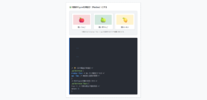
レスポンシブ対応とドロップダウンメニューの実装
スマホ画面に合わせてメニューの見た目を変えるテクニックや親メニューにマウスを乗せると子メニューがスッと出てくるドロップダウン、あるいはタブ切り替えの実装は、実務で頻出する重要項目です。
- ドロップダウンの重なり対策
絶対配置(absolute)にしたドロップダウン要素には、z-index: 10;のように他の要素より上にくるための重なり順を指定してください。 - レスポンシブ対応
メディアクエリ(@media)を使用し、「PCは横並び(flex-direction: row;)」「スマホは縦並び(flex-direction: column;)」に切り替えるのがよいです。
⭕️ SERVICEに乗せると子メニューが表示されます
ここにはページのメインコンテンツがあります。
※z-indexがないと、メニューがこの文字の裏側に潜ってしまいます。
.has-child {
position: relative; /* ★子メニューの基準位置にする */
}
/* 💡 2. 子メニュー(最初は隠しておく) */
.sub-list {
position: absolute; /* 親を基準に絶対配置 */
z-index: 10; /* ★背後に隠れないよう上に持ってくる */
display: none; /* 最初は非表示 */
top: 100%; /* 親のすぐ下に配置 */
left: 0;
}
/* 💡 3. 親にマウスが乗ったら表示する魔法 */
.has-child:hover .sub-list {
display: block; /* 表示させる */
}
HTMLコード表示
<div class="hnav-css3-wrapper">

  <div class="hnav-css3-demo-area">
    <div class="hnav-css3-box">
      <div class="hnav-css3-label">🔽 CSSだけで作るドロップダウンメニュー</div>

      <div class="hnav-css3-visual">
        <p style="font-size:12px; color:#0d6efd; font-weight:bold; margin:0 0 5px 0;">⭕️ SERVICEに乗せると子メニューが表示されます</p>

        <div class="hnav-css3-site-mock">
          <nav class="hnav-css3-dropdown-nav">
            <ul class="hnav-css3-main-list">
              <li><a href="#">HOME</a></li>
              <li><a href="#">ABOUT</a></li>
              <li class="hnav-css3-has-child">
                <a href="#">SERVICE ▾</a>
                <ul class="hnav-css3-sub-list">
                  <li><a href="#">Web制作</a></li>
                  <li><a href="#">SEO対策</a></li>
                  <li><a href="#">保守運用</a></li>
                </ul>
              </li>
            </ul>
          </nav>

          <div class="hnav-css3-behind-content">
            <p style="margin:0; font-size:12px;">ここにはページのメインコンテンツがあります。</p>
            <p style="margin:5px 0 0 0; font-size:11px; color:#666;">※z-indexがないと、メニューがこの文字の裏側に潜ってしまいます。</p>
          </div>
        </div>
      </div>

      <div class="hnav-css3-code">
        /* 💡 1. 親のli要素(起点)の設定 */<br>
        <span class="hnav-css3-hl-blue">.has-child</span> {<br>
          <span class="hnav-css3-hl-green">position: relative;</span> /* ★子メニューの基準位置にする */<br>
        }<br><br>
        /* 💡 2. 子メニュー(最初は隠しておく) */<br>
        <span class="hnav-css3-hl-blue">.sub-list</span> {<br>
          <span class="hnav-css3-hl-green">position: absolute;</span> /* 親を基準に絶対配置 */<br>
          <span class="hnav-css3-hl-red">z-index: 10;</span>        /* ★背後に隠れないよう上に持ってくる */<br>
          <span class="hnav-css3-hl-blue">display: none;</span>      /* 最初は非表示 */<br>
          top: 100%;          /* 親のすぐ下に配置 */<br>
          left: 0;<br>
        }<br><br>
        /* 💡 3. 親にマウスが乗ったら表示する魔法 */<br>
        <span class="hnav-css3-hl-blue">.has-child:hover .sub-list</span> {<br>
          <span class="hnav-css3-hl-green">display: block;</span>     /* 表示させる */<br>
        }
      </div>
    </div>
  </div>
</div>
CSSコード表示
.hnav-css3-wrapper {
  background-color: #f8f9fa;
  padding: 20px;
  border: 1px solid #dee2e6;
  border-radius: 4px;
  font-family: sans-serif;
}

.hnav-css3-demo-area {
  display: flex;
  justify-content: center;
}

.hnav-css3-box {
  background-color: #ffffff;
  border: 2px dashed #adb5bd;
  padding: 25px;
  width: 100%;
  max-width: 550px;
  border-radius: 4px;
}

.hnav-css3-label {
  font-size: 15px;
  font-weight: bold;
  margin-bottom: 20px;
  color: #333;
}

.hnav-css3-visual {
  background-color: #f1f3f5;
  padding: 20px;
  border-radius: 8px;
  margin-bottom: 20px;
  border: 1px solid #dee2e6;
}

.hnav-css3-site-mock {
  background-color: #fff;
  border: 1px solid #ced4da;
  border-radius: 4px;
}

/* メインナビゲーション */
.hnav-css3-dropdown-nav {
  background-color: #212529;
}

.hnav-css3-main-list {
  list-style: none !important;
  margin: 0 !important;
  padding: 0 !important;
  display: flex;
}

.hnav-css3-main-list > li {
  margin: 0 !important;
  padding: 0 !important;
}

.hnav-css3-main-list > li > a {
  display: block;
  color: #fff;
  text-decoration: none;
  font-size: 13px;
  font-weight: bold;
  padding: 15px 20px;
  transition: background-color 0.2s;
}

.hnav-css3-main-list > li > a:hover {
  background-color: #343a40;
}

/* ドロップダウンの起点 */
.hnav-css3-has-child {
  position: relative; /* 子要素の基準 */
}

/* 子メニュー(隠しておく) */
.hnav-css3-sub-list {
  list-style: none !important;
  margin: 0 !important;
  padding: 0 !important;
  position: absolute; /* 親を基準に配置 */
  top: 100%;          /* 親のすぐ下 */
  left: 0;
  width: 150px;       /* 子メニューの幅 */
  background-color: #ffffff;
  border: 1px solid #dee2e6;
  border-radius: 0 0 4px 4px;
  box-shadow: 0 4px 6px rgba(0,0,0,0.1);
  display: none;      /* ★最初は隠す */
  z-index: 10;        /* ★背後に隠れないようにする */
}

.hnav-css3-sub-list li {
  margin: 0 !important;
  padding: 0 !important;
  border-bottom: 1px solid #e9ecef;
}

.hnav-css3-sub-list li:last-child {
  border-bottom: none;
}

.hnav-css3-sub-list a {
  display: block;
  padding: 12px 15px;
  color: #333;
  text-decoration: none;
  font-size: 12px;
  transition: background-color 0.2s;
}

.hnav-css3-sub-list a:hover {
  background-color: #f8f9fa;
  color: #0d6efd;
}

/* ★親にマウスが乗ったら子メニューを表示 */
.hnav-css3-has-child:hover .hnav-css3-sub-list {
  display: block;
}

/* 背後のコンテンツ */
.hnav-css3-behind-content {
  padding: 30px 20px;
  background-color: #f8f9fa;
  color: #333;
  height: 80px;
}

.hnav-css3-code {
  background-color: #282c34;
  color: #abb2bf;
  padding: 15px;
  font-family: monospace;
  font-size: 13px;
  border-radius: 4px;
  line-height: 1.6;
  border-left: 4px solid #198754;
}

.hnav-css3-hl-green {
  color: #98c379;
  font-weight: bold;
}

.hnav-css3-hl-blue {
  color: #61afef;
  font-weight: bold;
}

.hnav-css3-hl-red {
  color: #e06c75;
  font-weight: bold;
}重なりで利用するz-indexプロパティの使い方を詳しく知りたい人は「【html&css】z-indexとは?使い方と効かない時の対処」を一読ください。
また、ドロップダウンメニューの作り方を詳しく知りたい人は「【HTML】プルダウン・セレクトボックス・ドロップダウンの作り方:コンボボックスとの違い」を一読ください。
コピペで使える!navタグのテンプレート
Webサイトの要となるナビゲーションバーですが、毎回ゼロから書き直すのは非効率です。
ここでは、実務でそのまま「ナビゲーションバー」としてコピペして使える、レスポンシブなCSSテンプレートを3つの用途別にご紹介します。
- ロゴ付きのシンプルなヘッダーナビゲーション
- ページ内リンクで該当セクションにスクロールさせる
- サイドバーやフッター用のナビゲーション
ロゴ付きのシンプルなヘッダーナビゲーション
コーポレートサイトからブログまで9割以上のサイトで採用されているのが、左側にロゴ、右側にメニューを配置したデザインです。
親要素の<header>に対してdisplay: flex; justify-content: space-between; align-items: center;を指定します。
これだけで、左と右に分かれ、かつ縦の中央が揃ったヘッダーが完成します。
⭕️ Flexboxで左右分割&縦中央揃え
header {
display: flex;
justify-content: space-between; /* ★左右に振り分ける */
align-items: center; /* ★縦の中央を揃える */
padding: 15px 30px;
background-color: #212529;
}
/* 💡 2. メニューを横並びにする */
nav ul {
display: flex;
gap: 20px;
}
HTMLコード表示
<div class="hnav-tpl1-wrapper">

  <div class="hnav-tpl1-demo-area">
    <div class="hnav-tpl1-box">
      <div class="hnav-tpl1-label">🌟 ロゴ付きのヘッダーナビゲーション</div>

      <div class="hnav-tpl1-visual">
        <p style="font-size:12px; color:#198754; font-weight:bold; margin:0 0 5px 0;">⭕️ Flexboxで左右分割&縦中央揃え</p>

        <header class="hnav-tpl1-header">
          <div class="hnav-tpl1-logo">
            <a href="#">SampleCorp.</a>
          </div>
          <nav class="hnav-tpl1-nav">
            <ul>
              <li><a href="#">HOME</a></li>
              <li><a href="#">ABOUT</a></li>
              <li><a href="#">CONTACT</a></li>
            </ul>
          </nav>
        </header>
      </div>

      <div class="hnav-tpl1-code">
        /* 💡 1. ヘッダー全体をFlexboxにする */<br>
        <span class="hnav-tpl1-hl-blue">header</span> {<br>
          <span class="hnav-tpl1-hl-green">display: flex;</span><br>
          <span class="hnav-tpl1-hl-green">justify-content: space-between;</span> /* ★左右に振り分ける */<br>
          <span class="hnav-css2-hl-green">align-items: center;</span>            /* ★縦の中央を揃える */<br>
          padding: 15px 30px;<br>
          background-color: #212529;<br>
        }<br><br>
        /* 💡 2. メニューを横並びにする */<br>
        <span class="hnav-tpl1-hl-blue">nav ul</span> {<br>
          display: flex;<br>
          gap: 20px;<br>
        }
      </div>
    </div>
  </div>
</div>
CSSコード表示
.hnav-tpl1-wrapper {
  background-color: #f8f9fa;
  padding: 20px;
  border: 1px solid #dee2e6;
  border-radius: 4px;
  font-family: sans-serif;
}

.hnav-tpl1-demo-area {
  display: flex;
  justify-content: center;
}

.hnav-tpl1-box {
  background-color: #ffffff;
  border: 2px dashed #adb5bd;
  padding: 25px;
  width: 100%;
  max-width: 550px;
  border-radius: 4px;
}

.hnav-tpl1-label {
  font-size: 15px;
  font-weight: bold;
  margin-bottom: 20px;
  color: #333;
}

.hnav-tpl1-visual {
  background-color: #f1f3f5;
  padding: 20px;
  border-radius: 8px;
  margin-bottom: 20px;
}

/* テンプレートのCSS */
.hnav-tpl1-header {
  display: flex;
  justify-content: space-between; /* 左右に分ける */
  align-items: center;            /* 縦の中央を揃える */
  background-color: #212529;
  padding: 15px 20px;
  border-radius: 4px;
}

.hnav-tpl1-logo a {
  color: #fff;
  text-decoration: none;
  font-size: 18px;
  font-weight: bold;
  letter-spacing: 1px;
}

.hnav-tpl1-nav ul {
  list-style: none !important;
  margin: 0 !important;
  padding: 0 !important;
  display: flex;
  gap: 20px;
}

.hnav-tpl1-nav ul li {
  margin: 0 !important;
  padding: 0 !important;
}

.hnav-tpl1-nav ul li a {
  color: #f8f9fa;
  text-decoration: none;
  font-size: 13px;
  font-weight: 500;
  transition: color 0.3s;
}

.hnav-tpl1-nav ul li a:hover {
  color: #0d6efd;
}

.hnav-tpl1-code {
  background-color: #282c34;
  color: #abb2bf;
  padding: 15px;
  font-family: monospace;
  font-size: 13px;
  border-radius: 4px;
  line-height: 1.6;
  border-left: 4px solid #198754;
}

.hnav-tpl1-hl-green { color: #98c379; font-weight: bold; }
.hnav-tpl1-hl-blue { color: #61afef; font-weight: bold; }改めて、displayプロパティの使い方を詳しく知りたい人は「【html&css】displayの種類は?flexやinline-blockの違い」を一読ください。
ページ内リンクで該当セクションにスクロールさせる
LP(ランディングページ)などで多用されるのが、メニューをクリックすると別ページへ飛ぶのではなく、同じページ内の特定の場所へ移動する「ページ内リンク」のナビゲーションです。
- スムーススクロール
HTML全体に対してhtml { scroll-behavior: smooth; }を指定し、滑らかにスクロールさせます。 - ヘッダー被り対策
リンクの移動先となる各セクション(<section id="...">)に対してscroll-margin-topプロパティを設定し、ヘッダーの高さ分だけ「停止位置を上にずらす」処理を行います。
⭕️ メニューをクリックしてスクロール挙動を確認
ヘッダーの下に隠れず、綺麗にここで止まります。
実際のサイトでは scroll-margin-top が効きます。
最後まで滑らかにスクロールします。
html {
scroll-behavior: smooth;
}
/* 💡 2. ヘッダーを上部に固定する */
header {
position: sticky;
top: 0;
z-index: 100;
}
/* 💡 3. ★超重要:移動先がヘッダーに隠れないようにする */
section {
scroll-margin-top: 60px; /* ★ヘッダーの高さ分ずらす */
}
HTMLコード表示
<div class="hnav-tpl2-wrapper">

  <div class="hnav-tpl2-demo-area">
    <div class="hnav-tpl2-box">
      <div class="hnav-tpl2-label">⬇️ ページ内リンクとスムーススクロール</div>

      <div class="hnav-tpl2-visual">
        <p style="font-size:12px; color:#0d6efd; font-weight:bold; margin:0 0 5px 0;">⭕️ メニューをクリックしてスクロール挙動を確認</p>

        <div id="demoScrollArea" class="hnav-tpl2-scroll-area">

          <header class="hnav-tpl2-sticky-header">
            <nav class="hnav-tpl2-page-nav">
              <ul>
                <li><a href="#sec-a" class="js-demo-scroll">特徴</a></li>
                <li><a href="#sec-b" class="js-demo-scroll">料金</a></li>
                <li><a href="#sec-c" class="js-demo-scroll">よくある質問</a></li>
              </ul>
            </nav>
          </header>

          <div class="hnav-tpl2-content">
            <div style="height: 100px; padding:20px; background:#f8f9fa;">トップ領域(スクロールしてください)</div>

            <section id="sec-a" class="hnav-tpl2-section">
              <div style="margin:0; font-size:14px; color:#198754;">■ 特徴セクション</div>
              <p style="font-size:12px; margin-top:5px;">ヘッダーの下に隠れず、綺麗にここで止まります。</p>
            </section>

            <section id="sec-b" class="hnav-tpl2-section" style="background-color:#e9ecef;">
              <div style="margin:0; font-size:14px; color:#0d6efd;">■ 料金セクション</div>
              <p style="font-size:12px; margin-top:5px;">実際のサイトでは scroll-margin-top が効きます。</p>
            </section>

            <section id="sec-c" class="hnav-tpl2-section">
              <div style="margin:0; font-size:14px; color:#dc3545;">■ よくある質問セクション</div>
              <p style="font-size:12px; margin-top:5px;">最後まで滑らかにスクロールします。</p>
            </section>
            <div style="height: 150px; background:#f8f9fa;"></div>
          </div>
        </div>
      </div>

      <div class="hnav-tpl2-code">
        /* 💡 1. 滑らかにスクロールさせる魔法 */<br>
        <span class="hnav-tpl2-hl-blue">html</span> {<br>
          <span class="hnav-tpl2-hl-green">scroll-behavior: smooth;</span><br>
        }<br><br>
        /* 💡 2. ヘッダーを上部に固定する */<br>
        <span class="hnav-tpl2-hl-blue">header</span> {<br>
          <span class="hnav-tpl2-hl-green">position: sticky;</span><br>
          top: 0;<br>
          z-index: 100;<br>
        }<br><br>
        /* 💡 3. ★超重要:移動先がヘッダーに隠れないようにする */<br>
        <span class="hnav-tpl2-hl-blue">section</span> {<br>
          <span class="hnav-tpl2-hl-red">scroll-margin-top: 60px;</span> /* ★ヘッダーの高さ分ずらす */<br>
        }
      </div>
    </div>
  </div>
</div>
CSSコード表示
.hnav-tpl2-wrapper {
  background-color: #f8f9fa;
  padding: 20px;
  border: 1px solid #dee2e6;
  border-radius: 4px;
  font-family: sans-serif;
}

.hnav-tpl2-demo-area {
  display: flex;
  justify-content: center;
}

.hnav-tpl2-box {
  background-color: #ffffff;
  border: 2px dashed #adb5bd;
  padding: 25px;
  width: 100%;
  max-width: 550px;
  border-radius: 4px;
}

.hnav-tpl2-label {
  font-size: 15px;
  font-weight: bold;
  margin-bottom: 20px;
  color: #333;
}

.hnav-tpl2-visual {
  background-color: #fff;
  padding: 0;
  margin-bottom: 20px;
  border: 1px solid #dee2e6;
  border-radius: 4px;
  overflow: hidden;
}

/* 枠内だけスクロールさせる設定(擬似的なhtml/body) */
.hnav-tpl2-scroll-area {
  height: 200px;
  overflow-y: scroll;
  scroll-behavior: smooth;
  position: relative;
}

/* 固定ヘッダー */
.hnav-tpl2-sticky-header {
  position: sticky;
  top: 0;
  background-color: #212529;
  padding: 10px;
  z-index: 10;
  box-shadow: 0 2px 4px rgba(0,0,0,0.2);
}

.hnav-tpl2-page-nav ul {
  list-style: none !important;
  margin: 0 !important;
  padding: 0 !important;
  display: flex;
  justify-content: center;
  gap: 15px;
}

.hnav-tpl2-page-nav ul li {
  margin: 0 !important;
  padding: 0 !important;
}

.hnav-tpl2-page-nav a {
  color: #fff;
  text-decoration: none;
  font-size: 12px;
  font-weight: bold;
}

/* 各セクション */
.hnav-tpl2-section {
  padding: 30px 20px 80px 20px;
  border-bottom: 1px dashed #ccc;
}

.hnav-tpl2-code {
  background-color: #282c34;
  color: #abb2bf;
  padding: 15px;
  font-family: monospace;
  font-size: 13px;
  border-radius: 4px;
  line-height: 1.6;
  border-left: 4px solid #198754;
}

.hnav-tpl2-hl-green { color: #98c379; font-weight: bold; }
.hnav-tpl2-hl-blue { color: #61afef; font-weight: bold; }
.hnav-tpl2-hl-red { color: #e06c75; font-weight: bold; }
JavaScriptコード表示
document.addEventListener("DOMContentLoaded", function() {
  const scrollArea = document.getElementById('demoScrollArea');
  if(!scrollArea) return;

  scrollArea.addEventListener('click', function(e) {
    const link = e.target.closest('.js-demo-scroll');
    if (link) {
      e.preventDefault();
      e.stopPropagation();
      e.stopImmediatePropagation();

      const targetId = link.getAttribute('href').replace('#', '');
      const targetElement = document.getElementById(targetId);

      if (targetElement) {
        const headerHeight = 38;
        const targetPos = targetElement.offsetTop - headerHeight;

        scrollArea.scrollTo({
          top: targetPos,
          behavior: 'smooth'
        });
      }
    }
  }, { capture: true });
});
サイドバーやフッター用のナビゲーション
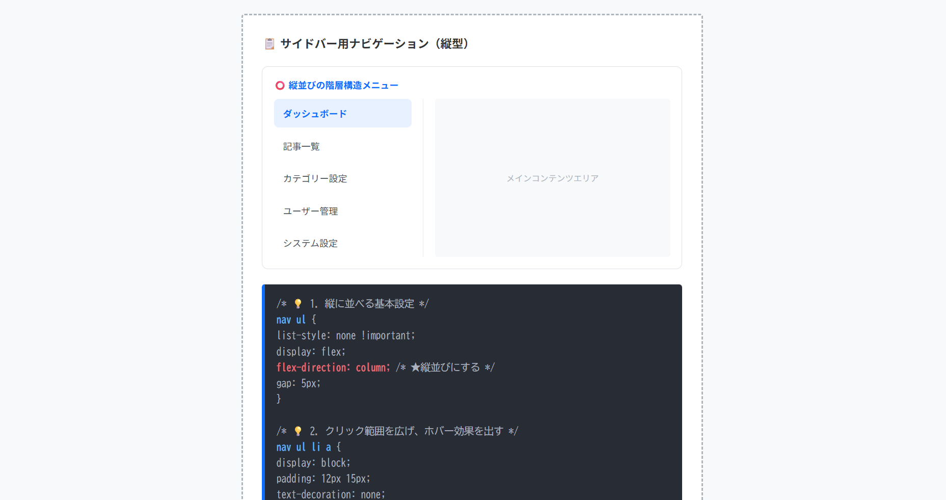
グローバルナビゲーション以外にも、管理画面やブログの横に配置するサイドメニューやページ最下部のリンク集など、特定のセクション内でナビゲーションを使うケースもあります。
サイドバーナビゲーションは、メインコンテンツの横に配置され、サイト内の特定カテゴリーや詳細なサブメニューへのアクセスを助ける役割を持ちます。
通常、HTML構造としては<aside>タグの中に<nav>を配置するのが一般的です。
- アクセシビリティの確保
ヘッダーにも<nav>がある場合、サイドバーの<nav>にはaria-label="サイドナビゲーション"などのラベルを付け、スクリーンリーダー利用者が混乱しないようにします。 - レスポンシブ設計
スマホ表示では、サイドバーを横幅100%にしてメインコンテンツの下に移動させるか、「ハンバーガーメニュー」の中に格納して非表示にする制御がよいです。
⭕️ 縦並びの階層構造メニュー
メインコンテンツエリア
nav ul {
list-style: none !important;
display: flex;
flex-direction: column; /* ★縦並びにする */
gap: 5px;
}
/* 💡 2. クリック範囲を広げ、ホバー効果を出す */
nav ul li a {
display: block;
padding: 12px 15px;
text-decoration: none;
border-radius: 6px;
}
/* 💡 3. 現在地のハイライト(アクティブ状態) */
a.is-active {
background-color: #e7f1ff;
color: #0d6efd;
font-weight: bold;
}
HTMLコード表示
<div class="hnav-side-wrapper">
  <div class="hnav-side-demo-area">
    <div class="hnav-side-box">
      <div class="hnav-side-label">📋 サイドバー用ナビゲーション(縦型)</div>

      <div class="hnav-side-visual">
        <p style="font-size:12px; color:#0d6efd; font-weight:bold; margin:0 0 10px 0;">⭕️ 縦並びの階層構造メニュー</p>

        <div class="hnav-side-layout">
          <aside class="hnav-side-aside">
            <nav class="hnav-side-nav" aria-label="サイドメニュー">
              <ul>
                <li><a href="#" class="is-active">ダッシュボード</a></li>
                <li><a href="#">記事一覧</a></li>
                <li><a href="#">カテゴリー設定</a></li>
                <li><a href="#">ユーザー管理</a></li>
                <li><a href="#">システム設定</a></li>
              </ul>
            </nav>
          </aside>

          <main class="hnav-side-main-mock">
            <p>メインコンテンツエリア</p>
          </main>
        </div>
      </div>

      <div class="hnav-side-code">
        /* 💡 1. 縦に並べる基本設定 */<br>
        <span class="hnav-side-hl-blue">nav ul</span> {<br>
          list-style: none !important;<br>
          display: flex;<br>
          <span class="hnav-side-hl-red">flex-direction: column;</span> /* ★縦並びにする */<br>
          gap: 5px;<br>
        }<br><br>
        /* 💡 2. クリック範囲を広げ、ホバー効果を出す */<br>
        <span class="hnav-side-hl-blue">nav ul li a</span> {<br>
          display: block;<br>
          padding: 12px 15px;<br>
          text-decoration: none;<br>
          <span class="hnav-side-hl-green">border-radius: 6px;</span><br>
        }<br><br>
        /* 💡 3. 現在地のハイライト(アクティブ状態) */<br>
        <span class="hnav-side-hl-blue">a.is-active</span> {<br>
          background-color: #e7f1ff;<br>
          color: #0d6efd;<br>
          font-weight: bold;<br>
        }
      </div>
    </div>
  </div>
</div>
CSSコード表示
.hnav-side-wrapper {
  background-color: #f8f9fa;
  padding: 20px;
  border: 1px solid #dee2e6;
  border-radius: 4px;
  font-family: sans-serif;
}

.hnav-side-demo-area {
  display: flex;
  justify-content: center;
}

.hnav-side-box {
  background-color: #ffffff;
  border: 2px dashed #adb5bd;
  padding: 25px;
  width: 100%;
  max-width: 550px;
  border-radius: 4px;
}

.hnav-side-label {
  font-size: 15px;
  font-weight: bold;
  margin-bottom: 20px;
  color: #333;
}

.hnav-side-visual {
  background-color: #fff;
  padding: 15px;
  border-radius: 8px;
  margin-bottom: 20px;
  border: 1px solid #dee2e6;
}

.hnav-side-layout {
  display: flex; /* 横並びレイアウト */
  gap: 15px;
  min-height: 200px;
}

.hnav-side-aside {
  width: 180px;
  border-right: 1px solid #e9ecef;
  padding-right: 15px;
}

.hnav-side-nav ul {
  list-style: none !important;
  margin: 0 !important;
  padding: 0 !important;
  display: flex;
  flex-direction: column;
  gap: 5px;
}

.hnav-side-nav ul li {
  margin: 0 !important;
  padding: 0 !important;
}

.hnav-side-nav ul li a {
  display: block;
  padding: 10px 12px;
  color: #495057;
  text-decoration: none;
  font-size: 12px;
  border-radius: 6px;
  transition: all 0.2s;
}

.hnav-side-nav ul li a:hover {
  background-color: #f8f9fa;
  color: #0d6efd;
}

.hnav-side-nav ul li a.is-active {
  background-color: #e7f1ff;
  color: #0d6efd;
  font-weight: bold;
}

.hnav-side-main-mock {
  flex: 1;
  background-color: #f8f9fa;
  border-radius: 4px;
  display: flex;
  align-items: center;
  justify-content: center;
  color: #adb5bd;
  font-size: 11px;
}

.hnav-side-code {
  background-color: #282c34;
  color: #abb2bf;
  padding: 15px;
  font-family: monospace;
  font-size: 13px;
  border-radius: 4px;
  line-height: 1.6;
  border-left: 4px solid #0d6efd;
}

.hnav-side-hl-green { color: #98c379; font-weight: bold; }
.hnav-side-hl-blue { color: #61afef; font-weight: bold; }
.hnav-side-hl-red { color: #e06c75; font-weight: bold; }サイドバーで使う<aside>タグの使い方を詳しく知りたい人は「【HTML】asideタグの使い方:サイドバー実装やsectionとの違い」を一読ください。
フッターなどの複雑なナビゲーションは、カテゴリーごとに独立した<ul>(または<section>+<ul>)を作り、それらを親の<nav>とFlexboxで横に並べるのがよいです。
これにより、スマホ画面ではFlexboxをflex-direction: column;に切り替えるだけで、縦並びのメニューに変形できます。
⭕️ カテゴリーごとにリスト(ul)を分ける
<footer>
<nav class=”footer-nav” aria-label=”フッターメニュー”>
<!– グループ1 –>
<div class=”nav-column”>
<p>企業情報</p>
<ul> <li><a href=”#”>会社概要</a></li> … </ul>
</div>
<!– グループ2 –>
<div class=”nav-column”>
<p>サービス</p>
<ul> <li><a href=”#”>Web制作</a></li> … </ul>
</div>
</nav>
</footer>
HTMLコード表示
<div class="hnav-tpl3-wrapper">

  <div class="hnav-tpl3-demo-area">
    <div class="hnav-tpl3-box">
      <div class="hnav-tpl3-label">🦶 フッター用カラムナビゲーション</div>

      <div class="hnav-tpl3-visual">
        <p style="font-size:12px; color:#198754; font-weight:bold; margin:0 0 5px 0;">⭕️ カテゴリーごとにリスト(ul)を分ける</p>

        <footer class="hnav-tpl3-mock-footer">
          <nav class="hnav-tpl3-footer-nav" aria-label="フッターナビゲーション">
            <div class="hnav-tpl3-nav-col">
              <p class="hnav-tpl3-col-title">企業情報</p>
              <ul>
                <li><a href="#">会社概要</a></li>
                <li><a href="#">採用情報</a></li>
                <li><a href="#">アクセス</a></li>
              </ul>
            </div>

            <div class="hnav-tpl3-nav-col">
              <p class="hnav-tpl3-col-title">サービス</p>
              <ul>
                <li><a href="#">Web制作</a></li>
                <li><a href="#">システム開発</a></li>
              </ul>
            </div>

            <div class="hnav-tpl3-nav-col">
              <p class="hnav-tpl3-col-title">サポート</p>
              <ul>
                <li><a href="#">よくある質問</a></li>
                <li><a href="#">お問い合わせ</a></li>
              </ul>
            </div>
          </nav>
        </footer>
      </div>

      <div class="hnav-tpl3-code">
        <!-- 💡 意味のあるグループごとに分割する --><br>
        <span class="hnav-tpl3-hl-blue"><footer></span><br>
          <span class="hnav-tpl3-hl-green"><nav class="footer-nav" aria-label="フッターメニュー"></span><br><br>
            <!-- グループ1 --><br>
            <span class="hnav-tpl3-hl-red"><div class="nav-column"></span><br>
              <p>企業情報</p><br>
              <ul> <li><a href="#">会社概要</a></li> ... </ul><br>
            <span class="hnav-tpl3-hl-red"></div></span><br><br>
            <!-- グループ2 --><br>
            <span class="hnav-tpl3-hl-red"><div class="nav-column"></span><br>
              <p>サービス</p><br>
              <ul> <li><a href="#">Web制作</a></li> ... </ul><br>
            <span class="hnav-tpl3-hl-red"></div></span><br><br>
          <span class="hnav-tpl3-hl-green"></nav></span><br>
        <span class="hnav-tpl3-hl-blue"></footer></span>
      </div>
    </div>
  </div>
</div>
CSSコード表示
.hnav-tpl3-wrapper {
  background-color: #f8f9fa;
  padding: 20px;
  border: 1px solid #dee2e6;
  border-radius: 4px;
  font-family: sans-serif;
}

.hnav-tpl3-demo-area {
  display: flex;
  justify-content: center;
}

.hnav-tpl3-box {
  background-color: #ffffff;
  border: 2px dashed #adb5bd;
  padding: 25px;
  width: 100%;
  max-width: 550px;
  border-radius: 4px;
}

.hnav-tpl3-label {
  font-size: 15px;
  font-weight: bold;
  margin-bottom: 20px;
  color: #333;
}

.hnav-tpl3-visual {
  background-color: #f1f3f5;
  padding: 20px;
  border-radius: 8px;
  margin-bottom: 20px;
}

/* フッターのスタイル */
.hnav-tpl3-mock-footer {
  background-color: #212529;
  padding: 20px;
  border-radius: 4px;
}

.hnav-tpl3-footer-nav {
  display: flex;
  justify-content: space-between; /* カラムを均等に配置 */
  flex-wrap: wrap; /* 狭い場合は折り返す */
  gap: 20px;
}

.hnav-tpl3-nav-col {
  flex: 1;
  min-width: 100px;
}

.hnav-tpl3-col-title {
  color: #adb5bd;
  font-size: 12px;
  font-weight: bold;
  margin: 0 0 10px 0;
  border-bottom: 1px solid #495057;
  padding-bottom: 5px;
}

.hnav-tpl3-nav-col ul {
  list-style: none !important;
  margin: 0 !important;
  padding: 0 !important;
  display: flex;
  flex-direction: column;
  gap: 8px;
}

.hnav-tpl3-nav-col li {
  margin: 0 !important;
  padding: 0 !important;
}

.hnav-tpl3-nav-col a {
  color: #f8f9fa;
  text-decoration: none;
  font-size: 11px;
  transition: color 0.2s;
}

.hnav-tpl3-nav-col a:hover {
  color: #0d6efd;
  text-decoration: underline;
}

.hnav-tpl3-code {
  background-color: #282c34;
  color: #abb2bf;
  padding: 15px;
  font-family: monospace;
  font-size: 13px;
  border-radius: 4px;
  line-height: 1.6;
  border-left: 4px solid #198754;
}

.hnav-tpl3-hl-green { color: #98c379; font-weight: bold; }
.hnav-tpl3-hl-blue { color: #61afef; font-weight: bold; }
.hnav-tpl3-hl-red { color: #e06c75; font-weight: bold; }
まとめ
分かりやすいようにまとめを記載します。
- 役割と定義
サイト内の主要なナビゲーション(グローバルメニュー、パンくずリスト、ページネーション等)を明示するセマンティックタグ。 - 基本のHTML構造
navの直下には<ul>と<li>のリスト要素を配置し、その中にリンク(<a>)を記述する。 - 複数配置のルール
1ページに複数配置可能。
ただし、スクリーンリーダー等での混乱を防ぐため、aria-label属性で各メニューの役割を指定する。 - divタグとの違い
検索エンジンに意味を伝える必要のない、関連リンクのまとまりはdivを使用する。 - headerタグとの関係
headerとnavは共存可能であり、headerの中にnavを入れ子にするのが標準的な構造。 - menuタグとの違い
ページ移動を目的とする場合はnav、アプリのような操作コマンドのボタン群にはmenuを使用する。 - CSSレイアウト
メニューの並び替えや中央寄せなどの配置は、display: flex;で制御する。 - UI/UXの最適化
クリック可能な範囲を広げるため、余白(padding)はliではなくブロック化したaタグに対して指定する。
よくある質問(FAQ)
HTMLの<nav>タグとは何ですか?何に使われますか?
<nav>タグは、Webサイト内の「主要なナビゲーション(道案内)リンクのまとまり」を示すためのHTML5タグです。
グローバルメニュー、パンくずリスト、ページネーション(ページ送り)などを囲むために使用し、検索エンジンや音声読み上げソフトに対して正確に伝える役割を持ちます。
<nav>タグと<div>タグの違いは何ですか?
<div>タグが「レイアウトを整える意味を持たない箱」であるのに対し、<nav>タグは「主要なナビゲーションである」という明確な意味を持ちます。
見た目上の違いはありませんが、検索エンジンにサイト構造を正しく理解してもらうため、メニュー部分に<div>ではなく<nav>を使うのがよいです。
1つのページに複数の<nav>タグを使ってもいいですか?
はい、1ページ内に複数の<nav>タグを使用しても問題ありません。
ヘッダーのメインメニュー、記事上のパンくずリスト、フッターの主要リンクなど、必要な箇所に複数回使えます。
ただし、複数配置する場合は、音声読み上げソフトが混乱しないようaria-label="メインメニュー"のように属性を追加し、役割を区別することが推奨されます。
<nav>の中に<ul>や<li>タグを入れる必要はありますか?
必須ではありませんが、入れるのが実務上のベストプラクティスです。
ナビゲーションは「リンクの箇条書き」であるため、<nav>の中に<ul>と<li>を配置し、その中に<a>を書くのがレイアウト調整も行いやすくなります。
<nav>タグを使うとSEOに効果はありますか?
<nav>タグを使っただけで直接的に検索順位が急上昇するわけではありません。
しかし、Googleのクローラーがどこがサイトの主要なリンクなのかを効率よく理解できるようになるため、サイト全体の構造把握を助けるという点で間接的なSEO効果が期待できます。
正しいタグ付けは、SEOの基本となる内部対策の一つです。