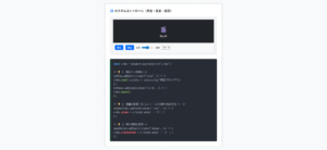
本記事では、おしゃれなボタンデザインのコードをご紹介します。
HTMLとCSSの両方をコピペすればすぐに利用できます。
コピペしたコードをカスタマイズし、自分好みにぜひ変更してみてください。
また、ここでは以下のボタンを種類別で記載しています。
- 線状のボタン
- 塗りつぶされたボタン
- アイコン付きのボタン
- アニメーションボタン
- ホバーで動くボタン
- クリックで動くボタン
- その他のおしゃれなボタン
- 高さ制限の折りたたみ式「続きを読む」ボタン
- 行数制限の折りたたみ式「続きを読む」ボタン
- 切り替え式のタブボタン(ラジオボタン)
- シンプルなトグルボタン(スイッチ式)
- 文字付きのトグルボタン(スイッチ式)
- ボタン型のラジオボタン(横並び)
- リスト型のラジオボタン(縦並び)
デザインと合わせて<button>タグの使い方を知りたい人は「【HTML】<button>タグの使い方:リンク・CSS装飾・無効化」を一読ください。
また、リンクタグ(aタグ)をボタンに変える方法を知りたい人は「【html&css】aタグ(リンク)の使い方とWebデザインによる装飾」を一読ください。
おしゃれなフリー素材デザイン集
本サイトでは、ボタン以外にも様々なHTML&CSSによるおしゃれな素材をご用意しています。
以下は、主なデザインカテゴリーです。
ぜひTOPページから「デザインギャラリー」を一読頂けますと幸いです。
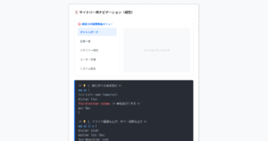
線状のボタン
ここでは、以下の線状のボタンデザイン例を記載しています。
- スタンダード
- 細い矢印
- 交差する枠線
- 平行四辺形
実際のデザインプレビューとHTML&CSSコードを記載しています。
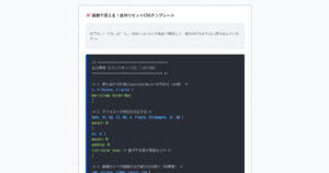
スタンダード
ボタンデザインHTMLコード表示
<a href="#" class="btn-line-01">ボタンデザイン</a>CSSコード表示
.btn-line-01 {
  display: flex;
  justify-content: center;
  align-items: center;
  width: 250px;
  margin: 0 auto 32px;
  padding: .9em 2em;
  position: relative;
  text-decoration: none;
  color: #2589d0;
  border: 1px solid #2589d0;
  background-color: #fff;
  transition: all 0.3s;
}

.btn-line-01:hover {
  color: #fff;
  background-color: #2589d0;
}

.btn-line-01::after {
  content: '';
  position: absolute;
  top: 50%;
  right: 15px;
  transform: translateY(-50%) rotate(45deg);
  width: 6px;
  height: 6px;
  border-top: 2px solid #2589d0;
  border-right: 2px solid #2589d0;
  transition: all 0.3s;
}
.btn-line-01:hover::after {
  border-color: #fff;
  right: 10px;
}
細い矢印
ボタンデザインHTMLコード表示
<a href="#" class="btn-line-02">ボタンデザイン</a>CSSコード表示
.btn-line-02 {
  display: flex;
  justify-content: center;
  align-items: center;
  width: 250px;
  margin: 0 auto 32px;
  padding: .9em 2em;
  position: relative;
  text-decoration: none;
  color: #2589d0;
  border: 1px solid #2589d0;
  background-color: #fff;
  transition: all 0.3s;
}

.btn-line-02:hover {
  color: #fff;
  background-color: #2589d0;
}

.btn-line-02::before {
  content: '';
  position: absolute;
  top: 50%;
  right: 15px;
  width: 20px;
  height: 1px;
  background-color: #2589d0;
  transform: translateY(-50%);
  transition: all 0.3s;
}
.btn-line-02::after {
  content: '';
  position: absolute;
  top: 50%;
  right: 15px;
  width: 6px;
  height: 6px;
  border-top: 1px solid #2589d0;
  border-right: 1px solid #2589d0;
  transform: translateY(-50%) rotate(45deg);
  transition: all 0.3s;
}
.btn-line-02:hover::before {
  background-color: #fff;
  right: 10px;
}
.btn-line-02:hover::after {
  border-color: #fff;
  right: 10px;
}
交差する枠線
ボタンデザインHTMLコード表示
<a href="#" class="btn-line-03">ボタンデザイン</a>CSSコード表示
.btn-line-03 {
  display: flex;
  justify-content: center;
  align-items: center;
  width: 250px;
  margin: 0 auto 32px;
  position: relative;
  text-decoration: none;
  color: #2589d0;
  /* borderなし */
  padding: 12px 40px;
  transition: all 0.3s;
}

.btn-line-03:hover {
  color: #fff;
  background-color: #2589d0;
}

.btn-line-03::before {
  content: '';
  position: absolute;
  top: 0;
  left: 0;
  width: 100%;
  height: 100%;
  border-top: 1px solid #2589d0;
  border-bottom: 1px solid #2589d0;
  transform: scaleX(1.1);
}
.btn-line-03::after {
  content: '';
  position: absolute;
  top: 0;
  left: 0;
  width: 100%;
  height: 100%;
  border-left: 1px solid #2589d0;
  border-right: 1px solid #2589d0;
  transform: scaleY(1.3);
}
平行四辺形
ボタンデザインHTMLコード表示
<a href="#" class="btn-line-04"><span>ボタンデザイン</span></a>CSSコード表示
.btn-line-04 {
display: flex;
justify-content: center;
align-items: center;
width: 250px;
margin: 0 auto 32px;
position: relative;
text-decoration: none;
color: #2589d0;
border: 1px solid #2589d0;
background-color: #fff;
padding: .9em 2em;
transition: all 0.3s;
transform: skewX(-15deg);
text-align: center;
}
.btn-line-04 span {
display: inline-block;
transform: skewX(15deg);
.btn-line-04:hover {
color: #fff;
background-color: #2589d0;
}
.btn-line-04 span::after {
content: '';
display: inline-block;
margin-left: 10px;
width: 6px;
height: 6px;
border-top: 2px solid #2589d0;
border-right: 2px solid #2589d0;
transform: rotate(45deg);
transition: border-color 0.3s;
}
.btn-line-04:hover span::after {
border-color: #fff;
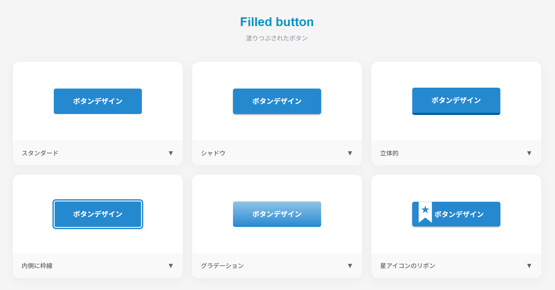
}塗りつぶされたボタン
ここでは、以下の塗りつぶされたボタンデザイン例を記載しています。
- スタンダード
- シャドウ
- 立体的
- 内側に枠線
- グラデーション
- 星アイコンのリボン付きボタン
実際のデザインプレビューとHTML&CSSコードを記載しています。
スタンダード
ボタンデザインHTMLコード表示
<a href="#" class="btn-filled-05">ボタンデザイン</a>CSSコード表示
.btn-filled-05 {
  display: flex;
  justify-content: center;
  align-items: center;
  width: 250px;
  margin: 0 auto 32px;
  padding: .9em 2em;
  border: none;
  border-radius: 5px;
  background-color: #2589d0;
  color: #fff;
  font-weight: 600;
  font-size: 1em;
}

.btn-filled-05:hover {
  background-color: #1175bc;
}
シャドウ
ボタンデザインHTMLコード表示
<a href="#" class="btn-filled-06">ボタンデザイン</a>CSSコード表示
.btn-filled-06 {
  display: flex;
  justify-content: center;
  align-items: center;
  width: 250px;
  margin: 0 auto 32px;
  padding: .9em 2em;
  border: none;
  border-radius: 5px;
  box-shadow: 0 2px 3px rgb(0 0 0 / 25%), 0 2px 3px -2px rgb(0 0 0 / 15%);
  background-color: #2589d0;
  color: #fff;
  font-weight: 600;
  font-size: 1em;
}

.btn-filled-06:hover {
  background-color: #1175bc;
}
立体的
ボタンデザインHTMLコード表示
<a href="#" class="btn-filled-07">ボタンデザイン</a>CSSコード表示
.btn-filled-07 {
  display: flex;
  justify-content: center;
  align-items: center;
  width: 250px;
  margin: 0 auto 32px;
  padding: .9em 2em;
  border: none;
  border-radius: 5px;
  border-bottom: solid 5px #0061a8;
  background-color: #2589d0;
  color: #fff;
  font-weight: 600;
  font-size: 1em;
  transition: .5s ease;
}

.btn-filled-07:hover {
  transform: translateY(3px);
  border-bottom-width: 2px;
}
内側に枠線
ボタンデザインHTMLコード表示
<a href="#" class="btn-filled-08">ボタンデザイン</a>CSSコード表示
.btn-filled-08 {
  display: flex;
  justify-content: center;
  align-items: center;
  width: 250px;
  margin: 0 auto 32px;
  padding: .9em 2em;
  border: none;
  border-radius: 5px;
  border: 2px solid #fff;
  box-shadow: 0 0 0 3px #2589d0;
  background-color: #2589d0;
  color: #fff;
  font-weight: 600;
  font-size: 1em;
}

.btn-filled-08:hover {
}
グラデーション
ボタンデザインHTMLコード表示
<a href="#" class="btn-filled-09">ボタンデザイン</a>CSSコード表示
.btn-filled-09 {
  display: flex;
  justify-content: center;
  align-items: center;
  width: 250px;
  margin: 0 auto 32px;
  padding: .9em 2em;
  border: none;
  border-radius: 5px;
  background-image: linear-gradient(0deg, #2589d0 0%, #5b99e9 100%);
  background-color: #2589d0;
  color: #fff;
  font-weight: 600;
  font-size: 1em;
}

.btn-filled-09:hover {
}
星アイコンのリボン付きボタン
ボタンデザインHTMLコード表示
<a href="#" class="btn-filled-10">ボタンデザイン</a>CSSコード表示
.btn-filled-10 {
  display: flex;
  justify-content: center;
  align-items: center;
  width: 250px;
  margin: 0 auto 32px;
  padding: .9em 2em;
  border: none;
  border-radius: 5px;
  position: relative;
  padding: .9em 2em .8em 45px;
  box-shadow: 0 2px 3px rgb(0 0 0 / 30%), 0 2px 3px -2px rgb(0 0 0 / 20%);
  background-color: #2589d0;
  color: #fff;
  font-weight: 600;
  font-size: 1em;
  transition: transform .3s ease-in-out, box-shadow .3s ease-in-out;
}

.btn-filled-10:hover {
  transform: translateY(-1px);
  box-shadow: 0 15px 30px -5px rgb(0 0 0 / 20%), 0 0 5px rgb(0 0 0 / 10%);
}

.btn-filled-10::before {
  position: absolute;
  top: 0;
  left: 15px;
  width: 30px;
  height: 85%;
  background-color: #fff;
  clip-path: polygon(0 0, 0 100%, 50% 75%, 100% 100%, 100% 0);
  content: '';
}

.btn-filled-10::after {
  position: absolute;
  top: 33%;
  left: 30px;
  transform: translate(-50%, -50%);
  color: #2589d0;
  font-size: 1.2em;
  content: '★';
}
アイコン付きのボタン
ここでは、以下のアイコン付きのボタンデザイン例を記載しています。
- ページ上部へ戻る
- 通知ボタン
- プラスアイコン
- 外部リンクアイコン
- メールアイコン
- お気に入り
実際のデザインプレビューとHTML&CSSコードを記載しています。
ページ上部へ戻る
HTMLコード表示
<button class="btn-icon-top"><svg viewBox="0 0 24 24" width="24" height="24"><path d="M12 4l-8 8h6v8h4v-8h6z"></path></svg></button>CSSコード表示
.btn-icon-top {
  display: flex;
  justify-content: center;
  align-items: center;
  margin: 0 auto 32px;
  border: none;
  cursor: pointer;
  width: 50px;
  height: 50px;
  border-radius: 50%;
  background-color: #2589d0;
}
.btn-icon-top svg { fill: #fff; transition: fill 0.3s; }
.btn-icon-top:hover { border: 1px solid #2589d0; background-color: #fff; }
.btn-icon-top:hover svg { fill: #2589d0; }
通知ボタン
HTMLコード表示
<button class="btn-icon-bell"><svg viewBox="0 0 24 24" width="25" height="25"><path d="M12 22c1.1 0 2-.9 2-2h-4c0 1.1.9 2 2 2zm6-6v-5c0-3.07-1.63-5.64-4.5-6.32V4c0-.83-.67-1.5-1.5-1.5s-1.5.67-1.5 1.5v.68C7.64 5.36 6 7.92 6 11v5l-2 2v1h16v-1l-2-2zm-2 1H8v-6c0-2.48 1.51-4.5 4-4.5s4 2.02 4 4.5v6z"></path></svg><span>2</span></button>CSSコード表示
.btn-icon-bell {
  display: flex;
  justify-content: center;
  align-items: center;
  margin: 0 auto 32px;
  border: none;
  cursor: pointer;
  position: relative;
  width: 44px;
  height: 44px;
  border-radius: 50%;
  background-color: #f2f2f2;
}
.btn-icon-bell svg { width: 25px; height: 25px; fill: #aaaaaa; }
.btn-icon-bell span {
  display: flex;
  justify-content: center;
  align-items: center;
  position: absolute;
  top: -15%;
  right: -15%;
  width: 20px;
  height: 20px;
  border-radius: 50%;
  background-color: #2589d0;
  color: #fff;
  font-size: .9em;
}
プラスアイコン
HTMLコード表示
<button class="btn-icon-plus">ボタンデザイン</button>CSSコード表示
.btn-icon-plus {
  display: flex;
  justify-content: center;
  align-items: center;
  border: none;
  cursor: pointer;
  padding: .9em 3em .9em 1.5em;
  width: 250px;
  margin: 0 auto 32px;
  border-radius: 5px;
  background-color: #2589d0;
  color: #fff;
  font-weight: 600;
  font-size: 1em;
  white-space: nowrap;
  position: relative;
  background-image: url("data:image/svg+xml,%3Csvg xmlns='http://www.w3.org/2000/svg' viewBox='0 0 28 28'%3E%3Ccircle cx='14' cy='14' r='14' style='fill:%23fff;'/%3E%3C/svg%3E");
  background-size: 1.2em;
  background-repeat: no-repeat;
  background-position: right 1.5em center;
}
.btn-icon-plus::before,
.btn-icon-plus::after {
  content: '';
  position: absolute;
  width: 3px;
  height: 10px;
  background-color: #2589d0;
  border-radius: 1px;
  right: calc(1.5em + 0.6em - 1.5px);
  top: 50%;
  transform: translateY(-50%);
}
.btn-icon-plus::before { transform: translateY(-50%) rotate(90deg); }
.btn-icon-plus:hover { background-color: #1175bc; }
外部リンクアイコン
HTMLコード表示
<button class="btn-icon-external">ボタンデザイン</button>CSSコード表示
.btn-icon-external {
  display: flex;
  justify-content: center;
  align-items: center;
  border: none;
  cursor: pointer;
  padding: .9em 2em;
  width: 250px;
  margin: 0 auto 32px;
  border-radius: 5px;
  background-color: #2589d0;
  color: #fff;
  font-weight: 600;
  font-size: 1em;
  white-space: nowrap;
}
.btn-icon-external::after {
  content: '';
  width: 1.25em;
  height: 1.25em;
  margin-left: 8px;
  background-image: url("data:image/svg+xml;charset=utf8,%3Csvg xmlns='http://www.w3.org/2000/svg' viewBox='0 0 24 24'%3E%3Cpath d='M10 6V8H5V19H16V14H18V20C18 20.5523 17.5523 21 17 21H4C3.44772 21 3 20.5523 3 20V7C3 6.44772 3.44772 6 4 6H10ZM21 3V11H19L18.9999 6.413L11.2071 14.2071L9.79289 12.7929L17.5849 5H13V3H21Z' fill='%23fff'%3E%3C/path%3E%3C/svg%3E");
  background-repeat: no-repeat;
  background-size: contain;
}
.btn-icon-external:hover { background-color: #1175bc; }
メールアイコン
HTMLコード表示
<button class="btn-icon-mail">ボタンデザイン</button>CSSコード表示
.btn-icon-mail {
  display: flex;
  justify-content: center;
  align-items: center;
  border: none;
  cursor: pointer;
  padding: .9em 2em;
  width: 250px;
  margin: 0 auto 32px;
  border-radius: 5px;
  background-color: #2589d0;
  color: #fff;
  font-weight: 600;
  font-size: 1em;
  white-space: nowrap;
}
.btn-icon-mail::after {
  content: '';
  width: 1.25em;
  height: 1.25em;
  margin-left: 8px;
  background-image: url("data:image/svg+xml;charset=utf8,%3Csvg xmlns='http://www.w3.org/2000/svg' viewBox='0 0 24 24'%3E%3Cpath d='M3 3H21C21.5523 3 22 3.44772 22 4V20C22 20.5523 21.5523 21 21 21H3C2.44772 21 2 20.5523 2 20V4C2 3.44772 2.44772 3 3 3ZM12.0606 11.6829L5.64722 6.2377L4.35278 7.7623L12.0731 14.3171L19.6544 7.75616L18.3456 6.24384L12.0606 11.6829Z' fill='%23fff'%3E%3C/path%3E%3C/svg%3E");
  background-repeat: no-repeat;
  background-size: contain;
}
.btn-icon-mail:hover { background-color: #1175bc; }
お気に入り
HTMLコード表示
<button class="btn-icon-heart">ボタンデザイン</button>CSSコード表示
.btn-icon-heart {
  display: flex;
  justify-content: center;
  align-items: center;
  border: none;
  cursor: pointer;
  padding: .9em 2em;
  width: 250px;
  margin: 0 auto 32px;
  border-radius: 5px;
  background-color: #fff;
  border: 1px solid #f1443e;
  color: #f1443e;
  font-weight: 600;
  font-size: 1em;
  white-space: nowrap;
}
.btn-icon-heart::after {
  content: '';
  width: 1.25em;
  height: 1.25em;
  margin-left: 8px;
  background-image: url("data:image/svg+xml;charset=utf8,%3Csvg xmlns='http://www.w3.org/2000/svg' viewBox='0 0 24 24'%3E%3Cpath d='M12.001 4.52853C14.35 2.42 17.98 2.49 20.2426 4.75736C22.5053 7.02472 22.583 10.637 20.4786 12.993L11.9999 21.485L3.52138 12.993C1.41705 10.637 1.49571 7.01901 3.75736 4.75736C6.02157 2.49315 9.64519 2.41687 12.001 4.52853ZM18.827 6.1701C17.3279 4.66794 14.9076 4.60701 13.337 6.01687L12.0019 7.21524L10.6661 6.01781C9.09098 4.60597 6.67506 4.66808 5.17157 6.17157C3.68183 7.66131 3.60704 10.0473 4.97993 11.6232L11.9999 18.6543L19.0201 11.6232C20.3935 10.0467 20.319 7.66525 18.827 6.1701Z' fill='%23f1443e'%3E%3C/path%3E%3C/svg%3E");
  background-repeat: no-repeat;
  background-size: contain;
  transition: filter 0.3s;
}
.btn-icon-heart:hover { background-color: #f1443e; color: #fff; }
.btn-icon-heart:hover::after { filter: brightness(0) invert(1); }
アニメーションボタン
ここでは、以下のアニメーションボタンのデザイン例を記載しています。
- 通り抜ける光
- 輝き
実際のデザインプレビューとHTML&CSSコードを記載しています。
通り抜ける光
ボタンデザインHTMLコード表示
<a href="#" class="btn-anim-17">ボタンデザイン</a>CSSコード表示
.btn-anim-17 {
  display: flex;
  justify-content: center;
  align-items: center;
  position: relative;
  width: 250px;
  margin: 0 auto 32px;
  padding: 1em 2em;
  border: none;
  border-radius: 5px;
  background-color: #2589d0;
  color: #fff;
  font-weight: 600;
  font-size: 1em;
  text-decoration: none;
  overflow: hidden;
}

.btn-anim-17::before {
  display: block;
  position: absolute;
  top: -50%;
  left: -100%;
  transform: rotate(30deg);
  width: 70px;
  height: 100px;
  content: '';
  background-image: linear-gradient(to right, rgba(255, 255, 255, 0) 0%, rgba(255, 255, 255, 1) 50%, rgba(255, 255, 255, 0) 100%);
  animation: btn-anim-17-anim 2.5s infinite linear;
}

@keyframes btn-anim-17-anim {
  0% { left: -100%; }
  20% { left: 200%; }
  100% { left: 200%; }
}

.btn-anim-17:hover {
  background-color: #1175bc;
}
輝き
ボタンデザインHTMLコード表示
<a href="#" class="btn-anim-18">ボタンデザイン</a>CSSコード表示
.btn-anim-18 {
  display: flex;
  justify-content: center;
  align-items: center;
  position: relative;
  width: 250px;
  margin: 0 auto 32px;
  padding: 1em 2em;
  border: none;
  border-radius: 5px;
  background-color: #2589d0;
  color: #fff;
  font-weight: 600;
  font-size: 1em;
  text-decoration: none;
  animation: btn-anim-18-bright 1.4s ease-out infinite;
}

.btn-anim-18::before,
.btn-anim-18::after {
  position: absolute;
  top: -1.5em;
  right: -1.5em;
  width: 3em;
  height: 3em;
  content: '';
}

.btn-anim-18::before {
  border: 1px solid rgba(255,255,255,0.2);
  border-radius: 50%;
  animation: btn-anim-18-circle 1.4s linear infinite;
}

.btn-anim-18::after {
  background: url('data:image/svg+xml;charset=utf8,%3Csvg%20xmlns%3D%22http%3A%2F%2Fwww.w3.org%2F2000%2Fsvg%22%20viewBox%3D%220%200%20190%20247%22%3E%3Cpath%20d%3D%22M190%2C123.5c-90%2C3.6-92.2%2C6.5-95%2C123.5-2.8-117-5-119.9-95-123.5%2C90-3.6%2C92.2-6.5%2C95-123.5%2C2.8%2C117%2C5%2C119.9%2C95%2C123.5Z%22%20fill%3D%22%23fff%22%2F%3E%3C%2Fsvg%3E') no-repeat center;
  background-size: contain;
  animation: btn-anim-18-star 1.4s linear infinite;
  opacity: 0.8;
}

@keyframes btn-anim-18-bright { 75% { filter: unset; } 80% { filter: brightness(1.1); } }
@keyframes btn-anim-18-circle { 0% { opacity:0; transform:scale(0); } 75% { opacity:0; } 80% { opacity:1; transform:scale(1); } 100% { opacity:0; transform:scale(1.5); } }
@keyframes btn-anim-18-star { 0% { opacity:0; transform:scale(0); } 75% { opacity:0; transform:scale(0); } 80% { opacity:1; } 85% { opacity:1; transform:scale(1.5) rotate(50deg); } 95% { opacity:0; transform:scale(4) rotate(150deg); } 100% { opacity:0; transform:scale(0) rotate(80deg); } }

.btn-anim-18:hover {
  background-color: #1175bc;
}
ホバーで動くボタン
ここでは、以下のホバーで動くボタンのデザイン例を記載しています。
- 伸びる下線
- 色が反転
- 横にスライド
- 狭まりながら塗りつぶす
- 対角線上に広がる
- 波紋
- 枠線を描画
- バウンド
- 震える
実際のデザインプレビューとHTML&CSSコードを記載しています。
伸びる下線
ボタンデザインHTMLコード表示
<a href="#" class="btn-hover-19"><span>ボタンデザイン</span></a>CSSコード表示
.btn-hover-19 {
  display: flex;
  justify-content: center;
  align-items: center;
  position: relative;
  width: 250px;
  margin: 0 auto 32px;
  padding: .9em 2em;
  font-weight: 600;
  text-decoration: none;
  transition: all 0.3s ease;
  z-index: 1;
  border-radius: 5px;
}

.btn-hover-19 span {
  position: relative;
  z-index: 2;
}

.btn-hover-19 {
  border-bottom: 2px solid #e6edf3;
  background-color: transparent;
  color: #333;
}

.btn-hover-19::after {
  position: absolute;
  bottom: -2px;
  left: 0;
  transform: scaleX(0);
  transform-origin: center left;
  width: 100%;
  height: 2px;
  background-color: #2589d0;
  content: '';
  transition: transform 0.3s ease;
}

.btn-hover-19:hover::after {
  transform: scaleX(1);
}
色が反転
ボタンデザインHTMLコード表示
<a href="#" class="btn-hover-20"><span>ボタンデザイン</span></a>CSSコード表示
.btn-hover-20 {
  display: flex;
  justify-content: center;
  align-items: center;
  position: relative;
  width: 250px;
  margin: 0 auto 32px;
  padding: .9em 2em;
  font-weight: 600;
  text-decoration: none;
  transition: all 0.3s ease;
  z-index: 1;
  border-radius: 5px;
}

.btn-hover-20 span {
  position: relative;
  z-index: 2;
}

.btn-hover-20 {
  border: 1px solid #2589d0;
  background-color: #fff;
  color: #2589d0;
}

.btn-hover-20:hover {
  background-color: #2589d0;
  color: #fff;
}
横にスライド
ボタンデザインHTMLコード表示
<a href="#" class="btn-hover-21"><span>ボタンデザイン</span></a>CSSコード表示
.btn-hover-21 {
  display: flex;
  justify-content: center;
  align-items: center;
  position: relative;
  width: 250px;
  margin: 0 auto 32px;
  padding: .9em 2em;
  font-weight: 600;
  text-decoration: none;
  transition: all 0.3s ease;
  z-index: 1;
  border-radius: 5px;
}

.btn-hover-21 span {
  position: relative;
  z-index: 2;
}

.btn-hover-21 {
  border: 1px solid #2589d0;
  background-color: #fff;
  color: #2589d0;
  overflow: hidden;
}

.btn-hover-21:hover {
  color: #fff;
}

.btn-hover-21::before {
  position: absolute;
  top: 0;
  left: 0;
  z-index: 1;
  width: 0;
  height: 100%;
  background-color: #2589d0;
  content: '';
  transition: width 0.3s ease;
}

.btn-hover-21:hover::before {
  width: 100%;
}
狭まりながら塗りつぶす
ボタンデザインHTMLコード表示
<a href="#" class="btn-hover-22"><span>ボタンデザイン</span></a>CSSコード表示
.btn-hover-22 {
  display: flex;
  justify-content: center;
  align-items: center;
  position: relative;
  width: 250px;
  margin: 0 auto 32px;
  padding: .9em 2em;
  font-weight: 600;
  text-decoration: none;
  transition: all 0.3s ease;
  z-index: 1;
  border-radius: 5px;
}

.btn-hover-22 span {
  position: relative;
  z-index: 2;
}

.btn-hover-22 {
  border: 1px solid #2589d0;
  background-color: #fff;
  color: #2589d0;
  transition: box-shadow 0.3s ease;
}

.btn-hover-22:hover {
  box-shadow: inset #2589d0 0 0 0 2em;
  color: #fff;
}
対角線上に広がる
ボタンデザインHTMLコード表示
<a href="#" class="btn-hover-23"><span>ボタンデザイン</span></a>CSSコード表示
.btn-hover-23 {
  display: flex;
  justify-content: center;
  align-items: center;
  position: relative;
  width: 250px;
  margin: 0 auto 32px;
  padding: .9em 2em;
  font-weight: 600;
  text-decoration: none;
  transition: all 0.3s ease;
  z-index: 1;
  border-radius: 5px;
}

.btn-hover-23 span {
  position: relative;
  z-index: 2;
}

.btn-hover-23 {
  border: 1px solid #2589d0;
  background-color: #fff;
  color: #2589d0;
  overflow: hidden;
}

.btn-hover-23:hover {
  color: #fff;
}

.btn-hover-23::before {
  position: absolute;
  z-index: 1;
  transform: rotate(-30deg);
  width: 100%;
  height: 0;
  background-color: #2589d0;
  content: '';
  transition: height 0.3s ease;
  top: 50%; left: 0; transform-origin: center;
}
波紋
ボタンデザインHTMLコード表示
<a href="#" class="btn-hover-24"><span>ボタンデザイン</span></a>CSSコード表示
.btn-hover-24 {
  display: flex;
  justify-content: center;
  align-items: center;
  position: relative;
  width: 250px;
  margin: 0 auto 32px;
  padding: .9em 2em;
  font-weight: 600;
  text-decoration: none;
  transition: all 0.3s ease;
  z-index: 1;
  border-radius: 5px;
}

.btn-hover-24 span {
  position: relative;
  z-index: 2;
}

.btn-hover-24 {
  border: 1px solid #2589d0;
  background-color: #fff;
  color: #2589d0;
}

.btn-hover-24:hover {
  animation: btn-hover-24-anim 1s;
}

@keyframes btn-hover-24-anim {
  0% { box-shadow: 0 0 0 0 #2589d080; }
  100% { box-shadow: 0 0 0 1.2em rgba(0,0,0,0); }
}
枠線を描画
ボタンデザインHTMLコード表示
<a href="#" class="btn-hover-25"><span>ボタンデザイン</span></a>CSSコード表示
.btn-hover-25 {
  display: flex;
  justify-content: center;
  align-items: center;
  position: relative;
  width: 250px;
  margin: 0 auto 32px;
  padding: .9em 2em;
  font-weight: 600;
  text-decoration: none;
  transition: all 0.3s ease;
  z-index: 1;
  border-radius: 5px;
}

.btn-hover-25 span {
  position: relative;
  z-index: 2;
}

.btn-hover-25 {
  color: #2589d0;
  border: none;
}

.btn-hover-25::before, .btn-hover-25::after {
  position: absolute;
  z-index: -1;
  width: 0;
  height: 1px;
  content: '';
  background: #2589d0;
}

.btn-hover-25::before {
  top: 0;
  left: 0;
}

.btn-hover-25::after {
  bottom: 0;
  right: 0;
}

.btn-hover-25:hover::before, .btn-hover-25:hover::after {
  width: 100%;
  transition: width 0.3s ease;
}
バウンド
ボタンデザインHTMLコード表示
<a href="#" class="btn-hover-26"><span>ボタンデザイン</span></a>CSSコード表示
.btn-hover-26 {
  display: flex;
  justify-content: center;
  align-items: center;
  position: relative;
  width: 250px;
  margin: 0 auto 32px;
  padding: .9em 2em;
  font-weight: 600;
  text-decoration: none;
  transition: all 0.3s ease;
  z-index: 1;
  border-radius: 5px;
}

.btn-hover-26 span {
  position: relative;
  z-index: 2;
}

.btn-hover-26 {
  background-color: #2589d0;
  color: #fff;
  border: none;
}

.btn-hover-26:hover {
  animation: btn-hover-26-anim 2s linear infinite;
}

@keyframes btn-hover-26-anim {
  7% { transform: translateY(-10px); }
  15% { transform: translateY(0); }
  20% { transform: translateY(-5px); }
  25% { transform: translateY(0); }
}
震える
ボタンデザインHTMLコード表示
<a href="#" class="btn-hover-27"><span>ボタンデザイン</span></a>CSSコード表示
.btn-hover-27 {
  display: flex;
  justify-content: center;
  align-items: center;
  position: relative;
  width: 250px;
  margin: 0 auto 32px;
  padding: .9em 2em;
  font-weight: 600;
  text-decoration: none;
  transition: all 0.3s ease;
  z-index: 1;
  border-radius: 5px;
}

.btn-hover-27 span {
  position: relative;
  z-index: 2;
}

.btn-hover-27 {
  background-color: #2589d0;
  color: #fff;
  border: none;
}

.btn-hover-27:hover {
  animation: btn-hover-27-anim .3s linear infinite;
}

@keyframes btn-hover-27-anim {
  20% { transform: translate(-2px, 2px); }
  40% { transform: translate(-2px, -2px); }
  60% { transform: translate(2px, 2px); }
  80% { transform: translate(2px, -2px); }
}
クリックで動くボタン
ここでは、以下のクリックで動くボタンのデザイン例を記載しています。
- ローディング
実際のデザインプレビューとHTML&CSSコードを記載しています。
ローディング
HTMLコード表示
<button class="btn-click-37">ボタンデザイン</button>CSSコード表示
.btn-click-37 {
  display: flex;
  justify-content: center;
  align-items: center;
  position: relative;
  width: 250px;
  margin: 0 auto 32px;
  padding: .9em 2em;
  border: 1px solid #2589d0;
  border-radius: 5px;
  background-color: #fff;
  color: #2589d0;
  font-size: 1em;
  cursor: pointer;
}

.btn-click-37:focus {
  color: transparent;
}

.btn-click-37:focus::before {
  display: flex;
  justify-content: center;
  align-items: center;
  position: absolute;
  width: 100%;
  height: 100%;
  background: url('data:image/svg+xml;charset=utf8,%3Csvg%20xmlns%3D%22http%3A%2F%2Fwww.w3.org%2F2000%2Fsvg%22%20viewBox%3D%220%200%2032%2032%22%20width%3D%2248%22%20height%3D%2248%22%20fill%3D%22%232589d0%22%3E%20%3Cpath%20d%3D%22M14%200%20H18%20V8%20H14%20z%22%20transform%3D%22rotate(0%2016%2016)%22%20opacity%3D%22.1%22%3E%20%3Canimate%20attributeName%3D%22opacity%22%20from%3D%221%22%20to%3D%22.1%22%20begin%3D%220%22%20dur%3D%221s%22%20repeatCount%3D%22indefinite%22%2F%3E%20%3C%2Fpath%3E%20%3Cpath%20d%3D%22M14%200%20H18%20V8%20H14%20z%22%20transform%3D%22rotate(45%2016%2016)%22%20opacity%3D%22.1%22%3E%20%3Canimate%20attributeName%3D%22opacity%22%20from%3D%221%22%20to%3D%22.1%22%20begin%3D%220.125s%22%20dur%3D%221s%22%20repeatCount%3D%22indefinite%22%2F%3E%20%3C%2Fpath%3E%20%3Cpath%20d%3D%22M14%200%20H18%20V8%20H14%20z%22%20transform%3D%22rotate(90%2016%2016)%22%20opacity%3D%22.1%22%3E%20%3Canimate%20attributeName%3D%22opacity%22%20from%3D%221%22%20to%3D%22.1%22%20begin%3D%220.25s%22%20dur%3D%221s%22%20repeatCount%3D%22indefinite%22%2F%3E%20%3C%2Fpath%3E%20%3Cpath%20d%3D%22M14%200%20H18%20V8%20H14%20z%22%20transform%3D%22rotate(135%2016%2016)%22%20opacity%3D%22.1%22%3E%20%3Canimate%20attributeName%3D%22opacity%22%20from%3D%221%22%20to%3D%22.1%22%20begin%3D%220.375s%22%20dur%3D%221s%22%20repeatCount%3D%22indefinite%22%2F%3E%20%3C%2Fpath%3E%20%3Cpath%20d%3D%22M14%200%20H18%20V8%20H14%20z%22%20transform%3D%22rotate(180%2016%2016)%22%20opacity%3D%22.1%22%3E%20%3Canimate%20attributeName%3D%22opacity%22%20from%3D%221%22%20to%3D%22.1%22%20begin%3D%220.5s%22%20dur%3D%221s%22%20repeatCount%3D%22indefinite%22%2F%3E%20%3C%2Fpath%3E%20%3Cpath%20d%3D%22M14%200%20H18%20V8%20H14%20z%22%20transform%3D%22rotate(225%2016%2016)%22%20opacity%3D%22.1%22%3E%20%3Canimate%20attributeName%3D%22opacity%22%20from%3D%221%22%20to%3D%22.1%22%20begin%3D%220.625s%22%20dur%3D%221s%22%20repeatCount%3D%22indefinite%22%2F%3E%20%3C%2Fpath%3E%20%3Cpath%20d%3D%22M14%200%20H18%20V8%20H14%20z%22%20transform%3D%22rotate(270%2016%2016)%22%20opacity%3D%22.1%22%3E%20%3Canimate%20attributeName%3D%22opacity%22%20from%3D%221%22%20to%3D%22.1%22%20begin%3D%220.75s%22%20dur%3D%221s%22%20repeatCount%3D%22indefinite%22%2F%3E%20%3C%2Fpath%3E%20%3Cpath%20d%3D%22M14%200%20H18%20V8%20H14%20z%22%20transform%3D%22rotate(315%2016%2016)%22%20opacity%3D%22.1%22%3E%20%3Canimate%20attributeName%3D%22opacity%22%20from%3D%221%22%20to%3D%22.1%22%20begin%3D%220.875s%22%20dur%3D%221s%22%20repeatCount%3D%22indefinite%22%2F%3E%20%3C%2Fpath%3E%3C%2Fsvg%3E') no-repeat center / 1.7em;
  content: '';
}
その他のおしゃれなボタン
ここでは、その他のおしゃれなボタンのデザイン例を記載しています。
- ストライプ背景&枠線
- 白背景&シャドウ
- ニューモーフィズム風
- コントラスト強め
- クラシカル
- リアルな円形
- 凸凹感強め
実際のデザインプレビューとHTML&CSSコードを記載しています。
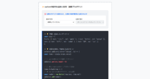
ストライプ背景&枠線
HTMLコード表示
<button class="btn-other-stripe">ボタンデザイン</button>CSSコード表示
.btn-other-stripe {
  display: flex;
  justify-content: center;
  align-items: center;
  width: 250px;
  margin: 0 auto 32px;
  padding: .9em 2em;
  border-radius: 5px;
  border: 1px solid #333333;
  background-image: repeating-linear-gradient(-45deg, #eee, #eee 1px, #ffffff 1px, #ffffff 4px);
  color: #333333;
  font-weight: 600;
  transition: box-shadow .3s;
}

.btn-other-stripe:hover {
  box-shadow: 0 7px 30px -5px rgba(0, 0, 0, 0.2);
}
白背景&シャドウ
HTMLコード表示
<button class="btn-other-white-shadow">ボタンデザイン</button>CSSコード表示
.btn-other-white-shadow {
  display: flex;
  justify-content: center;
  align-items: center;
  width: 250px;
  margin: 0 auto 32px;
  padding: .9em 2em;
  border-radius: 5px;
  position: relative;
  border: none;
  box-shadow: 0 7px 10px rgba(0, 0, 0, 0.1);
  background-color: #fff;
  color: #333333;
  transition: transform .3s, box-shadow .3s;
}

.btn-other-white-shadow:hover {
  transform: translateY(-2px);
  box-shadow: 0 7px 10px rgba(0, 0, 0, 0.15);
}
ニューモーフィズム風
HTMLコード表示
<button class="btn-other-neumorphism">ボタンデザイン</button>CSSコード表示
.btn-other-neumorphism {
  display: flex;
  justify-content: center;
  align-items: center;
  width: 250px;
  margin: 0 auto 32px;
  padding: .9em 2em;
  border-radius: 5px;
  border: 1px solid #e7e7e7;
  box-shadow: 6px 6px 12px #c5c5c5, -6px -6px 12px #fff;
  background-color: #e7e7e7;
  color: #555555;
  font-weight: 600;
}

.btn-other-neumorphism:hover {
  box-shadow: inset 4px 4px 12px #c5c5c5, inset -4px -4px 12px #fff;
}
コントラスト強め
HTMLコード表示
<button class="btn-other-contrast"><span>ボタンデザイン ></span></button>CSSコード表示
.btn-click-37 {
  display: flex;
  justify-content: center;
  align-items: center;
  position: relative;
  width: 250px;
  margin: 0 auto 32px;
  padding: .9em 2em;
  border: 1px solid #2589d0;
  border-radius: 5px;
  background-color: #fff;
  color: #2589d0;
  font-size: 1em;
  cursor: pointer;
}

.btn-click-37:focus {
  color: transparent;
}

.btn-click-37:focus::before {
  display: flex;
  justify-content: center;
  align-items: center;
  position: absolute;
  width: 100%;
  height: 100%;
  background: url('data:image/svg+xml;charset=utf8,%3Csvg%20xmlns%3D%22http%3A%2F%2Fwww.w3.org%2F2000%2Fsvg%22%20viewBox%3D%220%200%2032%2032%22%20width%3D%2248%22%20height%3D%2248%22%20fill%3D%22%232589d0%22%3E%20%3Cpath%20d%3D%22M14%200%20H18%20V8%20H14%20z%22%20transform%3D%22rotate(0%2016%2016)%22%20opacity%3D%22.1%22%3E%20%3Canimate%20attributeName%3D%22opacity%22%20from%3D%221%22%20to%3D%22.1%22%20begin%3D%220%22%20dur%3D%221s%22%20repeatCount%3D%22indefinite%22%2F%3E%20%3C%2Fpath%3E%20%3Cpath%20d%3D%22M14%200%20H18%20V8%20H14%20z%22%20transform%3D%22rotate(45%2016%2016)%22%20opacity%3D%22.1%22%3E%20%3Canimate%20attributeName%3D%22opacity%22%20from%3D%221%22%20to%3D%22.1%22%20begin%3D%220.125s%22%20dur%3D%221s%22%20repeatCount%3D%22indefinite%22%2F%3E%20%3C%2Fpath%3E%20%3Cpath%20d%3D%22M14%200%20H18%20V8%20H14%20z%22%20transform%3D%22rotate(90%2016%2016)%22%20opacity%3D%22.1%22%3E%20%3Canimate%20attributeName%3D%22opacity%22%20from%3D%221%22%20to%3D%22.1%22%20begin%3D%220.25s%22%20dur%3D%221s%22%20repeatCount%3D%22indefinite%22%2F%3E%20%3C%2Fpath%3E%20%3Cpath%20d%3D%22M14%200%20H18%20V8%20H14%20z%22%20transform%3D%22rotate(135%2016%2016)%22%20opacity%3D%22.1%22%3E%20%3Canimate%20attributeName%3D%22opacity%22%20from%3D%221%22%20to%3D%22.1%22%20begin%3D%220.375s%22%20dur%3D%221s%22%20repeatCount%3D%22indefinite%22%2F%3E%20%3C%2Fpath%3E%20%3Cpath%20d%3D%22M14%200%20H18%20V8%20H14%20z%22%20transform%3D%22rotate(180%2016%2016)%22%20opacity%3D%22.1%22%3E%20%3Canimate%20attributeName%3D%22opacity%22%20from%3D%221%22%20to%3D%22.1%22%20begin%3D%220.5s%22%20dur%3D%221s%22%20repeatCount%3D%22indefinite%22%2F%3E%20%3C%2Fpath%3E%20%3Cpath%20d%3D%22M14%200%20H18%20V8%20H14%20z%22%20transform%3D%22rotate(225%2016%2016)%22%20opacity%3D%22.1%22%3E%20%3Canimate%20attributeName%3D%22opacity%22%20from%3D%221%22%20to%3D%22.1%22%20begin%3D%220.625s%22%20dur%3D%221s%22%20repeatCount%3D%22indefinite%22%2F%3E%20%3C%2Fpath%3E%20%3Cpath%20d%3D%22M14%200%20H18%20V8%20H14%20z%22%20transform%3D%22rotate(270%2016%2016)%22%20opacity%3D%22.1%22%3E%20%3Canimate%20attributeName%3D%22opacity%22%20from%3D%221%22%20to%3D%22.1%22%20begin%3D%220.75s%22%20dur%3D%221s%22%20repeatCount%3D%22indefinite%22%2F%3E%20%3C%2Fpath%3E%20%3Cpath%20d%3D%22M14%200%20H18%20V8%20H14%20z%22%20transform%3D%22rotate(315%2016%2016)%22%20opacity%3D%22.1%22%3E%20%3Canimate%20attributeName%3D%22opacity%22%20from%3D%221%22%20to%3D%22.1%22%20begin%3D%220.875s%22%20dur%3D%221s%22%20repeatCount%3D%22indefinite%22%2F%3E%20%3C%2Fpath%3E%3C%2Fsvg%3E') no-repeat center / 1.7em;
  content: '';
}
クラシカル
HTMLコード表示
<button class="btn-other-classical">ボタンデザイン</button>CSSコード表示
.btn-other-classical {
  display: flex;
  justify-content: center;
  align-items: center;
  width: 150px;
  margin: 0 auto 32px;
  padding: .5em 1em;
  border-radius: 5px;
  border: none;
  box-shadow: inset -1px -1px #333, inset 1px 1px #fff, inset -2px -2px #999, inset 2px 2px #ffffff;
  background-color: #c0c0c0;
  color: #333;
  outline: 1px dotted #333;
  outline-offset: -4px;
}

.btn-other-classical:active {
  box-shadow: inset -1px -1px #fff, inset 1px 1px #333, inset -2px -2px #ffffff, inset 2px 2px #999;
}
リアルな円形
HTMLコード表示
<button class="btn-other-sphere">ボタン</button>CSSコード表示
.btn-other-sphere {
  display: flex;
  justify-content: center;
  align-items: center;
  width: 80px;
  height: 80px;
  margin: 0 auto 32px;
  border-radius: 50%;
  border: none;
  border-bottom: solid 2px #c0c0c0;
  box-shadow: inset 15px 30px 40px rgba(255, 255, 255, 0.5), 0 3px 7px rgba(0, 0, 0, .2);
  background-image: linear-gradient(#1579c0 0%, #000 100%);
  color: #ffffff;
  font-weight: 600;
  white-space: nowrap;
}
凸凹感強め
HTMLコード表示
<button class="btn-other-emboss"><span>ボタン</span></button>CSSコード表示
.btn-other-emboss {
  display: flex;
  justify-content: center;
  align-items: center;
  margin: 0 auto 32px;
  width: 80px;
  height: 80px;
  border-radius: 50%;
  padding: 8px;
  border: none;
  box-shadow: 0 10px 10px rgb(0 0 0 / 20%);
  background-image: linear-gradient(0, #ddd, #fff);
  color: #333333;
  font-weight: 600;
  transition: transform .3s, box-shadow .3s;
}

.btn-other-emboss:hover {
  transform: scale(.99);
  box-shadow: 0 5px 5px rgb(0 0 0 / 20%);
}

.btn-other-emboss span {
  display: flex; justify-content: center; align-items: center;
  width: 100%;
  height: 100%;
  border-radius: 50%;
  background-image: linear-gradient(0, #fff, #ddd);
}
高さ制限の折りたたみ式「続きを読む」ボタン
ここでは、以下の高さ制限の折りたたみ式「続きを読む」ボタンデザイン例を記載しています。
- リンク風
- ボタン風
実際のデザインプレビューとHTML&CSSコードを記載しています。
さらに、以下の項目も「続きを読む」ボタンページでは選択式でご用意しました。
- リンク色
- ホバー時のリンク色
- ボタン色
- ボタンの形状:四角, 角丸
ご興味があれば「「続きを読む」ボタン一覧ページ」を一読ください。
リンク風
「Code Stock」はWeb制作の「これが欲しい」を叶える、をテーマにHTML・CSSのデザインやパーツをご紹介するサイトです。 お好きなパーツを選び、デザインや色を調整するだけ。あとはHTMLやCSSをコピペすれば、コーディング要らずでサイトに取り入れることができます。 ちなみにどのコードにおいても、自由にご自身のWebサイトやブログで使用いただいて構いません。もちろんオリジナルにカスタマイズしてご使用いただいても大丈夫です。
HTMLコード表示
<div class="read-more-1">
  <p>
    「Code Stock」はWeb制作の「これが欲しい」を叶える、をテーマにHTML・CSSのデザインやパーツをご紹介するサイトです。
    お好きなパーツを選び、デザインや色を調整するだけ。あとはHTMLやCSSをコピペすれば、コーディング要らずでサイトに取り入れることができます。
    ちなみにどのコードにおいても、自由にご自身のWebサイトやブログで使用いただいて構いません。もちろんオリジナルにカスタマイズしてご使用いただいても大丈夫です。
  </p>
  <label>
    <input type="checkbox"/>
    ...続きを読む
  </label>
</div>
CSSコード表示
.read-more-1 {
  position: relative;
}

.read-more-1 p {
  position: relative;
  max-height: 100px; /* 開く前に見せたい高さを指定 */
  margin-bottom: 0;
  overflow: hidden;
  transition: max-height 1s;
}

.read-more-1:has(:checked) p {
  max-height: 100vh;
}

.read-more-1 p::after {
  display: block;
  position: absolute;
  left: 0;
  bottom: 0;
  width: 100%;
  height: 60px;
  background: linear-gradient(180deg, hsla(0, 0%, 100%, 0) 0, hsla(0, 0%, 100%, .9) 50%, hsla(0, 0%, 100%, .9) 0, #fff);
  content: '';
}

.read-more-1:has(:checked) p::after {
  content: none;
}

.read-more-1 label {
  display: flex;
  align-items: center;
  gap: 0 4px;
  position: absolute;
  bottom: 0;
  left: 50%;
  transform: translateX(-50%);
  color: #4f96f6;
  font-size: .8em;
}

.read-more-1 label:hover {
  color: #c7511f;
  text-decoration: underline;
  cursor: pointer;
}

.read-more-1:has(:checked) label {
  display: none;
}

.read-more-1 label::after {
  display: inline-block;
  width: 10px;
  height: 5px;
  background-color: #b6bdc3;
  clip-path: polygon(0 0, 100% 0, 50% 100%);
  content: '';
}

.read-more-1 input {
  display: none;
}
ボタン風
「Code Stock」はWeb制作の「これが欲しい」を叶える、をテーマにHTML・CSSのデザインやパーツをご紹介するサイトです。 お好きなパーツを選び、デザインや色を調整するだけ。あとはHTMLやCSSをコピペすれば、コーディング要らずでサイトに取り入れることができます。 ちなみにどのコードにおいても、自由にご自身のWebサイトやブログで使用いただいて構いません。もちろんオリジナルにカスタマイズしてご使用いただいても大丈夫です。
HTMLコード表示
<div class="read-more-2">
  <p>
    「Code Stock」はWeb制作の「これが欲しい」を叶える、をテーマにHTML・CSSのデザインやパーツをご紹介するサイトです。
    お好きなパーツを選び、デザインや色を調整するだけ。あとはHTMLやCSSをコピペすれば、コーディング要らずでサイトに取り入れることができます。
    ちなみにどのコードにおいても、自由にご自身のWebサイトやブログで使用いただいて構いません。もちろんオリジナルにカスタマイズしてご使用いただいても大丈夫です。
  </p>
  <label>
    <input type="checkbox"/>
    ...続きを読む
  </label>
</div>
CSSコード表示
.read-more-2 {
  position: relative;
}

.read-more-2 p {
  position: relative;
  max-height: 100px; /* 開く前に見せたい高さを指定 */
  margin-bottom: 10px;
  overflow: hidden;
  transition: max-height 1s;
}

.read-more-2:has(:checked) p {
  max-height: 100vh;
}

.read-more-2 p::after {
  display: block;
  position: absolute;
  left: 0;
  bottom: 0;
  width: 100%;
  height: 60px;
  background: linear-gradient(180deg, hsla(0, 0%, 100%, 0) 0, hsla(0, 0%, 100%, .9) 50%, hsla(0, 0%, 100%, .9) 0, #fff);
  content: '';
}

.read-more-2:has(:checked) p::after {
  content: none;
}

.read-more-2 label {
  display: flex;
  align-items: center;
  gap: 0 4px;
  position: absolute;
  bottom: 0;
  left: 50%;
  transform: translateX(-50%);
  padding: .4em 1.2em;
  border-radius: 1px;
  background-color: #2589d0;
  color: #fff;
  font-size: .7em;
}

.read-more-2 label:hover {
  border: 1px solid #2589d0;
  background-color: #fff;
  color: #2589d0;
  cursor: pointer;
}

.read-more-2:has(:checked) label {
  display: none;
}

.read-more-2 label::after {
  display: inline-block;
  width: 10px;
  height: 5px;
  background-color: #fff;
  clip-path: polygon(0 0, 100% 0, 50% 100%);
  content: '';
}

.read-more-2 label:hover::after {
  background-color: #2589d0;
}

.read-more-2 input {
  display: none;
}
行数制限の折りたたみ式「続きを読む」ボタン
ここでは、以下の行数制限の折りたたみ式「続きを読む」ボタンデザイン例を記載しています。
- リンク風
- ボタン風
実際のデザインプレビューとHTML&CSSコードを記載しています。
さらに、以下の項目も「続きを読む」ボタンページでは選択式でご用意しました。
- リンク色
- ホバー時のリンク色
- ボタン色
- ボタンの形状:四角, 角丸
ご興味があれば「「続きを読む」ボタン一覧ページ」を一読ください。
リンク風
「Code Stock」はWeb制作の「これが欲しい」を叶える、をテーマにHTML・CSSのデザインやパーツをご紹介するサイトです。 お好きなパーツを選び、デザインや色を調整するだけ。あとはHTMLやCSSをコピペすれば、コーディング要らずでサイトに取り入れることができます。 ちなみにどのコードにおいても、自由にご自身のWebサイトやブログで使用いただいて構いません。もちろんオリジナルにカスタマイズしてご使用いただいても大丈夫です。
HTMLコード表示
<div class="read-more-3">
  <p>
    「Code Stock」はWeb制作の「これが欲しい」を叶える、をテーマにHTML・CSSのデザインやパーツをご紹介するサイトです。
    お好きなパーツを選び、デザインや色を調整するだけ。あとはHTMLやCSSをコピペすれば、コーディング要らずでサイトに取り入れることができます。
    ちなみにどのコードにおいても、自由にご自身のWebサイトやブログで使用いただいて構いません。もちろんオリジナルにカスタマイズしてご使用いただいても大丈夫です。
  </p>
  <label>
    <input type="checkbox"/>
    ...続きを読む
  </label>
</div>
CSSコード表示
.read-more-3 {
  position: relative;
}

.read-more-3 p {
  display: -webkit-box;
  position: relative;
  margin-bottom: 0;
  overflow: hidden;
  -webkit-box-orient: vertical;
  -webkit-line-clamp: 2; /* 開く前に見せたい行数を指定 */
}

.read-more-3:has(:checked) p {
  display: block;
}

.read-more-3 p::after {
  display: block;
  position: absolute;
  left: 0;
  bottom: 0;
  width: 100%;
  height: 60px;
  background: linear-gradient(180deg, hsla(0, 0%, 100%, 0) 0, hsla(0, 0%, 100%, .9) 50%, hsla(0, 0%, 100%, .9) 0, #fff);
  content: '';
}

.read-more-3:has(:checked) p::after {
  content: none;
}

.read-more-3 label {
  display: flex;
  align-items: center;
  gap: 0 4px;
  position: absolute;
  bottom: 0;
  left: 50%;
  transform: translateX(-50%);
  color: #4f96f6;
  font-size: .8em;
}

.read-more-3 label:hover {
  color: #c7511f;
  text-decoration: underline;
  cursor: pointer;
}

.read-more-3:has(:checked) label {
  display: none;
}

.read-more-3 label::after {
  display: inline-block;
  width: 10px;
  height: 5px;
  background-color: #b6bdc3;
  clip-path: polygon(0 0, 100% 0, 50% 100%);
  content: '';
}

.read-more-3 input {
  display: none;
}
ボタン風
「Code Stock」はWeb制作の「これが欲しい」を叶える、をテーマにHTML・CSSのデザインやパーツをご紹介するサイトです。 お好きなパーツを選び、デザインや色を調整するだけ。あとはHTMLやCSSをコピペすれば、コーディング要らずでサイトに取り入れることができます。 ちなみにどのコードにおいても、自由にご自身のWebサイトやブログで使用いただいて構いません。もちろんオリジナルにカスタマイズしてご使用いただいても大丈夫です。
HTMLコード表示
<div class="read-more-4">
  <p>
    「Code Stock」はWeb制作の「これが欲しい」を叶える、をテーマにHTML・CSSのデザインやパーツをご紹介するサイトです。
    お好きなパーツを選び、デザインや色を調整するだけ。あとはHTMLやCSSをコピペすれば、コーディング要らずでサイトに取り入れることができます。
    ちなみにどのコードにおいても、自由にご自身のWebサイトやブログで使用いただいて構いません。もちろんオリジナルにカスタマイズしてご使用いただいても大丈夫です。
  </p>
  <label>
    <input type="checkbox"/>
    ...続きを読む
  </label>
</div>
CSSコード表示
.read-more-4 {
  position: relative;
}

.read-more-4 p {
  display: -webkit-box;
  position: relative;
  margin-bottom: 10px;
  overflow: hidden;
  -webkit-box-orient: vertical;
  -webkit-line-clamp: 4; /* 開く前に見せたい行数を指定 */
}

.read-more-4:has(:checked) p {
  display: block;
}

.read-more-4 p::after {
  display: block;
  position: absolute;
  left: 0;
  bottom: 0;
  width: 100%;
  height: 60px;
  background: linear-gradient(180deg, hsla(0, 0%, 100%, 0) 0, hsla(0, 0%, 100%, .9) 50%, hsla(0, 0%, 100%, .9) 0, #fff);
  content: '';
}

.read-more-4:has(:checked) p::after {
  content: none;
}

.read-more-4 label {
  display: flex;
  align-items: center;
  gap: 0 4px;
  position: absolute;
  bottom: 0;
  left: 50%;
  transform: translateX(-50%);
  padding: .4em 1.2em;
  border-radius: 1px;
  background-color: #2589d0;
  color: #fff;
  font-size: .7em;
}

.read-more-4 label:hover {
  border: 1px solid #2589d0;
  background-color: #fff;
  color: #2589d0;
  cursor: pointer;
}

.read-more-4:has(:checked) label {
  display: none;
}

.read-more-4 label::after {
  display: inline-block;
  width: 10px;
  height: 5px;
  background-color: #fff;
  clip-path: polygon(0 0, 100% 0, 50% 100%);
  content: '';
}

.read-more-4 label:hover::after {
  background-color: #2589d0;
}

.read-more-4 input {
  display: none;
}
切り替え式のタブ(ラジオボタン)
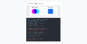
ここでは、以下の切り替え式のタブデザイン例を記載しています。
- シンプル
- 付箋風
- 下線あり
- 吹き出し風
実際のデザインプレビューとHTML&CSSコードを記載しています。
さらに、以下の項目もタブページでは選択式でご用意しました。
- タブの色
- タブ文字の太さ:細め, 太め
- 付箋の色
- 下線の色
- 背景の色
ご興味があれば「タブ一覧ページ」を一読ください。
シンプル
HTMLコード表示
<div class="tab-1">
  <label>
    <input type="radio" name="tab-1-group" checked>
    タブ1
  </label>
  <div>
    背景が単色のシンプルなタブです。
    タブの文言がはっきり見えるだけでなく、色を変えることでどんなサイトにも馴染みやすいのが特徴です。
  </div>

  <label>
    <input type="radio" name="tab-1-group">
    タブ2
  </label>
  <div>ぜひお好みの色にアレンジしてみてください。</div>

  <label>
    <input type="radio" name="tab-1-group">
    タブ3
  </label>
  <div>もちろんレスポンシブ対応で、タブの追加にも対応しています。</div>
</div>
CSSコード表示
.tab-1 {
  display: flex;
  margin: 0 auto 2em;
  flex-wrap: wrap;
  gap: 0 10px;
  max-width: 500px;
}

.tab-1 > label {
  flex: 1 1;
  order: -1;
  opacity: .5;
  min-width: 70px;
  padding: .6em 1em;
  border-radius: 5px 5px 0 0;
  background-color: #2589d0;
  color: #fff;
  font-size: .9em;
  text-align: center;
  cursor: pointer;
}

.tab-1 > label:hover {
  opacity: .8;
}

.tab-1 input {
  display: none;
}

.tab-1 > div {
  display: none;
  width: 100%;
  padding: 1.5em 1em;
  background-color: #fff;
}

.tab-1 label:has(:checked) {
  opacity: 1;
}

.tab-1 label:has(:checked) + div {
  display: block;
}
付箋風
HTMLコード表示
<div class="tab-2">
  <label>
    <input type="radio" name="tab-2-group" checked>
    タブ1
  </label>
  <div>
    上に枠線の付いたタブです。現在表示されているタブがどれなのか判別しやすいのが特徴。
    背景が白以外の箇所で利用するとよりおしゃれに見えます。
  </div>

  <label>
    <input type="radio" name="tab-2-group">
    タブ2
  </label>
  <div>ぜひお好みの色にアレンジしてみてください。</div>

  <label>
    <input type="radio" name="tab-2-group">
    タブ3
  </label>
  <div>もちろんレスポンシブ対応で、タブの追加にも対応しています。</div>
</div>
CSSコード表示
.tab-2 {
  display: flex;
  margin: 0 auto 2em;
  flex-wrap: wrap;
  max-width: 500px;
}

.tab-2 > label {
  flex: 1 1;
  order: -1;
  min-width: 70px;
  padding: .7em 1em .5em;
  border-bottom: 1px solid #f0f0f0;
  border-radius: 0;
  background-color: #e9f0f6;
  color: #535353;
  font-size: .9em;
  text-align: center;
  cursor: pointer;
}

.tab-2 > label:hover {
  opacity: .8;
}

.tab-2 input {
  display: none;
}

.tab-2 > div {
  display: none;
  width: 100%;
  padding: 1.5em 1em;
  background-color: #fff;
}

.tab-2 label:has(:checked) {
  background-color: #fff;
  border-color: #2589d0 #f0f0f0 #fff;
  border-style: solid;
  border-width: 4px 1px 1px;
  border-radius: 5px;
  color: #333333;
}

.tab-2 label:has(:checked) + div {
  display: block;
}
下線あり
HTMLコード表示
<div class="tab-3">
  <label>
    <input type="radio" name="tab-3-group" checked>
    タブ1
  </label>
  <div>
    アクティブになると下線が付くタブです。アクティブ時の文字色と下線の色は揃えるのがおすすめです。
  </div>

  <label>
    <input type="radio" name="tab-3-group">
    タブ2
  </label>
  <div>ぜひお好みの色にアレンジしてみてください。</div>

  <label>
    <input type="radio" name="tab-3-group">
    タブ3
  </label>
  <div>もちろんレスポンシブ対応で、タブの追加にも対応しています。</div>
</div>
CSSコード表示
.tab-3 {
  display: flex;
  margin: 0 auto 2em;
  flex-wrap: wrap;
  max-width: 500px;
}

.tab-3 > label {
  flex: 1 1;
  order: -1;
  min-width: 70px;
  padding: .7em 1em .5em;
  background-color: #f2f2f2;
  color: #999;
  font-size: .9em;
  text-align: center;
  cursor: pointer;
}

.tab-3 > label:hover {
  opacity: .8;
}

.tab-3 input {
  display: none;
}

.tab-3 > div {
  display: none;
  width: 100%;
  padding: 1.5em 1em;
  background-color: #fff;
}

.tab-3 label:has(:checked) {
  border-bottom: 4px solid #2589d0;
  color: #333333;
}

.tab-3 label:has(:checked) + div {
  display: block;
}
吹き出し風
HTMLコード表示
<div class="tab-4">
  <label>
    <input type="radio" name="tab-4-group" checked>
    タブ1
  </label>
  <div>
    アクティブになると吹き出しのように変化するタブ。タブの内容をより際立たせたい場合などにおすすめなデザインです。
  </div>

  <label>
    <input type="radio" name="tab-4-group">
    タブ2
  </label>
  <div>ぜひお好みの色にアレンジしてみてください。</div>

  <label>
    <input type="radio" name="tab-4-group">
    タブ3
  </label>
  <div>もちろんレスポンシブ対応で、タブの追加にも対応しています。</div>
</div>
CSSコード表示
.tab-4 {
  display: flex;
  margin: 0 auto 2em;
  flex-wrap: wrap;
  max-width: 500px;
}

.tab-4 > label {
  flex: 1 1;
  order: -1;
  position: relative;
  min-width: 70px;
  padding: .7em 1em;
  background-color: #f2f2f2;
  color: #999;
  font-size: .9em;
  text-align: center;
  cursor: pointer;
}

.tab-4 > label:hover,
.tab-4 label:has(:checked) {
  background-color: #2589d0;
  color: #fff;
}

.tab-4 label:has(:checked)::before {
  position: absolute;
  bottom: -8px;
  left: 50%;
  transform: translateX(-50%);
  width: 18px;
  height: 9px;
  background-color: #2589d0;
  content: '';
  clip-path: polygon(0 0, 100% 0, 50% 100%);
}

.tab-4 input {
  display: none;
}

.tab-4 > div {
  display: none;
  width: 100%;
  padding: 1.5em 1em;
  background-color: #fff;
}

.tab-4 label:has(:checked) + div {
  display: block;
}
シンプルなトグルボタン(スイッチ式)
ここでは、以下のスイッチ式のシンプルなトグルボタンデザイン例を記載しています。
また、アニメーションによる動きも実装している状態です。
- iOS風
- iOS風(縁あり)
- iOS風(背景細め)
実際のデザインプレビューとHTML&CSSコードを記載しています。
さらに、以下の項目もトグルボタンページでは選択式でご用意しました。
- 非アクティブ時の色
- アクティブ時の色
- アニメーション:あり, なし
ご興味があれば「トグルボタン一覧ページ」を一読ください。
iOS風
HTMLコード表示
<label class="toggle-button-1">
  <input type="checkbox"/>
</label>
CSSコード表示
.toggle-button-1 {
  display: flex;
  position: relative;
  margin: 0 auto 2em;
  width: 100px;
  height: 50px;
  border-radius: 50px;
  background-color: #dddddd;
  cursor: pointer;
  transition: background-color .4s;
}

.toggle-button-1:has(:checked) {
  background-color: #4bd865;
}

.toggle-button-1::after {
  position: absolute;
  top: 0;
  left: 0;
  width: 50px;
  height: 50px;
  border-radius: 50%;
  box-shadow: 0 0 5px rgb(0 0 0 / 20%);
  background-color: #fff;
  content: '';
  transition: left .4s;
}

.toggle-button-1:has(:checked)::after {
  left: 50px;
}

.toggle-button-1 input {
  display: none;
}
iOS風(縁あり)
HTMLコード表示
<label class="toggle-button-2">
  <input type="checkbox"/>
</label>
CSSコード表示
.toggle-button-2 {
  display: flex;
  position: relative;
  margin: 0 auto 2em;
  width: 100px;
  height: 50px;
  border-radius: 50px;
  border: 3px solid #dddddd;
  box-sizing: content-box;
  cursor: pointer;
  transition: border-color .4s;
}

.toggle-button-2:has(:checked) {
  border-color: #4bd865;
}

.toggle-button-2::after {
  position: absolute;
  top: 50%;
  left: 5px;
  transform: translateY(-50%);
  width: 45px;
  height: 45px;
  border-radius: 50%;
  background-color: #dddddd;
  content: '';
  transition: left .4s, background-color .4s;
}

.toggle-button-2:has(:checked)::after {
  left: 50px;
  background-color: #4bd865;
}

.toggle-button-2 input {
  display: none;
}
iOS風(背景細め)
HTMLコード表示
<label class="toggle-button-3">
  <input type="checkbox"/>
</label>
CSSコード表示
.toggle-button-3 {
  display: flex;
  position: relative;
  margin: 0 auto 2em;
  align-items: center;
  width: 100px;
  height: 25px;
  margin-top: 12.5px;
  border-radius: 50px;
  background-color: #dddddd;
  cursor: pointer;
  transition: background-color .4s;
}

.toggle-button-3:has(:checked) {
  background-color: #4bd865;
}

.toggle-button-3::after {
  position: absolute;
  left: 0;
  width: 50px;
  height: 50px;
  border-radius: 50%;
  box-shadow: 0 0 5px rgb(0 0 0 / 20%);
  background: #fff;
  content: '';
  transition: left .4s;
}

.toggle-button-3:has(:checked)::after {
  left: 50px;
}

.toggle-button-3 input {
  display: none;
}
文字付きのトグルボタン(スイッチ式)
ここでは、以下のスイッチ式の文字付きトグルボタンデザイン例を記載しています。
また、アニメーションによる動きも実装している状態です。
- Yes/No
実際のデザインプレビューとHTML&CSSコードを記載しています。
さらに、以下の項目もトグルボタンページでは選択式でご用意しました。
- 非アクティブ時の色
- アクティブ時の色
- アニメーション:あり, なし
ご興味があれば「トグルボタン一覧ページ」を一読ください。
Yes/No
HTMLコード表示
<label class="toggle-button-4">
  <input type="checkbox"/>
</label>
CSSコード表示
.toggle-button-4 {
  display: flex;
  position: relative;
  margin: 0 auto 2em;
  align-items: center;
  width: 100px;
  height: 50px;
  border-radius: 50px;
  box-sizing: content-box;
  background-color: #ff8d8d33;
  cursor: pointer;
  transition: background-color .4s;
}

.toggle-button-4:has(:checked) {
  background-color: #75bbff33;
}

.toggle-button-4::before {
  position: absolute;
  left: 5px;
  width: 42px;
  height: 42px;
  border-radius: 50%;
  background-color: #ff8d8d;
  content: '';
  transition: left .4s, background-color .4s;
}

.toggle-button-4:has(:checked)::before {
  left: 50px;
  background-color: #75bbff;
}

.toggle-button-4::after {
  position: absolute;
  left: 26px;
  transform: translateX(-50%);
  color: #fff;
  font-weight: 600;
  font-size: .9em;
  content: 'No';
  transition: left .4s;
}

.toggle-button-4:has(:checked)::after {
  left: 71px;
  content: 'Yes';
}

.toggle-button-4 input {
  display: none;
}
ボタン型のラジオボタン(横並び)
ここでは、以下のボタン型のラジオボタン(横並び)デザイン例を記載しています。
- スタンダード
- 枠線あり
実際のデザインプレビューとHTML&CSSコードを記載しています。
さらに、以下の項目もラジオボタンページでは選択式でご用意しました。
- 基調色
- 並びの向き:横, 縦
- 形状:円, 四角
- チェック時のアニメーション:あり, なし
ご興味があれば「ラジオボタン一覧ページ」を一読ください。
スタンダード
HTMLコード表示
<fieldset class="radio-1">
  <label>
    <input type="radio" name="radio-1" checked/>
    radio1
  </label>
  <label>
    <input type="radio" name="radio-1"/>
    radio2
  </label>
  <label>
    <input type="radio" name="radio-1"/>
    radio3
  </label>
</fieldset>
CSSコード表示
.radio-1 {
  display: flex;
  justify-content: center;
  flex-wrap: wrap;
  gap: .3em 2em;
  border: none;
}

.radio-1 label {
  display: flex;
  align-items: center;
  gap: 0 .5em;
  position: relative;
  cursor: pointer;
}

.radio-1 label::before,
.radio-1 label:has(:checked)::after {
  border-radius: 50%;
  content: '';
}

.radio-1 label::before {
  width: 18px;
  height: 18px;
  background-color: #e6edf3;
}

.radio-1 label:has(:checked)::after {
  position: absolute;
  top: 50%;
  left: 9px;
  transform: translate(-50%, -50%);
  width: 10px;
  height: 10px;
  background-color: #2589d0;
  animation: anim-radio-1 .3s linear;
}

@keyframes anim-radio-1 {
  0% {
    box-shadow: 0 0 0 1px transparent;
  }
  50% {
    box-shadow: 0 0 0 10px #2589d033;
  }
  100% {
    box-shadow: 0 0 0 10px transparent;
  }
}

.radio-1 input {
  display: none;
}
枠線あり
HTMLコード表示
<fieldset class="radio-2">
  <label>
    <input type="radio" name="radio-2" checked/>
    radio1
  </label>
  <label>
    <input type="radio" name="radio-2"/>
    radio2
  </label>
  <label>
    <input type="radio" name="radio-2"/>
    radio3
  </label>
</fieldset>
CSSコード表示
.radio-2 {
  display: flex;
  justify-content: center;
  flex-wrap: wrap;
  gap: .3em 2em;
  border: none;
}

.radio-2 label {
  display: flex;
  align-items: center;
  gap: 0 .5em;
  position: relative;
  cursor: pointer;
}

.radio-2 label::before,
.radio-2 label::after {
  border-radius: 50%;
  content: '';
}

.radio-2 label::before {
  width: 18px;
  height: 18px;
  border: 2px solid #dee5eb;
  box-sizing: border-box;
}

.radio-2 label::after {
  position: absolute;
  top: 50%;
  left: 9px;
  transform: translate(-50%, -50%);
  width: 9px;
  height: 9px;
  background-color: #dee5eb;
}

.radio-2 label:has(:checked)::after {
  background-color: #2589d0;
  animation: anim-radio-2 .3s linear;
}

@keyframes anim-radio-2 {
  0% {
    box-shadow: 0 0 0 1px transparent;
  }
  50% {
    box-shadow: 0 0 0 10px #2589d033;
  }
  100% {
    box-shadow: 0 0 0 10px transparent;
  }
}

.radio-2 input {
  display: none;
}
リスト型のラジオボタン(縦並び)
ここでは、以下のリスト型のラジオボタン(縦並び)デザイン例を記載しています。
- 枠線&背景色
実際のデザインプレビューとHTML&CSSコードを記載しています。
さらに、以下の項目もラジオボタンページでは選択式でご用意しました。
- 基調色
- 並びの向き:横, 縦
- 形状:円, 四角, 角丸
- チェック時のアニメーション:あり, なし
ご興味があれば「ラジオボタン一覧ページ」を一読ください。
枠線&背景色
HTMLコード表示
<fieldset class="radio-3">
  <label>
    <input type="radio" name="radio-3" checked/>
    radio1
  </label>
  <label>
    <input type="radio" name="radio-3"/>
    radio2
  </label>
  <label>
    <input type="radio" name="radio-3"/>
    radio3
  </label>
</fieldset>
CSSコード表示
.radio-3 {
  display: block;
  width: 200px;
  margin: 0 auto 2em;
  border: none;
}

.radio-3 label {
  display: flex;
  align-items: center;
  gap: 0 .5em;
  position: relative;
  max-width: 200px;
  margin-bottom: .4em;
  padding: .5em .7em;
  border: 1px solid #2589d0;
  border-radius: 3px;
  background-color: #2589d026;
  cursor: pointer;
}

.radio-3 label:has(:checked) {
  background-color: #2589d0;
  color: #fff;
}

.radio-3 label::before,
.radio-3 label:has(:checked)::after {
  border-radius: 50%;
  content: '';
}

.radio-3 label::before {
  width: 14px;
  height: 14px;
  background-color: #fff;
}

.radio-3 label:has(:checked)::after {
  position: absolute;
  top: 50%;
  left: calc(7px + .7em);
  transform: translate(-50%, -50%);
  width: 7px;
  height: 7px;
  background-color: #2589d0;
}

.radio-3 input {
  display: none;
}
アニメーションやホバーボタン実装の注意点
Webサイト制作やアプリ開発におけるフロントエンドのコーディングにおいて、以下の注意点を心に留めておくとよいです。
- ホバー(カーソルを合わせる)という概念を考慮する
- モバイルユーザーは「スピード」を求めている
- デバイスの処理能力とバッテリーへの配慮
上記の注意点がスマホでアニメーションをなくす・減らすべき理由になります。
アニメーションやホバーを実装すると、タップ形式のスマホやタブレットはカクついたり不自然な挙動を発生させます。
また、デスクトップファーストのみで開発してしまうと、PC用の動作秒数ではもたつくため、スマホ・タブレット用のCSSも分けて実装するとよいです。
そのため、フロントエンドのコーディングにおいて具体的に以下のルールを設けることが多いです。
- ボタンの
:hoverアニメーションは無効化する - 代わりに
:activeで「押した感」を出す - フェードインなどの装飾アニメーションは速く・短く
例えば、最新のCSSでは @media (hover: hover) という記述を使うことで、「マウスが使える端末(PC)にだけホバーアニメーションを適用する」といったスマートな振り分けが可能です。
そして、PC特有のホバーアニメーションをスマホで無効化し、「タップ時のフィードバック(:active)」を追加するCSSへの書き換えも検討しましょう。