本記事では、おしゃれなボックスデザインのコードをご紹介します。
HTMLとCSSの両方をコピペすればすぐに作ることができます。
コピペしたコードをカスタマイズし、自分好みにぜひ変更してみてください。
また、ここでは以下のボックスを種類別で記載しています。
- シンプルなボックス
- ブログで使えるブログボックス
- その他のボックス
- ボタン型のチェックボックス
- リスト型のチェックボックス
- シンプルなテキストボックス
- シンプルなセレクトボックス
- カラフルなセレクトボックス
- シンプルな引用ボックス
- アイコン付きの引用ボックス
- 点付きのリストボックス
- 番号付きのリストボックス
- アイコン付きのリストボックス
おしゃれなフリー素材デザイン集
本サイトでは、ボックス以外にも様々なHTML&CSSによるおしゃれな素材をご用意しています。
以下は、主なデザインカテゴリーです。
- 見出し
- ボタン
- ボックス
- ローディング
- リスト
- 吹き出し
- アコーディオンメニュー
- 検索フォーム
- セレクトボックス
- パンくずリスト
- テキストボックス
- ツールチップ
- Q&Aリスト
- 引用ボックス
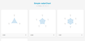
- レーダーチャート
- 「READ MORE」ボタン
- タブボタン
- トグルボタン
- チェックボックス
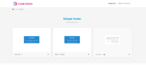
- フッター
- 付箋
- ページネーション
- 円グラフ
- ラジオボタン
- 目次
- 棒グラフ
- モーダルウィンドウ
- タイムライン(ステップバー)
ぜひTOPページから「デザインギャラリー」を一読頂けますと幸いです。
シンプルなボックス
ここでは、以下のシンプルなボックスデザイン例を記載しています。
- 交差する枠線
- 番号あり
- タイトル(枠外)
- タイトル(枠内)
- タイトル(吹き出し風)
- タイトル(上部)
- タイトル(見出し風)
- 引用風
実際のデザインプレビューとHTML&CSSコードを記載しています。
さらに、以下の項目もシンプルなボックスページでは選択式でご用意しました。
- 基調色
- 背景色
- 文字色
ご興味があれば「ボックス一覧ページ」を一読ください。
交差する枠線
ここにテキストが入ります。ここにテキストが入ります。
HTMLコード表示
<div class="box-1">
  <p>ここにテキストが入ります。ここにテキストが入ります。</p>
</div>
CSSコード表示
.box-1 {
  position: relative;
  display: block;
  width: fit-content;
  max-width: 400px;
  margin: 0 auto 32px;
  padding: 1em calc(1.5em + 9px);
  border-top: 1px solid #2589d0;
  border-bottom: 1px solid #2589d0;
  background-color: #ffffff;
  color: #333333;
}

.box-1::before,
.box-1::after {
  position: absolute;
  width: 1px;
  top: 50%;
  transform: translateY(-50%);
  height: calc(100% + 20px);
  background-color: #2589d0;
  content: '';
}

.box-1::before {
  left: 9px;
}

.box-1::after {
  right: 9px;
}
番号あり
ここにテキストが入ります。ここにテキストが入ります。
HTMLコード表示
<div class="box-2" data-number="1">
  <p>ここにテキストが入ります。ここにテキストが入ります。</p>
</div>
CSSコード表示
.box-2 {
  position: relative;
  max-width: 400px;
  margin: 2em auto;
  padding: 1em 1.5em;
  border: 2px solid #2589d0;
  border-radius: 3px;
  background-color: #ffffff;
  color: #333333;
}

.box-2::before {
  display: flex;
  justify-content: center;
  align-items: center;
  position: absolute;
  top: -1em;
  left: -1em;
  width: 2em;
  height: 2em;
  border-radius: 50%;
  background-color: #2589d0;
  color: #fff;
  font-weight: 600;
  content: attr(data-number);
}
タイトル(枠外)
ここにテキストが入ります。ここにテキストが入ります。
HTMLコード表示
<div class="box-3">
  <span>タイトル</span>
  <p>ここにテキストが入ります。ここにテキストが入ります。</p>
</div>
CSSコード表示
.box-3 {
  position: relative;
  max-width: 400px;
  margin: 2em auto;
  padding: 1em 1.5em;
  border: 2px solid #2589d0;
  border-radius: 3px;
  background-color: #ffffff;
}

.box-3 span {
  position: absolute;
  top: -2.2em;
  left: -2px;
  padding: .2em .8em;
  border-radius: 5px 5px 0 0;
  background-color: #2589d0;
  color: #fff;
}

.box-3 p {
  margin: 0;
  color: #333333;
}
タイトル(枠内)
ここにテキストが入ります。ここにテキストが入ります。
HTMLコード表示
<div class="box-4">
  <span>タイトル</span>
  <p>ここにテキストが入ります。ここにテキストが入ります。</p>
</div>
CSSコード表示
.box-4 {
  max-width: 400px;
  margin: 2em auto;
  border: 2px solid #2589d0;
  border-radius: 3px;
  overflow: hidden;
  background-color: #ffffff;
}

.box-4 span {
  display: block;
  padding: .4em .8em;
  background-color: #2589d0;
  color: #fff;
}

.box-4 p {
  margin: 0;
  padding: 1em 1.5em;
  color: #333333;
}
タイトル(吹き出し風)
ここにテキストが入ります。ここにテキストが入ります。
HTMLコード表示
<div class="box-5">
  <div>タイトル</div>
  <p>ここにテキストが入ります。ここにテキストが入ります。</p>
</div>
CSSコード表示
.box-5 {
  position: relative;
  max-width: 400px;
  margin: 1em auto 2em;
  padding: 1.8em 1.5em 1em 1.5em;
  border: 2px solid #2589d0;
  background-color: #ffffff;
}

.box-5 > div {
  position: absolute;
  top: -1.15em;
  left: -.5em;
  padding: .4em 1.4em;
  border-radius: 25px;
  background-color: #2589d0;
  color: #fff;
  font-size: .9em;
}

.box-5 > div::before {
  position: absolute;
  bottom: -8px;
  left: 50%;
  transform: translateX(-50%);
  width: 16px;
  height: 8px;
  background-color: #2589d0;
  clip-path: polygon(0 0, 100% 0, 50% 100%);
  content: '';
}

.box-5 p {
  margin: 0;
  color: #333333;
}
タイトル(上部)
ここにテキストが入ります。ここにテキストが入ります。
HTMLコード表示
<div class="box-6">
  <span>タイトル</span>
  <p>ここにテキストが入ります。ここにテキストが入ります。</p>
</div>
CSSコード表示
.box-6 {
  max-width: 400px;
  margin: 0 auto 2em;
  border: 2px solid #2589d0;
  border-radius: 3px;
  overflow: hidden;
  background-color: #ffffff;
}

.box-6 span {
  display: flex;
  justify-content: center;
  align-items: center;
  padding: .5em 0;
  background-color: #2589d0;
  color: #fff;
  font-weight: 600;
}

.box-6 p {
  margin: 0;
  padding: 1em 1.5em;
  color: #333333;
}
タイトル(見出し風)
ここにテキストが入ります。ここにテキストが入ります。
HTMLコード表示
<div class="box-7">
  <div>タイトル</div>
  <p>ここにテキストが入ります。ここにテキストが入ります。</p>
</div>
CSSコード表示
.box-7 {
  max-width: 400px;
  margin: 0 auto 2em;
  padding: .5em 1.5em 1em;
  border-top: 5px solid #2589d0;
  border-radius: 3px;
  background-color: #f2f2f2;
}

.box-7 > div {
  margin-bottom: .5em;
  color: #2589d0;
  font-weight: 600;
  font-size: 1.05em;
}

.box-7 > p {
  margin: 0;
  color: #333333;
}
引用風
ここにテキストが入ります。ここにテキストが入ります。
HTMLコード表示
<div class="box-8">
  <p>ここにテキストが入ります。ここにテキストが入ります。</p>
</div>
CSSコード表示
.box-8 {
  position: relative;
  max-width: 400px;
  margin: 0 auto 2em;
  padding: 1em 1.5em;
  border-left: 5px solid #2589d0;
  background-color: #f2f2f2;
  color: #333333;
}

.box-8 p {
  margin: 0;
}
ブログで使えるブログボックス
ここでは、以下のブログボックスデザイン例を記載しています。
- メモアイコン(小)
- チェックアイコン(小)
- 注意アイコン(小)
- メモアイコン(大)
- チェックアイコン(大)
- 注意アイコン(大)
実際のデザインプレビューとHTML&CSSコードを記載しています。
さらに、以下の項目もボックスページでは選択式でご用意しました。
- 背景色
- アイコン色
- 文字色
ご興味があれば「ボックス一覧ページ」を一読ください。
メモアイコン(小)
ここにテキストが入ります。ここにテキストが入ります。
HTMLコード表示
<div class="box-9">
  <p>ここにテキストが入ります。ここにテキストが入ります。</p>
</div>
CSSコード表示
.box-9 {
  display: flex;
  grid-gap: 0 .7em;
  margin: 0 auto 2em;
  padding: 1em;
  border-radius: 5px;
  background-color: #fff9e5;
  color: #333333;
}

.box-9::before {
  width: 24px;
  height: 24px;
  content: '';
  background-image: url("data:image/svg+xml,%3Csvg xmlns='http://www.w3.org/2000/svg' viewBox='0 0 24 24'%3E%3Cpath d='M12.8995 6.85453L17.1421 11.0972L7.24264 20.9967H3V16.754L12.8995 6.85453ZM14.3137 5.44032L16.435 3.319C16.8256 2.92848 17.4587 2.92848 17.8492 3.319L20.6777 6.14743C21.0682 6.53795 21.0682 7.17112 20.6777 7.56164L18.5563 9.68296L14.3137 5.44032Z' fill='%23ffb36b'%3E%3C/path%3E%3C/svg%3E");
}

.box-9 p {
  margin: 0;
  padding: 0 0 0 .7em;
  border-left: 1px solid #ffb36b;
}
チェックアイコン(小)
ここにテキストが入ります。ここにテキストが入ります。
HTMLコード表示
<div class="box-10">
  <p>ここにテキストが入ります。ここにテキストが入ります。</p>
</div>
CSSコード表示
.box-10 {
  display: flex;
  align-items: center;
  grid-gap: 0 .7em;
  margin: 0 auto 2em;
  padding: 1em;
  border-radius: 5px;
  background-color: #ecffe9;
  color: #333333;
}

.box-10::before {
  width: 16px;
  height: 8px;
  border-bottom: 3px solid #86d67c;
  border-left: 3px solid #86d67c;
  transform: rotate(-45deg) translate(2.5px, -2.5px);
  content: '';
}

.box-10 p {
  margin: 0;
  padding: 0 0 0 .7em;
  border-left: 1px solid #86d67c;
}
注意アイコン(小)
ここにテキストが入ります。ここにテキストが入ります。
HTMLコード表示
<div class="box-11">
  <p>ここにテキストが入ります。ここにテキストが入ります。</p>
</div>
CSSコード表示
.box-11 {
  display: flex;
  grid-gap: 0 .7em;
  margin: 0 auto 2em;
  padding: 1em;
  border-radius: 5px;
  background-color: #ffebee;
  color: #333333;
}

.box-11::before {
  width: 24px;
  height: 24px;
  content: '';
  background-image: url("data:image/svg+xml,%3Csvg xmlns='http://www.w3.org/2000/svg' viewBox='0 0 24 24'%3E%3Cpath d='M12.8659 3.00017L22.3922 19.5002C22.6684 19.9785 22.5045 20.5901 22.0262 20.8662C21.8742 20.954 21.7017 21.0002 21.5262 21.0002H2.47363C1.92135 21.0002 1.47363 20.5525 1.47363 20.0002C1.47363 19.8246 1.51984 19.6522 1.60761 19.5002L11.1339 3.00017C11.41 2.52187 12.0216 2.358 12.4999 2.63414C12.6519 2.72191 12.7782 2.84815 12.8659 3.00017ZM10.9999 16.0002V18.0002H12.9999V16.0002H10.9999ZM10.9999 9.00017V14.0002H12.9999V9.00017H10.9999Z' fill='%23f06060'%3E%3C/path%3E%3C/svg%3E");
}

.box-11 p {
  margin: 0;
  padding: 0 0 0 .7em;
  border-left: 1px solid #f06060;
}
メモアイコン(大)
ここにテキストが入ります。ここにテキストが入ります。ここにテキストが入ります。ここにテキストが入ります。
HTMLコード表示
<div class="box-12">
  <div>タイトル</div>
  <p>ここにテキストが入ります。ここにテキストが入ります。ここにテキストが入ります。ここにテキストが入ります。</p>
</div>
CSSコード表示
.box-12 {
  max-width: 400px;
  margin: 0 auto 2em;
  border: 2px solid #ffb36b;
  border-radius: 5px;
  color: #333333;
}

.box-12 div {
  display: inline-flex;
  align-items: center;
  column-gap: 4px;
  position: relative;
  top: -13px;
  left: 10px;
  margin: 0 7px;
  padding: 0 8px;
  background: #fff;
  color: #ffb36b;
  font-weight: 600;
  vertical-align: top;
}

.box-12 div::before {
  width: 22px;
  height: 22px;
  content: '';
  background-image: url("data:image/svg+xml,%3Csvg xmlns='http://www.w3.org/2000/svg' viewBox='0 0 24 24'%3E%3Cpath d='M12.8995 6.85453L17.1421 11.0972L7.24264 20.9967H3V16.754L12.8995 6.85453ZM14.3137 5.44032L16.435 3.319C16.8256 2.92848 17.4587 2.92848 17.8492 3.319L20.6777 6.14743C21.0682 6.53795 21.0682 7.17112 20.6777 7.56164L18.5563 9.68296L14.3137 5.44032Z' fill='%23ffb36b'%3E%3C/path%3E%3C/svg%3E");
}

.box-12 p {
  margin: 0;
  padding: 0 1.5em 1em;
}
チェックアイコン(大)
ここにテキストが入ります。ここにテキストが入ります。ここにテキストが入ります。ここにテキストが入ります。
HTMLコード表示
<div class="box-13">
  <div>タイトル</div>
  <p>ここにテキストが入ります。ここにテキストが入ります。ここにテキストが入ります。ここにテキストが入ります。</p>
</div>
CSSコード表示
.box-13 {
  max-width: 400px;
  margin: 0 auto 2em;
  border: 2px solid #86d67c;
  border-radius: 5px;
  color: #333333;
}

.box-13 div {
  display: inline-flex;
  align-items: center;
  column-gap: 4px;
  position: relative;
  top: -13px;
  left: 10px;
  margin: 0 7px;
  padding: 0 8px;
  background: #fff;
  color: #86d67c;
  font-weight: 600;
  vertical-align: top;
}

.box-13 div::before {
  width: 15px;
  height: 7.5px;
  border-bottom: 3px solid #86d67c;
  border-left: 3px solid #86d67c;
  transform: rotate(-45deg) translate(2px, -2px);
  content: '';
}

.box-13 p {
  margin: 0;
  padding: 0 1.5em 1em;
}
注意アイコン(大)
ここにテキストが入ります。ここにテキストが入ります。ここにテキストが入ります。ここにテキストが入ります。
HTMLコード表示
<div class="box-14">
  <div>タイトル</div>
  <p>ここにテキストが入ります。ここにテキストが入ります。ここにテキストが入ります。ここにテキストが入ります。</p>
</div>
CSSコード表示
.box-14 {
  max-width: 400px;
  margin: 0 auto 2em;
  border: 2px solid #f06060;
  border-radius: 5px;
  color: #333333;
}

.box-14 div {
  display: inline-flex;
  align-items: center;
  column-gap: 4px;
  position: relative;
  top: -13px;
  left: 10px;
  margin: 0 7px;
  padding: 0 8px;
  background: #fff;
  color: #f06060;
  font-weight: 600;
  vertical-align: top;
}

.box-14 div::before {
  width: 22px;
  height: 22px;
  content: '';
  background-image: url("data:image/svg+xml,%3Csvg xmlns='http://www.w3.org/2000/svg' viewBox='0 0 24 24'%3E%3Cpath d='M12.8659 3.00017L22.3922 19.5002C22.6684 19.9785 22.5045 20.5901 22.0262 20.8662C21.8742 20.954 21.7017 21.0002 21.5262 21.0002H2.47363C1.92135 21.0002 1.47363 20.5525 1.47363 20.0002C1.47363 19.8246 1.51984 19.6522 1.60761 19.5002L11.1339 3.00017C11.41 2.52187 12.0216 2.358 12.4999 2.63414C12.6519 2.72191 12.7782 2.84815 12.8659 3.00017ZM10.9999 16.0002V18.0002H12.9999V16.0002H10.9999ZM10.9999 9.00017V14.0002H12.9999V9.00017H10.9999Z' fill='%23f06060'%3E%3C/path%3E%3C/svg%3E");
}

.box-14 p {
  margin: 0;
  padding: 0 1.5em 1em;
}
その他のボックス
ここでは、以下のその他のボックスデザイン例を記載しています。
- チェック柄
- めくられた紙風
- テープで貼られている風
- クリップ風
- ウィンドウ風
- 方眼紙風
- iPhone風
実際のデザインプレビューとHTML&CSSコードを記載しています。
さらに、以下の項目もボックスページでは選択式でご用意しました。
- 基調色
- 枠線:あり, なし
- 背景色
- 文字色
- バーの色
- 端末の色
ご興味があれば「ボックス一覧ページ」を一読ください。
チェック柄
ここにテキストが入ります。ここにテキストが入ります。
HTMLコード表示
<div class="box-15">
  <p>ここにテキストが入ります。ここにテキストが入ります。</p>
</div>
CSSコード表示
.box-15 {
  max-width: 400px;
  margin: 0 auto 2em;
  padding: 1em 1.5em;
  border: 2px solid #5ba9f7;
  border-radius: 3px;
  background-image: linear-gradient(45deg, #5ba9f712 25%, transparent 25%, transparent 50%, #5ba9f712 50%, #5ba9f712 75%, transparent 75%, transparent), linear-gradient(-45deg, #5ba9f712 25%, transparent 25%, transparent 50%, #5ba9f712 50%, #5ba9f712 75%, transparent 75%, transparent);
  background-color: #5ba9f70d;
  background-size: 20px 20px;
}
めくられた紙風
ここにテキストが入ります。ここにテキストが入ります。
HTMLコード表示
<div class="box-16">
  <p>ここにテキストが入ります。ここにテキストが入ります。</p>
</div>
CSSコード表示
.box-16 {
  position: relative;
  max-width: 400px;
  margin: 0 auto 2em;
  padding: 1em 1.5em;
  background-color: #e0efff;
  color: #333;
}

.box-16::after {
  position: absolute;
  top: 0;
  right: 0;
  border-width: 0 20px 20px 0;
  border-style: solid;
  border-color: #c0cfdf #fff;
  box-shadow: -1px 1px 1px rgb(0 0 0 / 5%);
  content: '';
}
テープで貼られている風
ここにテキストが入ります。ここにテキストが入ります。
HTMLコード表示
<div class="box-17">
  <span>タイトル</span>
  <p>ここにテキストが入ります。ここにテキストが入ります。</p>
</div>
CSSコード表示
.box-17 {
  position: relative;
  max-width: 400px;
  margin: 1.5em auto 2em;
  padding: 2.5em 1.5em 1.5em;
  box-shadow: 0 2px 3px rgb(0 0 0 / 20%);
  background-color: #e0efff;
  color: #333333;
}

.box-17 span {
  position: absolute;
  top: -15px;
  left: 50%;
  transform: translateX(-50%) rotate(-5deg);
  padding: .5em 2em;
  border-right: 2px dotted rgb(0 0 0 / 10%);
  border-left: 2px dotted rgb(0 0 0 / 10%);
  box-shadow: 0 0 5px rgb(0 0 0 / 20%);
  background-color: rgb(255 255 255 / 40%);
  font-weight: 600;
}

.box-17 p {
  margin: 0;
}
クリップ風
ここにテキストが入ります。ここにテキストが入ります。
HTMLコード表示
<div class="box-18">
  <p>ここにテキストが入ります。ここにテキストが入ります。</p>
</div>
CSSコード表示
.box-18 {
  position: relative;
  max-width: 400px;
  margin: 1em auto 2em;
  padding: 1em 2.5em 1em 1.5em;
  border-radius: 3px;
  box-shadow: 0 2px 3px rgb(0 0 0 / 20%);
  background-color: #e0efff;
  color: #333333;
}

.box-18::before,
.box-18::after {
  position: absolute;
  content: '';
}

.box-18::before {
  top: -15px;
  right: 10px;
  height: 50px;
  width: 15px;
  border: 3px solid #999;
  border-radius: 10px;
  box-shadow: 1px 1px 2px rgb(0 0 0 / 30%);
  transform: rotate(10deg);
}

.box-18::after {
  top: 0;
  width: 10px;
  right: 20px;
  border: solid 5px #e0efff;
}
ウィンドウ風
ここにテキストが入ります。ここにテキストが入ります。
HTMLコード表示
<div class="box-19">
  <svg class="window-bar" xmlns="http://www.w3.org/2000/svg" role="img" aria-label="ウインドウのボタン">
    <circle cx="25" cy="12" r="5.5" fill="#f48384"/>
    <circle cx="45" cy="12" r="5.5" fill="#fbd172"/>
    <circle cx="65" cy="12" r="5.5" fill="#82c880"/>
  </svg>
  <p>ここにテキストが入ります。ここにテキストが入ります。</p>
</div>
CSSコード表示
.box-19 {
  position: relative;
  max-width: 400px;
  margin: 0 auto 2em;
  padding: calc(1em + 25px) 1.5em 1em;
  border: 2px solid #f2f2f2;
  border-radius: 5px;
  overflow: auto;
}

.box-19 svg {
  position: absolute;
  top: 0;
  left: 0;
  width: 100%;
  height: 25px;
  background-color: #f2f2f2;
}

.box-19 p {
  margin: 0;
  padding: 0;
}
方眼紙風
ここにテキストが入ります。ここにテキストが入ります。
HTMLコード表示
<div class="box-20">
  <p>ここにテキストが入ります。ここにテキストが入ります。</p>
</div>
CSSコード表示
.box-20 {
  max-width: 400px;
  margin: 0 auto 2em;
  padding: 1em 1.5em;
  box-shadow: 0 4px 4px rgb(0 0 0 / 5%), 0 2px 3px -2px rgb(0 0 0 / 1%);
  background-image: linear-gradient(transparent calc(100% - 1px), #e6edf3 50%, #e6edf3), linear-gradient(90deg, transparent calc(100% - 1px), #e6edf3 50%, #e6edf3);
  background-size: 15px 15px;
  background-repeat: repeat;
  background-color: #ffffff;
  color: #333333;
}
iPhone風

HTMLコード表示
<div class="box-21">
  <svg xmlns="http://www.w3.org/2000/svg" viewBox="0 0 90 25" fill="#3c3c3c">
    <circle cx="22.5" cy="7.5" r="5"/>
    <circle cx="37.5" cy="7.5" r="5"/>
    <circle cx="52.5" cy="7.5" r="5"/>
    <circle cx="67.5" cy="7.5" r="5"/>
  </svg>

  <img decoding="async" src="https://placehold.jp/120x200.png?text=Image" data-src="https://placehold.jp/120x200.png?text=Image" alt="" class="lazyload" ><noscript><img decoding="async" src="YOUR_IMAGE_URL" alt=""></noscript>
</div>
CSSコード表示
.box-21 {
position: relative;
display: flex;
flex-direction: column;
align-items: center;
width: 168px;
height: 360px;
margin: 0 auto 2em;
overflow: hidden;
border: 8px solid #303030;
border-radius: 25px;
box-sizing: content-box;
box-shadow: 0 15px 30px -7px rgba(0, 12, 66, .2);
background: #303030;
}
.box-21::after {
position: absolute;
bottom: 5px;
width: 60px;
height: 3px;
border-radius: 20px;
background-color: rgba(255, 255, 255, .8);
content: '';
}
.box-21 svg {
display: flex;
justify-content: center;
align-items: center;
position: absolute;
width: 60px;
height: 15px;
border-radius: 0 0 15px 15px;
background-color: #303030;
}
.box-21 img {
width: 100%;
height: 100%;
object-fit: contain;
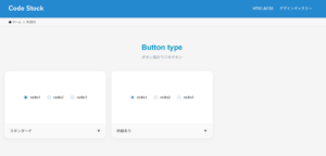
}ボタン型のチェックボックス
ここでは、以下のボタン型のチェックボックスデザイン例を記載しています。
- スタンダード
- 背景色あり
実際のデザインプレビューとHTML&CSSコードを記載しています。
さらに、以下の項目もボックスページでは選択式でご用意しました。
- 基調色
- 並びの向き:横, 縦
- 形状:四角, 角丸(円)
ご興味があれば「チェックボックス一覧ページ」を一読ください。
スタンダード
HTML|並びの向き:横, 形状:角丸
<fieldset class="checkbox-2">
  <label>
    <input type="checkbox" name="checkbox-2" checked/>
    radio1
  </label>
  <label>
    <input type="checkbox" name="checkbox-2"/>
    radio2
  </label>
  <label>
    <input type="checkbox" name="checkbox-2"/>
    radio3
  </label>
</fieldset>
CSS|並びの向き:横, 形状:角丸
.checkbox-2 {
  display: flex;
  justify-content: center;
  flex-wrap: wrap;
  gap: 1em 1.5em;
  border: none;
}

.checkbox-2 label {
  display: inline-flex;
  align-items: center;
  position: relative;
  padding-left: 26px;
  cursor: pointer;
  min-height: 20px;
}

.checkbox-2 label::before {
  position: absolute;
  top: 50%;
  left: 0;
  transform: translateY(-50%);
  width: 18px;
  height: 18px;
  border-radius: 3px;
  content: '';
  box-sizing: border-box;
}

.checkbox-2 label:has(:checked)::after {
  position: absolute;
  top: 50%;
  left: 9px;
  transform: translate(-50%, -55%) rotate(45deg);
  width: 6px;
  height: 10px;
  content: '';
  box-sizing: border-box;
}

.checkbox-2 label::before {
  border: 2px solid #d6dde3;
  background: transparent;
}

.checkbox-2 label:has(:checked)::after {
  border: solid #2589d0;
  border-width: 0 2px 2px 0;
}

.checkbox-2 input {
  display: none;
}HTML|並びの向き:横, 形状:円
<fieldset class="checkbox-3">
  <label>
    <input type="checkbox" name="checkbox-3" checked/>
    radio1
  </label>
  <label>
    <input type="checkbox" name="checkbox-3"/>
    radio2
  </label>
  <label>
    <input type="checkbox" name="checkbox-3"/>
    radio3
  </label>
</fieldset>
CSS|並びの向き:横, 形状:円
.checkbox-3 {
  display: flex;
  justify-content: center;
  flex-wrap: wrap;
  gap: 1em 1.5em;
  border: none;
}

.checkbox-3 label {
  display: inline-flex;
  align-items: center;
  position: relative;
  padding-left: 26px;
  cursor: pointer;
  min-height: 20px;
}

.checkbox-3 label::before {
  position: absolute;
  top: 50%;
  left: 0;
  transform: translateY(-50%);
  width: 18px;
  height: 18px;
  border-radius: 50%;
  content: '';
  box-sizing: border-box;
}

.checkbox-3 label:has(:checked)::after {
  position: absolute;
  top: 50%;
  left: 9px;
  transform: translate(-50%, -55%) rotate(45deg);
  width: 6px;
  height: 10px;
  content: '';
  box-sizing: border-box;
}

.checkbox-3 label::before {
  border: 2px solid #d6dde3;
  background: transparent;
}

.checkbox-3 label:has(:checked)::after {
  border: solid #2589d0;
  border-width: 0 2px 2px 0;
}

.checkbox-3 input {
  display: none;
}HTML|並びの向き:縦, 形状:角丸
<fieldset class="checkbox-4">
  <label>
    <input type="checkbox" name="checkbox-4" checked/>
    radio1
  </label>
  <label>
    <input type="checkbox" name="checkbox-4"/>
    radio2
  </label>
  <label>
    <input type="checkbox" name="checkbox-4"/>
    radio3
  </label>
</fieldset>
CSS|並びの向き:縦, 形状:角丸
.checkbox-4 {
  display: flex;
  flex-direction: column;
  flex-wrap: wrap;
  gap: 1em 1.5em;
  border: none;
}

.checkbox-4 label {
  display: inline-flex;
  align-items: center;
  position: relative;
  padding-left: 26px;
  cursor: pointer;
  min-height: 20px;
}

.checkbox-4 label::before {
  position: absolute;
  top: 50%;
  left: 0;
  transform: translateY(-50%);
  width: 18px;
  height: 18px;
  border-radius: 3px;
  content: '';
  box-sizing: border-box;
}

.checkbox-4 label:has(:checked)::after {
  position: absolute;
  top: 50%;
  left: 9px;
  transform: translate(-50%, -55%) rotate(45deg);
  width: 6px;
  height: 10px;
  content: '';
  box-sizing: border-box;
}

.checkbox-4 label::before {
  border: 2px solid #d6dde3;
  background: transparent;
}

.checkbox-4 label:has(:checked)::after {
  border: solid #2589d0;
  border-width: 0 2px 2px 0;
}

.checkbox-4 input {
  display: none;
}HTML|並びの向き:縦, 形状:円
<fieldset class="checkbox-5">
  <label>
    <input type="checkbox" name="checkbox-5" checked/>
    radio1
  </label>
  <label>
    <input type="checkbox" name="checkbox-5"/>
    radio2
  </label>
  <label>
    <input type="checkbox" name="checkbox-5"/>
    radio3
  </label>
</fieldset>
CSS|並びの向き:縦, 形状:円
.checkbox-5 {
  display: flex;
  flex-direction: column;
  flex-wrap: wrap;
  gap: 1em 1.5em;
  border: none;
}

.checkbox-5 label {
  display: inline-flex;
  align-items: center;
  position: relative;
  padding-left: 26px;
  cursor: pointer;
  min-height: 20px;
}

.checkbox-5 label::before {
  position: absolute;
  top: 50%;
  left: 0;
  transform: translateY(-50%);
  width: 18px;
  height: 18px;
  border-radius: 50%;
  content: '';
  box-sizing: border-box;
}

.checkbox-5 label:has(:checked)::after {
  position: absolute;
  top: 50%;
  left: 9px;
  transform: translate(-50%, -55%) rotate(45deg);
  width: 6px;
  height: 10px;
  content: '';
  box-sizing: border-box;
}

.checkbox-5 label::before {
  border: 2px solid #d6dde3;
  background: transparent;
}

.checkbox-5 label:has(:checked)::after {
  border: solid #2589d0;
  border-width: 0 2px 2px 0;
}

.checkbox-5 input {
  display: none;
}
背景色あり
HTML|並びの向き:横, 形状:角丸
<fieldset class="checkbox-6">
  <label>
    <input type="checkbox" name="checkbox-6" checked/>
    radio1
  </label>
  <label>
    <input type="checkbox" name="checkbox-6"/>
    radio2
  </label>
  <label>
    <input type="checkbox" name="checkbox-6"/>
    radio3
  </label>
</fieldset>
CSS|並びの向き:横, 形状:角丸
.checkbox-2 {
  display: flex;
  justify-content: center;
  flex-wrap: wrap;
  gap: 1em 1.5em;
  border: none;
}

.checkbox-2 label {
  display: inline-flex;
  align-items: center;
  position: relative;
  padding-left: 26px;
  cursor: pointer;
  min-height: 20px;
}

.checkbox-2 label::before {
  position: absolute;
  top: 50%;
  left: 0;
  transform: translateY(-50%);
  width: 18px;
  height: 18px;
  border-radius: 3px;
  content: '';
  box-sizing: border-box;
}

.checkbox-2 label:has(:checked)::after {
  position: absolute;
  top: 50%;
  left: 9px;
  transform: translate(-50%, -55%) rotate(45deg);
  width: 6px;
  height: 10px;
  content: '';
  box-sizing: border-box;
}

.checkbox-2 label::before {
  border: 2px solid #d6dde3;
  background: transparent;
}

.checkbox-2 label:has(:checked)::after {
  border: solid #2589d0;
  border-width: 0 2px 2px 0;
}

.checkbox-2 input {
  display: none;
}HTML|並びの向き:横, 形状:円
<fieldset class="checkbox-7">
  <label>
    <input type="checkbox" name="checkbox-7" checked/>
    radio1
  </label>
  <label>
    <input type="checkbox" name="checkbox-7"/>
    radio2
  </label>
  <label>
    <input type="checkbox" name="checkbox-7"/>
    radio3
  </label>
</fieldset>
CSS|並びの向き:横, 形状:円
.checkbox-7 {
  display: flex;
  justify-content: center;
  flex-wrap: wrap;
  gap: 1em 1.5em;
  border: none;
}

.checkbox-7 label {
  display: inline-flex;
  align-items: center;
  position: relative;
  padding-left: 26px;
  cursor: pointer;
  min-height: 20px;
}

.checkbox-7 label::before {
  position: absolute;
  top: 50%;
  left: 0;
  transform: translateY(-50%);
  width: 18px;
  height: 18px;
  border-radius: 50%;
  content: '';
  box-sizing: border-box;
}

.checkbox-7 label:has(:checked)::after {
  position: absolute;
  top: 50%;
  left: 9px;
  transform: translate(-50%, -55%) rotate(45deg);
  width: 6px;
  height: 10px;
  content: '';
  box-sizing: border-box;
}

.checkbox-7 label::before {
  background-color: #e6edf3;
  border: none;
}

.checkbox-7 label:has(:checked)::before {
  background-color: #2589d0;
}

.checkbox-7 label:has(:checked)::after {
  border: solid #fff;
  border-width: 0 2px 2px 0;
}

.checkbox-7 input {
  display: none;
}HTML|並びの向き:縦, 形状:角丸
<fieldset class="checkbox-8">
  <label>
    <input type="checkbox" name="checkbox-8" checked/>
    radio1
  </label>
  <label>
    <input type="checkbox" name="checkbox-8"/>
    radio2
  </label>
  <label>
    <input type="checkbox" name="checkbox-8"/>
    radio3
  </label>
</fieldset>
CSS|並びの向き:縦, 形状:角丸
.checkbox-8 {
  display: flex;
  flex-direction: column;
  flex-wrap: wrap;
  gap: 1em 1.5em;
  border: none;
}

.checkbox-8 label {
  display: inline-flex;
  align-items: center;
  position: relative;
  padding-left: 26px;
  cursor: pointer;
  min-height: 20px;
}

.checkbox-8 label::before {
  position: absolute;
  top: 50%;
  left: 0;
  transform: translateY(-50%);
  width: 18px;
  height: 18px;
  border-radius: 3px;
  content: '';
  box-sizing: border-box;
}

.checkbox-8 label:has(:checked)::after {
  position: absolute;
  top: 50%;
  left: 9px;
  transform: translate(-50%, -55%) rotate(45deg);
  width: 6px;
  height: 10px;
  content: '';
  box-sizing: border-box;
}

.checkbox-8 label::before {
  background-color: #e6edf3;
  border: none;
}

.checkbox-8 label:has(:checked)::before {
  background-color: #2589d0;
}

.checkbox-8 label:has(:checked)::after {
  border: solid #fff;
  border-width: 0 2px 2px 0;
}

.checkbox-8 input {
  display: none;
}HTML|並びの向き:縦, 形状:円
<fieldset class="checkbox-9">
  <label>
    <input type="checkbox" name="checkbox-9" checked/>
    radio1
  </label>
  <label>
    <input type="checkbox" name="checkbox-9"/>
    radio2
  </label>
  <label>
    <input type="checkbox" name="checkbox-9"/>
    radio3
  </label>
</fieldset>
CSS|並びの向き:縦, 形状:円
.checkbox-9 {
  display: flex;
  flex-direction: column;
  flex-wrap: wrap;
  gap: 1em 1.5em;
  border: none;
}

.checkbox-9 label {
  display: inline-flex;
  align-items: center;
  position: relative;
  padding-left: 26px;
  cursor: pointer;
  min-height: 20px;
}

.checkbox-9 label::before {
  position: absolute;
  top: 50%;
  left: 0;
  transform: translateY(-50%);
  width: 18px;
  height: 18px;
  border-radius: 50%;
  content: '';
  box-sizing: border-box;
}

.checkbox-9 label:has(:checked)::after {
  position: absolute;
  top: 50%;
  left: 9px;
  transform: translate(-50%, -55%) rotate(45deg);
  width: 6px;
  height: 10px;
  content: '';
  box-sizing: border-box;
}

.checkbox-9 label::before {
  background-color: #e6edf3;
  border: none;
}

.checkbox-9 label:has(:checked)::before {
  background-color: #2589d0;
}

.checkbox-9 label:has(:checked)::after {
  border: solid #fff;
  border-width: 0 2px 2px 0;
}

.checkbox-9 input {
  display: none;
}
リスト型のチェックボックス
ここでは、以下のリスト型のチェックボックスデザイン例を記載しています。
- 枠線&背景色
実際のデザインプレビューとHTML&CSSコードを記載しています。
さらに、以下の項目もボックスページでは選択式でご用意しました。
- 基調色
- 形状:四角, 角丸(円)
ご興味があれば「チェックボックス一覧ページ」を一読ください。
枠線&背景色
HTML|形状:四角
<fieldset class="checkbox-10">
  <label>
    <input type="checkbox" name="checkbox-10" checked/>
    radio1
  </label>
  <label>
    <input type="checkbox" name="checkbox-10"/>
    radio2
  </label>
  <label>
    <input type="checkbox" name="checkbox-10"/>
    radio3
  </label>
</fieldset>
CSS|形状:四角
.checkbox-10 {
  border: none;
}

.checkbox-10 label {
  display: flex;
  align-items: center;
  position: relative;
  max-width: 200px;
  margin-bottom: .4em;
  padding: .5em .7em .5em 32px;
  border: 1px solid #2589d0;
  border-radius: 3px;
  background-color: #2589d026;
  cursor: pointer;
}

.checkbox-10 label:has(:checked) {
  background-color: #2589d0;
  color: #fff;
}

.checkbox-10 label::before {
  position: absolute;
  top: 50%;
  left: 10px;
  transform: translateY(-50%);
  width: 14px;
  height: 14px;
  border-radius: 1px;
  background-color: #fff;
  content: '';
  box-sizing: border-box;
}

.checkbox-10 label:has(:checked)::after {
  position: absolute;
  top: 50%;
  left: 17px;
  transform: translate(-50%, -60%) rotate(45deg);
  width: 4px;
  height: 8px;
  border: solid #2589d0;
  border-width: 0 2px 2px 0;
  content: '';
  box-sizing: border-box;
}

.checkbox-10 input {
  display: none;
}HTML|形状:角丸
<fieldset class="checkbox-11">
  <label>
    <input type="checkbox" name="checkbox-11" checked/>
    radio1
  </label>
  <label>
    <input type="checkbox" name="checkbox-11"/>
    radio2
  </label>
  <label>
    <input type="checkbox" name="checkbox-11"/>
    radio3
  </label>
</fieldset>
CSS|形状:角丸
.checkbox-11 {
  border: none;
}

.checkbox-11 label {
  display: flex;
  align-items: center;
  position: relative;
  max-width: 200px;
  margin-bottom: .4em;
  padding: .5em .7em .5em 32px;
  border: 1px solid #2589d0;
  border-radius: 30px;
  background-color: #2589d026;
  cursor: pointer;
}

.checkbox-11 label:has(:checked) {
  background-color: #2589d0;
  color: #fff;
}

.checkbox-11 label::before {
  position: absolute;
  top: 50%;
  left: 10px;
  transform: translateY(-50%);
  width: 14px;
  height: 14px;
  border-radius: 50%;
  background-color: #fff;
  content: '';
  box-sizing: border-box;
}

.checkbox-11 label:has(:checked)::after {
  position: absolute;
  top: 50%;
  left: 17px;
  transform: translate(-50%, -60%) rotate(45deg);
  width: 4px;
  height: 8px;
  border: solid #2589d0;
  border-width: 0 2px 2px 0;
  content: '';
  box-sizing: border-box;
}

.checkbox-11 input {
  display: none;
}
シンプルなテキストボックス
ここでは、以下のシンプルなテキストボックスデザイン例を記載しています。
- 枠線あり
- 背景色あり
- 枠線&背景色
実際のデザインプレビューとHTML&CSSコードを記載しています。
さらに、以下の項目もテキストボックスページでは選択式でご用意しました。
- 枠線の色
- 文字色
- タグの種類:<input>タグ, <textarea>タグ
- 形状:四角, 角丸
- ラベル:あり, なし
ご興味があれば「テキストボックス一覧ページ」を一読ください。
ダークモード対応のテキストボックスデザイン例も記載していますので、ぜひご参照ください。
枠線あり
HTMLコード表示
<label class="textbox-1-label" for="textbox-1-id">ラベルの例</label>
<input type="text" id="textbox-1-id" class="textbox-1" placeholder="テキストボックスの例">
CSSコード表示
.textbox-1-label,
.textbox-1 {
  color: #333333;
}

.textbox-1-label {
  display: block;
  margin-bottom: 5px;
  font-size: .9em;
}

.textbox-1 {
  width: 100%;
  padding: 8px 10px;
  border: 1px solid #969da3;
  border-radius: 3px;
  background: #fff;
  font-size: 1em;
  line-height: 1.5;
  box-sizing: border-box;
}

.textbox-1::placeholder {
  color: #999;
}
背景色あり
HTMLコード表示
<label class="textbox-1-label" for="textbox-1-id">ラベルの例</label>
<input type="text" id="textbox-1-id" class="textbox-1" placeholder="テキストボックスの例">
CSSコード表示
.textbox-2-label,
.textbox-2 {
  color: #333333;
}

.textbox-2-label {
  display: block;
  margin-bottom: 5px;
  font-size: .9em;
}

.textbox-2 {
  width: 100%;
  padding: 8px 10px;
  border: none;
  border-radius: 3px;
  background: #f7f7f7;
  font-size: 1em;
  line-height: 1.5;
  box-sizing: border-box;
}

.textbox-2::placeholder {
  color: #999;
}
枠線&背景色
HTMLコード表示
<label class="textbox-1-label" for="textbox-1-id">ラベルの例</label>
<input type="text" id="textbox-1-id" class="textbox-1" placeholder="テキストボックスの例">
CSSコード表示
.textbox-3-label,
.textbox-3 {
  color: #333333;
}

.textbox-3-label {
  display: block;
  margin-bottom: 5px;
  font-size: .9em;
}

.textbox-3 {
  width: 100%;
  padding: 8px 10px;
  border: 1px solid #d2d2d2;
  border-radius: 3px;
  background: #f7f7f7;
  font-size: 1em;
  line-height: 1.5;
  box-sizing: border-box;
}

.textbox-3::placeholder {
  color: #999;
}
シンプルなセレクトボックス
ここでは、以下のシンプルなセレクトボックスデザイン例を記載しています。
- スタンダード
- 矢印2つ
- 下線あり
- 白背景&シャドウ
実際のデザインプレビューとHTML&CSSコードを記載しています。
さらに、以下の項目もセレクトボックスページでは選択式でご用意しました。
- 枠線の色
- 文字色
- 形状:四角, 角丸
ご興味があれば「セレクトボックス一覧ページ」を一読ください。
スタンダード
HTMLコード表示
<label class="selectbox-1">
  <select>
    <option>optionの例1</option>
    <option>optionの例2</option>
    <option>optionの例3</option>
  </select>
</label>
CSSコード表示
.selectbox-1 {
  display: inline-flex;
  align-items: center;
  position: relative;
}

.selectbox-1::after {
  position: absolute;
  right: 15px;
  width: 10px;
  height: 7px;
  background-color: #333333;
  clip-path: polygon(0 0, 100% 0, 50% 100%);
  content: '';
  pointer-events: none;
}

.selectbox-1 select {
  appearance: none;
  -webkit-appearance: none;
  min-width: 230px;
  height: 2.8em;
  padding: .4em calc(.8em + 30px) .4em .8em;
  border: 1px solid #d0d0d0;
  border-radius: 3px;
  background-color: #fff;
  color: #333333;
  font-size: 1em;
  cursor: pointer;
}

.selectbox-1 select:focus {
  outline: none;
}
矢印2つ
HTMLコード表示
<label class="selectbox-2">
  <select>
    <option>optionの例1</option>
    <option>optionの例2</option>
    <option>optionの例3</option>
  </select>
</label>
CSSコード表示
.selectbox-2 {
  display: inline-flex;
  align-items: center;
  position: relative;
}

.selectbox-2::before,
.selectbox-2::after {
  position: absolute;
  right: 15px;
  width: 9px;
  height: 6px;
  background-color: #333333;
  content: '';
  pointer-events: none;
}

.selectbox-2::before {
  top: calc(50% - 9px);
  clip-path: polygon(50% 0, 100% 100%, 0 100%);
}

.selectbox-2::after {
  bottom: calc(50% - 9px);
  clip-path: polygon(0 0, 50% 100%, 100% 0);
}

.selectbox-2 select {
  appearance: none;
  -webkit-appearance: none;
  min-width: 230px;
  height: 2.8em;
  padding: .4em calc(.8em + 30px) .4em .8em;
  border: 1px solid #d0d0d0;
  border-radius: 3px;
  background-color: #fff;
  color: #333333;
  font-size: 1em;
  cursor: pointer;
}

.selectbox-2 select:focus {
  outline: none;
}
下線あり
HTMLコード表示
<label class="selectbox-3">
  <select>
    <option>optionの例1</option>
    <option>optionの例2</option>
    <option>optionの例3</option>
  </select>
</label>
CSSコード表示
.selectbox-3 {
  display: inline-flex;
  align-items: center;
  position: relative;
}

.selectbox-3::after {
  position: absolute;
  right: 15px;
  width: 10px;
  height: 7px;
  background-color: #333333;
  clip-path: polygon(0 0, 100% 0, 50% 100%);
  content: '';
  pointer-events: none;
}

.selectbox-3 select {
  appearance: none;
  -webkit-appearance: none;
  min-width: 230px;
  height: 2.8em;
  padding: .4em calc(.8em + 30px) .4em .8em;
  border: none;
  border-bottom: 2px solid #d0d0d0;
  background-color: #fff;
  color: #333333;
  font-size: 1em;
  cursor: pointer;
}

.selectbox-3 select:focus {
  outline: none;
}
白背景&シャドウ
HTMLコード表示
<label class="selectbox-4">
  <select>
    <option>optionの例1</option>
    <option>optionの例2</option>
    <option>optionの例3</option>
  </select>
</label>
CSSコード表示
.selectbox-4 {
  display: inline-flex;
  align-items: center;
  position: relative;
}

.selectbox-4::after {
  position: absolute;
  right: 15px;
  width: 10px;
  height: 7px;
  background-color: #333333;
  clip-path: polygon(0 0, 100% 0, 50% 100%);
  content: '';
  pointer-events: none;
}

.selectbox-4 select {
  appearance: none;
  -webkit-appearance: none;
  min-width: 230px;
  height: 2.8em;
  padding: .4em calc(.8em + 30px) .4em .8em;
  border: none;
  border-radius: 3px;
  box-shadow: 0 4px 4px rgb(0 0 0 / 10%), 0 2px 3px -2px rgba(0 0 0 / 15%);
  background-color: #fff;
  color: #333333;
  font-size: 1em;
  cursor: pointer;
}

.selectbox-4 select:focus {
  outline: none;
}
カラフルなセレクトボックス
ここでは、以下のカラフルなセレクトボックスデザイン例を記載しています。
- フラットデザイン
- 枠線あり
実際のデザインプレビューとHTML&CSSコードを記載しています。
さらに、以下の項目もセレクトボックスページでは選択式でご用意しました。
- 矢印の背景色
- 枠線の色
- 文字色
- 形状:四角, 角丸
ご興味があれば「セレクトボックス一覧ページ」を一読ください。
フラットデザイン
HTMLコード表示
<label class="selectbox-5">
  <select>
    <option>optionの例1</option>
    <option>optionの例2</option>
    <option>optionの例3</option>
  </select>
</label>
CSSコード表示
.selectbox-5 {
  position: relative;
  display: block;
  width: fit-content;
  margin: 0 auto 32px;
}

.selectbox-5::before,
.selectbox-5::after {
  position: absolute;
  content: '';
  pointer-events: none;
}

.selectbox-5::before {
  display: inline-block;
  right: 0;
  width: 2.8em;
  height: 100%;
  border-radius: 0 3px 3px 0;
  background-color: #2589d0;
}

.selectbox-5::after {
  top: 50%;
  right: 1.4em;
  transform: translate(50%, -50%) rotate(45deg);
  width: 6px;
  height: 6px;
  border-bottom: 3px solid #fff;
  border-right: 3px solid #fff;
}

.selectbox-5 select {
  appearance: none;
  -webkit-appearance: none;
  min-width: 230px;
  height: 2.8em;
  padding: .4em 3.6em .4em .8em;
  border: none;
  border-radius: 3px;
  background-color: #f2f2f2;
  color: #333333;
  font-size: 1em;
  cursor: pointer;
  box-sizing: border-box;
}

.selectbox-5 select:focus {
  outline: 2px solid #2589d0;
}
枠線あり
HTMLコード表示
<label class="selectbox-6">
  <select>
    <option>optionの例1</option>
    <option>optionの例2</option>
    <option>optionの例3</option>
  </select>
</label>
CSSコード表示
.selectbox-6 {
  position: relative;
  display: block;
  width: fit-content;
  margin: 0 auto 32px;
}

.selectbox-6::before,
.selectbox-6::after {
  position: absolute;
  content: '';
  pointer-events: none;
}

.selectbox-6::before {
  display: inline-block;
  right: 0;
  width: 2.8em;
  height: 100%;
  border-radius: 0 3px 3px 0;
  background-color: #2589d0;
}

.selectbox-6::after {
  top: 50%;
  right: 1.4em;
  transform: translate(50%, -50%) rotate(45deg);
  width: 6px;
  height: 6px;
  border-bottom: 3px solid #fff;
  border-right: 3px solid #fff;
}

.selectbox-6 select {
  appearance: none;
  -webkit-appearance: none;
  min-width: 230px;
  height: 2.8em;
  padding: .4em 3.6em .4em .8em;
  border: 2px solid #2589d0;
  border-radius: 3px;
  background-color: #fff;
  color: #333333;
  font-size: 1em;
  cursor: pointer;
  box-sizing: border-box;
}

.selectbox-6 select:focus {
  outline: 1px solid #2589d0;
}
シンプルな引用ボックス
ここでは、以下のシンプルな引用ボックスデザイン例を記載しています。
- スタンダード
実際のデザインプレビューとHTML&CSSコードを記載しています。
さらに、以下の項目もシンプルな引用ボックスページでは選択式でご用意しました。
- 左線の色
- 文字色
- 出典(citeタグ):あり, なし
ご興味があれば「引用ボックス一覧ページ」を一読ください。
スタンダード
ここに引用するコンテンツを入れます。ここに引用するコンテンツを入れます。
出典:ここに引用元を入れる
HTMLコード表示
<blockquote class="quote-1">
  <p>ここに引用するコンテンツを入れます。ここに引用するコンテンツを入れます。</p>
  <cite>出典:ここに引用元を入れる</cite>
</blockquote>
CSSコード表示
.quote-1 {
max-width: 500px;
padding: 1em 1.5em;
margin: 0 auto 2em;
border-left: 4px solid #f2f2f2;
color: #333333;
}
.quote-1:has(cite) {
padding-bottom: .5em;
}
.quote-1 p {
margin-top: 0;
}
.quote-1 cite {
display: block;
color: #737373;
font-size: .8em;
text-align: right;
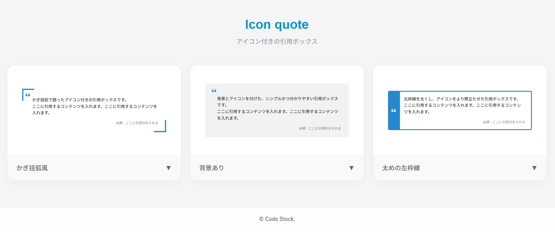
}アイコン付きの引用ボックス
ここでは、以下のアイコン付きの引用ボックスデザイン例を記載しています。
- カギカッコ風
- 背景あり
- 太めの左枠線
実際のデザインプレビューとHTML&CSSコードを記載しています。
さらに、以下の項目もアイコン付きの引用ボックスページでは選択式でご用意しました。
- カギカッコの色
- アイコン色
- 文字色
- 背景色
- 基調色
- 出典(citeタグ):あり, なし
ご興味があれば「引用ボックス一覧ページ」を一読ください。
カギカッコ風
ここに引用するコンテンツを入れます。ここに引用するコンテンツを入れます。
出典:ここに引用元を入れる
HTMLコード表示
<blockquote class="quote-2">
  <p>ここに引用するコンテンツを入れます。ここに引用するコンテンツを入れます。</p>
  <cite>出典:ここに引用元を入れる</cite>
</blockquote>
CSSコード表示
body .quote-2 {
  max-width: 500px;
  position: relative;
  margin: 1.5em auto 2em !important;
  padding: 2.5em 2.5em 2em 3em !important;
  color: #333333 !important;
  border: none !important;
  border-left: none !important;
  background: transparent !important;
  box-shadow: none !important;
}

body .quote-2::before,
body .quote-2::after {
  display: inline-block !important;
  position: absolute !important;
  width: 4em !important;
  height: 4em !important;
  content: '' !important;
  font-family: inherit !important;
  background-color: transparent !important;
}

body .quote-2::before {
  top: 0 !important;
  left: 0 !important;
  border-top: 3px solid #2589d0 !important;
  border-left: 3px solid #2589d0 !important;
  border-bottom: none !important;
  border-right: none !important;
  background-image: url("data:image/svg+xml,%3Csvg xmlns='http://www.w3.org/2000/svg' viewBox='0 0 24 24'%3E%3Cpath d='M4.58341 17.3211C3.55316 16.2274 3 15 3 13.0103C3 9.51086 5.45651 6.37366 9.03059 4.82318L9.92328 6.20079C6.58804 8.00539 5.93618 10.346 5.67564 11.822C6.21263 11.5443 6.91558 11.4466 7.60471 11.5105C9.40908 11.6778 10.8312 13.159 10.8312 15C10.8312 16.933 9.26416 18.5 7.33116 18.5C6.2581 18.5 5.23196 18.0095 4.58341 17.3211ZM14.5834 17.3211C13.5532 16.2274 13 15 13 13.0103C13 9.51086 15.4565 6.37366 19.0306 4.82318L19.9233 6.20079C16.588 8.00539 15.9362 10.346 15.6756 11.822C16.2126 11.5443 16.9156 11.4466 17.6047 11.5105C19.4091 11.6778 20.8312 13.159 20.8312 15C20.8312 16.933 19.2642 18.5 17.3312 18.5C16.2581 18.5 15.232 18.0095 14.5834 17.3211Z' fill='%232589d0'%3E%3C/path%3E%3C/svg%3E") !important;
  background-position: top 35% left 35% !important;
  background-size: 2em !important;
  background-repeat: no-repeat !important;
}

body .quote-2::after {
  bottom: 0 !important;
  right: 0 !important;
  top: auto !important;
  left: auto !important;
  border-bottom: 3px solid #2589d0 !important;
  border-right: 3px solid #2589d0 !important;
  border-top: none !important;
  border-left: none !important;
  background-image: none !important;
}

body .quote-2 p {
  margin-top: 0 !important;
  margin-bottom: 1em !important;
  color: #333333 !important;
}

body .quote-2 cite {
  display: block !important;
  color: #737373 !important;
  font-size: .8em !important;
  text-align: right !important;
}
背景あり
ここに引用するコンテンツを入れます。ここに引用するコンテンツを入れます。
出典:ここに引用元を入れる
HTMLコード表示
<blockquote class="quote-3">
  <p>ここに引用するコンテンツを入れます。ここに引用するコンテンツを入れます。</p>
  <cite>出典:ここに引用元を入れる</cite>
</blockquote>
CSSコード表示
body .quote-3 {
  max-width: 500px;
  position: relative;
  margin: 1.5em auto 2em !important;
  padding: 3em 2.5em 2em 3.5em !important;
  color: #333333 !important;
  background-color: #f2f2f2 !important;
  border: none !important;
  border-left: none !important;
  box-shadow: none !important;
}

body .quote-3::before {
  display: inline-block !important;
  position: absolute !important;
  top: 1em !important;
  left: 1.5em !important;
  width: 2em !important;
  height: 2em !important;
  background-image: url("data:image/svg+xml,%3Csvg xmlns='http://www.w3.org/2000/svg' viewBox='0 0 24 24'%3E%3Cpath d='M4.58341 17.3211C3.55316 16.2274 3 15 3 13.0103C3 9.51086 5.45651 6.37366 9.03059 4.82318L9.92328 6.20079C6.58804 8.00539 5.93618 10.346 5.67564 11.822C6.21263 11.5443 6.91558 11.4466 7.60471 11.5105C9.40908 11.6778 10.8312 13.159 10.8312 15C10.8312 16.933 9.26416 18.5 7.33116 18.5C6.2581 18.5 5.23196 18.0095 4.58341 17.3211ZM14.5834 17.3211C13.5532 16.2274 13 15 13 13.0103C13 9.51086 15.4565 6.37366 19.0306 4.82318L19.9233 6.20079C16.588 8.00539 15.9362 10.346 15.6756 11.822C16.2126 11.5443 16.9156 11.4466 17.6047 11.5105C19.4091 11.6778 20.8312 13.159 20.8312 15C20.8312 16.933 19.2642 18.5 17.3312 18.5C16.2581 18.5 15.232 18.0095 14.5834 17.3211Z' fill='%232589d0'%3E%3C/path%3E%3C/svg%3E") !important;
  background-repeat: no-repeat !important;
  background-size: contain !important;
  background-color: transparent !important;
  content: '' !important;
  font-family: inherit !important;
}

body .quote-3::after {
  content: none !important;
  display: none !important;
}

body .quote-3 p {
  margin-top: 0 !important;
  margin-bottom: 1em !important;
  color: #333333 !important;
}

body .quote-3 cite {
  display: block !important;
  color: #737373 !important;
  font-size: .8em !important;
  text-align: right !important;
}
太めの左枠線
ここに引用するコンテンツを入れます。ここに引用するコンテンツを入れます。
出典:ここに引用元を入れる
HTMLコード表示
<blockquote class="quote-4">
  <p>ここに引用するコンテンツを入れます。ここに引用するコンテンツを入れます。</p>
  <cite>出典:ここに引用元を入れる</cite>
</blockquote>
CSSコード表示
body .quote-4 {
  max-width: 500px;
  position: relative;
  margin: 1.5em auto 2em !important;
  padding: 1em 1.5em 1em 1em !important;
  border: 2px solid #2589d0 !important;
  border-left-width: 3.5em !important;
  border-radius: 3px !important;
  color: #333333 !important;
  background-color: transparent !important;
  box-shadow: none !important;
}

body .quote-4::before {
  content: none !important;
  display: none !important;
}

body .quote-4::after {
  display: block !important;
  position: absolute !important;
  top: -2px !important;
  left: -3.5em !important;
  width: 3.5em !important;
  height: calc(100% + 4px) !important;
  background: url("data:image/svg+xml,%3Csvg xmlns='http://www.w3.org/2000/svg' viewBox='0 0 24 24'%3E%3Cpath d='M4.58341 17.3211C3.55316 16.2274 3 15 3 13.0103C3 9.51086 5.45651 6.37366 9.03059 4.82318L9.92328 6.20079C6.58804 8.00539 5.93618 10.346 5.67564 11.822C6.21263 11.5443 6.91558 11.4466 7.60471 11.5105C9.40908 11.6778 10.8312 13.159 10.8312 15C10.8312 16.933 9.26416 18.5 7.33116 18.5C6.2581 18.5 5.23196 18.0095 4.58341 17.3211ZM14.5834 17.3211C13.5532 16.2274 13 15 13 13.0103C13 9.51086 15.4565 6.37366 19.0306 4.82318L19.9233 6.20079C16.588 8.00539 15.9362 10.346 15.6756 11.822C16.2126 11.5443 16.9156 11.4466 17.6047 11.5105C19.4091 11.6778 20.8312 13.159 20.8312 15C20.8312 16.933 19.2642 18.5 17.3312 18.5C16.2581 18.5 15.232 18.0095 14.5834 17.3211Z' fill='%23fff'%3E%3C/path%3E%3C/svg%3E") no-repeat center / 2em !important;
  background-color: transparent !important;
  content: '' !important;
  font-family: inherit !important;
  border: none !important;
}

body .quote-4 p {
  margin-top: 0 !important;
  margin-bottom: 1em !important;
  color: #333333 !important;
}

body .quote-4 cite {
  display: block !important;
  color: #777 !important;
  font-size: .8em !important;
  text-align: right !important;
}
点付きのリストボックス
ここでは、以下の点付きのリストデザイン例を記載しています。
- スタンダード
- 下線あり
- 引用風
- タイトル(小)
- タイトル(大)
- タイトル(大)&背景色
実際のデザインプレビューとHTML&CSSコードを記載しています。
さらに、以下の項目もリストページでは選択式でご用意しました。
- 基調色
- タグの種類:ul, ol
- 枠線:あり, なし
- 左線の色
- 背景の色
ご興味があれば「リスト一覧ページ」を一読ください。
スタンダード
- リストの項目1
- リストの項目2
- リストの項目3
HTMLコード表示
<ul class="list-1">
  <li>リストの項目1</li>
  <li>リストの項目2</li>
  <li>リストの項目3</li>
</ul>
CSSコード表示
.list-1 {
  list-style-type: disc;
  padding: 1em 1em 1em 2.5em;
  border: 2px solid #2589d0;
}

.list-1 li {
  padding: .3em .3em .3em 0;
}

.list-1 li::marker {
  color: #2589d0;
  font-size: 1.1em;
}
下線あり
- リストの項目1
- リストの項目2
- リストの項目3
HTMLコード表示
<ul class="list-2">
  <li>リストの項目1</li>
  <li>リストの項目2</li>
  <li>リストの項目3</li>
</ul>
CSSコード表示
.list-2 {
  list-style-type: disc;
  list-style-position: inside;
  padding: 1em;
  border: 2px solid #2589d0;
}

.list-2 li {
  padding: .5em;
}

.list-2 li:not(:last-child) {
  border-bottom: 1px dashed #2589d0;
}

.list-2 li::marker {
  color: #2589d0;
  font-size: 1.1em;
}
引用風
- リストの項目1
- リストの項目2
- リストの項目3
HTMLコード表示
<ul class="list-3">
  <li>リストの項目1</li>
  <li>リストの項目2</li>
  <li>リストの項目3</li>
</ul>
CSSコード表示
.list-3 {
  list-style-type: disc;
  padding: 1em 1em 1em 2.5em;
  border-left: 5px solid #2589d0;
  background-color: #f2f2f2;
}

.list-3 li {
  padding: .3em .3em .3em 0;
}

.list-3 li::marker {
  color: #2589d0;
  font-size: 1.1em;
}
タイトル(小)
- リストの項目1
- リストの項目2
- リストの項目3
HTMLコード表示
<div class="list-4">
  <div>タイトル</div>
  <ul>
    <li>リストの項目1</li>
  <li>リストの項目2</li>
  <li>リストの項目3</li>
  </ul>
</div>
CSSコード表示
.list-4 {
  position: relative;
  padding: 1.5em 1em 1em 2.5em;
  border: 2px solid #2589d0;
}

.list-4 > div {
  position: absolute;
  top: -.75em;
  left: 1em;
  padding: 0 .5em;
  background-color: #fff;
  color: #2589d0;
  font-weight: 600;
}

.list-4 ul {
  list-style-type: disc;
  margin: 0;
  padding: 0;
}

.list-4 li {
  padding: .3em .3em .3em 0;
}

.list-4 li::marker {
  color: #2589d0;
  font-size: 1.1em;
}
タイトル(大)
- リストの項目1
- リストの項目2
- リストの項目3
HTMLコード表示
<div class="list-5">
  <div>タイトル</div>
  <ul>
    <li>リストの項目1</li>
  <li>リストの項目2</li>
  <li>リストの項目3</li>
  </ul>
</div>
CSSコード表示
.list-5 {
  border: 2px solid #2589d0;
}

.list-5 > div {
  display: flex;
  justify-content: center;
  align-items: center;
  margin: 0;
  padding: 10px 0;
  background-color: #2589d0;
  color: #fff;
  font-weight: 600;
}

.list-5 ul {
  list-style-type: disc;
  margin: 0;
  padding: 1em 1em 1em 2.5em;
}

.list-5 li {
  padding: .3em .3em .3em 0;
}

.list-5 li::marker {
  color: #2589d0;
  font-size: 1.1em;
}
タイトル(大)&背景色
- リストの項目1
- リストの項目2
- リストの項目3
HTMLコード表示
<div class="list-6">
  <div>タイトル</div>
  <ul>
    <li>リストの項目1</li>
  <li>リストの項目2</li>
  <li>リストの項目3</li>
  </ul>
</div>
CSSコード表示
.list-6 {
  background-color: #f2f2f2;
}

.list-6 > div {
  display: flex;
  justify-content: center;
  align-items: center;
  margin: 0;
  padding: 10px 0;
  background-color: #2589d0;
  color: #fff;
  font-weight: 600;
}

.list-6 ul {
  list-style-type: disc;
  margin: 0;
  padding: 1em 1em 1em 2.5em;
}

.list-6 li {
  padding: .3em .3em .3em 0;
}

.list-6 li::marker {
  color: #2589d0;
  font-size: 1.1em;
}
番号付きのリストボックス
ここでは、以下の番号付きのリストデザイン例を記載しています。
- 番号に背景
実際のデザインプレビューとHTML&CSSコードを記載しています。
さらに、以下の項目もリストページでは選択式でご用意しました。
- 基調色
- タグの種類:ul, ol
- 枠線:あり, なし
- 番号の形状:円, 四角
ご興味があれば「リスト一覧ページ」を一読ください。
番号に背景
- リストの項目1
- リストの項目2
- リストの項目3
HTMLコード表示
<ul class="list-7">
  <li>リストの項目1</li>
  <li>リストの項目2</li>
  <li>リストの項目3</li>
</ul>
CSSコード表示
.list-7 {
  list-style-type: none;
  padding: 1em;
  border: 2px solid #2589d0;
  counter-reset: li;
}

.list-2 li {
  display: flex;
  align-items: center;
  padding: .3em;
}

.list-7 li::before {
  display: inline-block;
  min-width: 1.7em;
  margin-right: 5px;
  border-radius: 50%;
  background-color: #2589d0;
  color: #fff;
  font-weight: bold;
  font-size: .75em;
  line-height: 1.7em;
  text-align: center;
  content: counter(li);
  counter-increment: li;
}
アイコンのリストボックス
ここでは、以下のアイコンのリストデザイン例を記載しています。
- 矢印
- 矢印(円形)
- チェックマーク
- 絵文字
- 見出し風
- ディレクトリリスト (ツリー構造)
実際のデザインプレビューとHTML&CSSコードを記載しています。
さらに、以下の項目もリストページでは選択式でご用意しました。
- 基調色
- タグの種類:ul, ol
- 枠線:あり, なし
- 番号の形状:円, 四角
- 絵文字
- 左線の色
- 背景色
- 線の色
- アイコンの色
ご興味があれば「リスト一覧ページ」を一読ください。
矢印
- リストの項目1
- リストの項目2
- リストの項目3
HTMLコード表示
<ul class="list-8">
  <li>リストの項目1</li>
  <li>リストの項目2</li>
  <li>リストの項目3</li>
</ul>
CSSコード表示
.list-8 {
  list-style-type: none;
  padding: 1em;
  border: 2px solid #2589d0;
}

.list-8 li {
  display: flex;
  align-items: center;
  gap: 0 10px;
  padding: .3em;
}

.list-8 li::before {
  transform: rotate(-45deg);
  width: .4em;
  height: .4em;
  border-bottom: 3px solid #2589d0;
  border-right: 3px solid #2589d0;
  content: '';
}
矢印(円形)
- リストの項目1
- リストの項目2
- リストの項目3
HTMLコード表示
<ul class="list-9">
  <li>リストの項目1</li>
  <li>リストの項目2</li>
  <li>リストの項目3</li>
</ul>
CSSコード表示
.list-9 {
  list-style-type: none;
  padding: 1em;
  border: 2px solid #2589d0;
}

.list-9 li {
  display: flex;
  align-items: center;
  gap: 0 10px;
  position: relative;
  padding: .3em .3em .3em 1.5em;
}

.list-9 li::before,
.list-9 li::after {
  position: absolute;
  content: '';
}

.list-9 li::before {
  left: 0;
  width: 1.2em;
  height: 1.2em;
  border-radius: 50%;
  background-color: #2589d0;
}

.list-9 li::after {
  left: .6em;
  transform: translateX(-75%) rotate(-45deg);
  width: .3em;
  height: .3em;
  border-bottom: 2px solid #fff;
  border-right: 2px solid #fff;
}
チェックマーク
- リストの項目1
- リストの項目2
- リストの項目3
HTMLコード表示
<ul class="list-10">
  <li>リストの項目1</li>
  <li>リストの項目2</li>
  <li>リストの項目3</li>
</ul>
CSSコード表示
.list-10 {
  list-style-type: none;
  padding: 1em;
  border: 2px solid #2589d0;
}

.list-10 li {
  display: flex;
  align-items: center;
  gap: 0 5px;
  padding: .3em;
}

.list-10 li::before {
  display: inline-block;
  width: 10px;
  height: 5px;
  border-bottom: 2px solid #2589d0;
  border-left: 2px solid #2589d0;
  transform: rotate(-45deg) translateY(-1.5px);
  content: '';
}
絵文字
- リストの項目1
- リストの項目2
- リストの項目3
HTMLコード表示
<ul class="list-11">
  <li>リストの項目1</li>
  <li>リストの項目2</li>
  <li>リストの項目3</li>
</ul>
CSSコード表示
.list-11 {
  list-style-type: '👉 ';
  padding: 1em 1em 1em 2.5em;
  border: 2px solid #2589d0;
}

.list-11 li {
  padding: .3em;
}
見出し風
- リストの項目1
- リストの項目2
- リストの項目3
HTMLコード表示
<ul class="list-12">
  <li>リストの項目1</li>
  <li>リストの項目2</li>
  <li>リストの項目3</li>
</ul>
CSSコード表示
.list-12 {
  list-style-type: none;
  padding: 0;
  margin: 0 auto 2em;
}

.list-12 li {
  margin-bottom: 5px;
  padding: .5em .7em;
  border-left: 5px solid #2589d0;
  background-color: #f2f2f2;
  font-weight: 600;
}
ディレクトリリスト (ツリー構造)
- folder1
- index.html
- style.css
- folder2
- folder2-1
- index.html
- style.css
- folder2-1
HTMLコード表示
<ul class="list-13">
  <li><span>folder1</span>
    <ul>
      <li>index.html</li>
      <li>style.css</li>
    </ul>
  </li>
  <li><span>folder2</span>
    <ul>
      <li><span>folder2-1</span>
        <ul>
          <li>index.html</li>
          <li>style.css</li>
        </ul>
      </li>
    </ul>
  </li>
</ul>
CSSコード表示
.list-13 {
  padding: 1em;
  list-style-type: none;
}

.list-13 ul {
  list-style-type: none;
  padding-left: 1.5em;
  margin: 0;
}

.list-13 li {
  list-style-type: none;
  position: relative;
  padding: .3em .3em .3em 1em;
  color: #333333;
}

.list-13 li::before,
.list-13 li::after {
  position: absolute;
  left: 0;
  background-color: #333333;
  content: '';
}

.list-13 li::before {
  top: 1em;
  width: 10px;
  height: 1px;
}

.list-13 li::after {
  top: 0;
  width: 1px;
  height: 100%;
}

.list-13 li:last-child::after {
  height: 1em;
}

/* フォルダ名(span)のスタイル調整 */
.list-13 span {
  position: relative;
  display: inline-block;
  padding-left: 1.5em; /* アイコンを配置するための余白 */
  font-weight: bold;   /* お好みで太字に */
}

/* フォルダアイコンの描画 */
.list-13 span::before {
  content: '';
  position: absolute;
  left: 0;
  top: 50%;
  transform: translateY(-50%);
  width: 1.2em;
  height: 1.2em;
  /* 青いフォルダアイコンのSVGデータを背景として読み込む */
  background-image: url('data:image/svg+xml;charset=utf8,<svg xmlns="http://www.w3.org/2000/svg" viewBox="0 0 512 512" fill="%232589d0"><path d="M64 480H448c35.3 0 64-28.7 64-64V160c0-35.3-28.7-64-64-64H288c-10.1 0-19.6-4.7-25.6-12.8L243.2 57.6C231.1 41.5 212.1 32 192 32H64C28.7 32 0 60.7 0 96V416c0 35.3 28.7 64 64 64z"/></svg>');
  background-size: contain;
  background-repeat: no-repeat;
}