本記事では、カスタマイズ可能な折りたたみ式の「続きを読む」ボタンデザインのコードをご紹介します。
HTMLとCSSの両方をコピペすればすぐに利用できます。
コピペしたコードをカスタマイズし、自分好みにぜひ変更してみてください。
また、「続きを読む」の部分を作成するにはinputタグを多用します。
inputタグの使い方を詳しく知りたい人は「【HTML】inputタグの使い方:type種類・属性一覧とCSS装飾・JS連携」を一読ください。
おしゃれなフリー素材デザイン集
本サイトでは、「続きを読む」ボタン以外にも様々なHTML&CSSによるおしゃれな素材をご用意しています。
以下は、主なデザインカテゴリーです。
ぜひTOPページから「デザインギャラリー」を一読頂けますと幸いです。
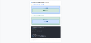
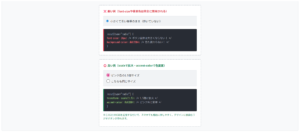
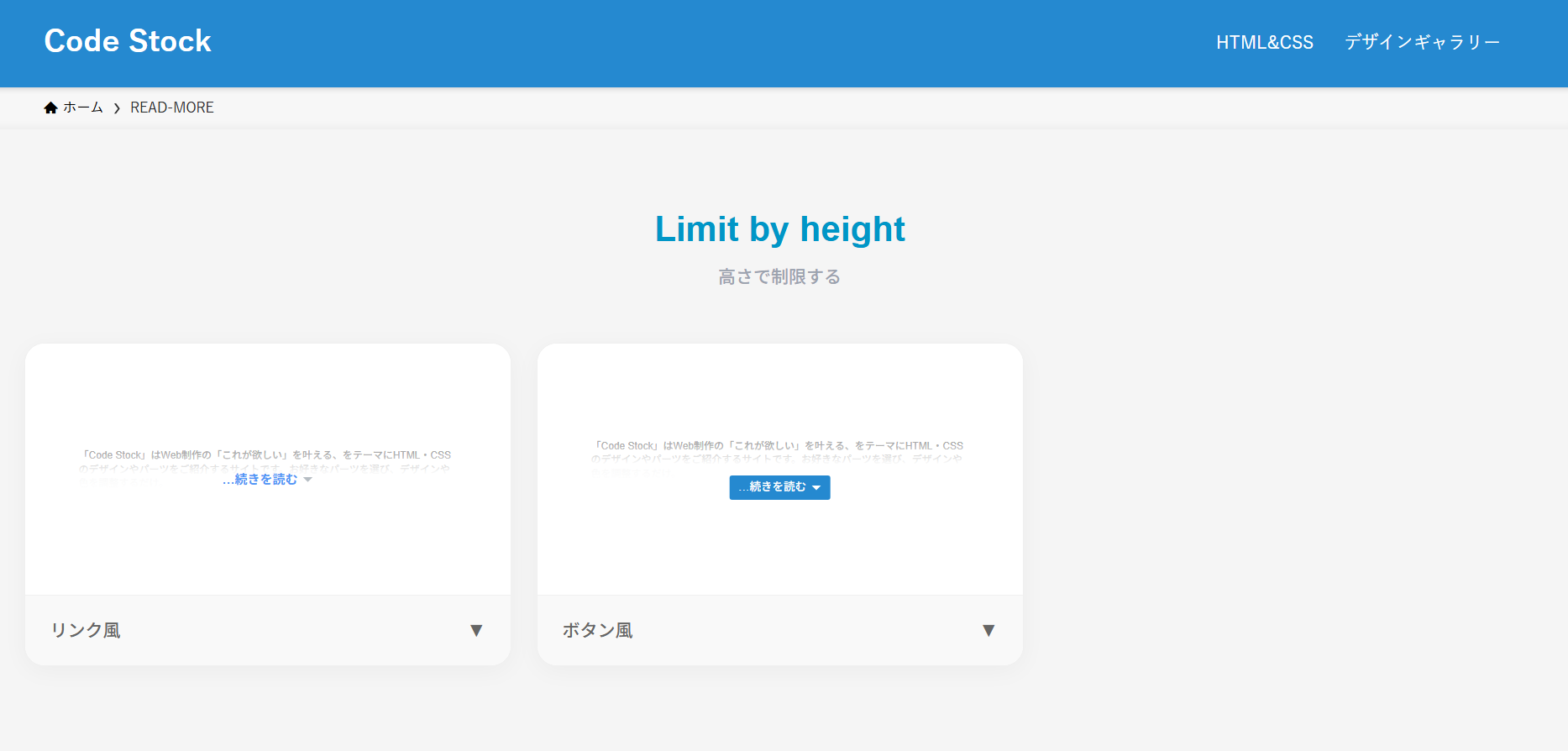
高さ制限の折りたたみ式「続きを読む」ボタン
ここでは、以下の高さ制限の折りたたみ式「続きを読む」ボタンデザイン例を記載しています。
- リンク風
- ボタン風
実際のデザインプレビューとHTML&CSSコードを記載しています。
さらに、以下の項目も「続きを読む」ボタンページでは選択式でご用意しました。
- リンク色
- ホバー時のリンク色
- ボタン色
- ボタンの形状:四角, 角丸
ご興味があれば「「続きを読む」ボタン一覧ページ」を一読ください。
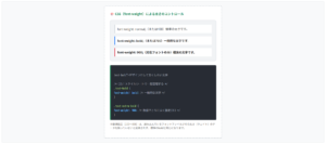
リンク風
「Code Stock」はWeb制作の「これが欲しい」を叶える、をテーマにHTML・CSSのデザインやパーツをご紹介するサイトです。 お好きなパーツを選び、デザインや色を調整するだけ。あとはHTMLやCSSをコピペすれば、コーディング要らずでサイトに取り入れることができます。 ちなみにどのコードにおいても、自由にご自身のWebサイトやブログで使用いただいて構いません。もちろんオリジナルにカスタマイズしてご使用いただいても大丈夫です。
HTMLコード表示
<div class="read-more-1">
  <p>
    「Code Stock」はWeb制作の「これが欲しい」を叶える、をテーマにHTML・CSSのデザインやパーツをご紹介するサイトです。
    お好きなパーツを選び、デザインや色を調整するだけ。あとはHTMLやCSSをコピペすれば、コーディング要らずでサイトに取り入れることができます。
    ちなみにどのコードにおいても、自由にご自身のWebサイトやブログで使用いただいて構いません。もちろんオリジナルにカスタマイズしてご使用いただいても大丈夫です。
  </p>
  <label>
    <input type="checkbox"/>
    ...続きを読む
  </label>
</div>
CSSコード表示
.read-more-1 {
position: relative;
}
.read-more-1 p {
position: relative;
max-height: 100px; /* 開く前に見せたい高さを指定 */
margin-bottom: 0;
overflow: hidden;
transition: max-height 1s;
}
.read-more-1:has(:checked) p {
max-height: 100vh;
}
.read-more-1 p::after {
display: block;
position: absolute;
left: 0;
bottom: 0;
width: 100%;
height: 60px;
background: linear-gradient(180deg, hsla(0, 0%, 100%, 0) 0, hsla(0, 0%, 100%, .9) 50%, hsla(0, 0%, 100%, .9) 0, #fff);
content: '';
}
.read-more-1:has(:checked) p::after {
content: none;
}
.read-more-1 label {
display: flex;
align-items: center;
gap: 0 4px;
position: absolute;
bottom: 0;
left: 50%;
transform: translateX(-50%);
color: #4f96f6;
font-size: .8em;
}
.read-more-1 label:hover {
color: #c7511f;
text-decoration: underline;
cursor: pointer;
}
.read-more-1:has(:checked) label {
display: none;
}
.read-more-1 label::after {
display: inline-block;
width: 10px;
height: 5px;
background-color: #b6bdc3;
clip-path: polygon(0 0, 100% 0, 50% 100%);
content: '';
}
.read-more-1 input {
display: none;
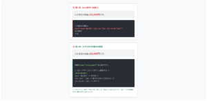
}ボタン風
「Code Stock」はWeb制作の「これが欲しい」を叶える、をテーマにHTML・CSSのデザインやパーツをご紹介するサイトです。 お好きなパーツを選び、デザインや色を調整するだけ。あとはHTMLやCSSをコピペすれば、コーディング要らずでサイトに取り入れることができます。 ちなみにどのコードにおいても、自由にご自身のWebサイトやブログで使用いただいて構いません。もちろんオリジナルにカスタマイズしてご使用いただいても大丈夫です。
HTMLコード表示
<div class="read-more-2">
  <p>
    「Code Stock」はWeb制作の「これが欲しい」を叶える、をテーマにHTML・CSSのデザインやパーツをご紹介するサイトです。
    お好きなパーツを選び、デザインや色を調整するだけ。あとはHTMLやCSSをコピペすれば、コーディング要らずでサイトに取り入れることができます。
    ちなみにどのコードにおいても、自由にご自身のWebサイトやブログで使用いただいて構いません。もちろんオリジナルにカスタマイズしてご使用いただいても大丈夫です。
  </p>
  <label>
    <input type="checkbox"/>
    ...続きを読む
  </label>
</div>
CSSコード表示
.read-more-2 {
position: relative;
}
.read-more-2 p {
position: relative;
max-height: 100px; /* 開く前に見せたい高さを指定 */
margin-bottom: 10px;
overflow: hidden;
transition: max-height 1s;
}
.read-more-2:has(:checked) p {
max-height: 100vh;
}
.read-more-2 p::after {
display: block;
position: absolute;
left: 0;
bottom: 0;
width: 100%;
height: 60px;
background: linear-gradient(180deg, hsla(0, 0%, 100%, 0) 0, hsla(0, 0%, 100%, .9) 50%, hsla(0, 0%, 100%, .9) 0, #fff);
content: '';
}
.read-more-2:has(:checked) p::after {
content: none;
}
.read-more-2 label {
display: flex;
align-items: center;
gap: 0 4px;
position: absolute;
bottom: 0;
left: 50%;
transform: translateX(-50%);
padding: .4em 1.2em;
border-radius: 1px;
background-color: #2589d0;
color: #fff;
font-size: .7em;
}
.read-more-2 label:hover {
border: 1px solid #2589d0;
background-color: #fff;
color: #2589d0;
cursor: pointer;
}
.read-more-2:has(:checked) label {
display: none;
}
.read-more-2 label::after {
display: inline-block;
width: 10px;
height: 5px;
background-color: #fff;
clip-path: polygon(0 0, 100% 0, 50% 100%);
content: '';
}
.read-more-2 label:hover::after {
background-color: #2589d0;
}
.read-more-2 input {
display: none;
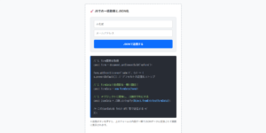
}行数制限の折りたたみ式「続きを読む」ボタン
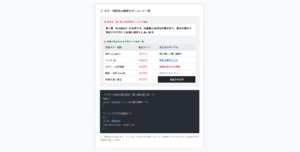
ここでは、以下の行数制限の折りたたみ式「続きを読む」ボタンデザイン例を記載しています。
- リンク風
- ボタン風
実際のデザインプレビューとHTML&CSSコードを記載しています。
さらに、以下の項目も「続きを読む」ボタンページでは選択式でご用意しました。
- リンク色
- ホバー時のリンク色
- ボタン色
- ボタンの形状:四角, 角丸
ご興味があれば「「続きを読む」ボタン一覧ページ」を一読ください。
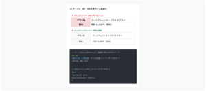
リンク風
「Code Stock」はWeb制作の「これが欲しい」を叶える、をテーマにHTML・CSSのデザインやパーツをご紹介するサイトです。 お好きなパーツを選び、デザインや色を調整するだけ。あとはHTMLやCSSをコピペすれば、コーディング要らずでサイトに取り入れることができます。 ちなみにどのコードにおいても、自由にご自身のWebサイトやブログで使用いただいて構いません。もちろんオリジナルにカスタマイズしてご使用いただいても大丈夫です。
HTMLコード表示
<div class="read-more-3">
  <p>
    「Code Stock」はWeb制作の「これが欲しい」を叶える、をテーマにHTML・CSSのデザインやパーツをご紹介するサイトです。
    お好きなパーツを選び、デザインや色を調整するだけ。あとはHTMLやCSSをコピペすれば、コーディング要らずでサイトに取り入れることができます。
    ちなみにどのコードにおいても、自由にご自身のWebサイトやブログで使用いただいて構いません。もちろんオリジナルにカスタマイズしてご使用いただいても大丈夫です。
  </p>
  <label>
    <input type="checkbox"/>
    ...続きを読む
  </label>
</div>
CSSコード表示
.read-more-3 {
position: relative;
}
.read-more-3 p {
display: -webkit-box;
position: relative;
margin-bottom: 0;
overflow: hidden;
-webkit-box-orient: vertical;
-webkit-line-clamp: 2; /* 開く前に見せたい行数を指定 */
}
.read-more-3:has(:checked) p {
display: block;
}
.read-more-3 p::after {
display: block;
position: absolute;
left: 0;
bottom: 0;
width: 100%;
height: 60px;
background: linear-gradient(180deg, hsla(0, 0%, 100%, 0) 0, hsla(0, 0%, 100%, .9) 50%, hsla(0, 0%, 100%, .9) 0, #fff);
content: '';
}
.read-more-3:has(:checked) p::after {
content: none;
}
.read-more-3 label {
display: flex;
align-items: center;
gap: 0 4px;
position: absolute;
bottom: 0;
left: 50%;
transform: translateX(-50%);
color: #4f96f6;
font-size: .8em;
}
.read-more-3 label:hover {
color: #c7511f;
text-decoration: underline;
cursor: pointer;
}
.read-more-3:has(:checked) label {
display: none;
}
.read-more-3 label::after {
display: inline-block;
width: 10px;
height: 5px;
background-color: #b6bdc3;
clip-path: polygon(0 0, 100% 0, 50% 100%);
content: '';
}
.read-more-3 input {
display: none;
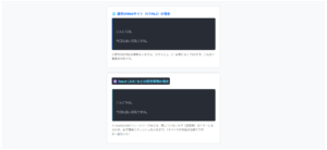
}ボタン風
「Code Stock」はWeb制作の「これが欲しい」を叶える、をテーマにHTML・CSSのデザインやパーツをご紹介するサイトです。 お好きなパーツを選び、デザインや色を調整するだけ。あとはHTMLやCSSをコピペすれば、コーディング要らずでサイトに取り入れることができます。 ちなみにどのコードにおいても、自由にご自身のWebサイトやブログで使用いただいて構いません。もちろんオリジナルにカスタマイズしてご使用いただいても大丈夫です。
HTMLコード表示
<div class="read-more-4">
  <p>
    「Code Stock」はWeb制作の「これが欲しい」を叶える、をテーマにHTML・CSSのデザインやパーツをご紹介するサイトです。
    お好きなパーツを選び、デザインや色を調整するだけ。あとはHTMLやCSSをコピペすれば、コーディング要らずでサイトに取り入れることができます。
    ちなみにどのコードにおいても、自由にご自身のWebサイトやブログで使用いただいて構いません。もちろんオリジナルにカスタマイズしてご使用いただいても大丈夫です。
  </p>
  <label>
    <input type="checkbox"/>
    ...続きを読む
  </label>
</div>
CSSコード表示
.read-more-4 {
  position: relative;
}

.read-more-4 p {
  display: -webkit-box;
  position: relative;
  margin-bottom: 10px;
  overflow: hidden;
  -webkit-box-orient: vertical;
  -webkit-line-clamp: 4; /* 開く前に見せたい行数を指定 */
}

.read-more-4:has(:checked) p {
  display: block;
}

.read-more-4 p::after {
  display: block;
  position: absolute;
  left: 0;
  bottom: 0;
  width: 100%;
  height: 60px;
  background: linear-gradient(180deg, hsla(0, 0%, 100%, 0) 0, hsla(0, 0%, 100%, .9) 50%, hsla(0, 0%, 100%, .9) 0, #fff);
  content: '';
}

.read-more-4:has(:checked) p::after {
  content: none;
}

.read-more-4 label {
  display: flex;
  align-items: center;
  gap: 0 4px;
  position: absolute;
  bottom: 0;
  left: 50%;
  transform: translateX(-50%);
  padding: .4em 1.2em;
  border-radius: 1px;
  background-color: #2589d0;
  color: #fff;
  font-size: .7em;
}

.read-more-4 label:hover {
  border: 1px solid #2589d0;
  background-color: #fff;
  color: #2589d0;
  cursor: pointer;
}

.read-more-4:has(:checked) label {
  display: none;
}

.read-more-4 label::after {
  display: inline-block;
  width: 10px;
  height: 5px;
  background-color: #fff;
  clip-path: polygon(0 0, 100% 0, 50% 100%);
  content: '';
}

.read-more-4 label:hover::after {
  background-color: #2589d0;
}

.read-more-4 input {
  display: none;
}