HTMLの<input>タグは、お問い合わせや検索など、ユーザーとWebサイトをつなぐ入力窓口です。
本記事では、用途別のtype属性からスマホ最適化、CSSデザイン、JavaScript連携を解説します。
HTMLにおけるinputタグの使い方
Webサイトでお問い合わせを受け付けたり、アンケートを実施したり、検索窓を作ったりする際、ユーザーに情報を入力してもらう根幹が<input>タグです。
HTML5からは単なる文字入力だけでなく、カレンダーの日付選択やカラースライダーなど、多彩な入力形式がサポートされるようになりました。
ここでは、フォーム作成の書き方と実務で知っておくべき「使いやすさ(UX)」を高める内容を解説します。
- inputタグの書き方と閉じタグ
- placeholder(入力ヒント)と初期値(value)
- labelタグとの連携でクリック領域を広げる
inputタグの書き方と閉じタグ
<input>タグを書く上で、初心者が間違えるのが「閉じタグ」の扱いです。
<p>テキスト</p> のように中身を囲むタグとは異なり、<input>タグは中身を持たない「空要素(エンプティ要素)」です。
そのため、</input>という閉じタグは存在せず、書いてはいけません。
<input> と単独で記述するのが正しい文法です。
また、<input>タグの特徴は、type属性の値を変えるだけでテキストボックス、パスワード入力欄、チェックボックスなど、異なる見た目と機能に変化することです。
実務で多いミスがtype属性を書き忘れて<input>とだけ書いてしまうことです。
この場合、ブラウザは自動的にtype="text"(1行のテキスト入力)として扱いますが、後からコードを見た人が「意図的にテキストにしたのか、書き忘れたのか」が分からず混乱になります。
テキスト入力であっても、必ず<input type="text">と明記するのがよいです。
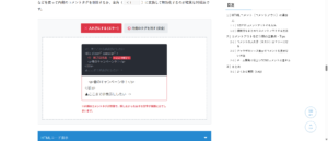
【type=”text”】
最も基本となる1行のテキスト入力欄です。お名前や住所の入力などに使います。
HTMLコード表示
<div class="hinp1-wrapper">
  <input type="radio" name="hinp1-state" id="hinp1-text" class="hinp1-radio" checked>
  <input type="radio" name="hinp1-state" id="hinp1-password" class="hinp1-radio">
  <input type="radio" name="hinp1-state" id="hinp1-checkbox" class="hinp1-radio">
  <input type="radio" name="hinp1-state" id="hinp1-date" class="hinp1-radio">

  <div class="hinp1-controls">
    <label for="hinp1-text" class="hinp1-btn">type="text"</label>
    <label for="hinp1-password" class="hinp1-btn">type="password"</label>
    <label for="hinp1-checkbox" class="hinp1-btn">type="checkbox"</label>
    <label for="hinp1-date" class="hinp1-btn">type="date"</label>
  </div>

  <div class="hinp1-demo-area">
    <div class="hinp1-box">
      <div class="hinp1-label">実際の入力欄:</div>

      <input type="text" class="hinp1-input target-text-hinp1" placeholder="文字を入力できます">
      <input type="password" class="hinp1-input target-password-hinp1" placeholder="入力文字が隠れます">
      <div class="hinp1-input-group target-checkbox-hinp1">
        <input type="checkbox" id="demo-check"> <label for="demo-check">チェックできます</label>
      </div>
      <input type="date" class="hinp1-input target-date-hinp1">

    </div>
  </div>

  <div class="hinp1-explanation">
    <p id="desc-text" class="hinp1-desc">【type="text"】<br>最も基本となる1行のテキスト入力欄です。お名前や住所の入力などに使います。</p>
    <p id="desc-password" class="hinp1-desc" style="display:none; color:#dc3545; font-weight:bold;">【type="password"】<br>入力した文字が「●●●」のように伏せ字になります。パスワード入力専用です。</p>
    <p id="desc-checkbox" class="hinp1-desc" style="display:none; color:#198754; font-weight:bold;">【type="checkbox"】<br>複数選択が可能な四角いチェックボックスになります。同意確認などによく使われます。</p>
    <p id="desc-date" class="hinp1-desc" style="display:none; color:#0d6efd; font-weight:bold;">【type="date"】<br>スマホやPCの標準カレンダーが起動し、直感的に日付を選択できるモダンな入力欄になります。</p>
  </div>
</div>
CSSコード表示
.hinp1-wrapper {
  background-color: #f8f9fa;
  padding: 20px;
  border: 1px solid #dee2e6;
  border-radius: 4px;
  font-family: sans-serif;
}

.hinp1-radio {
  display: none;
}

.hinp1-controls {
  display: flex;
  justify-content: center;
  gap: 10px;
  margin-bottom: 20px;
  flex-wrap: wrap;
}

.hinp1-btn {
  background-color: #e9ecef;
  padding: 10px 15px;
  border-radius: 4px;
  cursor: pointer;
  font-weight: bold;
  color: #495057;
  transition: 0.2s;
  font-size: 14px;
}

#hinp1-text:checked ~ .hinp1-controls [for="hinp1-text"] { background-color: #6c757d; color: white; }
#hinp1-password:checked ~ .hinp1-controls [for="hinp1-password"] { background-color: #dc3545; color: white; }
#hinp1-checkbox:checked ~ .hinp1-controls [for="hinp1-checkbox"] { background-color: #198754; color: white; }
#hinp1-date:checked ~ .hinp1-controls [for="hinp1-date"] { background-color: #0d6efd; color: white; }

.hinp1-demo-area {
  background-color: #ffffff;
  border: 2px dashed #adb5bd;
  padding: 40px 20px;
  display: flex;
  justify-content: center;
}

.hinp1-box {
  width: 100%;
  max-width: 300px;
  text-align: center;
}

.hinp1-label {
  font-size: 14px;
  font-weight: bold;
  color: #333;
  margin-bottom: 15px;
}

/* 入力欄の共通スタイル */
.hinp1-input {
  width: 100%;
  padding: 12px;
  font-size: 16px;
  border: 2px solid #ccc;
  border-radius: 4px;
  box-sizing: border-box;
}
.hinp1-input-group {
  display: flex;
  align-items: center;
  justify-content: center;
  gap: 8px;
  font-size: 16px;
}

/* 表示の切り替え */
.target-password-hinp1, .target-checkbox-hinp1, .target-date-hinp1 { display: none; }

#hinp1-text:checked ~ .hinp1-demo-area .target-text-hinp1 { display: block; }
#hinp1-text:checked ~ .hinp1-demo-area .target-password-hinp1,
#hinp1-text:checked ~ .hinp1-demo-area .target-checkbox-hinp1,
#hinp1-text:checked ~ .hinp1-demo-area .target-date-hinp1 { display: none; }

#hinp1-password:checked ~ .hinp1-demo-area .target-text-hinp1 { display: none; }
#hinp1-password:checked ~ .hinp1-demo-area .target-password-hinp1 { display: block; }

#hinp1-checkbox:checked ~ .hinp1-demo-area .target-text-hinp1 { display: none; }
#hinp1-checkbox:checked ~ .hinp1-demo-area .target-checkbox-hinp1 { display: flex; }

#hinp1-date:checked ~ .hinp1-demo-area .target-text-hinp1 { display: none; }
#hinp1-date:checked ~ .hinp1-demo-area .target-date-hinp1 { display: block; }

.hinp1-explanation {
  background-color: #fff;
  padding: 15px;
  border: 1px solid #ccc;
  border-radius: 4px;
  margin-top: 15px;
}

.hinp1-desc { margin: 0; font-size: 14px; line-height: 1.6; }

#hinp1-text:checked ~ .hinp1-explanation #desc-text { display: block !important; }
#hinp1-text:checked ~ .hinp1-explanation #desc-password,
#hinp1-text:checked ~ .hinp1-explanation #desc-checkbox,
#hinp1-text:checked ~ .hinp1-explanation #desc-date { display: none !important; }

#hinp1-password:checked ~ .hinp1-explanation #desc-password { display: block !important; }
#hinp1-password:checked ~ .hinp1-explanation #desc-text,
#hinp1-password:checked ~ .hinp1-explanation #desc-checkbox,
#hinp1-password:checked ~ .hinp1-explanation #desc-date { display: none !important; }

#hinp1-checkbox:checked ~ .hinp1-explanation #desc-checkbox { display: block !important; }
#hinp1-checkbox:checked ~ .hinp1-explanation #desc-text,
#hinp1-checkbox:checked ~ .hinp1-explanation #desc-password,
#hinp1-checkbox:checked ~ .hinp1-explanation #desc-date { display: none !important; }

#hinp1-date:checked ~ .hinp1-explanation #desc-date { display: block !important; }
#hinp1-date:checked ~ .hinp1-explanation #desc-text,
#hinp1-date:checked ~ .hinp1-explanation #desc-password,
#hinp1-date:checked ~ .hinp1-explanation #desc-checkbox { display: none !important; }
placeholder(入力ヒント)と初期値(value)
入力欄の中に「山田 太郎」や「例:東京都〜」といった薄い文字でガイドを表示させるにはplaceholder属性を使用します。
ユーザーが文字を入力し始めた瞬間に自動的に消えます。
一方、最初から入力欄に文字が入っている状態を作るにはvalue属性を使用します。
valueは実際に入力されているデータなので、ユーザーが自分で消したり書き換える必要があります。
※入力欄をクリックして文字を打ち始めると、薄いガイドテキストは自動的にスッと消えます。これが正解です。
※文字を打とうとしてもガイドが消えないため、ユーザーがわざわざ「例:山田 太郎」を消してから自分の名前を打たなければならず、非常にストレスです。
HTMLコード表示
<div class="hinp2-wrapper">
  <input type="radio" name="hinp2-state" id="hinp2-placeholder" class="hinp2-radio" checked>
  <input type="radio" name="hinp2-state" id="hinp2-value" class="hinp2-radio">

  <div class="hinp2-controls">
    <label for="hinp2-placeholder" class="hinp2-btn">⭕️ placeholder (入力ヒント)</label>
    <label for="hinp2-value" class="hinp2-btn">❌ value (初期値・消すのが面倒)</label>
  </div>

  <div class="hinp2-demo-area">

    <div class="hinp2-box target-ph-hinp2">
      <div class="hinp2-label">お名前をご入力ください</div>
      <input type="text" class="hinp2-input" placeholder="例:山田 太郎">
      <div class="hinp2-code">
        <input type="text" <span class="hinp2-hl-ok">placeholder="例:山田 太郎"</span>>
      </div>
      <p class="hinp2-note hinp2-note-ok">※入力欄をクリックして文字を打ち始めると、薄いガイドテキストは自動的にスッと消えます。これが正解です。</p>
    </div>

    <div class="hinp2-box target-val-hinp2">
      <div class="hinp2-label">お名前をご入力ください</div>
      <input type="text" class="hinp2-input" value="例:山田 太郎">
      <div class="hinp2-code hinp2-code-bad">
        <input type="text" <span class="hinp2-hl-error">value="例:山田 太郎"</span>>
      </div>
      <p class="hinp2-note">※文字を打とうとしてもガイドが消えないため、ユーザーがわざわざ「例:山田 太郎」を消してから自分の名前を打たなければならず、非常にストレスです。</p>
    </div>

  </div>
</div>
CSSコード表示
.hinp2-wrapper {
  background-color: #f8f9fa;
  padding: 20px;
  border: 1px solid #dee2e6;
  border-radius: 4px;
  font-family: sans-serif;
}

.hinp2-radio {
  display: none;
}

.hinp2-controls {
  display: flex;
  justify-content: center;
  gap: 10px;
  margin-bottom: 20px;
  flex-wrap: wrap;
}

.hinp2-btn {
  background-color: #e9ecef;
  padding: 10px 15px;
  border-radius: 4px;
  cursor: pointer;
  font-weight: bold;
  color: #495057;
  transition: 0.2s;
  font-size: 14px;
}

#hinp2-placeholder:checked ~ .hinp2-controls [for="hinp2-placeholder"] { background-color: #198754; color: white; }
#hinp2-value:checked ~ .hinp2-controls [for="hinp2-value"] { background-color: #dc3545; color: white; }

.hinp2-demo-area {
  background-color: #ffffff;
  border: 2px dashed #adb5bd;
  padding: 30px 20px;
  display: flex;
  justify-content: center;
}

.hinp2-box {
  width: 100%;
  max-width: 400px;
}

.hinp2-label {
  font-size: 14px;
  font-weight: bold;
  color: #333;
  margin-bottom: 10px;
}

.hinp2-input {
  width: 100%;
  padding: 12px;
  font-size: 16px;
  border: 2px solid #0d6efd;
  border-radius: 4px;
  box-sizing: border-box;
  margin-bottom: 15px;
}

.hinp2-code {
  background-color: #d1e7dd;
  color: #0f5132;
  padding: 15px;
  font-family: monospace;
  font-size: 13px;
  border-radius: 4px;
  border-left: 4px solid #198754;
  margin-bottom: 15px;
}

.hinp2-code-bad {
  background-color: #f8d7da;
  color: #842029;
  border-left-color: #dc3545;
}

.hinp2-hl-ok { font-weight: bold; color: #198754; }
.hinp2-hl-error { font-weight: bold; color: #dc3545; text-decoration: underline; }

.hinp2-note {
  font-size: 13px;
  color: #dc3545;
  font-weight: bold;
  line-height: 1.5;
  margin: 0;
}

.hinp2-note-ok {
  color: #198754;
}

/* 表示切り替え */
.target-val-hinp2 { display: none; }

#hinp2-placeholder:checked ~ .hinp2-demo-area .target-ph-hinp2 { display: block; }
#hinp2-placeholder:checked ~ .hinp2-demo-area .target-val-hinp2 { display: none; }

#hinp2-value:checked ~ .hinp2-demo-area .target-ph-hinp2 { display: none; }
#hinp2-value:checked ~ .hinp2-demo-area .target-val-hinp2 { display: block; }
labelタグとの連携でクリック領域を広げる
チェックボックス(type="checkbox")やラジオボタン(type="radio")を配置する際、セットで使わなければならないのが<label>タグです。
通常、チェックボックスは四角い小さな箱の部分をクリックしないとチェックが入りません。
しかし、<label>タグを使って入力欄とテキストを結びつけると、テキストの文字部分をクリックしてもチェックが入るという効果が得られます。
連携させる方法は2つあります。
- for属性とid属性で結びつける
<label for="hoge">文字</label> <input id="hoge">のように同じ名前をつけて紐付けます。 - labelで直接囲む
<label><input> 文字</label>のようにタグごと包み込みます。
※四角い枠の「中」を正確にクリックしないと反応しません。文字を押しても無反応です。
<span>利用規約に同意する</span>
※「利用規約に〜」の文字部分のどこをクリックしても、快適にチェックが入ります。
<input type=”checkbox”>
利用規約に同意する
</label>
HTMLコード表示
<div class="hinp3-wrapper">

  <div class="hinp3-demo-area">

    <div class="hinp3-box">
      <div class="hinp3-title">❌ 悪い例(label連携なし)</div>
      <p class="hinp3-note">※四角い枠の「中」を正確にクリックしないと反応しません。文字を押しても無反応です。</p>

      <div class="hinp3-input-group hinp3-group-bad">
        <input type="checkbox" class="hinp3-checkbox">
        <span>利用規約に同意する</span>
      </div>

      <div class="hinp3-code hinp3-code-bad">
        <input type="checkbox"><br>
        <span>利用規約に同意する</span>
      </div>
    </div>

    <div class="hinp3-box">
      <div class="hinp3-title" style="color:#198754;">⭕️ 良い例(label連携あり)</div>
      <p class="hinp3-note" style="color:#198754;">※「利用規約に〜」の文字部分のどこをクリックしても、快適にチェックが入ります。</p>

      <label class="hinp3-input-group hinp3-group-good">
        <input type="checkbox" class="hinp3-checkbox">
        <span class="hinp3-clickable-text">利用規約に同意する</span>
      </label>

      <div class="hinp3-code">
        <span class="hinp3-hl"><label></span><br>
          <input type="checkbox"><br>
          利用規約に同意する<br>
        <span class="hinp3-hl"></label></span>
      </div>
    </div>

  </div>
</div>
CSSコード表示
.hinp3-wrapper {
  background-color: #f8f9fa;
  padding: 20px;
  border: 1px solid #dee2e6;
  border-radius: 4px;
  font-family: sans-serif;
}

.hinp3-demo-area {
  display: flex;
  flex-direction: column;
  gap: 30px;
}

.hinp3-box {
  background-color: #ffffff;
  border: 2px dashed #adb5bd;
  padding: 20px;
  border-radius: 4px;
}

.hinp3-title {
  margin: 0 0 10px 0;
  font-size: 16px;
  color: #dc3545;
}

.hinp3-note {
  margin: 0 0 20px 0;
  font-size: 13px;
  color: #666;
  font-weight: bold;
}

/* 共通の入力グループスタイル */
.hinp3-input-group {
  display: flex;
  align-items: center;
  gap: 10px;
  padding: 15px;
  background-color: #f1f3f5;
  border: 1px solid #dee2e6;
  border-radius: 4px;
  font-size: 16px;
  margin-bottom: 15px;
}

.hinp3-checkbox {
  width: 20px;
  height: 20px;
  cursor: pointer;
}

/* ⭕️ 良い例の専用スタイル(ホバーアクションでクリックできることをアピール) */
.hinp3-group-good {
  cursor: pointer; /* エリア全体を指マークにする */
  transition: background-color 0.2s;
  border-color: #198754;
  background-color: #e7f1ff; /* 少し目立たせる */
}
.hinp3-group-good:hover {
  background-color: #d1e7dd;
}
.hinp3-clickable-text {
  font-weight: bold;
  color: #0d6efd;
  text-decoration: underline;
}

.hinp3-code {
  background-color: #d1e7dd;
  color: #0f5132;
  padding: 15px;
  font-family: monospace;
  font-size: 13px;
  border-radius: 4px;
  border-left: 4px solid #198754;
}

.hinp3-code-bad {
  background-color: #f8d7da;
  color: #842029;
  border-left-color: #dc3545;
}

.hinp3-hl {
  font-weight: bold;
  color: #198754;
}
主要なtype属性の種類と一覧
<input>タグの魅力はtype属性を変更するだけで、テキストボックスからカレンダー、ファイルアップロードまで、あらゆる入力に変えることができる点です。
HTML5以降はスマートフォンなどのタッチデバイスに最適化された形式が追加されました。
ここでは、実務で使う主要なtype属性を用途別の一覧として解説します。
- テキスト・パスワード入力
- 数値・金額の入力
- 日付・時間の選択
- チェックボックス・ラジオボタン
- ファイルのアップロード
- ボタン・送信・非表示
テキスト・パスワード入力
1行のテキストを入力させるtype="text"と入力文字が「●●●」のように伏せ字になるtype="password"です。
お名前、メールアドレス、ログインパスワードなどに使用します。
HTMLコード表示
<div class="htype1-wrapper">
  <input type="radio" name="htype1-state" id="htype1-text" class="htype1-radio" checked>
  <input type="radio" name="htype1-state" id="htype1-password" class="htype1-radio">
  <input type="radio" name="htype1-state" id="htype1-textarea" class="htype1-radio">

  <div class="htype1-controls">
    <label for="htype1-text" class="htype1-btn">text (1行)</label>
    <label for="htype1-password" class="htype1-btn">password (伏せ字)</label>
    <label for="htype1-textarea" class="htype1-btn">✨ textarea (複数行)</label>
  </div>

  <div class="htype1-demo-area">

    <div class="htype1-box target-text-htype1">
      <div class="htype1-label">お名前:</div>
      <input type="text" class="htype1-input" placeholder="例:山田 太郎">
    </div>

    <div class="htype1-box target-password-htype1">
      <div class="htype1-label">パスワード:</div>
      <input type="password" class="htype1-input" placeholder="英数字8文字以上">
    </div>

    <div class="htype1-box target-textarea-htype1">
      <div class="htype1-label">お問い合わせ内容:</div>
      <textarea class="htype1-textarea" rows="4" placeholder="ご自由にご記入ください..."></textarea>
    </div>

  </div>
</div>
CSSコード表示
.htype1-wrapper {
  background-color: #f8f9fa;
  padding: 20px;
  border: 1px solid #dee2e6;
  border-radius: 4px;
  font-family: sans-serif;
}

.htype1-radio {
  display: none;
}

.htype1-controls {
  display: flex;
  justify-content: center;
  gap: 10px;
  margin-bottom: 20px;
  flex-wrap: wrap;
}

.htype1-btn {
  background-color: #e9ecef;
  padding: 10px 15px;
  border-radius: 4px;
  cursor: pointer;
  font-weight: bold;
  color: #495057;
  transition: 0.2s;
  font-size: 14px;
}

#htype1-text:checked ~ .htype1-controls [for="htype1-text"] {
  background-color: #0d6efd;
  color: white;
}

#htype1-password:checked ~ .htype1-controls [for="htype1-password"] {
  background-color: #dc3545;
  color: white;
}

#htype1-textarea:checked ~ .htype1-controls [for="htype1-textarea"] {
  background-color: #198754;
  color: white;
}

.htype1-demo-area {
  background-color: #ffffff;
  border: 2px dashed #adb5bd;
  padding: 30px 20px;
  display: flex;
  justify-content: center;
}

.htype1-box {
  width: 100%;
  max-width: 300px;
}

.htype1-label {
  font-size: 14px;
  font-weight: bold;
  color: #333;
  margin-bottom: 5px;
}

.htype1-input, .htype1-textarea {
  width: 100%;
  padding: 10px;
  font-size: 16px;
  border: 2px solid #ccc;
  border-radius: 4px;
  box-sizing: border-box;
}

.htype1-textarea {
  resize: vertical; /* 縦方向のみリサイズ可能に */
}

.target-password-htype1, .target-textarea-htype1 {
  display: none;
}

#htype1-text:checked ~ .htype1-demo-area .target-text-htype1 {
  display: block;
}

#htype1-text:checked ~ .htype1-demo-area .target-password-htype1 {
  display: none;
}

#htype1-text:checked ~ .htype1-demo-area .target-textarea-htype1 {
  display: none;
}

#htype1-password:checked ~ .htype1-demo-area .target-text-htype1 {
  display: none;
}

#htype1-password:checked ~ .htype1-demo-area .target-password-htype1 {
  display: block;
}

#htype1-password:checked ~ .htype1-demo-area .target-textarea-htype1 {
  display: none;
}

#htype1-textarea:checked ~ .htype1-demo-area .target-text-htype1 {
  display: none;
}

#htype1-textarea:checked ~ .htype1-demo-area .target-password-htype1 {
  display: none;
}

#htype1-textarea:checked ~ .htype1-demo-area .target-textarea-htype1 {
  display: block;
}
数値・金額の入力
年齢や金額など、数字のみを入力させたい場合はtype="number"を使用します。
PCブラウザでは右側に数値を増減させるスピンボタンが表示され、スマホでは数字キーボードが立ち上がるため、ユーザーに優しい設計になります。
また、音量調整のように直感的にバーを動かして数値を決めさせたい場合はtype="range"を使用します。
※PCでは右端の上下ボタンで増減でき、スマホでは数字キーボードが開きます。step=”1″を指定することで小数を防ぎます。
※直感的なスライダーが表示されます。詳細な数値が見えなくても良い設定項目に向いています。
HTMLコード表示
<div class="htype2-wrapper">
  <input type="radio" name="htype2-state" id="htype2-number" class="htype2-radio" checked>
  <input type="radio" name="htype2-state" id="htype2-range" class="htype2-radio">

  <div class="htype2-controls">
    <label for="htype2-number" class="htype2-btn">number (数値入力)</label>
    <label for="htype2-range" class="htype2-btn">range (スライダー)</label>
  </div>

  <div class="htype2-demo-area">

    <div class="htype2-box target-number-htype2">
      <div class="htype2-label">注文数(整数のみ):</div>
      <input type="number" class="htype2-input" min="1" step="1" value="1">
      <p class="htype2-note">※PCでは右端の上下ボタンで増減でき、スマホでは数字キーボードが開きます。step="1"を指定することで小数を防ぎます。</p>
    </div>

    <div class="htype2-box target-range-htype2">
      <div class="htype2-label">ボリューム調整:</div>
      <input type="range" class="htype2-range" min="0" max="100" value="50">
      <p class="htype2-note">※直感的なスライダーが表示されます。詳細な数値が見えなくても良い設定項目に向いています。</p>
    </div>

  </div>
</div>
CSSコード表示
.htype2-wrapper {
  background-color: #f8f9fa;
  padding: 20px;
  border: 1px solid #dee2e6;
  border-radius: 4px;
  font-family: sans-serif;
}

.htype2-radio {
  display: none;
}

.htype2-controls {
  display: flex;
  justify-content: center;
  gap: 10px;
  margin-bottom: 20px;
  flex-wrap: wrap;
}

.htype2-btn {
  background-color: #e9ecef;
  padding: 10px 15px;
  border-radius: 4px;
  cursor: pointer;
  font-weight: bold;
  color: #495057;
  transition: 0.2s;
  font-size: 14px;
}

#htype2-number:checked ~ .htype2-controls [for="htype2-number"] {
  background-color: #fd7e14;
  color: white;
}

#htype2-range:checked ~ .htype2-controls [for="htype2-range"] {
  background-color: #6f42c1;
  color: white;
}

.htype2-demo-area {
  background-color: #ffffff;
  border: 2px dashed #adb5bd;
  padding: 30px 20px;
  display: flex;
  justify-content: center;
}

.htype2-box {
  width: 100%;
  max-width: 300px;
  text-align: center;
}

.htype2-label {
  font-size: 14px;
  font-weight: bold;
  color: #333;
  margin-bottom: 15px;
}

.htype2-input {
  width: 100%;
  padding: 10px;
  font-size: 16px;
  border: 2px solid #fd7e14;
  border-radius: 4px;
  box-sizing: border-box;
  text-align: right;
}

.htype2-range {
  width: 100%;
  cursor: pointer;
}

.htype2-note {
  font-size: 13px;
  color: #666;
  text-align: left;
  margin-top: 15px;
  line-height: 1.5;
}

.target-range-htype2 {
  display: none;
}

#htype2-number:checked ~ .htype2-demo-area .target-number-htype2 {
  display: block;
}

#htype2-number:checked ~ .htype2-demo-area .target-range-htype2 {
  display: none;
}

#htype2-range:checked ~ .htype2-demo-area .target-number-htype2 {
  display: none;
}

#htype2-range:checked ~ .htype2-demo-area .target-range-htype2 {
  display: block;
}
日付・時間の選択
予約フォームなどでユーザーに日付や時間を選ばせる場合、わざわざ「年」「月」「日」のテキストボックスを3つ作る必要はありません。
type="date"を指定するだけで、ブラウザやスマホが持つ標準の「カレンダーUI」を呼び出せます。
同様に、時間ならtype="time"、年月ならtype="month"を使用します。
※クリックするとカレンダーが表示されます。初期値を設定する場合は、必ず「YYYY-MM-DD」のハイフン形式を使います。
※時間を直感的に選べるドラムロールなどが表示されます。(表示はブラウザにより異なります)
※クレジットカードの有効期限など、年と月だけを選択させる場合に便利です。
HTMLコード表示
<div class="htype3-wrapper">
  <input type="radio" name="htype3-state" id="htype3-date" class="htype3-radio" checked>
  <input type="radio" name="htype3-state" id="htype3-time" class="htype3-radio">
  <input type="radio" name="htype3-state" id="htype3-month" class="htype3-radio">

  <div class="htype3-controls">
    <label for="htype3-date" class="htype3-btn">date (年月日)</label>
    <label for="htype3-time" class="htype3-btn">time (時間)</label>
    <label for="htype3-month" class="htype3-btn">month (年月)</label>
  </div>

  <div class="htype3-demo-area">

    <div class="htype3-box target-date-htype3">
      <div class="htype3-label">予約日:</div>
      <input type="date" class="htype3-input" value="2024-12-25">
      <p class="htype3-note">※クリックするとカレンダーが表示されます。初期値を設定する場合は、必ず「YYYY-MM-DD」のハイフン形式を使います。</p>
    </div>

    <div class="htype3-box target-time-htype3">
      <div class="htype3-label">予約時間:</div>
      <input type="time" class="htype3-input" value="19:30">
      <p class="htype3-note">※時間を直感的に選べるドラムロールなどが表示されます。(表示はブラウザにより異なります)</p>
    </div>

    <div class="htype3-box target-month-htype3">
      <div class="htype3-label">有効期限(月):</div>
      <input type="month" class="htype3-input" value="2025-05">
      <p class="htype3-note">※クレジットカードの有効期限など、年と月だけを選択させる場合に便利です。</p>
    </div>

  </div>
</div>
CSSコード表示
.htype3-wrapper {
  background-color: #f8f9fa;
  padding: 20px;
  border: 1px solid #dee2e6;
  border-radius: 4px;
  font-family: sans-serif;
}

.htype3-radio {
  display: none;
}

.htype3-controls {
  display: flex;
  justify-content: center;
  gap: 10px;
  margin-bottom: 20px;
  flex-wrap: wrap;
}

.htype3-btn {
  background-color: #e9ecef;
  padding: 10px 15px;
  border-radius: 4px;
  cursor: pointer;
  font-weight: bold;
  color: #495057;
  transition: 0.2s;
  font-size: 14px;
}

#htype3-date:checked ~ .htype3-controls [for="htype3-date"] {
  background-color: #198754;
  color: white;
}

#htype3-time:checked ~ .htype3-controls [for="htype3-time"] {
  background-color: #0dcaf0;
  color: #000;
}

#htype3-month:checked ~ .htype3-controls [for="htype3-month"] {
  background-color: #d63384;
  color: white;
}

.htype3-demo-area {
  background-color: #ffffff;
  border: 2px dashed #adb5bd;
  padding: 30px 20px;
  display: flex;
  justify-content: center;
}

.htype3-box {
  width: 100%;
  max-width: 300px;
  text-align: center;
}

.htype3-label {
  font-size: 14px;
  font-weight: bold;
  color: #333;
  margin-bottom: 10px;
}

.htype3-input {
  width: 100%;
  padding: 10px;
  font-size: 18px;
  border: 2px solid #ccc;
  border-radius: 4px;
  box-sizing: border-box;
  cursor: pointer;
}

.htype3-note {
  font-size: 13px;
  color: #666;
  text-align: left;
  margin-top: 15px;
  line-height: 1.5;
}

.target-time-htype3, .target-month-htype3 {
  display: none;
}

#htype3-date:checked ~ .htype3-demo-area .target-date-htype3 {
  display: block;
}

#htype3-date:checked ~ .htype3-demo-area .target-time-htype3 {
  display: none;
}

#htype3-date:checked ~ .htype3-demo-area .target-month-htype3 {
  display: none;
}

#htype3-time:checked ~ .htype3-demo-area .target-date-htype3 {
  display: none;
}

#htype3-time:checked ~ .htype3-demo-area .target-time-htype3 {
  display: block;
}

#htype3-time:checked ~ .htype3-demo-area .target-month-htype3 {
  display: none;
}

#htype3-month:checked ~ .htype3-demo-area .target-date-htype3 {
  display: none;
}

#htype3-month:checked ~ .htype3-demo-area .target-time-htype3 {
  display: none;
}

#htype3-month:checked ~ .htype3-demo-area .target-month-htype3 {
  display: block;
}
チェックボックス・ラジオボタン
ユーザーに選択肢を提示する際に使うのが複数選択可能なtype="checkbox"と1つしか選べないtype="radio"です。
また、最初から選択された状態にしたい場合は、タグの中にcheckedという属性を記述します。
HTMLコード表示
<div class="htype4-wrapper">

  <div class="htype4-demo-area">

    <div class="htype4-box">
      <div class="htype4-label">ご希望のオプション(複数選択可)</div>

      <label class="htype4-check-item">
        <input type="checkbox" name="option" value="gift"> ギフト包装
      </label>
      <label class="htype4-check-item">
        <input type="checkbox" name="option" value="express"> お急ぎ便
      </label>
      <label class="htype4-check-item">
        <input type="checkbox" name="option" value="magazine" checked> メルマガ購読 (初期チェック済)
      </label>
    </div>

    <div class="htype4-box">
      <div class="htype4-label">お支払い方法(1つだけ選択)</div>

      <label class="htype4-check-item">
        <input type="radio" name="payment" value="card" checked> クレジットカード
      </label>
      <label class="htype4-check-item">
        <input type="radio" name="payment" value="bank"> 銀行振込
      </label>
      <label class="htype4-check-item">
        <input type="radio" name="payment" value="cash"> 代引き
      </label>
    </div>

  </div>
</div>
CSSコード表示
.htype4-wrapper {
  background-color: #f8f9fa;
  padding: 20px;
  border: 1px solid #dee2e6;
  border-radius: 4px;
  font-family: sans-serif;
}

.htype4-demo-area {
  display: flex;
  flex-direction: column;
  gap: 20px;
  align-items: center;
}

.htype4-box {
  background-color: #ffffff;
  border: 2px dashed #adb5bd;
  padding: 20px;
  width: 100%;
  max-width: 350px;
  border-radius: 4px;
}

.htype4-label {
  font-size: 15px;
  font-weight: bold;
  color: #333;
  margin-bottom: 15px;
  border-bottom: 2px solid #dee2e6;
  padding-bottom: 5px;
}

.htype4-check-item {
  display: flex;
  align-items: center;
  gap: 10px;
  margin-bottom: 10px;
  cursor: pointer;
  padding: 8px;
  border-radius: 4px;
  transition: background-color 0.2s;
}

.htype4-check-item:hover {
  background-color: #e9ecef;
}

.htype4-check-item input {
  width: 18px;
  height: 18px;
  cursor: pointer;
}
ファイルのアップロード
ユーザーに顔写真や履歴書(PDFなど)を送信させたい場合はtype="file"を使用します。
※ファイル選択画面を開いた際、画像(jpgやpng)以外のファイルが選べないように制御されます。また、ドラッグなどで複数枚を同時に選べます。
HTMLコード表示
<div class="htype5-wrapper">

  <div class="htype5-demo-area">

    <div class="htype5-box">
      <div class="htype5-label">制限なし(何でも選べる)</div>
      <input type="file" class="htype5-file-input">
      <div class="htype5-code">
        <input type="file">
      </div>
    </div>

    <div class="htype5-box">
      <div class="htype5-label" style="color:#0d6efd;">⭕️ 画像のみ(複数OK)</div>
      <input type="file" class="htype5-file-input" accept="image/*" multiple>
      <div class="htype5-code" style="border-left-color:#0d6efd;">
        <input type="file" <span class="htype5-hl">accept="image/*"</span> <span class="htype5-hl">multiple</span>>
      </div>
      <p class="htype5-note">※ファイル選択画面を開いた際、画像(jpgやpng)以外のファイルが選べないように制御されます。また、ドラッグなどで複数枚を同時に選べます。</p>
    </div>

  </div>
</div>
CSSコード表示
.htype5-wrapper {
  background-color: #f8f9fa;
  padding: 20px;
  border: 1px solid #dee2e6;
  border-radius: 4px;
  font-family: sans-serif;
}

.htype5-demo-area {
  display: flex;
  flex-direction: column;
  gap: 20px;
  align-items: center;
}

.htype5-box {
  background-color: #ffffff;
  border: 2px dashed #adb5bd;
  padding: 20px;
  width: 100%;
  max-width: 400px;
  border-radius: 4px;
}

.htype5-label {
  font-size: 14px;
  font-weight: bold;
  color: #333;
  margin-bottom: 10px;
}

.htype5-file-input {
  width: 100%;
  padding: 10px;
  border: 1px solid #ccc;
  border-radius: 4px;
  background-color: #f1f3f5;
  cursor: pointer;
}

.htype5-code {
  background-color: #282c34;
  color: #abb2bf;
  padding: 15px;
  font-family: monospace;
  font-size: 13px;
  border-radius: 4px;
  border-left: 4px solid #ccc;
  margin-top: 15px;
  line-height: 1.5;
}

.htype5-hl {
  color: #61afef;
  font-weight: bold;
}

.htype5-note {
  font-size: 13px;
  color: #666;
  margin: 15px 0 0 0;
  line-height: 1.5;
  font-weight: bold;
}
ボタン・送信・非表示
フォームに入力したデータを送信したり、JavaScriptを動かしたりするボタンも<input>タグで作れます。
type="submit"(送信ボタン)
これを押すと、フォーム内に入力されたデータがサーバーへ送信されます。type="button"(ただのボタン)
これを押しても何も起きません。
JavaScriptと連携させて動きを作る際に使用します。type="hidden"(非表示データ)
画面には表示されませんがデータを裏側で保持します。
「ユーザーID」など、見せる必要はないが一緒に送信したいデータを埋め込めます。
type="hidden" が存在しますが、画面上には全く表示されず、裏側でデータを保持しています。)
HTMLコード表示
<div class="htype6-wrapper">

  <div class="htype6-demo-area">

    <div class="htype6-box">
      <div class="htype6-label">システム用の隠しデータ</div>
      <input type="hidden" name="user_id" value="12345">
      <div class="htype6-hidden-demo">
        (ここに <code>type="hidden"</code> が存在しますが、画面上には全く表示されず、裏側でデータを保持しています。)
      </div>
    </div>

    <div class="htype6-box">
      <div class="htype6-label">❌ 古い作り方(inputタグ)</div>
      <input type="submit" value="送信する" class="htype6-old-btn">
    </div>

    <div class="htype6-box">
      <div class="htype6-label" style="color:#198754;">⭕️ 現代の作り方(buttonタグ)</div>
      <button type="submit" class="htype6-modern-btn">
        <span class="htype6-icon">✉️</span> メッセージを送信する
      </button>
    </div>

  </div>
</div>
CSSコード表示
.htype6-wrapper {
  background-color: #f8f9fa;
  padding: 20px;
  border: 1px solid #dee2e6;
  border-radius: 4px;
  font-family: sans-serif;
}

.htype6-demo-area {
  display: flex;
  flex-direction: column;
  gap: 20px;
  align-items: center;
}

.htype6-box {
  background-color: #ffffff;
  border: 2px dashed #adb5bd;
  padding: 20px;
  width: 100%;
  max-width: 350px;
  border-radius: 4px;
  text-align: center;
}

.htype6-label {
  font-size: 14px;
  font-weight: bold;
  color: #333;
  margin-bottom: 15px;
}

.htype6-hidden-demo {
  background-color: #f1f3f5;
  border: 1px dashed #ccc;
  padding: 15px;
  font-size: 13px;
  color: #666;
  border-radius: 4px;
}

/* 古いinputボタンのスタイル */
.htype6-old-btn {
  padding: 10px 20px;
  font-size: 15px;
  cursor: pointer;
  border: 1px solid #999;
  background-color: #eee;
}

/* 現代のbuttonタグのスタイル */
.htype6-modern-btn {
  display: flex;
  align-items: center;
  justify-content: center;
  gap: 10px;
  width: 100%;
  padding: 15px;
  font-size: 16px;
  font-weight: bold;
  color: white;
  background-color: #198754;
  border: none;
  border-radius: 30px;
  cursor: pointer;
  transition: 0.2s;
  box-shadow: 0 4px 6px rgba(25, 135, 84, 0.2);
}

.htype6-modern-btn:hover {
  background-color: #146c43;
  transform: translateY(-2px);
}

.htype6-icon {
  font-size: 20px;
}<button>タグの使い方を詳しく知りたい人は「【HTML】buttonタグの使い方:リンク・CSS装飾・無効化」を一読ください。
スマホ最適化:inputmode属性とキーボード制御
Webサイトにおいて、アクセスの大半はスマートフォンからの閲覧です。
スマホユーザーにとってフォームの入力は面倒な作業であり、ストレスなくタイピングできるかが離脱率を左右します。
そこで活躍するのがHTMLのinputmode属性です。
type属性が入力データの種類や裏側のバリデーションを決めるのに対し、inputmode属性はスマホで入力欄をタップした時にどのキーボードを立ち上げるかをブラウザに指示する属性です。
- スマホのテンキー・英字キーボードを切り替える
スマホのテンキー・英字キーボードを切り替える
スマホで数字を入力させたい場面において、キーボードの切り替えは重要です。
例えば、電話番号や郵便番号・クレジットカード番号などを入力する際、最初から数字のキーボードが開けばユーザーはキーボードを切り替える手間が省けます。
inputmode="numeric"
0〜9の数字のみを入力するテンキーを立ち上げます。inputmode="decimal"
小数点を含む数字キーボードを立ち上げます。type="tel"
電話番号に特化したダイヤルパッドを立ち上げます。
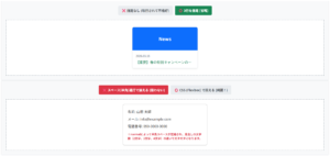
※電話番号の場合はinputmodeではなく、古くからサポートされているtype="tel"を使うのが一般的です。
※PCで見ると右端に不要な上下の矢印(スピンボタン)が表示されてしまいます。また、先頭の「0」が消えてしまうリスクがあります。
※PCでは綺麗なテキストボックスのままです。スマホでタップした時だけ、自動的に数字キーボード(テンキー)が立ち上がります。
※スマホでタップすると、電話をかける時のようなダイヤルキーボードが立ち上がります。
HTMLコード表示
<div class="hkbd1-wrapper">
  <input type="radio" name="hkbd1-state" id="hkbd1-bad" class="hkbd1-radio" checked>
  <input type="radio" name="hkbd1-state" id="hkbd1-numeric" class="hkbd1-radio">
  <input type="radio" name="hkbd1-state" id="hkbd1-tel" class="hkbd1-radio">

  <div class="hkbd1-controls">
    <label for="hkbd1-bad" class="hkbd1-btn">❌ 悪い例 (type="number")</label>
    <label for="hkbd1-numeric" class="hkbd1-btn">⭕️ 良い例 (inputmode="numeric")</label>
    <label for="hkbd1-tel" class="hkbd1-btn">📞 電話番号 (type="tel")</label>
  </div>

  <div class="hkbd1-demo-area">

    <div class="hkbd1-box target-bad-hkbd1">
      <div class="hkbd1-label">郵便番号(※悪い実装):</div>
      <input type="number" class="hkbd1-input" placeholder="1234567">
      <div class="hkbd1-code hkbd1-code-bad">
        <input <span class="hkbd1-hl-error">type="number"</span>>
      </div>
      <p class="hkbd1-note">※PCで見ると右端に不要な上下の矢印(スピンボタン)が表示されてしまいます。また、先頭の「0」が消えてしまうリスクがあります。</p>
    </div>

    <div class="hkbd1-box target-numeric-hkbd1">
      <div class="hkbd1-label">郵便番号(※正しい実装):</div>
      <input type="text" inputmode="numeric" class="hkbd1-input" placeholder="1234567">
      <div class="hkbd1-code">
        <input type="text" <span class="hkbd1-hl-ok">inputmode="numeric"</span>>
      </div>
      <p class="hkbd1-note hkbd1-note-ok">※PCでは綺麗なテキストボックスのままです。スマホでタップした時だけ、自動的に数字キーボード(テンキー)が立ち上がります。</p>
    </div>

    <div class="hkbd1-box target-tel-hkbd1">
      <div class="hkbd1-label">電話番号:</div>
      <input type="tel" class="hkbd1-input" placeholder="090-1234-5678">
      <div class="hkbd1-code">
        <input <span class="hkbd1-hl-tel">type="tel"</span>>
      </div>
      <p class="hkbd1-note hkbd1-note-ok">※スマホでタップすると、電話をかける時のようなダイヤルキーボードが立ち上がります。</p>
    </div>

  </div>
</div>
CSSコード表示
.hkbd1-wrapper {
  background-color: #f8f9fa;
  padding: 20px;
  border: 1px solid #dee2e6;
  border-radius: 4px;
  font-family: sans-serif;
}

.hkbd1-radio {
  display: none;
}

.hkbd1-controls {
  display: flex;
  justify-content: center;
  gap: 10px;
  margin-bottom: 20px;
  flex-wrap: wrap;
}

.hkbd1-btn {
  background-color: #e9ecef;
  padding: 10px 15px;
  border-radius: 4px;
  cursor: pointer;
  font-weight: bold;
  color: #495057;
  transition: 0.2s;
  font-size: 14px;
}

#hkbd1-bad:checked ~ .hkbd1-controls [for="hkbd1-bad"] {
  background-color: #dc3545;
  color: white;
}

#hkbd1-numeric:checked ~ .hkbd1-controls [for="hkbd1-numeric"] {
  background-color: #198754;
  color: white;
}

#hkbd1-tel:checked ~ .hkbd1-controls [for="hkbd1-tel"] {
  background-color: #0dcaf0;
  color: #000;
}

.hkbd1-demo-area {
  background-color: #ffffff;
  border: 2px dashed #adb5bd;
  padding: 30px 20px;
  display: flex;
  justify-content: center;
}

.hkbd1-box {
  width: 100%;
  max-width: 350px;
}

.hkbd1-label {
  font-size: 14px;
  font-weight: bold;
  color: #333;
  margin-bottom: 10px;
}

.hkbd1-input {
  width: 100%;
  padding: 12px;
  font-size: 16px;
  border: 2px solid #ccc;
  border-radius: 4px;
  box-sizing: border-box;
}

.hkbd1-code {
  background-color: #d1e7dd;
  color: #0f5132;
  padding: 15px;
  font-family: monospace;
  font-size: 13px;
  border-radius: 4px;
  border-left: 4px solid #198754;
  margin-top: 15px;
}

.hkbd1-code-bad {
  background-color: #f8d7da;
  color: #842029;
  border-left-color: #dc3545;
}

.hkbd1-hl-error {
  font-weight: bold;
  color: #dc3545;
  text-decoration: underline;
}

.hkbd1-hl-ok {
  font-weight: bold;
  color: #198754;
}

.hkbd1-hl-tel {
  font-weight: bold;
  color: #0dcaf0;
  background-color: #000;
  padding: 2px 4px;
  border-radius: 2px;
}

.hkbd1-note {
  font-size: 13px;
  color: #dc3545;
  line-height: 1.5;
  margin: 15px 0 0 0;
  font-weight: bold;
}

.hkbd1-note-ok {
  color: #198754;
}

/* 表示切り替え */
.target-numeric-hkbd1, .target-tel-hkbd1 {
  display: none;
}

#hkbd1-bad:checked ~ .hkbd1-demo-area .target-bad-hkbd1 {
  display: block;
}

#hkbd1-bad:checked ~ .hkbd1-demo-area .target-numeric-hkbd1 {
  display: none;
}

#hkbd1-bad:checked ~ .hkbd1-demo-area .target-tel-hkbd1 {
  display: none;
}

#hkbd1-numeric:checked ~ .hkbd1-demo-area .target-bad-hkbd1 {
  display: none;
}

#hkbd1-numeric:checked ~ .hkbd1-demo-area .target-numeric-hkbd1 {
  display: block;
}

#hkbd1-numeric:checked ~ .hkbd1-demo-area .target-tel-hkbd1 {
  display: none;
}

#hkbd1-tel:checked ~ .hkbd1-demo-area .target-bad-hkbd1 {
  display: none;
}

#hkbd1-tel:checked ~ .hkbd1-demo-area .target-numeric-hkbd1 {
  display: none;
}

#hkbd1-tel:checked ~ .hkbd1-demo-area .target-tel-hkbd1 {
  display: block;
}
入力制限とバリデーション(属性による制御)
Webフォームを作る際、ユーザーが常に完璧なデータを入力してくれるとは限りません。
「必須項目が空っぽ」「文字数が長すぎる」「全角で入力してしまった」といった不備を防ぎ、正しいデータだけを受け取る仕組みをバリデーションと呼びます。
HTML5では、<input>タグに属性を追加するだけでブラウザが自動的に入力制限を行います。
ここでは、実務で主要な属性とバリデーションについて解説します。
- 必須入力と文字数制限
- 入力不可・無効化
- 正規表現で半角英数字などに制限する
必須入力と文字数制限
フォームの中で「未入力のまま送信させたくない項目」には、required属性を指定します。
これを追記するだけで、ユーザーが空のまま送信ボタンを押した際、ブラウザが「このフィールドを入力してください」という警告メッセージを出して送信をブロックします。
また、「パスワードは8文字以内で」「備考欄は100文字まで」といった文字数制限(をかけたい場合は、maxlength属性を使用します。
指定した文字数に達すると、キーボードを叩いても文字が入力されなくなります。
HTMLコード表示
<div class="hval1-wrapper">

  <div class="hval1-demo-area">

    <form action="#" onsubmit="alert('送信成功!'); return false;" class="hval1-form">

      <div class="hval1-box">
        <div class="hval1-label">お名前 <span class="hval1-badge">必須</span></div>
        <input type="text" class="hval1-input" required placeholder="入力せずに送信ボタンを押してください">
        <div class="hval1-code">
          <input type="text" <span class="hval1-hl-red">required</span>>
        </div>
      </div>

      <div class="hval1-box">
        <div class="hval1-label">ニックネーム <span class="hval1-badge-gray">任意(最大10文字)</span></div>
        <input type="text" class="hval1-input" maxlength="10" placeholder="11文字以上は物理的に打てません">
        <div class="hval1-code">
          <input type="text" <span class="hval1-hl-blue">maxlength="10"</span>>
        </div>
      </div>

      <div class="hval1-submit-area">
        <button type="submit" class="hval1-submit-btn">フォームを送信する</button>
      </div>

    </form>

  </div>
</div>
CSSコード表示
.hval1-wrapper {
  background-color: #f8f9fa;
  padding: 20px;
  border: 1px solid #dee2e6;
  border-radius: 4px;
  font-family: sans-serif;
}

.hval1-demo-area {
  background-color: #ffffff;
  border: 2px dashed #adb5bd;
  padding: 30px 20px;
  display: flex;
  justify-content: center;
}

.hval1-form {
  width: 100%;
  max-width: 400px;
  display: flex;
  flex-direction: column;
  gap: 25px;
}

.hval1-box {
  background-color: #f8f9fa;
  padding: 15px;
  border-radius: 4px;
  border: 1px solid #dee2e6;
}

.hval1-label {
  font-size: 14px;
  font-weight: bold;
  color: #333;
  margin-bottom: 10px;
  display: flex;
  align-items: center;
  gap: 10px;
}

.hval1-badge {
  background-color: #dc3545;
  color: white;
  padding: 2px 6px;
  font-size: 11px;
  border-radius: 4px;
}

.hval1-badge-gray {
  background-color: #6c757d;
  color: white;
  padding: 2px 6px;
  font-size: 11px;
  border-radius: 4px;
}

.hval1-input {
  width: 100%;
  padding: 12px;
  font-size: 15px;
  border: 2px solid #ccc;
  border-radius: 4px;
  box-sizing: border-box;
}

/* 入力中(フォーカス時)のデザイン */
.hval1-input:focus {
  outline: none;
  border-color: #0d6efd;
  box-shadow: 0 0 0 3px rgba(13,110,253,0.25);
}

.hval1-code {
  background-color: #282c34;
  color: #abb2bf;
  padding: 10px;
  font-family: monospace;
  font-size: 13px;
  border-radius: 4px;
  margin-top: 10px;
}

.hval1-hl-red { color: #e06c75; font-weight: bold; }
.hval1-hl-blue { color: #61afef; font-weight: bold; }

.hval1-submit-area {
  text-align: center;
}

.hval1-submit-btn {
  background-color: #198754;
  color: white;
  border: none;
  padding: 12px 30px;
  font-size: 16px;
  font-weight: bold;
  border-radius: 30px;
  cursor: pointer;
  transition: 0.2s;
}

.hval1-submit-btn:hover {
  background-color: #146c43;
}
入力不可・無効化
システム側で自動計算された合計金額や会員情報の確認画面などで「書き換えられたくないデータ」を表示する際、入力をブロックする属性が2つ存在します。
readonly属性
「読み取り専用」にします。
入力はできませんが、文字を選択してコピーしたり、クリックしてフォーカスを当てることが可能です。disabled属性
「無効化(非活性)」にします。
グレーアウトされ、クリックすらできず文字のコピーも不可能です。
※文字の書き換えはできませんが、クリックして中の文字を選択し、コピーすることは可能です。送信時、データもちゃんと送られます。
※完全にグレーアウトされ、クリックしても反応しません。文字のコピーもできず、送信時もこのデータは無視されます。
HTMLコード表示
<div class="hval2-wrapper">

  <div class="hval2-demo-area">

    <div class="hval2-box">
      <div class="hval2-label">📝 readonly (読み取り専用)</div>
      <input type="text" class="hval2-input" value="12345-ABC" readonly>
      <div class="hval2-code">
        <input type="text" <span class="hval2-hl-green">readonly</span>>
      </div>
      <p class="hval2-note">※文字の書き換えはできませんが、クリックして中の文字を選択し、コピーすることは可能です。送信時、データもちゃんと送られます。</p>
    </div>

    <div class="hval2-box">
      <div class="hval2-label" style="color:#6c757d;">🚫 disabled (完全無効・非活性)</div>
      <input type="text" class="hval2-input" value="使用不可のクーポン" disabled>
      <div class="hval2-code">
        <input type="text" <span class="hval2-hl-gray">disabled</span>>
      </div>
      <p class="hval2-note">※完全にグレーアウトされ、クリックしても反応しません。文字のコピーもできず、送信時もこのデータは無視されます。</p>
    </div>

  </div>
</div>
CSSコード表示
.hval2-wrapper {
  background-color: #f8f9fa;
  padding: 20px;
  border: 1px solid #dee2e6;
  border-radius: 4px;
  font-family: sans-serif;
}

.hval2-demo-area {
  display: flex;
  flex-direction: column;
  gap: 20px;
  align-items: center;
}

.hval2-box {
  background-color: #ffffff;
  border: 2px dashed #adb5bd;
  padding: 20px;
  width: 100%;
  max-width: 400px;
  border-radius: 4px;
}

.hval2-label {
  font-size: 15px;
  font-weight: bold;
  color: #198754;
  margin-bottom: 10px;
}

.hval2-input {
  width: 100%;
  padding: 12px;
  font-size: 16px;
  border: 2px solid #ccc;
  border-radius: 4px;
  box-sizing: border-box;
}

/* readonly用のわかりやすいスタイル */
.hval2-input[readonly] {
  background-color: #e9ecef;
  cursor: text;
}
.hval2-input[readonly]:focus {
  outline: none;
  border-color: #198754;
  box-shadow: 0 0 0 3px rgba(25,135,84,0.25);
}

/* disabledはブラウザが勝手にグレーにしてくれるが、カーソルを禁止マークにする */
.hval2-input[disabled] {
  cursor: not-allowed;
}

.hval2-code {
  background-color: #282c34;
  color: #abb2bf;
  padding: 15px;
  font-family: monospace;
  font-size: 13px;
  border-radius: 4px;
  margin-top: 15px;
}

.hval2-hl-green { color: #98c379; font-weight: bold; }
.hval2-hl-gray { color: #5c6370; font-weight: bold; text-decoration: line-through; }

.hval2-note {
  font-size: 13px;
  color: #666;
  line-height: 1.5;
  margin: 15px 0 0 0;
}
正規表現で半角英数字などに制限する
「郵便番号は『3桁の数字-4桁の数字』で入力してほしい」「半角の数字だけで入力してほしい」といった特定形式に一致するかを判定するには、pattern属性を使用します。
この属性には、正規表現という特殊な文字列のルールを記述します。
例えば半角数字のみであればpattern="^[0-9]+$"と記述することで、全角数字やアルファベットが混ざった瞬間にエラーを出します。
HTMLコード表示
<div class="hval3-wrapper">

  <div class="hval3-demo-area">

    <form action="#" onsubmit="alert('正しい形式です!送信成功!'); return false;" class="hval3-form">

      <div class="hval3-box">
        <div class="hval3-label">
          社員ID
          <span class="hval3-hint">※半角英数字5文字</span>
        </div>

        <input type="text" class="hval3-input"
               pattern="^[a-zA-Z0-9]{5}$"
               title="半角英数字5文字で入力してください(例:A1234)"
               required
               placeholder="A1234">

        <div class="hval3-code">
          <input type="text"<br>
            <span class="hval3-hl-regex">pattern="^[a-zA-Z0-9]{5}$"</span><br>
            <span class="hval3-hl-title">title="半角英数字5文字で..."</span>>
        </div>
        <p class="hval3-note">※あえて日本語や全角文字、または4文字以下で入力して「送信する」を押してみてください。ブラウザが正規表現を判定してエラーを出し、title属性に書いたヒントが表示されます。</p>
      </div>

      <div class="hval3-submit-area">
        <button type="submit" class="hval3-submit-btn">チェックして送信する</button>
      </div>

    </form>

  </div>
</div>
CSSコード表示
.hval3-wrapper {
  background-color: #f8f9fa;
  padding: 20px;
  border: 1px solid #dee2e6;
  border-radius: 4px;
  font-family: sans-serif;
}

.hval3-demo-area {
  background-color: #ffffff;
  border: 2px dashed #adb5bd;
  padding: 30px 20px;
  display: flex;
  justify-content: center;
}

.hval3-form {
  width: 100%;
  max-width: 400px;
}

.hval3-box {
  background-color: #f8f9fa;
  padding: 20px;
  border-radius: 4px;
  border: 1px solid #dee2e6;
  margin-bottom: 20px;
}

.hval3-label {
  font-size: 15px;
  font-weight: bold;
  color: #333;
  margin-bottom: 10px;
  display: flex;
  align-items: center;
  justify-content: space-between;
}

.hval3-hint {
  font-size: 12px;
  color: #dc3545;
  background-color: #ffe6e6;
  padding: 4px 8px;
  border-radius: 4px;
}

.hval3-input {
  width: 100%;
  padding: 12px;
  font-size: 16px;
  border: 2px solid #ccc;
  border-radius: 4px;
  box-sizing: border-box;
}

/* 入力内容がpatternの条件を満たしていない時(かつ入力済みの時)は枠を赤くするモダンなCSS */
.hval3-input:not(:placeholder-shown):invalid {
  border-color: #dc3545;
  background-color: #fff8f8;
}
/* 条件を満たした時は緑にする */
.hval3-input:not(:placeholder-shown):valid {
  border-color: #198754;
  background-color: #f8fff8;
}

.hval3-code {
  background-color: #282c34;
  color: #abb2bf;
  padding: 15px;
  font-family: monospace;
  font-size: 13px;
  border-radius: 4px;
  margin-top: 15px;
  line-height: 1.5;
}

.hval3-hl-regex { color: #c678dd; font-weight: bold; }
.hval3-hl-title { color: #98c379; }

.hval3-note {
  font-size: 13px;
  color: #666;
  line-height: 1.5;
  margin: 15px 0 0 0;
}

.hval3-submit-area {
  text-align: center;
}

.hval3-submit-btn {
  background-color: #0d6efd;
  color: white;
  border: none;
  padding: 12px 30px;
  font-size: 16px;
  font-weight: bold;
  border-radius: 30px;
  cursor: pointer;
  transition: 0.2s;
  box-shadow: 0 4px 6px rgba(13,110,253,0.2);
}

.hval3-submit-btn:hover {
  background-color: #0b5ed7;
  transform: translateY(-2px);
}
CSSによるinputタグのデザイン・装飾
洗練されたフォームを作るには、CSSを用いたデザイン・装飾が欠かせません。
ここでは、フォームの見た目を整えるサイズ調整、フォーカス時の枠線対策、レイアウトの組み方を解説します。
- 幅・高さ・文字サイズの調整
- 枠線や背景色の変更
- 中央寄せ・右寄せ・横並びレイアウト
幅・高さ・文字サイズの調整
入力欄の横幅はwidthプロパティ、高さはpadding(内側の余白)やheightプロパティで調整します。
また、入力される文字の大きさはfont-sizeで指定します。
スマートフォンに対応させるため、横幅を親要素に合わせるにはwidth: 100%;を指定するのが一般的です。
padding: 15px;
border: 2px solid #000;
※幅100%にpaddingの15pxとborderの2pxが足されてしまい、親の枠から突き抜けてレイアウトが崩壊しています。
padding: 15px;
border: 2px solid #000;
box-sizing: border-box;
※box-sizingを指定したことで、余白や枠線を含めて全体を100%に計算してくれるため、ピタッと収まりました。
HTMLコード表示
<div class="hcss1-wrapper">
  <input type="radio" name="hcss1-state" id="hcss1-bad" class="hcss1-radio" checked>
  <input type="radio" name="hcss1-state" id="hcss1-good" class="hcss1-radio">

  <div class="hcss1-controls">
    <label for="hcss1-bad" class="hcss1-btn">❌ box-sizingなし (はみ出す)</label>
    <label for="hcss1-good" class="hcss1-btn">⭕️ box-sizingあり (綺麗に収まる)</label>
  </div>

  <div class="hcss1-demo-area">

    <div class="hcss1-parent-box">
      <div class="hcss1-label">親要素の枠(この中に収めたい)</div>

      <div class="target-bad-hcss1">
        <input type="text" class="hcss1-input hcss1-input-bad" value="右側がはみ出しています!">
        <div class="hcss1-code hcss1-code-bad">
          width: 100%;<br>
          padding: 15px;<br>
          border: 2px solid #000;
        </div>
        <p class="hcss1-note">※幅100%にpaddingの15pxとborderの2pxが足されてしまい、親の枠から突き抜けてレイアウトが崩壊しています。</p>
      </div>

      <div class="target-good-hcss1">
        <input type="text" class="hcss1-input hcss1-input-good" value="綺麗に収まっています✨">
        <div class="hcss1-code">
          width: 100%;<br>
          padding: 15px;<br>
          border: 2px solid #000;<br>
          <span class="hcss1-hl-green">box-sizing: border-box;</span>
        </div>
        <p class="hcss1-note hcss1-note-ok">※box-sizingを指定したことで、余白や枠線を含めて全体を100%に計算してくれるため、ピタッと収まりました。</p>
      </div>

    </div>

  </div>
</div>
CSSコード表示
.hcss1-wrapper {
  background-color: #f8f9fa;
  padding: 20px;
  border: 1px solid #dee2e6;
  border-radius: 4px;
  font-family: sans-serif;
}

.hcss1-radio {
  display: none;
}

.hcss1-controls {
  display: flex;
  justify-content: center;
  gap: 10px;
  margin-bottom: 20px;
  flex-wrap: wrap;
}

.hcss1-btn {
  background-color: #e9ecef;
  padding: 10px 15px;
  border-radius: 4px;
  cursor: pointer;
  font-weight: bold;
  color: #495057;
  transition: 0.2s;
  font-size: 14px;
}

#hcss1-bad:checked ~ .hcss1-controls [for="hcss1-bad"] {
  background-color: #dc3545;
  color: white;
}

#hcss1-good:checked ~ .hcss1-controls [for="hcss1-good"] {
  background-color: #198754;
  color: white;
}

.hcss1-demo-area {
  background-color: #ffffff;
  border: 2px dashed #adb5bd;
  padding: 30px 20px;
  display: flex;
  justify-content: center;
}

.hcss1-parent-box {
  width: 100%;
  max-width: 300px;
  background-color: #e7f1ff;
  border: 2px solid #0d6efd;
  padding: 10px;
  /* 子要素がはみ出たのを見えやすくする */
  overflow: visible;
}

.hcss1-label {
  font-size: 12px;
  font-weight: bold;
  color: #0d6efd;
  margin-bottom: 10px;
}

/* 共通のインプット設定 */
.hcss1-input {
  width: 100%;
  padding: 15px;
  font-size: 16px;
  border: 4px solid #333;
}

/* ❌ はみ出す設定 */
.hcss1-input-bad {
  box-sizing: content-box; /* 初期値(余白分が足される) */
  background-color: #f8d7da;
}

/* ⭕️ 収まる設定 */
.hcss1-input-good {
  box-sizing: border-box; /* 実務の正解 */
  background-color: #d1e7dd;
}

.hcss1-code {
  background-color: #282c34;
  color: #abb2bf;
  padding: 15px;
  font-family: monospace;
  font-size: 13px;
  border-radius: 4px;
  margin-top: 15px;
  line-height: 1.6;
}

.hcss1-code-bad {
  border-left: 4px solid #dc3545;
}

.hcss1-hl-green {
  color: #98c379;
  font-weight: bold;
}

.hcss1-note {
  font-size: 13px;
  color: #dc3545;
  font-weight: bold;
  line-height: 1.5;
  margin: 15px 0 0 0;
}

.hcss1-note-ok {
  color: #198754;
}

/* 切り替え */
.target-bad-hcss1, .target-good-hcss1 {
  display: none;
}

#hcss1-bad:checked ~ .hcss1-demo-area .target-bad-hcss1 {
  display: block;
}

#hcss1-good:checked ~ .hcss1-demo-area .target-good-hcss1 {
  display: block;
}幅と高さの設定方法や詳細な使い方を知りたい人は「【html&css】width(横幅)とheight(高さ)の指定とボックスモデル」を一読ください。
枠線や背景色の変更
入力欄のデザインをサイトに合わせるには、枠線の色や太さを変えたり、背景色を変更したりします。
モダンなデザインでは、枠線を消して下線だけ残すスタイルも人気です。
枠線を消すにはborder: none;やborder: 0;を指定します。
border: 2px solid #ccc;
/* outlineの対策をしていない */
border: none;
border-bottom: 2px solid #ccc;
/* ブラウザ標準の青枠を消す */
outline: none;
/* クリック時(:focus)に独自の色にする */
input:focus {
border-color: #0d6efd;
}
HTMLコード表示
<div class="hcss2-wrapper">

  <div class="hcss2-demo-area">

    <div class="hcss2-box">
      <div class="hcss2-label">❌ 対策なし(クリックしてください)</div>
      <input type="text" class="hcss2-input hcss2-input-bad" placeholder="クリックすると標準の枠が出ます">
      <div class="hcss2-code hcss2-code-bad">
        /* 独自の枠線は引いたが... */<br>
        border: 2px solid #ccc;<br>
        /* outlineの対策をしていない */
      </div>
    </div>

    <div class="hcss2-box">
      <div class="hcss2-label" style="color:#0d6efd;">⭕️ 独自の装飾(クリックしてください)</div>
      <input type="text" class="hcss2-input hcss2-input-good" placeholder="下線がスッと色付きます">
      <div class="hcss2-code hcss2-code-good">
        /* 枠線を消して下線だけにする */<br>
        border: none;<br>
        border-bottom: 2px solid #ccc;<br>
        /* ブラウザ標準の青枠を消す */<br>
        <span class="hcss2-hl">outline: none;</span><br><br>
        /* クリック時(:focus)に独自の色にする */<br>
        input:focus {<br>
          border-color: #0d6efd;<br>
        }
      </div>
    </div>

  </div>
</div>
CSSコード表示
.hcss2-wrapper {
  background-color: #f8f9fa;
  padding: 20px;
  border: 1px solid #dee2e6;
  border-radius: 4px;
  font-family: sans-serif;
}

.hcss2-demo-area {
  display: flex;
  flex-direction: column;
  gap: 30px;
  align-items: center;
}

.hcss2-box {
  background-color: #ffffff;
  border: 2px dashed #adb5bd;
  padding: 20px;
  width: 100%;
  max-width: 400px;
  border-radius: 4px;
}

.hcss2-label {
  font-size: 14px;
  font-weight: bold;
  color: #dc3545;
  margin-bottom: 10px;
}

.hcss2-input {
  width: 100%;
  padding: 12px;
  font-size: 15px;
  box-sizing: border-box;
  background-color: #f8f9fa;
}

/* ❌ 対策なし:独自の枠線はあるが、クリックするとブラウザのoutlineと被る */
.hcss2-input-bad {
  border: 2px solid #ccc;
  border-radius: 4px;
}

/* ⭕️ 独自の装飾:枠線を消して下線のみ、outlineを消し、focusで独自装飾 */
.hcss2-input-good {
  border: none;
  border-bottom: 2px solid #ccc;
  border-radius: 4px 4px 0 0;
  outline: none; /* ダサい青枠を消滅させる魔法 */
  transition: all 0.3s ease; /* 色の切り替わりを滑らかに */
}

/* ⭕️ クリック(フォーカス)された時の独自デザイン */
.hcss2-input-good:focus {
  background-color: #e7f1ff;
  border-bottom-color: #0d6efd;
}

.hcss2-code {
  background-color: #282c34;
  color: #abb2bf;
  padding: 15px;
  font-family: monospace;
  font-size: 13px;
  border-radius: 4px;
  margin-top: 15px;
  line-height: 1.5;
}

.hcss2-code-bad {
  border-left: 4px solid #dc3545;
}

.hcss2-code-good {
  border-left: 4px solid #0d6efd;
}

.hcss2-hl {
  color: #e5c07b;
  font-weight: bold;
}
中央寄せ・右寄せ・横並びレイアウト
入力される文字の位置やフォームのレイアウトを整えることも重要です。
入力文字を中央や右に寄せるには、文字の配置を決めるtext-alignプロパティを使用します。
金額を入力する欄ならtext-align: right;を指定して右揃えにするのがよいです。
.form { display: flex; }
/* 入力欄 */
.input { flex-grow: 1; }
※親にFlexboxを使い、入力欄に「残りの幅を全部使う」指示を出すことで、画面幅がどう変わっても綺麗に横に並び続ける完璧なレイアウトになります。
HTMLコード表示
<div class="hcss3-wrapper">

  <div class="hcss3-demo-area">

    <div class="hcss3-box">
      <div class="hcss3-label">文字の配置(金額など)</div>

      <div class="hcss3-input-row">
        <span>左 (通常)</span>
        <input type="text" class="hcss3-input hcss3-left" value="10,000">
      </div>

      <div class="hcss3-input-row">
        <span>中央寄せ</span>
        <input type="text" class="hcss3-input hcss3-center" value="10,000">
      </div>

      <div class="hcss3-input-row">
        <span style="color:#198754; font-weight:bold;">右寄せ (推奨)</span>
        <input type="text" class="hcss3-input hcss3-right" value="10,000">
      </div>
    </div>

    <div class="hcss3-box">
      <div class="hcss3-label" style="color:#0d6efd;">✨ 崩れない横並びフォーム (Flexbox)</div>

      <form class="hcss3-flex-form" onsubmit="return false;">
        <input type="text" class="hcss3-flex-input" placeholder="キーワードで検索...">
        <button type="submit" class="hcss3-flex-btn">検索</button>
      </form>

      <div class="hcss3-code">
        /* 親の枠 */<br>
        .form { <span class="hcss3-hl-flex">display: flex;</span> }<br><br>
        /* 入力欄 */<br>
        .input { <span class="hcss3-hl-flex">flex-grow: 1;</span> }
      </div>
      <p class="hcss3-note">※親にFlexboxを使い、入力欄に「残りの幅を全部使う」指示を出すことで、画面幅がどう変わっても綺麗に横に並び続ける完璧なレイアウトになります。</p>
    </div>

  </div>
</div>
CSSコード表示
.hcss3-wrapper {
  background-color: #f8f9fa;
  padding: 20px;
  border: 1px solid #dee2e6;
  border-radius: 4px;
  font-family: sans-serif;
}

.hcss3-demo-area {
  display: flex;
  flex-direction: column;
  gap: 30px;
  align-items: center;
}

.hcss3-box {
  background-color: #ffffff;
  border: 2px dashed #adb5bd;
  padding: 20px;
  width: 100%;
  max-width: 450px;
  border-radius: 4px;
}

.hcss3-label {
  font-size: 15px;
  font-weight: bold;
  color: #333;
  margin-bottom: 20px;
  border-bottom: 2px solid #eee;
  padding-bottom: 5px;
}

/* text-alignのスタイル */
.hcss3-input-row {
  display: flex;
  align-items: center;
  justify-content: space-between;
  margin-bottom: 10px;
  font-size: 14px;
  color: #555;
}

.hcss3-input {
  width: 150px;
  padding: 8px 12px;
  font-size: 16px;
  border: 2px solid #ccc;
  border-radius: 4px;
  box-sizing: border-box;
}

.hcss3-left {
  text-align: left;
}

.hcss3-center {
  text-align: center;
}

.hcss3-right {
  text-align: right;
  border-color: #198754;
  background-color: #f8fff8;
}

/* =========================================
   Flexboxによる横並びフォーム
   ========================================= */
.hcss3-flex-form {
  display: flex; /* 子要素を横並びにする */
  gap: 10px; /* 入力欄とボタンの間の隙間 */
  width: 100%;
}

.hcss3-flex-input {
  flex-grow: 1; /* 余ったスペースを全部自分の幅にする */
  padding: 12px;
  font-size: 15px;
  border: 2px solid #0d6efd;
  border-radius: 4px;
  box-sizing: border-box;
  outline: none;
}

.hcss3-flex-btn {
  padding: 0 20px;
  font-size: 15px;
  font-weight: bold;
  color: white;
  background-color: #0d6efd;
  border: none;
  border-radius: 4px;
  cursor: pointer;
  white-space: nowrap; /* ボタンの文字が折り返さないようにする */
}
.hcss3-flex-btn:hover {
  background-color: #0b5ed7;
}

.hcss3-code {
  background-color: #282c34;
  color: #abb2bf;
  padding: 15px;
  font-family: monospace;
  font-size: 13px;
  border-radius: 4px;
  margin-top: 20px;
  line-height: 1.5;
  border-left: 4px solid #0d6efd;
}

.hcss3-hl-flex {
  color: #c678dd;
  font-weight: bold;
}

.hcss3-note {
  font-size: 13px;
  color: #666;
  line-height: 1.5;
  margin: 15px 0 0 0;
}文字全般の装飾まとめを確認したい人は「【html&css】文字装飾に関するWebデザインまとめ」を一読ください。
JavaScript連携:値の取得とイベント処理
WebフォームはHTMLをマークアップするだけでは機能しません。
ユーザーが入力した内容を使って計算を行ったり、入力に間違いがないかリアルタイムでチェックするには、JavaScriptの連携が必須になります。
JavaScriptを使うことで、「入力されている文字は何か?」を読み取ったり、「文字が入力された瞬間」や「フォーカスが外れた瞬間」など、様々なタイミングで処理を走らせることが可能です。
ここでは、値の取得方法とイベントの使い分けについて解説します。
- 入力された値を取得・設定する
- 入力時・変更時のイベント
入力された値を取得・設定する
JavaScriptで入力欄のデータを操作するには、対象の<input>要素を取得し、valueプロパティにアクセスすることです。
- 値を取得する
element.valueと書くことで、現在入力されている文字列を取り出すせます。 - 値を設定する
element.value = "新しい文字"と代入することで、プログラム側から入力欄の文字を書き換えられます。
HTMLコード表示
<div class="hjs1-wrapper">

  <div class="hjs1-demo-area">

    <div class="hjs1-box">
      <div class="hjs1-label">足し算ツール(type="number")</div>

      <div class="hjs1-calc-row">
        <input type="number" id="hjs1-val1" class="hjs1-input" value="10">
        <span class="hjs1-symbol">+</span>
        <input type="number" id="hjs1-val2" class="hjs1-input" value="20">
      </div>

      <div class="hjs1-btn-group">
        <button type="button" class="hjs1-btn hjs1-btn-bad" onclick="calcBad()">❌ そのまま足す (バグる)</button>
        <button type="button" class="hjs1-btn hjs1-btn-good" onclick="calcGood()">⭕️ 数値に変換して足す</button>
      </div>

      <div class="hjs1-result-area">
        計算結果: <span id="hjs1-result" class="hjs1-result-text">---</span>
      </div>

      <div class="hjs1-code-block" id="hjs1-code-display">
        /* どちらかのボタンを押すとここにコードが表示されます */
      </div>
    </div>

  </div>
</div>
CSSコード表示
.hjs1-wrapper {
  background-color: #f8f9fa;
  padding: 20px;
  border: 1px solid #dee2e6;
  border-radius: 4px;
  font-family: sans-serif;
}

.hjs1-demo-area {
  display: flex;
  justify-content: center;
}

.hjs1-box {
  background-color: #ffffff;
  border: 2px dashed #adb5bd;
  padding: 25px;
  width: 100%;
  max-width: 450px;
  border-radius: 4px;
}

.hjs1-label {
  font-size: 15px;
  font-weight: bold;
  color: #333;
  margin-bottom: 20px;
  text-align: center;
}

.hjs1-calc-row {
  display: flex;
  align-items: center;
  justify-content: center;
  gap: 15px;
  margin-bottom: 20px;
}

.hjs1-input {
  width: 80px;
  padding: 10px;
  font-size: 18px;
  text-align: right;
  border: 2px solid #ccc;
  border-radius: 4px;
  box-sizing: border-box;
}

.hjs1-symbol {
  font-size: 20px;
  font-weight: bold;
  color: #555;
}

.hjs1-btn-group {
  display: flex;
  flex-direction: column;
  gap: 10px;
  margin-bottom: 20px;
}

.hjs1-btn {
  padding: 12px;
  font-size: 15px;
  font-weight: bold;
  color: white;
  border: none;
  border-radius: 4px;
  cursor: pointer;
  transition: 0.2s;
}

.hjs1-btn-bad {
  background-color: #dc3545;
}
.hjs1-btn-bad:hover {
  background-color: #bb2d3b;
}

.hjs1-btn-good {
  background-color: #198754;
}
.hjs1-btn-good:hover {
  background-color: #146c43;
}

.hjs1-result-area {
  background-color: #e9ecef;
  padding: 15px;
  font-size: 16px;
  font-weight: bold;
  color: #333;
  text-align: center;
  border-radius: 4px;
  margin-bottom: 15px;
}

.hjs1-result-text {
  font-size: 24px;
  color: #0d6efd;
  margin-left: 10px;
}

.hjs1-code-block {
  background-color: #282c34;
  color: #abb2bf;
  padding: 15px;
  font-family: monospace;
  font-size: 13px;
  border-radius: 4px;
  line-height: 1.5;
  white-space: pre-wrap;
}

.hjs1-hl-error {
  color: #e06c75;
  font-weight: bold;
  text-decoration: underline;
}

.hjs1-hl-ok {
  color: #98c379;
  font-weight: bold;
}
JavaScriptコード表示
function calcBad() {
  // 値の取得
  const v1 = document.getElementById('hjs1-val1').value;
  const v2 = document.getElementById('hjs1-val2').value;

  // そのまま足す(文字の結合になる罠)
  const result = v1 + v2;

  // 結果の設定
  document.getElementById('hjs1-result').textContent = result;
  document.getElementById('hjs1-result').style.color = '#dc3545'; // 赤字にする

  // コードの表示
  document.getElementById('hjs1-code-display').innerHTML =
    "let v1 = document.getElementById('val1').value;\n" +
    "let v2 = document.getElementById('val2').value;\n\n" +
    "// ❌ 「10」+「20」の文字結合になり「1020」になる\n" +
    "let result = <span class='hjs1-hl-error'>v1 + v2</span>;";
}

function calcGood() {
  // 値の取得
  const v1 = document.getElementById('hjs1-val1').value;
  const v2 = document.getElementById('hjs1-val2').value;

  // Number()で数値に変換してから足す
  const result = Number(v1) + Number(v2);

  // 結果の設定
  document.getElementById('hjs1-result').textContent = result;
  document.getElementById('hjs1-result').style.color = '#198754'; // 緑字にする

  // コードの表示
  document.getElementById('hjs1-code-display').innerHTML =
    "let v1 = document.getElementById('val1').value;\n" +
    "let v2 = document.getElementById('val2').value;\n\n" +
    "// ⭕️ 文字を数値に変換(キャスト)してから計算する\n" +
    "let result = <span class='hjs1-hl-ok'>Number(v1) + Number(v2)</span>;";
}
入力時・変更時のイベント
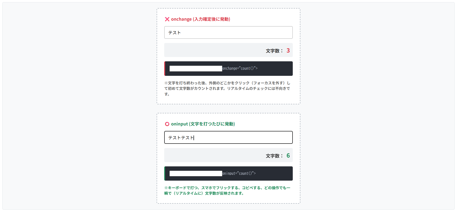
入力された値の文字数をカウントしたり、「半角で入力してください」といったリアルタイムの警告を出したりするには、HTML要素の操作を監視する「イベント」を使用します。
onchangeとoninputという2つのイベントです。
oninput
ユーザーがキーボードを叩いて文字が入力される「たび」に発動します。
リアルタイムな文字数カウントやパスワードの強度メーターなどに最適です。onchange
文字を入力している最中は発動しません。
入力が終わって「エンターキーを押した時」や「入力欄の外をクリックした時」に1回だけ発動します。
※文字を打ち終わった後、外側のどこかをクリック(フォーカスを外す)して初めて文字数がカウントされます。リアルタイムのチェックには不向きです。
※キーボードで打つ、スマホでフリックする、コピペする、どの操作でも一瞬で(リアルタイムに)文字数が反映されます。
HTMLコード表示
<div class="hjs2-wrapper">

  <div class="hjs2-demo-area">

    <div class="hjs2-box">
      <div class="hjs2-label" style="color:#dc3545;">❌ onchange (入力確定後に発動)</div>
      <input type="text" class="hjs2-input" id="hjs2-input-change" placeholder="文字を打ってもすぐには反応しません">
      <div class="hjs2-counter">
        文字数: <span id="hjs2-count-change" class="hjs2-count-text">0</span>
      </div>
      <div class="hjs2-code hjs2-code-bad">
        <input <span class="hjs2-hl-bad">onchange="count()"</span>>
      </div>
      <p class="hjs2-note">※文字を打ち終わった後、外側のどこかをクリック(フォーカスを外す)して初めて文字数がカウントされます。リアルタイムのチェックには不向きです。</p>
    </div>

    <div class="hjs2-box">
      <div class="hjs2-label" style="color:#198754;">⭕️ oninput (文字を打つたびに発動)</div>
      <input type="text" class="hjs2-input" id="hjs2-input-oninput" placeholder="文字を打つたびにリアルタイムで反応します">
      <div class="hjs2-counter">
        文字数: <span id="hjs2-count-oninput" class="hjs2-count-text" style="color:#198754;">0</span>
      </div>
      <div class="hjs2-code hjs2-code-good">
        <input <span class="hjs2-hl-good">oninput="count()"</span>>
      </div>
      <p class="hjs2-note" style="color:#198754;">※キーボードで打つ、スマホでフリックする、コピペする、どの操作でも一瞬で(リアルタイムに)文字数が反映されます。</p>
    </div>

  </div>
</div>
CSSコード表示
.hjs2-wrapper {
  background-color: #f8f9fa;
  padding: 20px;
  border: 1px solid #dee2e6;
  border-radius: 4px;
  font-family: sans-serif;
}

.hjs2-demo-area {
  display: flex;
  flex-direction: column;
  gap: 30px;
  align-items: center;
}

.hjs2-box {
  background-color: #ffffff;
  border: 2px dashed #adb5bd;
  padding: 25px;
  width: 100%;
  max-width: 450px;
  border-radius: 4px;
}

.hjs2-label {
  font-size: 15px;
  font-weight: bold;
  margin-bottom: 15px;
}

.hjs2-input {
  width: 100%;
  padding: 12px;
  font-size: 15px;
  border: 2px solid #ccc;
  border-radius: 4px;
  box-sizing: border-box;
  margin-bottom: 15px;
}

.hjs2-counter {
  font-size: 16px;
  font-weight: bold;
  color: #333;
  text-align: right;
  padding: 10px;
  background-color: #f1f3f5;
  border-radius: 4px;
}

.hjs2-count-text {
  font-size: 20px;
  color: #dc3545;
  margin-left: 5px;
}

.hjs2-code {
  background-color: #282c34;
  color: #abb2bf;
  padding: 15px;
  font-family: monospace;
  font-size: 13px;
  border-radius: 4px;
  margin-top: 15px;
}

.hjs2-code-bad {
  border-left: 4px solid #dc3545;
}

.hjs2-code-good {
  border-left: 4px solid #198754;
}

.hjs2-hl-bad {
  color: #e06c75;
  font-weight: bold;
}

.hjs2-hl-good {
  color: #98c379;
  font-weight: bold;
}

.hjs2-note {
  font-size: 13px;
  color: #666;
  line-height: 1.5;
  margin: 15px 0 0 0;
  font-weight: bold;
}
JavaScriptコード表示
// onchangeのイベントリスナー(入力が確定してフォーカスが外れた時)
document.getElementById('hjs2-input-change').addEventListener('change', function() {
  const textLength = this.value.length;
  document.getElementById('hjs2-count-change').textContent = textLength;
});

// oninputのイベントリスナー(文字が入力されるたびリアルタイム)
document.getElementById('hjs2-input-oninput').addEventListener('input', function() {
  const textLength = this.value.length;
  document.getElementById('hjs2-count-oninput').textContent = textLength;
});
まとめ
分かりやすいようにまとめを記載します。
- 基本構文
<input>は空要素のため、閉じタグ(</input>)は記述しない。 - 入力形式
type属性を変更し、テキスト、日付、チェックボックスなどを使い分ける。 - ヒントと初期値
入力前の案内文にはplaceholder、入力済みにするデータにはvalueを使用する。 - クリック領域
チェックボックスやラジオボタンは<label>タグと連携させ、テキスト部分もクリック可能にする。 - スマホ最適化
電話番号や郵便番号にtype="number"は使用せず、inputmode="numeric"やtype="tel"でテンキーを表示させる。 - 入力制限
required(必須)やmaxlength(文字数制限)、pattern(正規表現)で制御可能だがデータ検証はサーバー側で行う。 - 無効化の違い
readonly(読み取り専用)はデータが送信されるが、disabled(無効化)のデータは送信されない。 - CSSレイアウト
幅100%にする際はbox-sizing: border-box;を併記し、はみ出しを防ぐ。 - CSSフォーカス装飾
ブラウザ標準の枠はoutline: none;で消し、:focus疑似クラスで独自のハイライトを設定する。 - JS連携(値の取得)
valueで取得した値は「文字列」となるため、計算時は数値への変換処理が必要。 - JS連携(イベント)
入力確定後ではなく「リアルタイム」で処理を行いたい場合は、onchangeではなくoninputを使用する。
よくある質問(FAQ)
inputタグのtype属性にはどんな種類がありますか?
ユーザーに入力させたいデータの形式に合わせて、数多くの種類が用意されています。
text:1行のテキスト(名前など)password:伏せ字になるテキスト(パスワードなど)checkbox:複数選択できる四角いボタンradio:1つしか選べない丸いボタンnumber:数値入力(スピンボタン付き)date:カレンダーからの日付選択file:ファイルのアップロード
※複数行の文章を入力させたい場合は、<input>タグではなく<textarea>タグを使用します。
inputタグで「数字のみ」を入力させるにはどうすればいいですか?
目的によって2つの方法を使い分けます。
数量や金額など計算に使う数値であれば<input type="number">を使用します。
しかし、電話番号や郵便番号などの「計算しない数字」にtype="number"を使うと、先頭の「0」が消えたり、PCで上下矢印が出るバグの原因になります。
これらには<input type="text" inputmode="numeric">を使い、スマホで数字キーボードを立ち上げつつバグを防ぐのがよいです。
フォームを「必須入力」にして未入力のまま送信できないようにするには?
<input>タグの中にrequiredという属性を追記するだけで完了します。
これを記述すると、ユーザーが空のまま送信ボタンを押した際、ブラウザが「このフィールドを入力してください」という警告メッセージを表示し、送信をブロックします。
ただし、ブラウザ上の簡易的な制限であるため、実務ではサーバー側でも必須チェックを行います。
buttonタグとinput type=”submit”はどちらを使うべきですか?
Web制作においては、<button>タグの使用が推奨されています。
<input type="submit">は閉じタグがないため、ボタンのラベルをvalue="送信"のように文字でしか指定できません。
一方、<button type="submit">送信</button>のように書く<button>タグは、中にアイコン画像を入れたり、<span>タグで文字の一部だけ色を変えたりとデザインの自由度が高いためです。
JavaScriptでinputタグに入力された値を取得するにはどう書きますか?
対象の要素を取得し、.valueプロパティにアクセスします。
例えば、<input type="text" id="userName">の値を取得したい場合は、JavaScript側で let name = document.getElementById('userName').value;と記述します。
注意点として、取得したデータは数字を入力していてもプログラム上は文字列として扱われるため、足し算などの計算をする場合は数値への変換が必要です。