HTMLの<picture>タグは、ユーザーの画面サイズやブラウザ環境に合わせて画像を出し分けるレスポンシブ対応のWeb制作において必須要素です。
本記事では、<picture>タグの書き方や<img>タグとの使い分け、CSSを用いたレイアウト制御、SEOに直結するパフォーマンス最適化を解説します。
pictureタグの役割と書き方
<picture>タグは、画面サイズやブラウザの状況に応じて、「複数の画像候補から最適な1枚を出し分ける」ためのHTML要素です。
基本的な書き方としては、<picture>という親タグの中に、条件と画像のパスを指定する<source>タグを複数記述し、最後に<img>タグを1つだけ配置します。
初心者が間違えやすい点が2つあります。
1つ目は、「<source>タグは上から順番に評価される」というルールの見落としです。
例えば「PC用」「タブレット用」「スマホ用」と切り替えたい場合、条件指定(media属性)の順番を間違えると、常に同じ画像が表示されるバグが発生します。
実務では「min-width(〜px以上)」を使うなら大きいサイズから順に、「max-width(〜px以下)」を使うなら小さいサイズから順に書くのがよいです。
2つ目は、<img>タグを書き忘れるミスです。
<picture>タグはただの「箱」であり、実際に画面に画像を描画するのは内包された<img>タグです。
<img>タグがないと画面には何も表示されません。
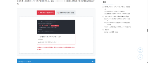
<!– ① PC用:1024px以上ならこれを表示 –>
<source media=”(min-width: 1024px)” srcset=”pc-image.jpg”>
<!– ② タブレット用:768px以上ならこれを表示 –>
<source media=”(min-width: 768px)” srcset=”tb-image.jpg”>
<!– ③ スマホ用(デフォルト):上の条件に当てはまらない場合はこれを表示 –>
<img src=”sp-image.jpg” alt=”メイン画像”>
</picture>
※ブラウザは上から順に条件(media属性)を確認し、最初に一致した画像のURLを最後のimgタグに渡して表示します。
HTMLコード表示
<div class="hpic1-wrapper">
  <input type="radio" name="hpic1-state" id="hpic1-sp" class="hpic1-radio" checked>
  <input type="radio" name="hpic1-state" id="hpic1-tb" class="hpic1-radio">
  <input type="radio" name="hpic1-state" id="hpic1-pc" class="hpic1-radio">

  <div class="hpic1-controls">
    <label for="hpic1-sp" class="hpic1-btn">📱スマホ画面 (767px以下)</label>
    <label for="hpic1-tb" class="hpic1-btn">💻タブレット画面 (768px〜)</label>
    <label for="hpic1-pc" class="hpic1-btn">🖥️PC画面 (1024px〜)</label>
  </div>

  <div class="hpic1-demo-area">
    <div class="hpic1-code-preview">
      <span class="hpic1-tag"><picture></span><br>

      <span class="hpic1-comment"><!-- ① PC用:1024px以上ならこれを表示 --></span><br>
        <span class="hpic1-source hpic1-source-pc"><source media="(min-width: 1024px)" srcset="pc-image.jpg"></span><br>

      <span class="hpic1-comment"><!-- ② タブレット用:768px以上ならこれを表示 --></span><br>
        <span class="hpic1-source hpic1-source-tb"><source media="(min-width: 768px)" srcset="tb-image.jpg"></span><br>

      <span class="hpic1-comment"><!-- ③ スマホ用(デフォルト):上の条件に当てはまらない場合はこれを表示 --></span><br>
        <span class="hpic1-img hpic1-img-sp"><img src="sp-image.jpg" alt="メイン画像"></span><br>

      <span class="hpic1-tag"></picture></span>
    </div>

    <div class="hpic1-render-area">
      <div class="hpic1-dummy-img target-sp-hpic1">
        📱スマホ用画像(縦長トリミング)
      </div>
      <div class="hpic1-dummy-img target-tb-hpic1">
        💻タブレット用画像(少し横長)
      </div>
      <div class="hpic1-dummy-img target-pc-hpic1">
        🖥️PC用画像(超横長パノラマ)
      </div>
    </div>
  </div>
  <p class="hpic1-note">※ブラウザは上から順に条件(media属性)を確認し、最初に一致した画像のURLを最後のimgタグに渡して表示します。</p>
</div>
CSSコード表示
.hpic1-wrapper {
  background-color: #f8f9fa;
  padding: 20px;
  border: 1px solid #dee2e6;
  border-radius: 4px;
  font-family: sans-serif;
}

.hpic1-radio {
  display: none;
}

.hpic1-controls {
  display: flex;
  justify-content: center;
  gap: 10px;
  margin-bottom: 20px;
  flex-wrap: wrap;
}

.hpic1-btn {
  background-color: #e9ecef;
  padding: 10px 15px;
  border-radius: 4px;
  cursor: pointer;
  font-weight: bold;
  color: #495057;
  transition: 0.2s;
  font-size: 14px;
}

#hpic1-sp:checked ~ .hpic1-controls [for="hpic1-sp"] {
  background-color: #0dcaf0;
  color: #000;
}

#hpic1-tb:checked ~ .hpic1-controls [for="hpic1-tb"] {
  background-color: #198754;
  color: white;
}

#hpic1-pc:checked ~ .hpic1-controls [for="hpic1-pc"] {
  background-color: #0d6efd;
  color: white;
}

.hpic1-demo-area {
  background-color: #ffffff;
  border: 2px dashed #adb5bd;
  padding: 20px;
  display: flex;
  flex-direction: column;
  gap: 20px;
}

.hpic1-code-preview {
  background-color: #282c34;
  padding: 15px;
  border-radius: 4px;
  font-family: monospace;
  font-size: 13px;
  line-height: 1.6;
  color: #abb2bf;
}

.hpic1-tag {
  color: #e5c07b;
}

.hpic1-comment {
  color: #5c6370;
  font-style: italic;
}

/* コードのハイライト処理 */
#hpic1-pc:checked ~ .hpic1-demo-area .hpic1-source-pc {
  color: #98c379;
  font-weight: bold;
  background: rgba(152,195,121,0.2);
  padding: 2px;
}

#hpic1-tb:checked ~ .hpic1-demo-area .hpic1-source-tb {
  color: #98c379;
  font-weight: bold;
  background: rgba(152,195,121,0.2);
  padding: 2px;
}

#hpic1-sp:checked ~ .hpic1-demo-area .hpic1-img-sp {
  color: #98c379;
  font-weight: bold;
  background: rgba(152,195,121,0.2);
  padding: 2px;
}

.hpic1-render-area {
  display: flex;
  justify-content: center;
  align-items: center;
  background: #e9ecef;
  padding: 20px;
  border-radius: 4px;
  min-height: 200px;
}

/* ダミー画像のスタイル */
.hpic1-dummy-img {
  display: flex;
  align-items: center;
  justify-content: center;
  color: white;
  font-weight: bold;
  font-size: 18px;
  border-radius: 8px;
  box-shadow: 0 4px 10px rgba(0,0,0,0.1);
  transition: all 0.3s ease;
}

.target-sp-hpic1 {
  width: 150px;
  height: 250px;
  background-color: #0dcaf0;
  color: #000;
  text-align: center;
} /* 縦長 */

.target-tb-hpic1 {
  width: 300px;
  height: 180px;
  background-color: #198754;
} /* 少し横長 */

.target-pc-hpic1 {
  width: 100%;
  max-width: 500px;
  height: 150px;
  background-color: #0d6efd;
} /* 超横長 */

/* 切り替えロジック */
.target-tb-hpic1, .target-pc-hpic1 {
  display: none;
}

#hpic1-sp:checked ~ .hpic1-demo-area .target-tb-hpic1 {
  display: none;
}

#hpic1-sp:checked ~ .hpic1-demo-area .target-pc-hpic1 {
  display: none;
}

#hpic1-sp:checked ~ .hpic1-demo-area .target-sp-hpic1 {
  display: flex;
}

#hpic1-tb:checked ~ .hpic1-demo-area .target-sp-hpic1 {
  display: none;
}

#hpic1-tb:checked ~ .hpic1-demo-area .target-pc-hpic1 {
  display: none;
}

#hpic1-tb:checked ~ .hpic1-demo-area .target-tb-hpic1 {
  display: flex;
}

#hpic1-pc:checked ~ .hpic1-demo-area .target-sp-hpic1 {
  display: none;
}

#hpic1-pc:checked ~ .hpic1-demo-area .target-tb-hpic1 {
  display: none;
}

#hpic1-pc:checked ~ .hpic1-demo-area .target-pc-hpic1 {
  display: flex;
}

.hpic1-note {
  font-size: 13px;
  color: #dc3545;
  font-weight: bold;
  margin-top: 15px;
}
pictureタグとimgタグとの違い
初心者が疑問に思うのが、「従来の<img>タグと新しい<picture>はどう使い分ければいいのか?」という点です。
結論から言うと、「単一の画像を表示するなら<img>タグ」「状況に応じて画像を差し替えるなら<picture>タグ」という使い分けになります。
また、似たタグに<figure>がありますが、figureは「図表や写真などのまとまりのコンテンツ」を意味づけるタグであり、画像の切り替え機能は持ちません。
役割が異なるため混同しないようにしましょう。
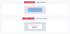
- トリミング(縦横比)の変更
- 次世代フォーマットの対応
PCでもスマホでも構図(縦横比)は同じ。CSSで縮小すれば良いだけで、わざわざ別ファイルを用意してpictureで切り替える必要はありません。
※小さくて見えない
PCでは引きの横長写真、スマホでは見切れを防ぐために「人物に寄った縦長写真」に差し替える。このような”構図の変更”こそがpictureタグの真骨頂です。
HTMLコード表示
<div class="hpic2-wrapper">
  <input type="radio" name="hpic2-state" id="hpic2-img" class="hpic2-radio" checked>
  <input type="radio" name="hpic2-state" id="hpic2-picture" class="hpic2-radio">

  <div class="hpic2-controls">
    <label for="hpic2-img" class="hpic2-btn">❌ 誤った使い方 (単なる縮小)</label>
    <label for="hpic2-picture" class="hpic2-btn">⭕️ 正しい使い方 (比率の変更)</label>
  </div>

  <div class="hpic2-demo-area">

    <div class="hpic2-box target-img-hpic2">
      <div class="hpic2-explain">
        【単なるサイズ変更】<br>PCでもスマホでも構図(縦横比)は同じ。CSSで縮小すれば良いだけで、わざわざ別ファイルを用意してpictureで切り替える必要はありません。
      </div>
      <div class="hpic2-visual-compare">
        <div class="hpic2-mock-pc">
          <div class="hpic2-dummy-photo">横長の風景写真(PC)</div>
        </div>
        <div class="hpic2-arrow">▶︎</div>
        <div class="hpic2-mock-sp">
          <div class="hpic2-dummy-photo hpic2-shrink">横長の風景写真(スマホ)<br><span style="font-size:10px;">※小さくて見えない</span></div>
        </div>
      </div>
    </div>

    <div class="hpic2-box target-picture-hpic2">
      <div class="hpic2-explain hpic2-explain-ok">
        【アートディレクション】<br>PCでは引きの横長写真、スマホでは見切れを防ぐために「人物に寄った縦長写真」に差し替える。このような"構図の変更"こそがpictureタグの真骨頂です。
      </div>
      <div class="hpic2-visual-compare">
        <div class="hpic2-mock-pc">
          <div class="hpic2-dummy-photo">横長の風景写真(PC)</div>
        </div>
        <div class="hpic2-arrow">▶︎</div>
        <div class="hpic2-mock-sp">
          <div class="hpic2-dummy-photo hpic2-crop">人物のアップ(スマホ)</div>
        </div>
      </div>
    </div>

  </div>
</div>
CSSコード表示
.hpic2-wrapper {
  background-color: #f8f9fa;
  padding: 20px;
  border: 1px solid #dee2e6;
  border-radius: 4px;
  font-family: sans-serif;
}

.hpic2-radio {
  display: none;
}

.hpic2-controls {
  display: flex;
  justify-content: center;
  gap: 10px;
  margin-bottom: 20px;
  flex-wrap: wrap;
}

.hpic2-btn {
  background-color: #e9ecef;
  padding: 10px 15px;
  border-radius: 4px;
  cursor: pointer;
  font-weight: bold;
  color: #495057;
  transition: 0.2s;
  font-size: 14px;
}

#hpic2-img:checked ~ .hpic2-controls [for="hpic2-img"] {
  background-color: #dc3545;
  color: white;
}

#hpic2-picture:checked ~ .hpic2-controls [for="hpic2-picture"] {
  background-color: #198754;
  color: white;
}

.hpic2-demo-area {
  background-color: #ffffff;
  border: 2px dashed #adb5bd;
  padding: 20px;
  display: flex;
  justify-content: center;
}

.hpic2-box {
  width: 100%;
  max-width: 500px;
}

.hpic2-explain {
  background-color: #f8d7da;
  color: #842029;
  padding: 15px;
  border-left: 4px solid #dc3545;
  font-size: 13px;
  line-height: 1.6;
  margin-bottom: 20px;
  border-radius: 4px;
  font-weight: bold;
}

.hpic2-explain-ok {
  background-color: #d1e7dd;
  color: #0f5132;
  border-left-color: #198754;
}

.hpic2-visual-compare {
  display: flex;
  align-items: center;
  justify-content: space-around;
  background: #e9ecef;
  padding: 20px;
  border-radius: 8px;
}

/* PCモックアップ */
.hpic2-mock-pc {
  width: 200px;
  height: 120px;
  background: #333;
  border-radius: 6px;
  padding: 5px;
  display: flex;
  align-items: center;
  justify-content: center;
}

/* スマホモックアップ */
.hpic2-mock-sp {
  width: 80px;
  height: 160px;
  background: #333;
  border-radius: 10px;
  padding: 5px;
  display: flex;
  align-items: center;
  justify-content: center;
}

.hpic2-arrow {
  font-size: 24px;
  color: #6c757d;
}

/* 写真に見立てたブロック */
.hpic2-dummy-photo {
  width: 100%;
  height: 100%;
  background: #0d6efd;
  color: white;
  display: flex;
  align-items: center;
  justify-content: center;
  font-size: 12px;
  text-align: center;
  font-weight: bold;
}

/* NG:ただ縮小しただけ */
.hpic2-shrink {
  height: 40px;
  align-self: center;
}

/* OK:縦長にトリミングし直した別の画像 */
.hpic2-crop {
  background: #f39c12;
  height: 100%;
}

.target-picture-hpic2 {
  display: none;
}

#hpic2-img:checked ~ .hpic2-demo-area .target-picture-hpic2 {
  display: none;
}

#hpic2-img:checked ~ .hpic2-demo-area .target-img-hpic2 {
  display: block;
}

#hpic2-picture:checked ~ .hpic2-demo-area .target-img-hpic2 {
  display: none;
}

#hpic2-picture:checked ~ .hpic2-demo-area .target-picture-hpic2 {
  display: block;
}
レスポンシブ対応:画面幅やWebPでの画像出し分け
Webサイト制作において、閲覧環境(スマホ、タブレット、PC)に合わせてレイアウトや画像を最適化する「レスポンシブ対応」は必須の要件です。
CSSのメディアクエリを使って背景画像を切り替えることも可能ですが、HTML内に直接配置する画像の切り替えには<picture>タグが最適です。
ここでは、画面幅に応じた出し分けや次世代画像フォーマットの読み込み方法などを解説します。
- スマホ・PCで画像を切り替える(
media属性) - 次世代フォーマット(WebP等)を出し分ける
- 解像度に応じた画像の最適化(
srcset属性)
スマホ・PCで画像を切り替える(media属性)
<picture>タグ内で<source>タグを使用してmedia属性を記述することで、CSSのメディアクエリと同様に「どの画面幅にどの画像を表示するか」をブラウザに指示できます。
注意点として、min-width(〜px以上)とmax-width(〜px以下)を混同し、評価の順番を間違えることです
ブラウザはコードを「上から順」に読み、最初に条件に合致した<source>を採用します。
そのため、min-widthを使うモバイルファーストの設計であれば「大きいサイズから順」に書く必要があります。
また、「PCはmin-width: 1025px」「スマホは max-width: 1024px」のように指定した際、小数を伴う解像度(1024.5pxなど)の端末で意図しない画像が表示される「隙間のバグ」も発生しがちです。
実務ではmin-widthに統一して上から順番に条件を上書きしていくのが安全な設計です。
<!– 上から順に評価されるため、広い幅から書くのが鉄則 –>
<source media=”(min-width: 1024px)” srcset=”img-pc.jpg”>
<source media=”(min-width: 768px)” srcset=”img-tb.jpg”>
<!– どの条件にも合致しない(767px以下)場合はここ –>
<img src=”img-sp.jpg” alt=”バナー”>
</picture>
HTMLコード表示
<div class="hres1-wrapper">
  <input type="radio" name="hres1-state" id="hres1-pc" class="hres1-radio" checked>
  <input type="radio" name="hres1-state" id="hres1-tb" class="hres1-radio">
  <input type="radio" name="hres1-state" id="hres1-sp" class="hres1-radio">

  <div class="hres1-controls">
    <label for="hres1-pc" class="hres1-btn">PC (1024px〜)</label>
    <label for="hres1-tb" class="hres1-btn">タブレット (768px〜)</label>
    <label for="hres1-sp" class="hres1-btn">スマホ (〜767px)</label>
  </div>

  <div class="hres1-demo-area">
    <div class="hres1-code-preview">
      <span class="hres1-tag"><picture></span><br>

      <span class="hres1-comment"><!-- 上から順に評価されるため、広い幅から書くのが鉄則 --></span><br>
      <span class="hres1-source target-code-pc"><source media="(min-width: 1024px)" srcset="img-pc.jpg"></span><br>
      <span class="hres1-source target-code-tb"><source media="(min-width: 768px)" srcset="img-tb.jpg"></span><br>

      <span class="hres1-comment"><!-- どの条件にも合致しない(767px以下)場合はここ --></span><br>
      <span class="hres1-img target-code-sp"><img src="img-sp.jpg" alt="バナー"></span><br>

      <span class="hres1-tag"></picture></span>
    </div>

    <div class="hres1-render-area">
      <div class="hres1-mock target-view-pc">
        PC用画像が表示されています
      </div>
      <div class="hres1-mock target-view-tb">
        タブレット用画像が表示されています
      </div>
      <div class="hres1-mock target-view-sp">
        スマホ用画像が表示されています
      </div>
    </div>
  </div>
</div>
CSSコード表示
.hres1-wrapper {
  background-color: #f8f9fa;
  padding: 20px;
  border: 1px solid #dee2e6;
  border-radius: 4px;
  font-family: sans-serif;
}

.hres1-radio {
  display: none;
}

.hres1-controls {
  display: flex;
  justify-content: center;
  gap: 10px;
  margin-bottom: 20px;
  flex-wrap: wrap;
}

.hres1-btn {
  background-color: #e9ecef;
  padding: 10px 15px;
  border-radius: 4px;
  cursor: pointer;
  font-weight: bold;
  color: #495057;
  transition: 0.2s;
  font-size: 14px;
}

#hres1-pc:checked ~ .hres1-controls [for="hres1-pc"] {
  background-color: #0d6efd;
  color: white;
}

#hres1-tb:checked ~ .hres1-controls [for="hres1-tb"] {
  background-color: #198754;
  color: white;
}

#hres1-sp:checked ~ .hres1-controls [for="hres1-sp"] {
  background-color: #0dcaf0;
  color: #000;
}

.hres1-demo-area {
  background-color: #ffffff;
  border: 2px dashed #adb5bd;
  padding: 20px;
  display: flex;
  flex-direction: column;
  gap: 20px;
}

.hres1-code-preview {
  background-color: #282c34;
  padding: 15px;
  border-radius: 4px;
  font-family: monospace;
  font-size: 13px;
  line-height: 1.6;
  color: #abb2bf;
}

.hres1-tag {
  color: #e5c07b;
}

.hres1-comment {
  color: #5c6370;
  font-style: italic;
}

/* コードハイライト */
#hres1-pc:checked ~ .hres1-demo-area .target-code-pc,
#hres1-tb:checked ~ .hres1-demo-area .target-code-tb,
#hres1-sp:checked ~ .hres1-demo-area .target-code-sp {
  color: #98c379;
  font-weight: bold;
  background: rgba(152,195,121,0.2);
  padding: 2px;
  border-radius: 2px;
}

.hres1-render-area {
  display: flex;
  justify-content: center;
  align-items: center;
  background: #e9ecef;
  padding: 20px;
  border-radius: 4px;
  min-height: 150px;
}

.hres1-mock {
  display: flex;
  align-items: center;
  justify-content: center;
  color: white;
  font-weight: bold;
  font-size: 16px;
  border-radius: 8px;
  box-shadow: 0 4px 10px rgba(0,0,0,0.1);
}

.target-view-pc {
  width: 100%;
  max-width: 500px;
  height: 120px;
  background-color: #0d6efd;
}

.target-view-tb {
  width: 300px;
  height: 150px;
  background-color: #198754;
}

.target-view-sp {
  width: 150px;
  height: 200px;
  background-color: #0dcaf0;
  color: #000;
  text-align: center;
}

/* 表示切替 */
.target-view-tb, .target-view-sp { display: none; }
#hres1-pc:checked ~ .hres1-demo-area .target-view-pc { display: flex; }
#hres1-pc:checked ~ .hres1-demo-area .target-view-tb { display: none; }
#hres1-pc:checked ~ .hres1-demo-area .target-view-sp { display: none; }

#hres1-tb:checked ~ .hres1-demo-area .target-view-pc { display: none; }
#hres1-tb:checked ~ .hres1-demo-area .target-view-tb { display: flex; }
#hres1-tb:checked ~ .hres1-demo-area .target-view-sp { display: none; }

#hres1-sp:checked ~ .hres1-demo-area .target-view-pc { display: none; }
#hres1-sp:checked ~ .hres1-demo-area .target-view-tb { display: none; }
#hres1-sp:checked ~ .hres1-demo-area .target-view-sp { display: flex; }
次世代フォーマット(WebP等)を出し分ける
ページの読み込み速度(PageSpeed Insightsのスコア)を改善する手段として、JPEGやPNGよりもファイルサイズが軽い「WebP」などの次世代画像フォーマットの採用です。
しかし、古いブラウザはWebPに対応していません。
そこで<picture>タグのtype属性を使用し、対応しているブラウザにはWebP、非対応のブラウザにはJPEG/PNGを表示させるという出し分けを行います。
ただし、<source>タグにtype="image/webp"のような MIMEタイプを書き忘れると、ブラウザは「ファイルが自分に対応している形式か」を判断するため、一度画像をダウンロードしようとします。
非対応フォーマットだった場合、結果的にエラーになり、フォールバックのJPEGをダウンロードするという無駄な通信(遅延)が発生します。
次世代フォーマットを出し分ける際は、type属性をセットで記述するのがパフォーマンス最適化になります。
<!– ブラウザがWebPを解釈できる場合のみ、これを読み込む –>
<source type=”image/webp” srcset=”photo.webp”>
<!– WebP非対応の場合は、安全なJPEG(フォールバック)を読み込む –>
<img src=”photo.jpg” alt=”風景写真”>
</picture>
(表示速度が爆速!)
(安全に表示されます)
HTMLコード表示
<div class="hres2-wrapper">
  <input type="radio" name="hres2-state" id="hres2-support" class="hres2-radio" checked>
  <input type="radio" name="hres2-state" id="hres2-unsupport" class="hres2-radio">

  <div class="hres2-controls">
    <label for="hres2-support" class="hres2-btn">⭕️ WebP対応ブラウザ</label>
    <label for="hres2-unsupport" class="hres2-btn">❌ 古いブラウザ (非対応)</label>
  </div>

  <div class="hres2-demo-area">
    <div class="hres2-code-preview">
      <span class="hres2-tag"><picture></span><br>

      <span class="hres2-comment"><!-- ブラウザがWebPを解釈できる場合のみ、これを読み込む --></span><br>
      <span class="hres2-source target-code-support"><source <span class="hres2-highlight">type="image/webp"</span> srcset="photo.webp"></span><br>

      <span class="hres2-comment"><!-- WebP非対応の場合は、安全なJPEG(フォールバック)を読み込む --></span><br>
      <span class="hres2-img target-code-unsupport"><img src="photo.jpg" alt="風景写真"></span><br>

      <span class="hres2-tag"></picture></span>
    </div>

    <div class="hres2-render-area">
      <div class="hres2-mock target-view-support">
        超軽量の photo.webp を表示中<br><span style="font-size: 12px;">(表示速度が爆速!)</span>
      </div>
      <div class="hres2-mock target-view-unsupport">
        従来の photo.jpg を表示中<br><span style="font-size: 12px;">(安全に表示されます)</span>
      </div>
    </div>
  </div>
</div>
CSSコード表示
.hres2-wrapper {
  background-color: #f8f9fa;
  padding: 20px;
  border: 1px solid #dee2e6;
  border-radius: 4px;
  font-family: sans-serif;
}

.hres2-radio {
  display: none;
}

.hres2-controls {
  display: flex;
  justify-content: center;
  gap: 10px;
  margin-bottom: 20px;
  flex-wrap: wrap;
}

.hres2-btn {
  background-color: #e9ecef;
  padding: 10px 15px;
  border-radius: 4px;
  cursor: pointer;
  font-weight: bold;
  color: #495057;
  transition: 0.2s;
  font-size: 14px;
}

#hres2-support:checked ~ .hres2-controls [for="hres2-support"] {
  background-color: #198754;
  color: white;
}

#hres2-unsupport:checked ~ .hres2-controls [for="hres2-unsupport"] {
  background-color: #6c757d;
  color: white;
}

.hres2-demo-area {
  background-color: #ffffff;
  border: 2px dashed #adb5bd;
  padding: 20px;
  display: flex;
  flex-direction: column;
  gap: 20px;
}

.hres2-code-preview {
  background-color: #282c34;
  padding: 15px;
  border-radius: 4px;
  font-family: monospace;
  font-size: 13px;
  line-height: 1.6;
  color: #abb2bf;
}

.hres2-tag {
  color: #e5c07b;
}

.hres2-comment {
  color: #5c6370;
  font-style: italic;
}

.hres2-highlight {
  color: #e06c75;
  font-weight: bold;
}

/* コードハイライト */
#hres2-support:checked ~ .hres2-demo-area .target-code-support {
  color: #98c379;
  font-weight: bold;
  background: rgba(152,195,121,0.2);
  padding: 2px;
  border-radius: 2px;
}

#hres2-unsupport:checked ~ .hres2-demo-area .target-code-unsupport {
  color: #98c379;
  font-weight: bold;
  background: rgba(152,195,121,0.2);
  padding: 2px;
  border-radius: 2px;
}

.hres2-render-area {
  display: flex;
  justify-content: center;
  align-items: center;
  background: #e9ecef;
  padding: 20px;
  border-radius: 4px;
}

.hres2-mock {
  display: flex;
  flex-direction: column;
  align-items: center;
  justify-content: center;
  color: white;
  font-weight: bold;
  font-size: 16px;
  border-radius: 8px;
  box-shadow: 0 4px 10px rgba(0,0,0,0.1);
  width: 100%;
  max-width: 400px;
  height: 120px;
  text-align: center;
}

.target-view-support {
  background-color: #198754;
}

.target-view-unsupport {
  background-color: #6c757d;
}

/* 表示切替 */
.target-view-unsupport { display: none; }
#hres2-support:checked ~ .hres2-demo-area .target-view-support { display: flex; }
#hres2-support:checked ~ .hres2-demo-area .target-view-unsupport { display: none; }
#hres2-unsupport:checked ~ .hres2-demo-area .target-view-support { display: none; }
#hres2-unsupport:checked ~ .hres2-demo-area .target-view-unsupport { display: flex; }
解像度に応じた画像の最適化(srcset属性)
iPhoneなどのRetinaディスプレイ(高解像度ディスプレイ)では、通常の画像を表示すると画素が粗くボヤけて見えてしまいます。
これを防ぐために、ディスプレイのピクセル密度(解像度)に応じて最適な画像を出し分ける機能がsrcset属性です。
通常のディスプレイ(1倍)は1x、高解像度ディスプレイ(2倍)は2xといった記述を使って、複数の画像をリストアップします。
しかし、「とりあえず高画質にしておけば綺麗だろう」と全ての端末向けに巨大な2倍画像(2x)や3倍画像(3x)だけを指定するケースがあります。
これは致命的なパフォーマンス低下を招き、PCディスプレイを使っているユーザーにも重い画像データをダウンロードさせることになり、ページ表示速度が遅くなります。
高画質画像はsrcsetを使って「必要な端末(2xなどの環境)にだけ読み込ませる」のがよいです。
<!– 解像度に応じてブラウザが自動判定 –>
<source srcset=”img-normal.jpg 1x, img-retina.jpg 2x“>
<!– 非対応ブラウザ用のフォールバック –>
<img src=”img-normal.jpg” alt=”ロゴ画像”>
</picture>
💡 ブラウザの賢い自動判定
- 通常のPC・モニター (1x):
軽いimg-normal.jpgをダウンロードし、素早く表示します。 - iPhoneやMacBook等 (2x):
高画質なimg-retina.jpgをダウンロードし、ボヤけず鮮明に表示します。
※無駄なデータ通信を省きつつ、Retinaディスプレイでは美しく表示させるための実務必須テクニックです。
HTMLコード表示
<div class="hres3-wrapper">
  <div class="hres3-demo-area">
    <div class="hres3-code-preview">
      <span class="hres3-tag"><picture></span><br>

      <span class="hres3-comment"><!-- 解像度に応じてブラウザが自動判定 --></span><br>
      <span class="hres3-source"><source srcset="img-normal.jpg <span class="hres3-highlight">1x</span>, img-retina.jpg <span class="hres3-highlight">2x</span>"></span><br>

      <span class="hres3-comment"><!-- 非対応ブラウザ用のフォールバック --></span><br>
      <span class="hres3-img"><img src="img-normal.jpg" alt="ロゴ画像"></span><br>

      <span class="hres3-tag"></picture></span>
    </div>

    <div class="hres3-explain-panel">
      <p class="hres3-explain-title">💡 ブラウザの賢い自動判定</p>
      <ul class="hres3-explain-list">
        <li><strong>通常のPC・モニター (1x):</strong><br>軽い <code>img-normal.jpg</code> をダウンロードし、素早く表示します。</li>
        <li><strong>iPhoneやMacBook等 (2x):</strong><br>高画質な <code>img-retina.jpg</code> をダウンロードし、ボヤけず鮮明に表示します。</li>
      </ul>
      <p class="hres3-note">※無駄なデータ通信を省きつつ、Retinaディスプレイでは美しく表示させるための実務必須テクニックです。</p>
    </div>
  </div>
</div>
CSSコード表示
.hres3-wrapper {
  background-color: #f8f9fa;
  padding: 20px;
  border: 1px solid #dee2e6;
  border-radius: 4px;
  font-family: sans-serif;
}

.hres3-demo-area {
  background-color: #ffffff;
  border: 2px dashed #adb5bd;
  padding: 20px;
  display: flex;
  flex-direction: column;
  gap: 20px;
}

.hres3-code-preview {
  background-color: #282c34;
  padding: 15px;
  border-radius: 4px;
  font-family: monospace;
  font-size: 13px;
  line-height: 1.6;
  color: #abb2bf;
}

.hres3-tag {
  color: #e5c07b;
}

.hres3-comment {
  color: #5c6370;
  font-style: italic;
}

.hres3-source {
  color: #98c379;
}

.hres3-img {
  color: #e5c07b;
}

.hres3-highlight {
  color: #e06c75;
  font-weight: bold;
  background: rgba(224,108,117,0.2);
  padding: 0 4px;
  border-radius: 2px;
}

.hres3-explain-panel {
  background-color: #f1f3f5;
  padding: 20px;
  border-radius: 8px;
  border-left: 5px solid #0d6efd;
}

.hres3-explain-title {
  font-size: 16px;
  font-weight: bold;
  color: #0d6efd;
  margin: 0 0 15px 0;
}

.hres3-explain-list {
  margin: 0;
  padding-left: 20px;
  font-size: 14px;
  color: #333;
  line-height: 1.6;
}

.hres3-explain-list li {
  margin-bottom: 10px;
}

.hres3-note {
  font-size: 13px;
  color: #dc3545;
  font-weight: bold;
  margin: 15px 0 0 0;
  padding-top: 15px;
  border-top: 1px dashed #ccc;
}
画像のサイズ調整と配置(CSSレイアウト)
Webページに画像を挿入したあと、デザインに合わせて大きさの縮小・拡大したり、レイアウトを整えたりする作業は欠かせません。
<picture>タグを使用して画像を表示する場合のサイズ指定は、<img>タグの時と勝手が違います。
<source>タグにwidthやheightを指定してレイアウトを制御しようとする人がいますが、見た目の調整はCSSで行い、<picture>の中にある<img>タグであるのが基本です。
ここでは、画像を配置するレイアウト方法と初心者が陥りやすいCSSのミスを解説します。
- 画像を中央揃え・右寄せにする
- テキストと画像を横並び(回り込み)させる
- 枠線や重なり(オーバーレイ)の装飾
画像を中央揃え・右寄せにする
画像を画面中央に配置する場合や右寄せにする場合、CSSのmarginや親要素のpositionを使用します。
画像(<img>や<picture>)は、標準では文字と同じインライン要素として振る舞います。
そのため、画像にmargin: 0 auto;と書いても中央に寄りません。
画像を中央揃えにするには、以下のどちらかのアプローチが必須です。
- 親要素で制御する
画像を囲む<div>などの親要素に対してtext-align: center;を指定する。 - 画像をブロック要素にする
画像のCSSにdisplay: block;を追加した上でmargin: 0 auto;を指定する。
※pictureタグ自体を動かすのではなく、親要素(div)にtext-alignを指定してレイアウトを制御します。
HTMLコード表示
<div class="hlyt1-wrapper">
  <input type="radio" name="hlyt1-state" id="hlyt1-left" class="hlyt1-radio" checked>
  <input type="radio" name="hlyt1-state" id="hlyt1-center" class="hlyt1-radio">
  <input type="radio" name="hlyt1-state" id="hlyt1-right" class="hlyt1-radio">

  <div class="hlyt1-controls">
    <label for="hlyt1-left" class="hlyt1-btn">左寄せ</label>
    <label for="hlyt1-center" class="hlyt1-btn">中央寄せ</label>
    <label for="hlyt1-right" class="hlyt1-btn">右寄せ</label>
  </div>

  <div class="hlyt1-demo-area">
    <div class="hlyt1-box">
      <div class="hlyt1-img-wrapper target-align-wrapper">
        <picture>
          <img src="dummy" alt="画像" class="hlyt1-dummy-img">
        </picture>
      </div>
      <p class="hlyt1-note">※pictureタグ自体を動かすのではなく、親要素(div)にtext-alignを指定してレイアウトを制御します。</p>
    </div>
  </div>
</div>
CSSコード表示
.hlyt1-wrapper {
  background-color: #f8f9fa;
  padding: 20px;
  border: 1px solid #dee2e6;
  border-radius: 4px;
  font-family: sans-serif;
}
.hlyt1-radio { display: none; }
.hlyt1-controls {
  display: flex;
  justify-content: center;
  gap: 10px;
  margin-bottom: 20px;
  flex-wrap: wrap;
}
.hlyt1-btn {
  background-color: #e9ecef;
  padding: 10px 15px;
  border-radius: 4px;
  cursor: pointer;
  font-weight: bold;
  color: #495057;
  transition: 0.2s;
  font-size: 14px;
}
#hlyt1-left:checked ~ .hlyt1-controls [for="hlyt1-left"],
#hlyt1-center:checked ~ .hlyt1-controls [for="hlyt1-center"],
#hlyt1-right:checked ~ .hlyt1-controls [for="hlyt1-right"] {
  background-color: #0d6efd;
  color: white;
}

.hlyt1-demo-area {
  background-color: #ffffff;
  border: 2px dashed #adb5bd;
  padding: 30px 20px;
  display: flex;
  justify-content: center;
}
.hlyt1-box { width: 100%; max-width: 500px; }

/* 親要素による配置の制御 */
.target-align-wrapper {
  background-color: #e9ecef;
  padding: 15px;
  border-radius: 4px;
  transition: text-align 0.3s ease;
}

#hlyt1-left:checked ~ .hlyt1-demo-area .target-align-wrapper { text-align: left; }
#hlyt1-center:checked ~ .hlyt1-demo-area .target-align-wrapper { text-align: center; }
#hlyt1-right:checked ~ .hlyt1-demo-area .target-align-wrapper { text-align: right; }

/* 画像に見立てたダミー要素 */
.hlyt1-dummy-img {
  display: inline-block; /* text-alignで動かすためにインライン要素として振る舞わせる */
  width: 150px;
  height: 100px;
  background-color: #6c757d;
  color: white;
  line-height: 100px;
  text-align: center;
  border-radius: 8px;
  font-weight: bold;
}
.hlyt1-dummy-img::before { content: "ダミー"; }

.hlyt1-note {
  font-size: 13px;
  color: #333;
  margin-top: 15px;
  line-height: 1.5;
  font-weight: bold;
}marginの設定方法について知りたい人は「【html&css】paddingとmarginの違いは?上下左右の余白と順番」を一読ください。
テキストと画像を横並び(回り込み)させる
ブログ記事や企業サイトのレイアウトで多いのは、左側に画像を置き、右側に説明文を配置するといった画像とテキストを横並びにするレイアウトです。
レイアウト崩れで多いのがfloat: left;を使って画像を回り込ませる手法です。
floatを使うと親要素の高さが潰れたり、次の行のレイアウトが崩れたりとトラブルの温床になります。
また、スマホ画面での縦並びへの切り替えも面倒です。
実務において要素を横並びにする場合は、親要素にdisplay: flex;(Flexbox)を指定するのがスタンダードです。
親要素に display: flex; を指定するだけで、float のような面倒なバグを起こさずに安全で美しい横並びが実現できます。レスポンシブ対応も簡単です。
HTMLコード表示
<div class="hlyt2-wrapper">
  <input type="radio" name="hlyt2-state" id="hlyt2-flex" class="hlyt2-radio" checked>
  <input type="radio" name="hlyt2-state" id="hlyt2-stack" class="hlyt2-radio">

  <div class="hlyt2-controls">
    <label for="hlyt2-flex" class="hlyt2-btn">💻 PC用 (横並び)</label>
    <label for="hlyt2-stack" class="hlyt2-btn">📱 スマホ用 (縦並び)</label>
  </div>

  <div class="hlyt2-demo-area">

    <div class="hlyt2-box target-layout-container">
      <div class="hlyt2-flex-card">
        <div class="hlyt2-flex-img-wrap">
          <picture>
            <div class="hlyt2-dummy-photo">写真</div>
          </picture>
        </div>
        <div class="hlyt2-flex-content">
          <div class="hlyt2-flex-title">モダンなFlexboxレイアウト</div>
          <p class="hlyt2-flex-text">親要素に display: flex; を指定するだけで、float のような面倒なバグを起こさずに安全で美しい横並びが実現できます。レスポンシブ対応も簡単です。</p>
        </div>
      </div>
    </div>

  </div>
</div>
CSSコード表示
.hlyt2-wrapper {
  background-color: #f8f9fa;
  padding: 20px;
  border: 1px solid #dee2e6;
  border-radius: 4px;
  font-family: sans-serif;
}
.hlyt2-radio { display: none; }
.hlyt2-controls {
  display: flex;
  justify-content: center;
  gap: 10px;
  margin-bottom: 20px;
  flex-wrap: wrap;
}
.hlyt2-btn {
  background-color: #e9ecef;
  padding: 10px 15px;
  border-radius: 4px;
  cursor: pointer;
  font-weight: bold;
  color: #495057;
  transition: 0.2s;
  font-size: 14px;
}
#hlyt2-flex:checked ~ .hlyt2-controls [for="hlyt2-flex"] { background-color: #198754; color: white; }
#hlyt2-stack:checked ~ .hlyt2-controls [for="hlyt2-stack"] { background-color: #0dcaf0; color: #000; }

.hlyt2-demo-area {
  background-color: #ffffff;
  border: 2px dashed #adb5bd;
  padding: 30px 20px;
  display: flex;
  justify-content: center;
}
.hlyt2-box { width: 100%; max-width: 500px; }

/* カードのベーススタイル */
.hlyt2-flex-card {
  background-color: #fff;
  border: 1px solid #dee2e6;
  border-radius: 8px;
  padding: 20px;
  box-shadow: 0 4px 6px rgba(0,0,0,0.05);
  display: flex; /* これが横並びの魔法 */
  gap: 20px;     /* 画像とテキストの隙間 */
  align-items: flex-start; /* 上揃え */
  transition: all 0.3s ease;
}

.hlyt2-flex-img-wrap {
  flex-shrink: 0; /* 画像が潰れるのを防ぐ */
}

.hlyt2-dummy-photo {
  width: 120px;
  height: 120px;
  background-color: #20c997;
  border-radius: 6px;
  color: white;
  display: flex;
  align-items: center;
  justify-content: center;
  font-weight: bold;
}

.hlyt2-flex-title {
  margin: 0 0 10px 0;
  font-size: 16px;
  color: #333;
}

.hlyt2-flex-text {
  margin: 0;
  font-size: 13px;
  line-height: 1.6;
  color: #555;
}

/* 縦並び(スマホ想定)のシミュレーション */
#hlyt2-stack:checked ~ .hlyt2-demo-area .hlyt2-flex-card {
  flex-direction: column; /* 要素を縦に並べ替える */
  align-items: center;    /* 中央揃えにする */
  text-align: center;
}
#hlyt2-stack:checked ~ .hlyt2-demo-area .hlyt2-dummy-photo {
  width: 150px;
  height: 150px;
}displayの設定方法ついて知りたい人は「【html&css】displayの種類は?flexやinline-blockの違い」を一読ください。
枠線や重なり(オーバーレイ)の装飾
画像に枠線をつけるには、CSSのborderプロパティを使用します。
また、画像の上にテキスト(キャプション)を重ねる装飾は、ヒーローヘッダーやサムネイル画像などでよく使われます。
画像の上に文字を重ねる場合、CSSのposition: absolute;(絶対位置)を使ってテキストを浮かせます。
よくあるミスが「親要素(画像とテキストを囲む箱)にposition: relative;を指定し忘れること」です。
これを忘れると、浮かせたテキストは基準点を見失い、画面の左上やページの最下部などへ飛んでいきます。
絶対位置を使う際は、「親にrelative、子にabsolute」がセットであることを意識しましょう。
HTMLコード表示
<div class="hlyt3-wrapper">
  <input type="radio" name="hlyt3-state" id="hlyt3-normal" class="hlyt3-radio" checked>
  <input type="radio" name="hlyt3-state" id="hlyt3-overlay" class="hlyt3-radio">

  <div class="hlyt3-controls">
    <label for="hlyt3-normal" class="hlyt3-btn">❌ 画像だけ (文字が読めない)</label>
    <label for="hlyt3-overlay" class="hlyt3-btn">⭕️ オーバーレイ装飾 (文字が読める)</label>
  </div>

  <div class="hlyt3-demo-area">

    <div class="hlyt3-box target-overlay-container">
      <div class="hlyt3-image-wrapper">

        <picture>
          <div class="hlyt3-dummy-bg"></div>
        </picture>

        <div class="hlyt3-overlay-mask"></div>

        <div class="hlyt3-caption">
          <div class="hlyt3-caption-title">美しいオーバーレイ</div>
          <p class="hlyt3-caption-text">画像の上に半透明の黒い膜を重ねることで、白文字のコントラストが確保され、非常に読みやすくなります。</p>
        </div>
      </div>
    </div>

  </div>
</div>
CSSコード表示
.hlyt3-wrapper {
  background-color: #f8f9fa;
  padding: 20px;
  border: 1px solid #dee2e6;
  border-radius: 4px;
  font-family: sans-serif;
}
.hlyt3-radio { display: none; }
.hlyt3-controls {
  display: flex;
  justify-content: center;
  gap: 10px;
  margin-bottom: 20px;
  flex-wrap: wrap;
}
.hlyt3-btn {
  background-color: #e9ecef;
  padding: 10px 15px;
  border-radius: 4px;
  cursor: pointer;
  font-weight: bold;
  color: #495057;
  transition: 0.2s;
  font-size: 14px;
}
#hlyt3-normal:checked ~ .hlyt3-controls [for="hlyt3-normal"] { background-color: #dc3545; color: white; }
#hlyt3-overlay:checked ~ .hlyt3-controls [for="hlyt3-overlay"] { background-color: #198754; color: white; }

.hlyt3-demo-area {
  background-color: #ffffff;
  border: 2px dashed #adb5bd;
  padding: 30px 20px;
  display: flex;
  justify-content: center;
}
.hlyt3-box { width: 100%; max-width: 450px; }

/* ★親要素に relative を指定 */
.hlyt3-image-wrapper {
  position: relative;
  width: 100%;
  height: 250px;
  border-radius: 8px;
  overflow: hidden; /* はみ出した部分を隠す */
  border: 3px solid #dee2e6; /* 枠線の装飾 */
}

/* 背景画像(ダミー) */
.hlyt3-dummy-bg {
  width: 100%;
  height: 100%;
  /* 明るいダミー画像 */
  background: repeating-linear-gradient(45deg, #e0f7fa, #e0f7fa 10px, #b2ebf2 10px, #b2ebf2 20px);
}

/* テキスト(キャプション)の絶対配置 */
.hlyt3-caption {
  position: absolute;
  top: 50%;
  left: 50%;
  transform: translate(-50%, -50%); /* ど真ん中に配置する */
  width: 80%;
  text-align: center;
  z-index: 2; /* マスクより上に表示 */
}

.hlyt3-caption-title { margin: 0 0 10px 0; font-size: 20px; font-weight: bold; color: #fff; }
.hlyt3-caption-text { margin: 0; font-size: 13px; line-height: 1.5; color: #fff; }

/* オーバーレイ(半透明の黒い膜)の絶対配置 */
.hlyt3-overlay-mask {
  position: absolute;
  top: 0;
  left: 0;
  width: 100%;
  height: 100%;
  background-color: rgba(0, 0, 0, 0.6); /* 60%の濃さの黒 */
  z-index: 1; /* 画像とテキストの間に挟む */
  transition: opacity 0.3s ease;
}

/* NG状態(オーバーレイなし)のシミュレーション */
#hlyt3-normal:checked ~ .hlyt3-demo-area .hlyt3-overlay-mask { opacity: 0; }
#hlyt3-normal:checked ~ .hlyt3-demo-area .hlyt3-caption-title,
#hlyt3-normal:checked ~ .hlyt3-demo-area .hlyt3-caption-text {
  color: #333; /* 背景が明るいので文字が見えなくなるのを再現 */
  text-shadow: 1px 1px 2px #fff;
}positionの設定方法について知りたい人は「【html&css】positionの使い方とabsolute・fixed・relativeの使い分け」を一読ください。
リンク・背景・ボタンとしての活用テクニック
<picture>タグは単なる画像表示に留まらず、クリック可能なリンク要素やアクションを促すボタン、Webサイトの背景装飾としても活用されます。
しかし、<picture>タグは画像コンテナであるため、機能を持たせるにはHTMLタグの組み合わせやCSSによるレイアウト制御が必須になります。
ここでは、実務で求められるテクニックと初心者が陥りやすいHTMLの文法エラーについて解説します。
- 画像にリンクを貼る・ボタン化する
- 画像を背景(フルスクリーン・表)に設定する
画像にリンクを貼る・ボタン化する
<picture>タグで出し分けた画像をクリックして別のページへ遷移させるには、画像を<a>タグ(アンカータグ)で囲んでリンク化するのが一般的な方法です。
同様に、ポップアップの起動などJavaScriptの処理を実行するボタンとして使いたい場合は、<button>タグで囲みます。
よくあるのが<picture href="https://...">や<source href="...">のように、画像タグにリンク先を書こうとするミス」です。
HTMLの仕様上、<picture>や<img>にhref属性を指定しても機能しません。
リンク機能を持たせたい場合は、<a>タグで<picture>タグを包み込むのがルールです。
<picture href=”/shop.html”>
<source srcset=”img.webp” type=”image/webp”>
<img src=”img.jpg” alt=”ショップへ”>
</picture>
※画像タグに直接hrefを書いてもリンクにはなりません。カーソルも指マークに変わらず、クリック不可能です。
<a href=”/shop.html” class=”img-link”>
<picture>
<source srcset=”img.webp” type=”image/webp”>
<img src=”img.jpg” alt=”ショップへ”>
</picture>
</a>
※aタグで囲むことで確実にリンク化されます。ホバー時のアニメーションも付与し、クリックできることをユーザーに伝えます。
HTMLコード表示
<div class="hpl1-wrapper">
  <input type="radio" name="hpl1-state" id="hpl1-bad" class="hpl1-radio" checked>
  <input type="radio" name="hpl1-state" id="hpl1-good" class="hpl1-radio">

  <div class="hpl1-controls">
    <label for="hpl1-bad" class="hpl1-btn">❌ pictureに直接href (反応なし)</label>
    <label for="hpl1-good" class="hpl1-btn">⭕️ aタグで囲む (クリック可能)</label>
  </div>

  <div class="hpl1-demo-area">

    <div class="hpl1-box target-bad-hpl1">
      <div class="hpl1-code-preview">
        <span class="hpl1-comment"><!-- 属性の指定間違い(hrefは無効) --></span><br>
        <span class="hpl1-tag"><picture <span class="hpl1-highlight-err">href="/shop.html"</span>></span><br>
          <source srcset="img.webp" type="image/webp"><br>
          <img src="img.jpg" alt="ショップへ"><br>
        <span class="hpl1-tag"></picture></span>
      </div>
      <div class="hpl1-render-area">
        <picture class="hpl1-dummy-pic hpl1-dummy-bad">
          <div class="hpl1-dummy-visual">ショップへ行く(クリック不可)</div>
        </picture>
      </div>
      <p class="hpl1-note">※画像タグに直接hrefを書いてもリンクにはなりません。カーソルも指マークに変わらず、クリック不可能です。</p>
    </div>

    <div class="hpl1-box target-good-hpl1">
      <div class="hpl1-code-preview">
        <span class="hpl1-comment"><!-- aタグで全体を囲むのが正解 --></span><br>
        <span class="hpl1-tag hpl1-highlight-ok"><a href="/shop.html" class="img-link"></span><br>
          <picture><br>
            <source srcset="img.webp" type="image/webp"><br>
            <img src="img.jpg" alt="ショップへ"><br>
          </picture><br>
        <span class="hpl1-tag hpl1-highlight-ok"></a></span>
      </div>
      <div class="hpl1-render-area">
        <a href="javascript:void(0);" onclick="alert('ショップページへ移動します!');" class="hpl1-img-link">
          <picture class="hpl1-dummy-pic">
            <div class="hpl1-dummy-visual">ショップへ行く(クリック可能)</div>
          </picture>
        </a>
      </div>
      <p class="hpl1-note hpl1-note-ok">※aタグで囲むことで確実にリンク化されます。ホバー時のアニメーションも付与し、クリックできることをユーザーに伝えます。</p>
    </div>

  </div>
</div>
CSSコード表示
.hpl1-wrapper {
  background-color: #f8f9fa;
  padding: 20px;
  border: 1px solid #dee2e6;
  border-radius: 4px;
  font-family: sans-serif;
}

.hpl1-radio {
  display: none;
}

.hpl1-controls {
  display: flex;
  justify-content: center;
  gap: 10px;
  margin-bottom: 20px;
  flex-wrap: wrap;
}

.hpl1-btn {
  background-color: #e9ecef;
  padding: 10px 15px;
  border-radius: 4px;
  cursor: pointer;
  font-weight: bold;
  color: #495057;
  transition: 0.2s;
  font-size: 14px;
}

#hpl1-bad:checked ~ .hpl1-controls [for="hpl1-bad"] {
  background-color: #dc3545;
  color: white;
}

#hpl1-good:checked ~ .hpl1-controls [for="hpl1-good"] {
  background-color: #198754;
  color: white;
}

.hpl1-demo-area {
  background-color: #ffffff;
  border: 2px dashed #adb5bd;
  padding: 30px 20px;
  display: flex;
  justify-content: center;
}

.hpl1-box {
  width: 100%;
  max-width: 450px;
}

.hpl1-code-preview {
  background-color: #282c34;
  color: #abb2bf;
  padding: 15px;
  font-family: monospace;
  font-size: 13px;
  border-radius: 4px;
  margin-bottom: 20px;
  line-height: 1.6;
}

.hpl1-tag {
  color: #e5c07b;
}

.hpl1-comment {
  color: #5c6370;
  font-style: italic;
}

.hpl1-highlight-err {
  color: #e06c75;
  font-weight: bold;
  background: rgba(224,108,117,0.2);
  padding: 0 4px;
}

.hpl1-highlight-ok {
  color: #98c379;
  font-weight: bold;
}

.hpl1-render-area {
  display: flex;
  justify-content: center;
  margin-bottom: 15px;
}

/* 画像に見立てたダミーブロック */
.hpl1-dummy-pic {
  display: block;
  width: 100%;
  max-width: 300px;
}

.hpl1-dummy-visual {
  width: 100%;
  height: 120px;
  background: linear-gradient(135deg, #0d6efd 0%, #0dcaf0 100%);
  color: white;
  display: flex;
  align-items: center;
  justify-content: center;
  font-weight: bold;
  font-size: 15px;
  border-radius: 8px;
  box-shadow: 0 4px 6px rgba(0,0,0,0.1);
}

/* リンク化された画像に対するスタイル */
.hpl1-img-link {
  display: inline-block;
  text-decoration: none;
  transition: opacity 0.3s ease, transform 0.2s ease;
}

/* ホバー時の美しいエフェクト */
.hpl1-img-link:hover {
  opacity: 0.8; /* 少し暗くする */
  transform: translateY(-2px); /* 少し浮かせる */
}

.hpl1-note {
  font-size: 13px;
  color: #dc3545;
  font-weight: bold;
  line-height: 1.5;
  border-top: 1px dashed #ccc;
  padding-top: 15px;
  margin: 0;
}

.hpl1-note-ok {
  color: #198754;
}

.target-good-hpl1 {
  display: none;
}

#hpl1-bad:checked ~ .hpl1-demo-area .target-bad-hpl1 {
  display: block;
}

#hpl1-bad:checked ~ .hpl1-demo-area .target-good-hpl1 {
  display: none;
}

#hpl1-good:checked ~ .hpl1-demo-area .target-bad-hpl1 {
  display: none;
}

#hpl1-good:checked ~ .hpl1-demo-area .target-good-hpl1 {
  display: block;
}<a>タグによるリンクタグの設定方法を詳しく知りたい人は「【html&css】リンク<a>タグの使い方とWebデザインによる装飾」を一読ください。
画像を背景(フルスクリーン・表)に設定する
Webサイトのトップページなどで画面いっぱいに広がるヒーローイメージや、表の背景として画像を敷きたい場合があります。
一般的に背景画像はCSSのbackground-imageを使用しますが、「レスポンシブで画像を出し分けたい」「次世代フォーマットとフォールバックを使いたい」といった理由から、HTMLの<picture>タグを背景のように敷くテクニックが存在します。
<picture>タグを背景として敷くには、親要素をposition: relative;とし、画像をposition: absolute;で絶対配置してz-index: -1;でテキストの下(背面)に潜り込ませます。
しかし、忘れてしまうのが画像の比率を保つCSSのobject-fit: cover;です。
これを指定しないと横長や縦長など画面サイズが変わった時、画像がアスペクト比を無視して引き伸ばされ、不格好に歪みます。

【指定なし(デフォルト)】
本来は「正方形」の画像ですが、横長の枠に合わせて無理やり引き伸ばされるため、中の文字がアスペクト比を無視してペチャンコに潰れてしまっています。

【object-fit: cover;】
画像の比率(正方形)が守られるため、中の文字は綺麗な形のままです。枠からはみ出た上下の部分は自動的にカット(トリミング)されています。
HTMLコード表示
<div class="hpl2-wrapper">
  <input type="radio" name="hpl2-state" id="hpl2-bad" class="hpl2-radio" checked>
  <input type="radio" name="hpl2-state" id="hpl2-good" class="hpl2-radio">

  <div class="hpl2-controls">
    <label for="hpl2-bad" class="hpl2-btn">❌ 指定なし (ペチャンコに潰れる)</label>
    <label for="hpl2-good" class="hpl2-btn">⭕️ object-fit: cover; (比率を維持)</label>
  </div>

  <div class="hpl2-demo-area">

    <div class="hpl2-box target-bad-hpl2">
      <div class="hpl2-image-container">
        <img src="https://placehold.co/400x400/dc3545/ffffff.png?text=1:1+Square" class="hpl2-img-bad" alt="ダミー画像">
      </div>
      <p class="hpl2-note">
        <strong>【指定なし(デフォルト)】</strong><br>
        本来は「正方形」の画像ですが、横長の枠に合わせて無理やり引き伸ばされるため、中の文字がアスペクト比を無視してペチャンコに潰れてしまっています。
      </p>
    </div>

    <div class="hpl2-box target-good-hpl2">
      <div class="hpl2-image-container">
        <img src="https://placehold.co/400x400/198754/ffffff.png?text=1:1+Square" class="hpl2-img-good" alt="ダミー画像">
      </div>
      <p class="hpl2-note hpl2-note-good">
        <strong>【object-fit: cover;】</strong><br>
        画像の比率(正方形)が守られるため、中の文字は綺麗な形のままです。枠からはみ出た上下の部分は自動的にカット(トリミング)されています。
      </p>
    </div>

  </div>
</div>
CSSコード表示
.hpl2-wrapper {
  background-color: #f8f9fa;
  padding: 20px;
  border: 1px solid #dee2e6;
  border-radius: 4px;
  font-family: sans-serif;
}

.hpl2-radio {
  display: none;
}

.hpl2-controls {
  display: flex;
  justify-content: center;
  gap: 10px;
  margin-bottom: 20px;
  flex-wrap: wrap;
}

.hpl2-btn {
  background-color: #e9ecef;
  padding: 10px 15px;
  border-radius: 4px;
  cursor: pointer;
  font-weight: bold;
  color: #495057;
  transition: 0.2s;
  font-size: 14px;
}

#hpl2-bad:checked ~ .hpl2-controls [for="hpl2-bad"] {
  background-color: #dc3545;
  color: white;
}

#hpl2-good:checked ~ .hpl2-controls [for="hpl2-good"] {
  background-color: #198754;
  color: white;
}

.hpl2-demo-area {
  background-color: #ffffff;
  border: 2px dashed #adb5bd;
  padding: 30px 20px;
  display: flex;
  justify-content: center;
}

.hpl2-box {
  width: 100%;
  max-width: 450px;
}

/* 画像を入れる横長の枠 */
.hpl2-image-container {
  width: 100%;
  height: 120px; /* 枠を極端な横長にする */
  border-radius: 8px;
  overflow: hidden;
  box-shadow: 0 4px 6px rgba(0,0,0,0.1);
  background-color: #fff;
  margin-bottom: 15px;
  display: block;
}

/* ❌ NG:枠のサイズに無理やり合わせる */
.hpl2-img-bad {
  width: 100%;
  height: 100%;
  max-width: none;
  max-height: none;
  object-fit: fill; /* 無理やり引き伸ばす命令 */
  display: block;
}

/* ⭕️ OK:比率を維持してトリミングする */
.hpl2-img-good {
  width: 100%;
  height: 100%;
  max-width: none;
  max-height: none;
  object-fit: cover; /* 比率を保つ命令 */
  display: block;
}

.hpl2-note {
  font-size: 14px;
  color: #dc3545;
  line-height: 1.6;
  margin: 0;
  padding: 15px;
  background-color: #f8d7da;
  border-radius: 6px;
}

.hpl2-note-good {
  color: #0f5132;
  background-color: #d1e7dd;
}

/* 表示切り替えロジック */
.target-good-hpl2 {
  display: none;
}

#hpl2-bad:checked ~ .hpl2-demo-area .target-bad-hpl2 {
  display: block;
}

#hpl2-bad:checked ~ .hpl2-demo-area .target-good-hpl2 {
  display: none;
}

#hpl2-good:checked ~ .hpl2-demo-area .target-bad-hpl2 {
  display: none;
}

#hpl2-good:checked ~ .hpl2-demo-area .target-good-hpl2 {
  display: block;
}
ギャラリー・スライドショー・フォームの実装
画像を1枚表示するだけでなく、複数画像を一覧表示する「画像ギャラリー」や自動で画像が切り替わる「スライドショー」は、ユーザーの目を惹きつけるコンテンツです。
ここでは、実用的なギャラリーの土台となるコードやユーザーに画像を投稿させるフォーム機能、動画の特殊な再生方法と注意点を解説します。
- 画像ギャラリーやグリッドを作る
- プロフィール画像のアップロードフォーム
- 動画のピクチャーインピクチャー機能
画像ギャラリーやグリッドを作る
ポートフォリオサイトや商品の陳列など、複数の画像を並べたグリッドデザインを作る際、floatやinline-blockなどを駆使したCSSが使われました。
しかし、CSS Grid(display: grid;) を使用するのがスマートな方法です。
HTMLとCSSだけでギャラリーが作成でき、テンプレートとして使い回すのがよいです。
さらにJavaScriptを組み合わせることで、画像をクリックして拡大表示するライトボックス機能などに拡張できます。
初心者がギャラリーを作った際、直面するのが「用意した画像の縦横比がバラバラでグリッドがガタガタになる」という問題です。
これを防ぐために、予め画像編集ソフトで同じサイズに切り抜くのは手間です。
実務では、CSSのaspect-ratioプロパティを使って比率(例:1 / 1の正方形など)を指定し、object-fit: cover;を組み合わせて「HTML/CSS側でトリミングして揃える」のが定番です。
)
)
)
)
)
)
)
)
【❌ アスペクト比固定なし】
CSS Gridで横並びにはしていますが、各アイテム(枠)にaspect-ratio(比率固定)がないため、グリッドアイテム自体の高さが中のバラバラな画像の高さ(本来の比率)に依存しています。横長、縦長、正方形、超横長が混在し、ギャラリー全体がガタガタと崩れて不格好になっています。
【⭕️ aspect-ratio: 1 / 1; 指定あり】
CSS Gridに加えて、CSSでアイテム(枠)の比率を強制的に正方形(1:1)に固定し、さらにobject-fit: cover;
を組み合わせることで、Photo 1〜4のように本来の比率がバラバラな画像でも、自動的にトリミングされて美しいグリッドに整列します。
HTMLコード表示
<div class="hgal1-wrapper">
  <input type="radio" name="hgal1-state" id="hgal1-bad" class="hgal1-radio" checked>
  <input type="radio" name="hgal1-state" id="hgal1-good" class="hgal1-radio">

  <div class="hgal1-controls">
    <label for="hgal1-bad" class="hgal1-btn">❌ 画像比率が不揃いでガタガタ (NG)</label>
    <label for="hgal1-good" class="hgal1-btn">⭕️ aspect-ratioで綺麗に整列 (OK)</label>
  </div>

  <div class="hgal1-demo-area">
    <div class="hgal1-title">📸 Picture Gallery Grid</div>

    <div class="hgal1-grid-container target-bad-hgal1">
      <picture class="hgal1-grid-item">
        <img src="https://placehold.co/600x400/dc3545/ffffff.png?text=Photo+1+(6:4)" alt="写真1" class="hgal1-img">
      </picture>
      <picture class="hgal1-grid-item">
        <img src="https://placehold.co/400x600/dc3545/ffffff.png?text=Photo+2+(4:6)" alt="写真2" class="hgal1-img">
      </picture>
      <picture class="hgal1-grid-item">
        <img src="https://placehold.co/500x500/dc3545/ffffff.png?text=Photo+3+(1:1)" alt="写真3" class="hgal1-img">
      </picture>
      <picture class="hgal1-grid-item">
        <img src="https://placehold.co/800x300/dc3545/ffffff.png?text=Photo+4+(8:3)" alt="写真4" class="hgal1-img">
      </picture>
    </div>

    <div class="hgal1-grid-container target-good-hgal1">
      <picture class="hgal1-grid-item">
        <img src="https://placehold.co/600x400/198754/ffffff.png?text=Photo+1+(6:4)" alt="写真1" class="hgal1-img">
      </picture>
      <picture class="hgal1-grid-item">
        <img src="https://placehold.co/400x600/198754/ffffff.png?text=Photo+2+(4:6)" alt="写真2" class="hgal1-img">
      </picture>
      <picture class="hgal1-grid-item">
        <img src="https://placehold.co/500x500/198754/ffffff.png?text=Photo+3+(1:1)" alt="写真3" class="hgal1-img">
      </picture>
      <picture class="hgal1-grid-item">
        <img src="https://placehold.co/800x300/198754/ffffff.png?text=Photo+4+(8:3)" alt="写真4" class="hgal1-img">
      </picture>
    </div>

    <div class="target-bad-hgal1 hgal1-explanation">
      <p class="hgal1-note">
        <strong>【❌ アスペクト比固定なし】</strong><br>
        CSS Gridで横並びにはしていますが、各アイテム(枠)に<code>aspect-ratio</code>(比率固定)がないため、グリッドアイテム自体の高さが中のバラバラな画像の高さ(本来の比率)に依存しています。横長、縦長、正方形、超横長が混在し、ギャラリー全体がガタガタと崩れて不格好になっています。
      </p>
    </div>
    <div class="target-good-hgal1 hgal1-explanation">
      <p class="hgal1-note hgal1-note-ok">
        <strong>【⭕️ <code>aspect-ratio: 1 / 1;</code> 指定あり】</strong><br>
        CSS Gridに加えて、CSSでアイテム(枠)の比率を強制的に正方形(1:1)に固定し、さらに<code>object-fit: cover;</code>
        を組み合わせることで、Photo 1〜4のように本来の比率がバラバラな画像でも、自動的にトリミングされて美しいグリッドに整列します。
      </p>
    </div>

  </div>
</div>
CSSコード表示
.hgal1-wrapper {
  background-color: #f8f9fa;
  padding: 20px;
  border: 1px solid #dee2e6;
  border-radius: 4px;
  font-family: sans-serif;
}

.hgal1-radio {
  display: none;
}

.hgal1-controls {
  display: flex;
  justify-content: center;
  gap: 10px;
  margin-bottom: 20px;
  flex-wrap: wrap;
}

.hgal1-btn {
  background-color: #e9ecef;
  padding: 10px 15px;
  border-radius: 4px;
  cursor: pointer;
  font-weight: bold;
  color: #495057;
  transition: 0.2s;
  font-size: 14px;
}

#hgal1-bad:checked ~ .hgal1-controls [for="hgal1-bad"] {
  background-color: #dc3545;
  color: white;
}

#hgal1-good:checked ~ .hgal1-controls [for="hgal1-good"] {
  background-color: #198754;
  color: white;
}

.hgal1-demo-area {
  background-color: #ffffff;
  border: 2px dashed #adb5bd;
  padding: 30px 20px;
}

.hgal1-title {
  text-align: center;
  font-size: 20px;
  font-weight: bold;
  color: #333;
  margin: 0 0 20px 0;
}

/* 共通のギャラリーコンテナスタイル */
.hgal1-grid-container {
  display: grid;
  grid-template-columns: repeat(auto-fit, minmax(150px, 1fr));
  gap: 15px;
  margin-bottom: 20px;
}

/* ギャラリーアイテム(枠)の基本共通スタイル */
.hgal1-grid-item {
  display: block;
  border-radius: 8px;
  overflow: hidden;
  box-shadow: 0 4px 6px rgba(0,0,0,0.1);
  border: none;
  padding: 0;
}

/* ❌ NG時のグリッドアイテム(枠)のスタイル */
#hgal1-bad:checked ~ .hgal1-demo-area .target-bad-hgal1 .hgal1-grid-item {
  aspect-ratio: auto; /* ★比率固定なし */
}

/* ❌ NG時の画像 */
#hgal1-bad:checked ~ .hgal1-demo-area .target-bad-hgal1 .hgal1-img {
  width: 100%;
  height: auto; /* ★高さは画像依存(本来の比率) */
  max-width: none;
  max-height: none;
  object-fit: fill; /* ★トリミングなし(本来の比率で表示) */
  display: block;
}

/* ⭕️ OK時のグリッドアイテム(枠)のスタイル */
#hgal1-good:checked ~ .hgal1-demo-area .target-good-hgal1 .hgal1-grid-item {
  aspect-ratio: 1 / 1; /* ★強制的に正方形(1:1)の枠を作る */
}

/* ⭕️ OK時の画像 */
#hgal1-good:checked ~ .hgal1-demo-area .target-good-hgal1 .hgal1-img {
  width: 100%;
  height: 100%; /* ★枠いっぱいに広げる */
  max-width: none;
  max-height: none;
  object-fit: cover; /* ★比率を保ってトリミングして収める */
  display: block;
}

.hgal1-note {
  font-size: 13px;
  color: #dc3545;
  background-color: #f8d7da;
  padding: 15px;
  border-radius: 6px;
  line-height: 1.6;
  margin: 0;
  font-weight: bold;
}

.hgal1-note-ok {
  color: #198754;
  background-color: #d1e7dd;
}

/* 表示切り替えロジック */
.target-good-hgal1 {
  display: none;
}

#hgal1-bad:checked ~ .hgal1-demo-area .target-good-hgal1 {
  display: none;
}

#hgal1-bad:checked ~ .hgal1-demo-area .target-bad-hgal1 {
  display: grid;
}

#hgal1-good:checked ~ .hgal1-demo-area .target-bad-hgal1 {
  display: none;
}

#hgal1-good:checked ~ .hgal1-demo-area .target-good-hgal1 {
  display: grid;
}
プロフィール画像のアップロードフォーム
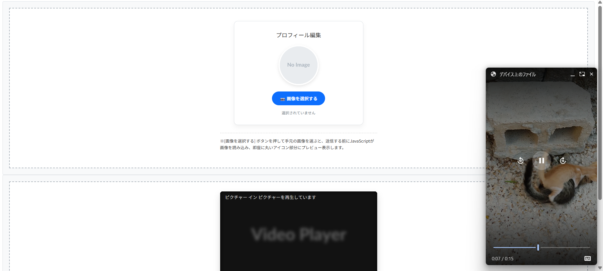
会員登録サイトやSNSなどでユーザーが自分のアイコン画像を設定するフォームを作るには<input type="file">を使用します。
初心者がやるのが「ファイルを選択したのに、画面上のアイコンが切り替わらない(プレビューされない)」というUX上の欠陥です。
ユーザーは「本当に画像がセットされたのか?」と不安になります。
実務では、JavaScriptのFileReaderAPI またはURL.createObjectURL()を使って、アップロード前に選択した画像をその場でプレビュー表示させるのがよいです。
また、HTML側でaccept="image/*"を指定して「画像以外のファイル(PDFや動画など)を誤って選択させないようにする」ガードも忘れてはいけません。

選択されていません
※[画像を選択する] ボタンを押して手元の画像を選ぶと、送信する前にJavaScriptが画像を読み込み、即座に丸いアイコン部分にプレビュー表示します。
HTMLコード表示
<div class="hup1-wrapper">
  <div class="hup1-demo-area">

    <div class="hup1-profile-card">
      <div class="hup1-title">プロフィール編集</div>

      <div class="hup1-preview-container">
        <picture>
          <img src="https://placehold.co/200x200/e9ecef/a8b2bc.png?text=No+Image" id="hup1-preview-img" class="hup1-avatar" alt="プロフィール画像プレビュー">
        </picture>
      </div>

      <div class="hup1-form-group">
        <label for="hup1-file-input" class="hup1-upload-btn">
          📷 画像を選択する
        </label>
        <input type="file" id="hup1-file-input" class="hup1-file-input" accept="image/png, image/jpeg, image/gif">
      </div>

      <p class="hup1-file-name" id="hup1-file-name">選択されていません</p>

    </div>

    <p class="hup1-note">※[画像を選択する] ボタンを押して手元の画像を選ぶと、送信する前にJavaScriptが画像を読み込み、即座に丸いアイコン部分にプレビュー表示します。</p>

  </div>
</div>
CSSコード表示
.hup1-wrapper {
  background-color: #f8f9fa;
  padding: 20px;
  border: 1px solid #dee2e6;
  border-radius: 4px;
  font-family: sans-serif;
}

.hup1-demo-area {
  background-color: #ffffff;
  border: 2px dashed #adb5bd;
  padding: 40px 20px;
  display: flex;
  flex-direction: column;
  align-items: center;
}

.hup1-profile-card {
  background-color: #fff;
  border: 1px solid #dee2e6;
  border-radius: 12px;
  padding: 30px;
  box-shadow: 0 8px 15px rgba(0,0,0,0.05);
  width: 100%;
  max-width: 350px;
  text-align: center;
}

.hup1-title {
  margin: 0 0 20px 0;
  font-size: 18px;
  color: #333;
}

/* プレビュー表示の丸い枠 */
.hup1-preview-container {
  margin-bottom: 20px;
  display: flex;
  justify-content: center;
}

.hup1-avatar {
  width: 120px;
  height: 120px;
  border-radius: 50%; /* 完全な丸にする */
  object-fit: cover;  /* 比率を保ってトリミング */
  border: 4px solid #fff;
  box-shadow: 0 4px 10px rgba(0,0,0,0.1);
  display: block;
  background-color: #e9ecef;
}

/* ファイルインプット本体は隠す(デザインがブラウザ依存でダサいため) */
.hup1-file-input {
  display: none;
}

/* 代わりとなるボタン */
.hup1-upload-btn {
  display: inline-block;
  background-color: #0d6efd;
  color: white;
  padding: 12px 24px;
  border-radius: 30px;
  font-weight: bold;
  font-size: 14px;
  cursor: pointer;
  transition: background-color 0.2s;
}

.hup1-upload-btn:hover {
  background-color: #0b5ed7;
}

.hup1-file-name {
  margin: 15px 0 0 0;
  font-size: 12px;
  color: #6c757d;
  word-break: break-all;
}

.hup1-note {
  font-size: 13px;
  color: #333;
  margin-top: 25px;
  line-height: 1.6;
  border-top: 1px dashed #ccc;
  padding-top: 15px;
  max-width: 500px;
}
JavaScriptコード表示
document.addEventListener('DOMContentLoaded', () => {
  const fileInput = document.getElementById('hup1-file-input');
  const previewImg = document.getElementById('hup1-preview-img');
  const fileNameDisplay = document.getElementById('hup1-file-name');

  if(fileInput && previewImg) {
    // ファイルが選択された時に発火するイベント
    fileInput.addEventListener('change', function(e) {
      const file = e.target.files[0]; // 選択された1つ目のファイルを取得

      if(file) {
        // ファイル名を表示
        fileNameDisplay.textContent = file.name;

        // FileReaderを使って画像を読み込み、プレビューにセットする
        const reader = new FileReader();
        reader.onload = function(e) {
          previewImg.src = e.target.result;
        }
        reader.readAsDataURL(file);
      } else {
        // キャンセルされた場合はリセット
        fileNameDisplay.textContent = '選択されていません';
        previewImg.src = 'https://placehold.co/200x200/e9ecef/a8b2bc.png?text=No+Image';
      }
    });
  }
});
動画のピクチャーインピクチャー機能
YouTubeなどの動画サービスで見かける「メイン画面をスクロールしても画面の右下に小窓で動画が追従して再生される機能」を「ピクチャー・イン・ピクチャー」と呼びます。
名前に「picture」と入っているため、「<picture>タグの機能の一つ」と勘違いする人も稀にいますが全くの別物です。
ピクチャー・イン・ピクチャーは、HTMLの<video>タグに対するJavaScriptのAPI機能です。
また、セキュリティや迷惑行為防止の観点から「ページを開いた瞬間に自動で小窓化する」ことはブラウザの仕様で禁止されており、「ユーザーがボタンをクリックする」などのアクションをトリガーにする必要があります。
※動画を再生し、「小窓化する」ボタンをクリックしてください。動画が枠から飛び出し、画面の右下などで追従再生される「ピクチャー・イン・ピクチャー」モードに移行します。
(※Safariなど、一部のブラウザ設定環境ではPiP APIが動作しない場合があります)
HTMLコード表示
<div class="hpip1-wrapper">
  <div class="hpip1-demo-area">

    <div class="hpip1-video-container">
      <video id="hpip1-video" class="hpip1-video" controls muted poster="https://placehold.co/600x337/282c34/ffffff.png?text=Video+Player">
        <source src="https://su-gi-rx.com/wp-content/uploads/2026/03/4624594-hd_1080_1920_30fps.mp4" type="video/mp4">
        お使いのブラウザは動画タグに対応していません。
      </video>

      <div class="hpip1-controls">
        <button id="hpip1-btn" class="hpip1-action-btn">
          <span class="hpip1-icon">⏬</span> 小窓化する (PiP)
        </button>
      </div>
    </div>

    <p class="hpip1-note">
      ※動画を再生し、「小窓化する」ボタンをクリックしてください。動画が枠から飛び出し、画面の右下などで追従再生される「ピクチャー・イン・ピクチャー」モードに移行します。<br>
      (※Safariなど、一部のブラウザ設定環境ではPiP APIが動作しない場合があります)
    </p>

  </div>
</div>
CSSコード表示
.hpip1-wrapper {
  background-color: #f8f9fa;
  padding: 20px;
  border: 1px solid #dee2e6;
  border-radius: 4px;
  font-family: sans-serif;
}

.hpip1-demo-area {
  background-color: #ffffff;
  border: 2px dashed #adb5bd;
  padding: 30px 20px;
  display: flex;
  flex-direction: column;
  align-items: center;
}

.hpip1-video-container {
  width: 100%;
  max-width: 500px;
  background-color: #000;
  border-radius: 8px;
  overflow: hidden;
  box-shadow: 0 10px 20px rgba(0,0,0,0.15);
}

.hpip1-video {
  width: 100% !important;
  display: block !important;
  aspect-ratio: 16 / 9 !important;
  background-color: #000 !important;
}

.hpip1-controls {
  background-color: #111;
  padding: 15px;
  display: flex;
  justify-content: center;
}

.hpip1-action-btn {
  all: unset;
  display: inline-flex;
  align-items: center;
  gap: 8px;
  background-color: #e50914; /* 動画サービス風の赤色 */
  color: white;
  font-size: 14px;
  font-weight: bold;
  padding: 10px 20px;
  border-radius: 4px;
  cursor: pointer;
  transition: background-color 0.2s;
}

.hpip1-action-btn:hover {
  background-color: #b20710;
}

.hpip1-icon {
  font-size: 16px;
}

.hpip1-note {
  font-size: 13px;
  color: #333;
  margin-top: 20px;
  line-height: 1.6;
  background-color: #e9ecef;
  padding: 15px;
  border-radius: 6px;
  max-width: 600px;
}
JavaScriptコード表示
document.addEventListener('DOMContentLoaded', () => {
  const video = document.getElementById('hpip1-video');
  const pipBtn = document.getElementById('hpip1-btn');

  // ブラウザがPicture-in-Picture APIに対応しているかチェック
  if (video && pipBtn) {
    if ('pictureInPictureEnabled' in document) {
      pipBtn.addEventListener('click', async () => {
        try {
          // もしすでにPiPモードなら解除する
          if (document.pictureInPictureElement) {
            await document.exitPictureInPicture();
          } else {
            // PiPモードを要求する
            await video.requestPictureInPicture();
          }
        } catch (error) {
          console.error('PiPの起動に失敗しました:', error);
          alert('お使いの環境ではピクチャー・イン・ピクチャーを起動できませんでした。');
        }
      });

      // PiP状態が変わった時のボタンテキストの更新
      video.addEventListener('enterpictureinpicture', () => {
        pipBtn.innerHTML = '<span class="hpip1-icon">⏫</span> 小窓を戻す';
      });

      video.addEventListener('leavepictureinpicture', () => {
        pipBtn.innerHTML = '<span class="hpip1-icon">⏬</span> 小窓化する (PiP)';
      });

    } else {
      // 非対応ブラウザの場合
      pipBtn.style.backgroundColor = '#6c757d';
      pipBtn.style.cursor = 'not-allowed';
      pipBtn.innerHTML = 'お使いのブラウザはPiP非対応です';
      pipBtn.disabled = true;
    }
  }
});
画像が表示されない原因とSEO対策
サイト制作において、「コードは合っているはずなのに画像が表示されない」というトラブルはよくあります。
画像が表示されない状態を放置すると、不信感を与えるだけでなく、Google検索エンジンからも「品質の低いページ」とみなされ、SEO(検索順位)に悪影響を及ぼします。
ここでは、画像が表示されない時のチェックポイントと表示速度を改善するテクニックを解説します。
- 表示されない時のチェックと代替テキスト(alt)
- ページ表示速度を上げる遅延読み込み(lazy load)
表示されない時のチェックと代替テキスト(alt)
<picture>タグを使っても画像が表示されない場合、実務において原因は以下の2パターンのどちらかです。
- パス(URL)の間違い
画像ファイルの名前やフォルダ階層の指定(相対パス・絶対パス)が間違っている。 <img>タグの書き忘れ<picture>タグのフォールバック用の<img>タグを書き忘れると画面には何も描画されません。
万が一、パスのエラーや通信障害で画像が読み込めなかった場合、画面にはリンク切れアイコンが表示されます。
この時、どんな画像が表示される予定だったのか文字で伝えるのがalt 属性(代替テキスト)です。
よくあるミスが2つあります。
一つは「<picture>や<source>タグにaltを書いてしまう」ことです。
HTMLの仕様上、alt属性は中の<img>タグに記述しなければ機能しません。
もう一つは「alt=""を空欄のまま放置する、または『画像』とだけ書く」ことです。
altに書かれたテキストは、視覚障害者向けの音声読み上げソフトで読まれるだけでなく、Googleのクローラーが「この画像は何を表しているか」を理解する重要な情報(SEO対策)になります。
<source srcset=”not-found.webp” type=”image/webp”>
<img src=”not-found.jpg” alt=””>
</picture>
※画像が読み込めなかった時、ただの「壊れたアイコン」だけが表示され、ユーザーも検索エンジンも「ここにあったはずの画像」が何なのか一切理解できません。
<source srcset=”not-found.webp” type=”image/webp”>
<img src=”not-found.jpg” alt=”新作の春物ワンピース(花柄ピンク)”>
</picture>
※リンク切れになっても「どんな画像だったか」が文字で表示されます。また、Google検索の画像検索結果にもヒットしやすくなります。
HTMLコード表示
<div class="herr1-wrapper">
  <input type="radio" name="herr1-state" id="herr1-bad" class="herr1-radio" checked>
  <input type="radio" name="herr1-state" id="herr1-good" class="herr1-radio">

  <div class="herr1-controls">
    <label for="herr1-bad" class="herr1-btn">❌ alt指定なし (何かわからない)</label>
    <label for="herr1-good" class="herr1-btn">⭕️ alt指定あり (内容が伝わる)</label>
  </div>

  <div class="herr1-demo-area">

    <div class="herr1-box target-bad-herr1">
      <div class="herr1-code">
        <picture><br>
          <source srcset="not-found.webp" type="image/webp"><br>
          <img src="not-found.jpg" <span class="herr1-highlight">alt=""</span>><br>
        </picture>
      </div>
      <div class="herr1-render">
        <div class="herr1-broken-img">
          <span class="herr1-broken-icon">🖼️ ✕</span>
        </div>
      </div>
      <p class="herr1-note">※画像が読み込めなかった時、ただの「壊れたアイコン」だけが表示され、ユーザーも検索エンジンも「ここにあったはずの画像」が何なのか一切理解できません。</p>
    </div>

    <div class="herr1-box target-good-herr1">
      <div class="herr1-code herr1-code-ok">
        <picture><br>
          <source srcset="not-found.webp" type="image/webp"><br>
          <img src="not-found.jpg" <span class="herr1-highlight-ok">alt="新作の春物ワンピース(花柄ピンク)"</span>><br>
        </picture>
      </div>
      <div class="herr1-render">
        <div class="herr1-broken-img">
          <span class="herr1-broken-icon">🖼️ ✕</span>
          <span class="herr1-alt-text">新作の春物ワンピース(花柄ピンク)</span>
        </div>
      </div>
      <p class="herr1-note herr1-note-ok">※リンク切れになっても「どんな画像だったか」が文字で表示されます。また、Google検索の画像検索結果にもヒットしやすくなります。</p>
    </div>

  </div>
</div>
CSSコード表示
.herr1-wrapper {
  background-color: #f8f9fa;
  padding: 20px;
  border: 1px solid #dee2e6;
  border-radius: 4px;
  font-family: sans-serif;
}

.herr1-radio {
  display: none;
}

.herr1-controls {
  display: flex;
  justify-content: center;
  gap: 10px;
  margin-bottom: 20px;
  flex-wrap: wrap;
}

.herr1-btn {
  background-color: #e9ecef;
  padding: 10px 15px;
  border-radius: 4px;
  cursor: pointer;
  font-weight: bold;
  color: #495057;
  transition: 0.2s;
  font-size: 14px;
}

#herr1-bad:checked ~ .herr1-controls [for="herr1-bad"] {
  background-color: #dc3545;
  color: white;
}

#herr1-good:checked ~ .herr1-controls [for="herr1-good"] {
  background-color: #198754;
  color: white;
}

.herr1-demo-area {
  background-color: #ffffff;
  border: 2px dashed #adb5bd;
  padding: 30px 20px;
  display: flex;
  justify-content: center;
}

.herr1-box {
  width: 100%;
  max-width: 450px;
}

.herr1-code {
  background-color: #f8d7da;
  color: #842029;
  padding: 15px;
  font-family: monospace;
  font-size: 13px;
  border-radius: 4px;
  margin-bottom: 20px;
  line-height: 1.5;
  border-left: 4px solid #dc3545;
}

.herr1-code-ok {
  background-color: #d1e7dd;
  color: #0f5132;
  border-left: 4px solid #198754;
}

.herr1-highlight {
  color: #dc3545;
  font-weight: bold;
  background: rgba(220,53,69,0.1);
}

.herr1-highlight-ok {
  color: #198754;
  font-weight: bold;
  background: rgba(25,135,84,0.1);
}

.herr1-render {
  display: flex;
  justify-content: center;
  margin-bottom: 20px;
}

/* リンク切れを再現したダミーボックス */
.herr1-broken-img {
  width: 100%;
  max-width: 300px;
  height: 120px;
  border: 1px solid #ccc;
  background-color: #f8f9fa;
  display: flex;
  flex-direction: column;
  align-items: center;
  justify-content: center;
  color: #6c757d;
  font-family: sans-serif;
  padding: 10px;
  box-sizing: border-box;
  text-align: center;
}

.herr1-broken-icon {
  font-size: 20px;
  margin-bottom: 5px;
}

.herr1-alt-text {
  font-size: 12px;
  color: #333;
}

.herr1-note {
  font-size: 13px;
  color: #dc3545;
  font-weight: bold;
  line-height: 1.5;
  margin: 0;
  padding-top: 15px;
  border-top: 1px dashed #ccc;
}

.herr1-note-ok {
  color: #198754;
}

.target-good-herr1 {
  display: none;
}

#herr1-bad:checked ~ .herr1-demo-area .target-bad-herr1 {
  display: block;
}

#herr1-good:checked ~ .herr1-demo-area .target-bad-herr1 {
  display: none;
}

#herr1-good:checked ~ .herr1-demo-area .target-good-herr1 {
  display: block;
}
ページ表示速度を上げる遅延読み込み(lazy load)
画像は、テキストやCSSに比べてファイルサイズが大きく、ページ表示速度(パフォーマンス)を低下させる要因です。
縦に長いページで数十枚の画像を一度に読み込むと、画面が真っ白なまま数秒間フリーズすることもあります。
これを防ぐのが「遅延読み込み(lazy load)」と呼ばれる技術です。
設定は簡単で<img>タグにloading="lazy"という属性を追加するだけです。
設定すると、ブラウザは「画像が画面内にスクロールされて近づいてくるまで画像のダウンロードを後回し(保留)にする」という動きをします。
注意点として「すべての画像にloading="lazy"を付ける」のはSEOにおける最悪のパターン です。
ユーザーがページを開いた瞬間に目に入るエリアの画像にlazyをつけてしまうと、最優先で表示すべき画像の読み込みが遅延され、Googleの重要指標である「LCP(Largest Contentful Paint)」のスコアが劇的に悪化します。
「スクロールせずに見える最初の画像には何もつけない(またはloading="eager")」「スクロールしないと見えない画像だけloading="lazy"をつける」のがよいです。
※すべての画像に loading=”lazy” を付けると、最初の表示速度が逆に遅くなりSEO評価が下がります。必ず「ファーストビューの下にある画像から」適用してください。
HTMLコード表示
<div class="hlazy1-wrapper">
  <div class="hlazy1-demo-area">

    <div class="hlazy1-mock-browser">
      <div class="hlazy1-browser-header">
        <span class="hlazy1-dot" style="background:#ff5f56;"></span>
        <span class="hlazy1-dot" style="background:#ffbd2e;"></span>
        <span class="hlazy1-dot" style="background:#27c93f;"></span>
      </div>

      <div class="hlazy1-viewport">

        <div class="hlazy1-first-view">
          <div class="hlazy1-label">ファーストビュー(開いてすぐ見える場所)</div>
          <div class="hlazy1-code-block">
            <img src="hero.jpg" alt="メイン"<br>
            <span class="hlazy1-highlight-eager">※ここは絶対にlazyを付けない!</span>>
          </div>
          <p class="hlazy1-status hlazy1-status-eager">▶︎ ページを開いた瞬間、最優先ですぐにダウンロードされます。</p>
        </div>

        <div class="hlazy1-scroll-arrow">
          ↓ スクロール ↓
        </div>

        <div class="hlazy1-second-view">
          <div class="hlazy1-label hlazy1-label-lazy">スクロール先(見えない場所)</div>
          <div class="hlazy1-code-block">
            <img src="sub.jpg" alt="サブ"<br>
            <span class="hlazy1-highlight-lazy">loading="lazy"</span>>
          </div>
          <p class="hlazy1-status hlazy1-status-lazy">▶︎ 画面に近づくまでダウンロードを保留し、通信量を節約します。</p>
        </div>

      </div>
    </div>

    <p class="hlazy1-note">※すべての画像に loading="lazy" を付けると、最初の表示速度が逆に遅くなりSEO評価が下がります。必ず「ファーストビューの下にある画像から」適用してください。</p>

  </div>
</div>
CSSコード表示
.hlazy1-wrapper {
  background-color: #f8f9fa;
  padding: 20px;
  border: 1px solid #dee2e6;
  border-radius: 4px;
  font-family: sans-serif;
}

.hlazy1-demo-area {
  background-color: #ffffff;
  border: 2px dashed #adb5bd;
  padding: 30px 20px;
  display: flex;
  flex-direction: column;
  align-items: center;
}

/* 擬似ブラウザ枠 */
.hlazy1-mock-browser {
  width: 100%;
  max-width: 400px;
  border: 2px solid #ccc;
  border-radius: 8px;
  overflow: hidden;
  background-color: #f1f3f5;
  box-shadow: 0 10px 20px rgba(0,0,0,0.1);
  margin-bottom: 20px;
}

.hlazy1-browser-header {
  background-color: #e9ecef;
  padding: 10px;
  display: flex;
  gap: 6px;
  border-bottom: 1px solid #ccc;
}

.hlazy1-dot {
  width: 12px;
  height: 12px;
  border-radius: 50%;
}

.hlazy1-viewport {
  padding: 20px;
  display: flex;
  flex-direction: column;
  gap: 30px;
}

/* ファーストビュー */
.hlazy1-first-view,
.hlazy1-second-view {
  background-color: #fff;
  border: 1px solid #dee2e6;
  border-radius: 6px;
  padding: 15px;
  box-shadow: 0 4px 6px rgba(0,0,0,0.05);
}

.hlazy1-label {
  font-size: 13px;
  font-weight: bold;
  color: #fff;
  background-color: #dc3545;
  padding: 4px 8px;
  border-radius: 4px;
  display: inline-block;
  margin-bottom: 10px;
}

.hlazy1-label-lazy {
  background-color: #198754;
}

.hlazy1-code-block {
  background-color: #282c34;
  color: #abb2bf;
  padding: 15px;
  font-family: monospace;
  font-size: 12px;
  border-radius: 4px;
  line-height: 1.5;
  margin-bottom: 10px;
}

.hlazy1-highlight-eager {
  color: #e06c75;
  font-weight: bold;
}

.hlazy1-highlight-lazy {
  color: #98c379;
  font-weight: bold;
  font-size: 14px;
}

.hlazy1-status {
  font-size: 12px;
  font-weight: bold;
  margin: 0;
}

.hlazy1-status-eager {
  color: #dc3545;
}

.hlazy1-status-lazy {
  color: #198754;
}

.hlazy1-scroll-arrow {
  text-align: center;
  font-weight: bold;
  color: #6c757d;
  font-size: 14px;
  letter-spacing: 2px;
}

.hlazy1-note {
  font-size: 13px;
  color: #333;
  line-height: 1.6;
  margin: 0;
  border-top: 1px dashed #ccc;
  padding-top: 15px;
  font-weight: bold;
}
まとめ
分かりやすいようにまとめを記載します。
- 基本構造
<picture>内に複数の<source>を記述し、必ず表示用の<img>タグを配置する。 - 役割の違い
画像の縮小表示は<img>を使い、構図変更やフォーマットの出し分けに<picture>を使用する。 - 画面幅の切り替え
<source>にmedia属性を指定し、条件の大きいサイズ(min-width)から順に記述する。 - 次世代フォーマット対応
type="image/webp"などを指定し、対応ブラウザのみ軽量画像を読み込ませる。 - 高解像度(Retina)対応
srcset属性で1xや2xの記述子を用い、ディスプレイのピクセル密度に応じて画像を出し分ける。 - サイズと比率の維持
枠に合わせて画像をトリミングするには、CSSでobject-fit: cover;を指定する。 - SEOとアクセシビリティ
<picture>内部の<img>は、画像の内容を説明したalt属性を記述する。 - 表示速度の最適化
loading="lazy"はファーストビューの画像に使用せず、スクロール領域の画像に付与する。
よくある質問(FAQ)
<picture>タグと<img>タグの違い・使い分け方は何ですか?
単一の画像を表示し、CSSでサイズを伸縮させるだけなら<img>タグを使用します。
一方、<picture>タグはスマホ用とPC用で違う画像に差し替える場合や、WebP対応ブラウザにはWebP、非対応ブラウザにはJPEGを読み込ませるといった出し分けが必要な場合に使用します。
スマホとPCで別の画像を表示させるにはどのように記述しますか?
<picture>タグに<source>タグを配置し、media属性で条件を指定します。
例えば、media="(min-width: 768px)"と指定した<source>タグにはPC・タブレット用の画像パスを記述し、その下の<img>タグにはスマホ用の画像パスを記述することで、768pxを境にブラウザが画像を切り替えます。
WebP画像とJPEG画像を出し分けるにはどうすればいいですか?
<source>タグのtype属性を使用します。
<source srcset="image.webp" type="image/webp">と記述することで、ブラウザがWebPに対応している場合のみ画像を読み込みます。
対応していないブラウザは無視し、記述された<img>タグのJPEG画像を読み込みます。
<picture>タグを使ったのに画面に画像が表示されないのはなぜですか?
必須である<img>タグを書き忘れている可能性が高いです。
<picture>や<source>タグは画面に画像を描画する機能を持ちません。
ブラウザは条件に合った画像のURLを決定した後、内包されている<img>タグにURLを渡して表示させる仕様になるため、<img>タグがないと表示されません。
<picture>タグで表示した画像のサイズ(幅や高さ)を変えるにはどうすればいいですか?
<picture>タグや<source>タグに対してCSSを指定するのではなく、中にある<img>タグに対してCSSを適用します。
例えば、img { width: 100%; height: auto; }のように指定することで、親要素の幅に合わせて画像がレスポンシブに可変します。
枠の比率に合わせてトリミングしたい場合はobject-fit: cover;を併用します。