本記事では、カスタマイズ可能なローディング・スピナーデザインのコードをご紹介します。
HTMLとCSSの両方をコピペすればすぐに利用できます。
コピペしたコードをカスタマイズし、自分好みにぜひ変更してみてください。
ローディングやスピナー作成にはdivタグを使うことがあります。
divタグの使い方を詳しく知りたい人は「【HTML】divタグの使い方:横並びや中央寄せ・CSS装飾」を一読ください。
おしゃれなフリー素材デザイン集
本サイトでは、ローディング・スピナー以外にも様々なHTML&CSSによるおしゃれな素材をご用意しています。
以下は、主なデザインカテゴリーです。
ぜひTOPページから「デザインギャラリー」を一読頂けますと幸いです。
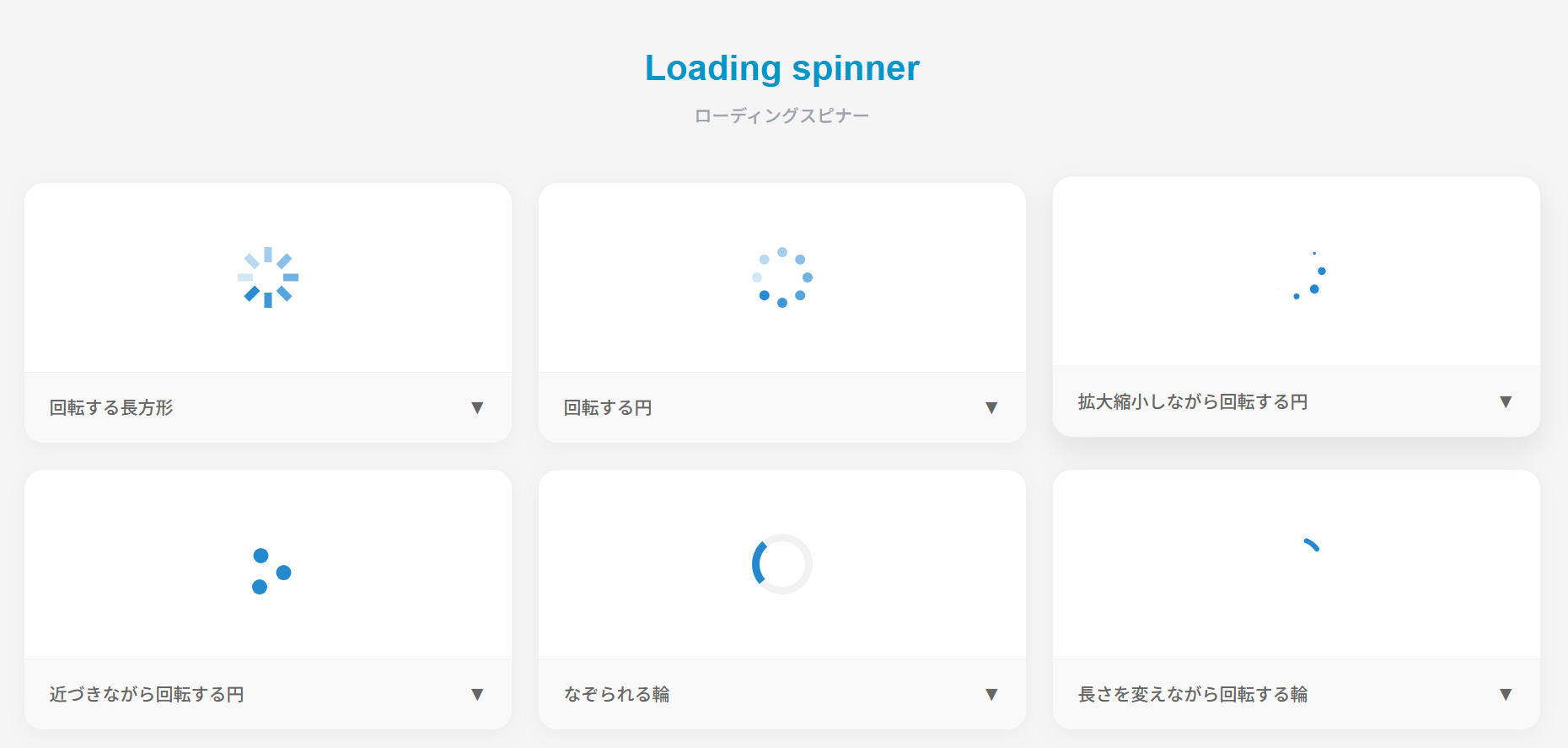
ローディングスピナー
ここでは、以下のローディングスピナーのデザイン例を記載しています。
- 回転する長方形
- 回転する円
- 拡大縮小しながら回転する円
- 近づきながら回転する円
- なぞられる輪
- 長さを変えながら回転する輪
- 時計風
- 円の中で回転する円
- バウンドする円
- 波紋を出す円
- 回転する正方形 – ver1.0
- 回転する正方形 – ver2.0
実際のデザインプレビューとHTML&CSSコードを記載しています。
さらに、以下の項目もローディングスピナーページでは選択式でご用意しました。
- 図形の色
- 円の色
- 軌道の色
- 輪の色
- 時計の色
- 外円の色
- 波紋の色
- アクティブの色
- ベースの色
- 正方形の色
ご興味があれば「ローディングスピナー一覧ページ」を一読ください。
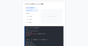
回転する長方形
HTMLコード表示
<svg xmlns="http://www.w3.org/2000/svg" viewBox="0 0 32 32" width="48" height="48" fill="#2589d0">
  <path d="M14 0 H18 V8 H14 z" transform="rotate(0 16 16)" opacity=".1"><animate attributeName="opacity" from="1" to=".1" begin="0" dur="1s" repeatCount="indefinite"/></path>
  <path d="M14 0 H18 V8 H14 z" transform="rotate(45 16 16)" opacity=".1"><animate attributeName="opacity" from="1" to=".1" begin="0.125s" dur="1s" repeatCount="indefinite"/></path>
  <path d="M14 0 H18 V8 H14 z" transform="rotate(90 16 16)" opacity=".1"><animate attributeName="opacity" from="1" to=".1" begin="0.25s" dur="1s" repeatCount="indefinite"/></path>
  <path d="M14 0 H18 V8 H14 z" transform="rotate(135 16 16)" opacity=".1"><animate attributeName="opacity" from="1" to=".1" begin="0.375s" dur="1s" repeatCount="indefinite"/></path>
  <path d="M14 0 H18 V8 H14 z" transform="rotate(180 16 16)" opacity=".1"><animate attributeName="opacity" from="1" to=".1" begin="0.5s" dur="1s" repeatCount="indefinite"/></path>
  <path d="M14 0 H18 V8 H14 z" transform="rotate(225 16 16)" opacity=".1"><animate attributeName="opacity" from="1" to=".1" begin="0.625s" dur="1s" repeatCount="indefinite"/></path>
  <path d="M14 0 H18 V8 H14 z" transform="rotate(270 16 16)" opacity=".1"><animate attributeName="opacity" from="1" to=".1" begin="0.75s" dur="1s" repeatCount="indefinite"/></path>
  <path d="M14 0 H18 V8 H14 z" transform="rotate(315 16 16)" opacity=".1"><animate attributeName="opacity" from="1" to=".1" begin="0.875s" dur="1s" repeatCount="indefinite"/></path>
</svg>
CSSコード表示
/* SVGの場合はCSSは不要です。サイズを調整したい場合は以下のように記述してください。*/
svg {
  width: 48px;
  height: 48px;
}
回転する円
HTMLコード表示
<svg xmlns="http://www.w3.org/2000/svg" viewBox="0 0 24 24" width="48" height="48" fill="#2589d0">
  <circle cx="12" cy="2" r="2" opacity=".1"><animate attributeName="opacity" from="1" to=".1" dur="1s" repeatCount="indefinite" begin="0"/></circle>
  <circle transform="rotate(45 12 12)" cx="12" cy="2" r="2" opacity=".1"><animate attributeName="opacity" from="1" to=".1" dur="1s" repeatCount="indefinite" begin=".125s"/></circle>
  <circle transform="rotate(90 12 12)" cx="12" cy="2" r="2" opacity=".1"><animate attributeName="opacity" from="1" to=".1" dur="1s" repeatCount="indefinite" begin=".25s"/></circle>
  <circle transform="rotate(135 12 12)" cx="12" cy="2" r="2" opacity=".1"><animate attributeName="opacity" from="1" to=".1" dur="1s" repeatCount="indefinite" begin=".375s"/></circle>
  <circle transform="rotate(180 12 12)" cx="12" cy="2" r="2" opacity=".1"><animate attributeName="opacity" from="1" to=".1" dur="1s" repeatCount="indefinite" begin=".5s"/></circle>
  <circle transform="rotate(225 12 12)" cx="12" cy="2" r="2" opacity=".1"><animate attributeName="opacity" from="1" to=".1" dur="1s" repeatCount="indefinite" begin=".625s"/></circle>
  <circle transform="rotate(270 12 12)" cx="12" cy="2" r="2" opacity=".1"><animate attributeName="opacity" from="1" to=".1" dur="1s" repeatCount="indefinite" begin=".75s"/></circle>
  <circle transform="rotate(315 12 12)" cx="12" cy="2" r="2" opacity=".1"><animate attributeName="opacity" from="1" to=".1" dur="1s" repeatCount="indefinite" begin=".875s"/></circle>
</svg>
CSSコード表示
/* SVGの場合はCSSは不要です。サイズを調整したい場合は以下のように記述してください。*/
svg {
  width: 48px;
  height: 48px;
}
拡大縮小しながら回転する円
HTMLコード表示
<svg xmlns="http://www.w3.org/2000/svg" viewBox="0 0 24 24" width="48" height="48" fill="#2589d0">
  <circle cx="12" cy="2" r="0"><animate attributeName="r" values="0;2;0;0" dur="1s" repeatCount="indefinite" begin="0" keySplines=".2 .2 .4 .8;.2 .2 .4 .8;.2 .2 .4 .8" calcMode="spline"/></circle>
  <circle transform="rotate(45 12 12)" cx="12" cy="2" r="0"><animate attributeName="r" values="0;2;0;0" dur="1s" repeatCount="indefinite" begin=".125s" keySplines=".2 .2 .4 .8;.2 .2 .4 .8;.2 .2 .4 .8" calcMode="spline"/></circle>
  <circle transform="rotate(90 12 12)" cx="12" cy="2" r="0"><animate attributeName="r" values="0;2;0;0" dur="1s" repeatCount="indefinite" begin=".25s" keySplines=".2 .2 .4 .8;.2 .2 .4 .8;.2 .2 .4 .8" calcMode="spline"/></circle>
  <circle transform="rotate(135 12 12)" cx="12" cy="2" r="0"><animate attributeName="r" values="0;2;0;0" dur="1s" repeatCount="indefinite" begin=".375s" keySplines=".2 .2 .4 .8;.2 .2 .4 .8;.2 .2 .4 .8" calcMode="spline"/></circle>
CSSコード表示
/* SVGの場合はCSSは不要です。サイズを調整したい場合は以下のように記述してください。*/
svg {
  width: 48px;
  height: 48px;
}
近づきながら回転する円
HTMLコード表示
<svg xmlns="http://www.w3.org/2000/svg" viewBox="0 0 24 24" width="48" height="48" fill="#2589d0">
  <circle cx="12" cy="3" r="3"><animate attributeName="cx" values="12;21;3;12" calcMode="linear" dur="2.2s" repeatCount="indefinite"/><animate attributeName="cy" values="3;21;21;3" calcMode="linear" dur="2.2s" repeatCount="indefinite"/></circle>
  <circle cx="21" cy="21" r="3"><animate attributeName="cx" values="21;3;12;21" calcMode="linear" dur="2.2s" repeatCount="indefinite"/><animate attributeName="cy" values="21;21;3;21" calcMode="linear" dur="2.2s" repeatCount="indefinite"/></circle>
  <circle cx="3" cy="21" r="3"><animate attributeName="cx" values="3;12;21;3" calcMode="linear" dur="2.2s" repeatCount="indefinite"/><animate attributeName="cy" values="21;3;21;21" calcMode="linear" dur="2.2s" repeatCount="indefinite"/></circle>
</svg>
CSSコード表示
/* SVGの場合はCSSは不要です。サイズを調整したい場合は以下のように記述してください。*/
svg {
  width: 48px;
  height: 48px;
}
なぞられる輪
HTMLコード表示
<svg xmlns="http://www.w3.org/2000/svg" viewBox="0 0 24 24" width="48" height="48">
  <path fill="#f2f2f2" d="M12,0C5.4,0,0,5.4,0,12s5.4,12,12,12,12-5.4,12-12S18.6,0,12,0m0,3c5,0,9,4,9,9s-4,9-9,9S3,17,3,12,7,3,12,3"/>
  <path fill="#2589d0" d="M12,0c6.6,0,12,5.4,12,12h-3c0-5-4-9-9-9V0Z"><animateTransform attributeName="transform" type="rotate" repeatCount="indefinite" from="0 12 12" to="360 12 12" dur="1s"/></path>
</svg>
CSSコード表示
/* SVGの場合はCSSは不要です。サイズを調整したい場合は以下のように記述してください。*/
svg {
  width: 48px;
  height: 48px;
}
長さを変えながら回転する輪
HTMLコード表示
<svg xmlns="http://www.w3.org/2000/svg" viewBox="0 0 24 24" width="48" height="48">
  <circle cx="12" cy="12" r="10" fill="none" stroke="#2589d0" stroke-width="2" stroke-dasharray="63" stroke-linecap="round">
    <animate attributeName="stroke-dashoffset" values="63;16;63" keyTimes="0;.5;1" keySplines=".42 0 .58 1;.42 0 .58 1;" calcMode="spline" dur="1.4s" repeatCount="indefinite"/>
    <animateTransform attributeName="transform" type="rotate" values="0,12,12;135,12,12;450,12,12" keySplines=".42 0 .58 1;.42 0 .58 1;" calcMode="spline" dur="1.4s" repeatCount="indefinite"/>
    <animateTransform attributeName="transform" type="rotate" from="0,12,12" to="270,12,12" calcMode="linear" dur="1.4s" repeatCount="indefinite" additive="sum"/>
  </circle>
</svg>
CSSコード表示
/* SVGの場合はCSSは不要です。サイズを調整したい場合は以下のように記述してください。*/
svg {
  width: 48px;
  height: 48px;
}
時計風
HTMLコード表示
<svg xmlns="http://www.w3.org/2000/svg" viewBox="0 0 24 24" width="48" height="48" fill="#2589d0">
  <circle cx="12" cy="12" r="11" fill="none" stroke="#2589d0" stroke-width="2"/>
  <rect x="11.5" y="3" width="1" height="9"><animateTransform attributeName="transform" type="rotate" from="0,12,12" to="360,12,12" dur="2s" calcMode="linear" repeatCount="indefinite"/></rect>
  <rect x="11.5" y="6" width="1" height="6.5"><animateTransform attributeName="transform" type="rotate" from="0,12,12" to="360,12,12" dur="8s" calcMode="linear" repeatCount="indefinite"/></rect>
</svg>
CSSコード表示
/* SVGの場合はCSSは不要です。サイズを調整したい場合は以下のように記述してください。*/
svg {
  width: 48px;
  height: 48px;
}
円の中で回転する円
HTMLコード表示
<svg xmlns="http://www.w3.org/2000/svg" viewBox="0 0 24 24" width="48" height="48">
  <circle cx="12" cy="12" r="12" fill="#2589d0"/>
  <circle cx="12" cy="5" r="4" fill="#fff"><animateTransform attributeName="transform" type="rotate" from="0 12 12" to="360 12 12" dur="1s" repeatCount="indefinite"/></circle>
</svg>
CSSコード表示
/* SVGの場合はCSSは不要です。サイズを調整したい場合は以下のように記述してください。*/
svg {
  width: 48px;
  height: 48px;
}
バウンドする円
HTMLコード表示
<svg xmlns="http://www.w3.org/2000/svg" viewBox="0 0 24 24" width="48" height="48" fill="#2589d0">
  <circle cx="12" cy="12" r="12" opacity=".5"><animate attributeName="r" values="0;12;0" keySplines="0.42 0.0 0.58 1.0" dur="2s" repeatCount="indefinite" begin="0"/></circle>
  <circle cx="12" cy="12" r="0" opacity=".5"><animate attributeName="r" values="0;12;0" keySplines="0.42 0.0 0.58 1.0" dur="2s" repeatCount="indefinite" begin="1s"/></circle>
</svg>
CSSコード表示
/* SVGの場合はCSSは不要です。サイズを調整したい場合は以下のように記述してください。*/
svg {
  width: 48px;
  height: 48px;
}
波紋を出す円
HTMLコード表示
<svg xmlns="http://www.w3.org/2000/svg" viewBox="0 0 24 24" width="48" height="48" fill="#2589d0">
  <circle cx="12" cy="12" r="0"><animate attributeName="opacity" values="0;1;0" keyTimes="0;.05;1" calcMode="linear" dur="1s" repeatCount="indefinite"/><animate attributeName="r" from="0" to="12" dur="1s" repeatCount="indefinite"/></circle>
  <circle cx="12" cy="12" r="0"><animate attributeName="opacity" values="0;1;0" keyTimes="0;.05;1" calcMode="linear" dur="1s" begin=".3s" repeatCount="indefinite"/><animate attributeName="r" from="0" to="12" dur="1s" begin=".3s" repeatCount="indefinite"/></circle>
  <circle cx="12" cy="12" r="0"><animate attributeName="opacity" values="0;1;0" keyTimes="0;.05;1" calcMode="linear" dur="1s" begin=".6s" repeatCount="indefinite"/><animate attributeName="r" from="0" to="12" dur="1s" begin=".6s" repeatCount="indefinite"/></circle>
</svg>
CSSコード表示
/* SVGの場合はCSSは不要です。サイズを調整したい場合は以下のように記述してください。*/
svg {
  width: 48px;
  height: 48px;
}
回転する正方形 ver1.0
HTMLコード表示
<svg xmlns="http://www.w3.org/2000/svg" viewBox="0 0 48 48" width="48" height="48" fill="#e6edf3">
  <rect x="0" y="0" width="14" height="14" fill="#e6edf3"><animate attributeName="fill" values="#2589d0;#e6edf3;#e6edf3" keyTimes="0;0.125;1" dur="1s" repeatCount="indefinite" begin="0s" calcMode="discrete"></animate></rect>
  <rect x="17" y="0" width="14" height="14" fill="#e6edf3"><animate attributeName="fill" values="#2589d0;#e6edf3;#e6edf3" keyTimes="0;0.125;1" dur="1s" repeatCount="indefinite" begin="0.125s" calcMode="discrete"></animate></rect>
  <rect x="34" y="0" width="14" height="14" fill="#e6edf3"><animate attributeName="fill" values="#2589d0;#e6edf3;#e6edf3" keyTimes="0;0.125;1" dur="1s" repeatCount="indefinite" begin="0.25s" calcMode="discrete"></animate></rect>
  <rect x="0" y="17" width="14" height="14" fill="#e6edf3"><animate attributeName="fill" values="#2589d0;#e6edf3;#e6edf3" keyTimes="0;0.125;1" dur="1s" repeatCount="indefinite" begin="0.875s" calcMode="discrete"></animate></rect>
  <rect x="34" y="17" width="14" height="14" fill="#e6edf3"><animate attributeName="fill" values="#2589d0;#e6edf3;#e6edf3" keyTimes="0;0.125;1" dur="1s" repeatCount="indefinite" begin="0.375s" calcMode="discrete"></animate></rect>
  <rect x="0" y="34" width="14" height="14" fill="#e6edf3"><animate attributeName="fill" values="#2589d0;#e6edf3;#e6edf3" keyTimes="0;0.125;1" dur="1s" repeatCount="indefinite" begin="0.75s" calcMode="discrete"></animate></rect>
  <rect x="17" y="34" width="14" height="14" fill="#e6edf3"><animate attributeName="fill" values="#2589d0;#e6edf3;#e6edf3" keyTimes="0;0.125;1" dur="1s" repeatCount="indefinite" begin="0.625s" calcMode="discrete"></animate></rect>
  <rect x="34" y="34" width="14" height="14" fill="#e6edf3"><animate attributeName="fill" values="#2589d0;#e6edf3;#e6edf3" keyTimes="0;0.125;1" dur="1s" repeatCount="indefinite" begin="0.5s" calcMode="discrete"></animate></rect>
</svg>
CSSコード表示
/* SVGの場合はCSSは不要です。サイズを調整したい場合は以下のように記述してください。*/
svg {
  width: 48px;
  height: 48px;
}
回転する正方形 ver2.0
HTMLコード表示
<div class="loader-cube"></div>CSSコード表示
.loader-cube {
  width: 48px;
  height: 48px;
  background-color: #2589d0;
  animation: loader-cube-spin 1.2s infinite ease-in-out;
  margin: 0 0 2em;
}

@keyframes loader-cube-spin {
  0% { transform: perspective(120px) rotateX(0deg) rotateY(0deg); }
  50% { transform: perspective(120px) rotateX(-180.1deg) rotateY(0deg); }
  100% { transform: perspective(120px) rotateX(-180deg) rotateY(-179.9deg); }
}
ローディングバー
ここでは、以下のローディングバーのデザイン例を記載しています。
- 2つの周期で動くバー
- 縦に伸びる棒(5本)
実際のデザインプレビューとHTML&CSSコードを記載しています。
さらに、以下の項目もローディングスピナーページでは選択式でご用意しました。
- バーの色
ご興味があれば「ローディングスピナー一覧ページ」を一読ください。
2つの周期で動くバー
HTMLコード表示
<svg xmlns="http://www.w3.org/2000/svg" viewBox="0 0 150 5" width="150" height="5">
  <rect x="0" y="0" rx="2" ry="2" width="150" height="5" fill="#f2f2f2"/>
  <rect x="0" y="0" rx="2" ry="2" width="150" height="5" fill="#2589d0" transform="scale(0,1)">
    <animateTransform attributeName="transform" type="translate" values="-75,0;-20,0;50,0;250,0" keyTimes="0;.3;.5;1" keySplines="0 0 1 1;.3 .3 .8 .7;.4 .6 .6 .9" dur="2s" repeatCount="indefinite" calcMode="spline"/>
    <animateTransform attributeName="transform" type="scale" values=".1,1;.5,1;.7,1;.1,1" keyTimes="0;.4;.8;1" keySplines="0 0 1 1;.3 .1 .8 1;.1 .1 .6 1" dur="2s" repeatCount="indefinite" calcMode="spline" additive="sum"/>
  </rect>
  <rect x="0" y="0" rx="2" ry="2" width="150" height="5" fill="#2589d0" transform="scale(0,1)">
    <animateTransform attributeName="transform" type="translate" values="-50,0;-50,0;-50,0;165,0" keyTimes="0;.2;.6;1" keySplines="0 0 1 1;.5 0 .7 .5;.3 .4 .6 1" dur="2s" repeatCount="indefinite" calcMode="spline" begin=".5s"/>
    <animateTransform attributeName="transform" type="scale" values=".1,1;.1,1;.7,1;.1,1" keyTimes="0;.4;.7;1" keySplines="0 0 1 1;.3 .1 .8 1;.1 .1 .6 1" dur="2s" repeatCount="indefinite" calcMode="spline" additive="sum" begin=".5s"/>
  </rect>
</svg>
CSSコード表示
/* SVGの場合はCSSは不要です。*/縦に伸びる棒(5本)
HTMLコード表示
<svg xmlns="http://www.w3.org/2000/svg" viewBox="0 0 32 32" width="72" height="72" fill="#2589d0">
  <path transform="translate(2)" d="M0 12 V20 H4 V12z">
    <animate attributeName="d" values="M0 12 V20 H4 V12z; M0 4 V28 H4 V4z; M0 12 V20 H4 V12z; M0 12 V20 H4 V12z" dur="1.2s" calcMode="spline" begin="0" repeatCount="indefinite" keytimes="0;.2;.5;1" keySplines=".2 .2 .4 .8;.2 0.6 .4 .8;.2 .8 .4 .8"/>
  </path>
  <path transform="translate(8)" d="M0 12 V20 H4 V12z">
    <animate attributeName="d" values="M0 12 V20 H4 V12z; M0 4 V28 H4 V4z; M0 12 V20 H4 V12z; M0 12 V20 H4 V12z" dur="1.2s" calcMode="spline" begin=".2s" repeatCount="indefinite" keytimes="0;.2;.5;1" keySplines=".2 .2 .4 .8;.2 0.6 .4 .8;.2 .8 .4 .8"/>
  </path>
  <path transform="translate(14)" d="M0 12 V20 H4 V12z">
    <animate attributeName="d" values="M0 12 V20 H4 V12z; M0 4 V28 H4 V4z; M0 12 V20 H4 V12z; M0 12 V20 H4 V12z" dur="1.2s" calcMode="spline" begin=".4s" repeatCount="indefinite" keytimes="0;.2;.5;1" keySplines=".2 .2 .4 .8;.2 0.6 .4 .8;.2 .8 .4 .8"/>
  </path>
  <path transform="translate(20)" d="M0 12 V20 H4 V12z">
    <animate attributeName="d" values="M0 12 V20 H4 V12z; M0 4 V28 H4 V4z; M0 12 V20 H4 V12z; M0 12 V20 H4 V12z" dur="1.2s" calcMode="spline" begin=".6s" repeatCount="indefinite" keytimes="0;.2;.5;1" keySplines=".2 .2 .4 .8;.2 0.6 .4 .8;.2 .8 .4 .8"/>
  </path>
  <path transform="translate(26)" d="M0 12 V20 H4 V12z">
    <animate attributeName="d" values="M0 12 V20 H4 V12z; M0 4 V28 H4 V4z; M0 12 V20 H4 V12z; M0 12 V20 H4 V12z" dur="1.2s" calcMode="spline" begin=".8s" repeatCount="indefinite" keytimes="0;.2;.5;1" keySplines=".2 .2 .4 .8;.2 0.6 .4 .8;.2 .8 .4 .8"/>
  </path>
</svg>
CSSコード表示
/* SVGの場合はCSSは不要です。*/ローディングテキスト
ここでは、以下のローディングテキストのデザイン例を記載しています。
- 波状に上下する文字
実際のデザインプレビューとHTML&CSSコードを記載しています。
さらに、以下の項目もローディングスピナーページでは選択式でご用意しました。
- 文字色
ご興味があれば「ローディングスピナー一覧ページ」を一読ください。
波状に上下する文字
L o a d i n g . . .
HTMLコード表示
<div class="loading-text">
  <p>
    <span>L</span>
    <span>o</span>
    <span>a</span>
    <span>d</span>
    <span>i</span>
    <span>n</span>
    <span>g</span>
    <span>.</span>
    <span>.</span>
    <span>.</span>
  </p>
</div>
CSSコード表示
.loading-text {
display: flex;
justify-content: center;
align-items: center;
}
.loading-text span {
display: inline-block;
color: #2589d0;
font-weight: 600;
font-size: 1.5em;
animation: animation-loading-text 1s infinite;
}
.loading-text span:nth-of-type(2) {
animation-delay: .1s;
}
.loading-text span:nth-of-type(3) {
animation-delay: .2s;
}
.loading-text span:nth-of-type(4) {
animation-delay: .3s;
}
.loading-text span:nth-of-type(5) {
animation-delay: .4s;
}
.loading-text span:nth-of-type(6) {
animation-delay: .5s;
}
.loading-text span:nth-of-type(7) {
animation-delay: .6s;
}
.loading-text span:nth-of-type(8) {
animation-delay: .7s;
}
.loading-text span:nth-of-type(9) {
animation-delay: .8s;
}
@keyframes animation-loading-text {
0%, 100% {
transform: translateY(0);
}
50% {
transform: translateY(-10px);
}
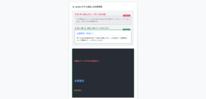
}その他のローディング
ここでは、以下のその他のローディングのデザイン例を記載しています。
- 記事の読み込み
実際のデザインプレビューとHTML&CSSコードを記載しています。
さらに、以下の項目もローディングスピナーページでは選択式でご用意しました。
- 基調色
- 行数
ご興味があれば「ローディングスピナー一覧ページ」を一読ください。
記事の読み込み
HTMLコード表示
<div class="loading-text">
  <p>
    <span>L</span>
    <span>o</span>
    <span>a</span>
    <span>d</span>
    <span>i</span>
    <span>n</span>
    <span>g</span>
    <span>.</span>
    <span>.</span>
    <span>.</span>
  </p>
</div>
CSSコード表示
.loading-post {
  display: flex;
  flex-direction: column;
  gap: 8px;
  position: relative;
  margin-bottom: 2em;
}

.loading-post::before {
  position: absolute;
  width: 34px;
  height: 34px;
  border-radius: 3px;
  background-color: #eeeeee;
  content: '';
}

.loading-post div {
  width: 300px;
  max-width: calc(100% - 43px);
  height: 13px;
  margin-left: 43px;
  border-radius: 3px;
  background-color: #eeeeee;
  background-image: linear-gradient(to right, #eeeeee 5%, #dedede 15%, #eeeeee 30%);
  background-size: 600px 100%;
  animation: anim-loading-post 2s linear infinite;
}

@keyframes anim-loading-post {
  from {
    background-position: -300px 0;
  }
  to {
    background-position: 300px 0;
  }
}