本記事では、カスタマイズ可能でシンプルなラジオボタンデザインのコードをご紹介します。
HTMLとCSSの両方をコピペすればすぐに利用できます。
コピペしたコードをカスタマイズし、自分好みにぜひ変更してみてください。
また、ラジオボタンの部分を作成するにはinputタグを利用します。
inputタグの使い方を詳しく知りたい人は「【HTML】inputタグの使い方:type種類・属性一覧とCSS装飾・JS連携」を一読ください。
目次
おしゃれなフリー素材デザイン集
本サイトでは、ラジオボタン以外にも様々なHTML&CSSによるおしゃれな素材をご用意しています。
以下は、主なデザインカテゴリーです。
おしゃれな素材デザイン集
ぜひTOPページから「デザインギャラリー」を一読頂けますと幸いです。
Code Stock
Code Stock | UIコピペサイト
UIコピペサイト
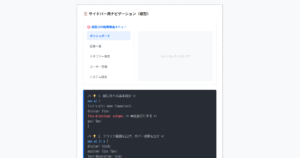
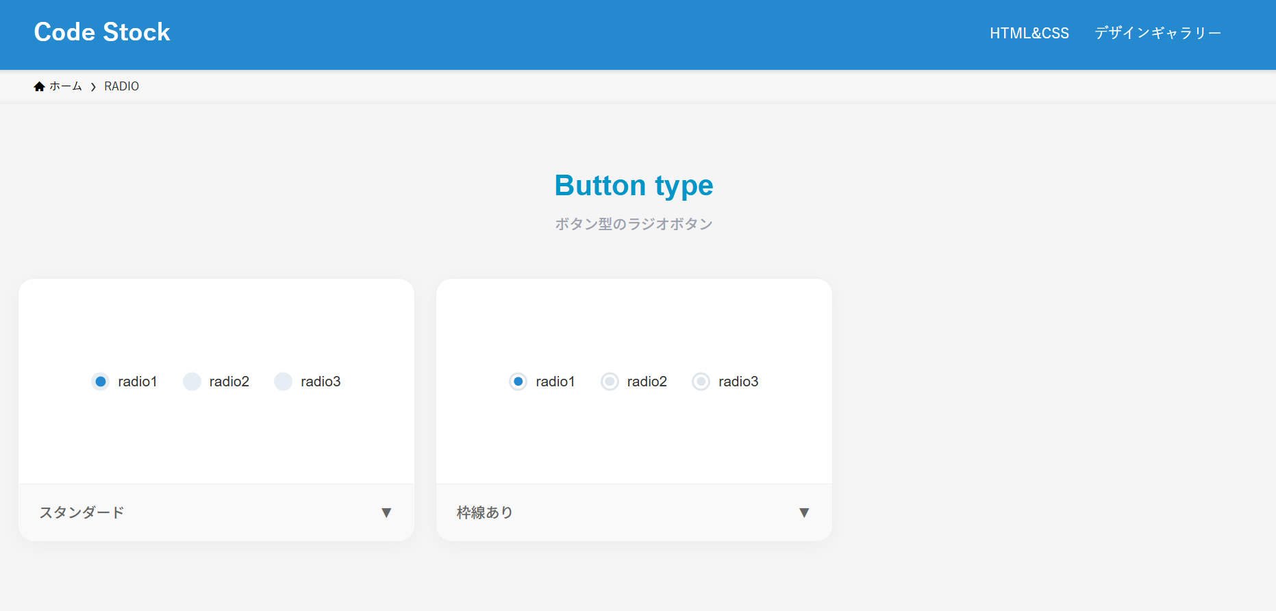
ボタン型のラジオボタン(横並び)
ここでは、以下のボタン型のラジオボタン(横並び)デザイン例を記載しています。
ボタン型のラジオボタン(横並び)デザイン
- スタンダード
- 枠線あり
実際のデザインプレビューとHTML&CSSコードを記載しています。
さらに、以下の項目もラジオボタンページでは選択式でご用意しました。
調整項目一覧
- 基調色
- 並びの向き:横, 縦
- 形状:円, 四角
- チェック時のアニメーション:あり, なし
ご興味があれば「ラジオボタン一覧ページ」を一読ください。
Code Stock
RADIO | Code Stock
うまくコピペできない場合は、記事からもコピペできるよう準備しております。 Button type ボタン型のラジオボタン radio1 radio2 radio3 スタンダード▼ radio1 radio2 rad…
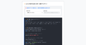
スタンダード
HTMLコード表示
<fieldset class="radio-1">
  <label>
    <input type="radio" name="radio-1" checked/>
    radio1
  </label>
  <label>
    <input type="radio" name="radio-1"/>
    radio2
  </label>
  <label>
    <input type="radio" name="radio-1"/>
    radio3
  </label>
</fieldset>
CSSコード表示
.radio-1 {
  display: flex;
  justify-content: center;
  flex-wrap: wrap;
  gap: .3em 2em;
  border: none;
}

.radio-1 label {
  display: flex;
  align-items: center;
  gap: 0 .5em;
  position: relative;
  cursor: pointer;
}

.radio-1 label::before,
.radio-1 label:has(:checked)::after {
  border-radius: 50%;
  content: '';
}

.radio-1 label::before {
  width: 18px;
  height: 18px;
  background-color: #e6edf3;
}

.radio-1 label:has(:checked)::after {
  position: absolute;
  top: 50%;
  left: 9px;
  transform: translate(-50%, -50%);
  width: 10px;
  height: 10px;
  background-color: #2589d0;
  animation: anim-radio-1 .3s linear;
}

@keyframes anim-radio-1 {
  0% {
    box-shadow: 0 0 0 1px transparent;
  }
  50% {
    box-shadow: 0 0 0 10px #2589d033;
  }
  100% {
    box-shadow: 0 0 0 10px transparent;
  }
}

.radio-1 input {
  display: none;
}
枠線あり
HTMLコード表示
<fieldset class="radio-2">
  <label>
    <input type="radio" name="radio-2" checked/>
    radio1
  </label>
  <label>
    <input type="radio" name="radio-2"/>
    radio2
  </label>
  <label>
    <input type="radio" name="radio-2"/>
    radio3
  </label>
</fieldset>
CSSコード表示
.radio-2 {
display: flex;
justify-content: center;
flex-wrap: wrap;
gap: .3em 2em;
border: none;
}
.radio-2 label {
display: flex;
align-items: center;
gap: 0 .5em;
position: relative;
cursor: pointer;
}
.radio-2 label::before,
.radio-2 label::after {
border-radius: 50%;
content: '';
}
.radio-2 label::before {
width: 18px;
height: 18px;
border: 2px solid #dee5eb;
box-sizing: border-box;
}
.radio-2 label::after {
position: absolute;
top: 50%;
left: 9px;
transform: translate(-50%, -50%);
width: 9px;
height: 9px;
background-color: #dee5eb;
}
.radio-2 label:has(:checked)::after {
background-color: #2589d0;
animation: anim-radio-2 .3s linear;
}
@keyframes anim-radio-2 {
0% {
box-shadow: 0 0 0 1px transparent;
}
50% {
box-shadow: 0 0 0 10px #2589d033;
}
100% {
box-shadow: 0 0 0 10px transparent;
}
}
.radio-2 input {
display: none;
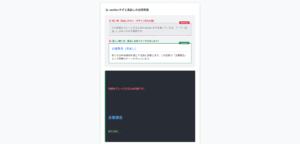
}リスト型のラジオボタン(縦並び)
ここでは、以下のリスト型のラジオボタン(縦並び)デザイン例を記載しています。
リスト型のラジオボタン(縦並び)デザイン
- 枠線&背景色
実際のデザインプレビューとHTML&CSSコードを記載しています。
さらに、以下の項目もラジオボタンページでは選択式でご用意しました。
調整項目一覧
- 基調色
- 並びの向き:横, 縦
- 形状:円, 四角, 角丸
- チェック時のアニメーション:あり, なし
ご興味があれば「ラジオボタン一覧ページ」を一読ください。
Code Stock
RADIO | Code Stock
うまくコピペできない場合は、記事からもコピペできるよう準備しております。 Button type ボタン型のラジオボタン radio1 radio2 radio3 スタンダード▼ radio1 radio2 rad…
枠線&背景色
HTMLコード表示
<fieldset class="radio-3">
  <label>
    <input type="radio" name="radio-3" checked/>
    radio1
  </label>
  <label>
    <input type="radio" name="radio-3"/>
    radio2
  </label>
  <label>
    <input type="radio" name="radio-3"/>
    radio3
  </label>
</fieldset>
CSSコード表示
.radio-3 {
  display: block;
  width: 200px;
  margin: 0 auto 2em;
  border: none;
}

.radio-3 label {
  display: flex;
  align-items: center;
  gap: 0 .5em;
  position: relative;
  max-width: 200px;
  margin-bottom: .4em;
  padding: .5em .7em;
  border: 1px solid #2589d0;
  border-radius: 3px;
  background-color: #2589d026;
  cursor: pointer;
}

.radio-3 label:has(:checked) {
  background-color: #2589d0;
  color: #fff;
}

.radio-3 label::before,
.radio-3 label:has(:checked)::after {
  border-radius: 50%;
  content: '';
}

.radio-3 label::before {
  width: 14px;
  height: 14px;
  background-color: #fff;
}

.radio-3 label:has(:checked)::after {
  position: absolute;
  top: 50%;
  left: calc(7px + .7em);
  transform: translate(-50%, -50%);
  width: 7px;
  height: 7px;
  background-color: #2589d0;
}

.radio-3 input {
  display: none;
}