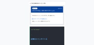
本記事では、カスタマイズ可能なセレクトボックスデザインのコードをご紹介します。
HTMLとCSSの両方をコピペすればすぐに利用できます。
コピペしたコードをカスタマイズし、自分好みにぜひ変更してみてください。
また、セレクトボックス作成にはHTMLのselectタグを利用します。
selectタグの使い方を詳しく知りたい人は「【HTML】プルダウン・セレクトボックス・ドロップダウンの作り方:コンボボックスとの違い」を一読ください。
目次
おしゃれなフリー素材デザイン集
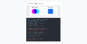
本サイトでは、セレクトボックス以外にも様々なHTML&CSSによるおしゃれな素材をご用意しています。
以下は、主なデザインカテゴリーです。
おしゃれな素材デザイン集
ぜひTOPページから「デザインギャラリー」を一読頂けますと幸いです。
Code Stock
Code Stock | UIコピペサイト
UIコピペサイト
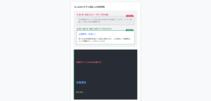
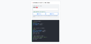
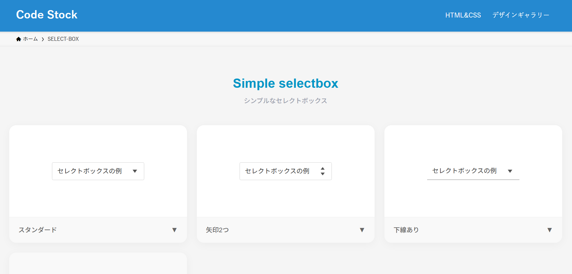
シンプルなセレクトボックス
ここでは、以下のシンプルなセレクトボックスデザイン例を記載しています。
シンプルなセレクトボックスデザイン
- スタンダード
- 矢印2つ
- 下線あり
- 白背景&シャドウ
実際のデザインプレビューとHTML&CSSコードを記載しています。
さらに、以下の項目もセレクトボックスページでは選択式でご用意しました。
調整項目一覧
- 枠線の色
- 文字色
- 形状:四角, 角丸
ご興味があれば「セレクトボックス一覧ページ」を一読ください。
Code Stock
SELECT-BOX | Code Stock
うまくコピペできない場合は、記事からもコピペできるよう準備しております。 Simple selectbox シンプルなセレクトボックス セレクトボックスの例 スタンダード▼ セレクト…
スタンダード
HTMLコード表示
<label class="selectbox-1">
  <select>
    <option>optionの例1</option>
    <option>optionの例2</option>
    <option>optionの例3</option>
  </select>
</label>
CSSコード表示
.selectbox-1 {
  display: inline-flex;
  align-items: center;
  position: relative;
}

.selectbox-1::after {
  position: absolute;
  right: 15px;
  width: 10px;
  height: 7px;
  background-color: #333333;
  clip-path: polygon(0 0, 100% 0, 50% 100%);
  content: '';
  pointer-events: none;
}

.selectbox-1 select {
  appearance: none;
  -webkit-appearance: none;
  min-width: 230px;
  height: 2.8em;
  padding: .4em calc(.8em + 30px) .4em .8em;
  border: 1px solid #d0d0d0;
  border-radius: 3px;
  background-color: #fff;
  color: #333333;
  font-size: 1em;
  cursor: pointer;
}

.selectbox-1 select:focus {
  outline: none;
}
矢印2つ
HTMLコード表示
<label class="selectbox-2">
  <select>
    <option>optionの例1</option>
    <option>optionの例2</option>
    <option>optionの例3</option>
  </select>
</label>
CSSコード表示
.selectbox-2 {
  display: inline-flex;
  align-items: center;
  position: relative;
}

.selectbox-2::before,
.selectbox-2::after {
  position: absolute;
  right: 15px;
  width: 9px;
  height: 6px;
  background-color: #333333;
  content: '';
  pointer-events: none;
}

.selectbox-2::before {
  top: calc(50% - 9px);
  clip-path: polygon(50% 0, 100% 100%, 0 100%);
}

.selectbox-2::after {
  bottom: calc(50% - 9px);
  clip-path: polygon(0 0, 50% 100%, 100% 0);
}

.selectbox-2 select {
  appearance: none;
  -webkit-appearance: none;
  min-width: 230px;
  height: 2.8em;
  padding: .4em calc(.8em + 30px) .4em .8em;
  border: 1px solid #d0d0d0;
  border-radius: 3px;
  background-color: #fff;
  color: #333333;
  font-size: 1em;
  cursor: pointer;
}

.selectbox-2 select:focus {
  outline: none;
}
下線あり
HTMLコード表示
<label class="selectbox-3">
  <select>
    <option>optionの例1</option>
    <option>optionの例2</option>
    <option>optionの例3</option>
  </select>
</label>
CSSコード表示
.selectbox-3 {
  display: inline-flex;
  align-items: center;
  position: relative;
}

.selectbox-3::after {
  position: absolute;
  right: 15px;
  width: 10px;
  height: 7px;
  background-color: #333333;
  clip-path: polygon(0 0, 100% 0, 50% 100%);
  content: '';
  pointer-events: none;
}

.selectbox-3 select {
  appearance: none;
  -webkit-appearance: none;
  min-width: 230px;
  height: 2.8em;
  padding: .4em calc(.8em + 30px) .4em .8em;
  border: none;
  border-bottom: 2px solid #d0d0d0;
  background-color: #fff;
  color: #333333;
  font-size: 1em;
  cursor: pointer;
}

.selectbox-3 select:focus {
  outline: none;
}
白背景&シャドウ
HTMLコード表示
<label class="selectbox-4">
  <select>
    <option>optionの例1</option>
    <option>optionの例2</option>
    <option>optionの例3</option>
  </select>
</label>
CSSコード表示
.selectbox-4 {
display: inline-flex;
align-items: center;
position: relative;
}
.selectbox-4::after {
position: absolute;
right: 15px;
width: 10px;
height: 7px;
background-color: #333333;
clip-path: polygon(0 0, 100% 0, 50% 100%);
content: '';
pointer-events: none;
}
.selectbox-4 select {
appearance: none;
-webkit-appearance: none;
min-width: 230px;
height: 2.8em;
padding: .4em calc(.8em + 30px) .4em .8em;
border: none;
border-radius: 3px;
box-shadow: 0 4px 4px rgb(0 0 0 / 10%), 0 2px 3px -2px rgba(0 0 0 / 15%);
background-color: #fff;
color: #333333;
font-size: 1em;
cursor: pointer;
}
.selectbox-4 select:focus {
outline: none;
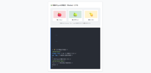
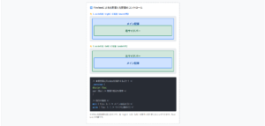
}カラフルなセレクトボックス
ここでは、以下のカラフルなセレクトボックスデザイン例を記載しています。
カラフルなセレクトボックスデザイン
- フラットデザイン
- 枠線あり
実際のデザインプレビューとHTML&CSSコードを記載しています。
さらに、以下の項目もセレクトボックスページでは選択式でご用意しました。
調整項目一覧
- 矢印の背景色
- 枠線の色
- 文字色
- 形状:四角, 角丸
ご興味があれば「セレクトボックス一覧ページ」を一読ください。
Code Stock
SELECT-BOX | Code Stock
うまくコピペできない場合は、記事からもコピペできるよう準備しております。 Simple selectbox シンプルなセレクトボックス セレクトボックスの例 スタンダード▼ セレクト…
フラットデザイン
HTMLコード表示
<label class="selectbox-5">
  <select>
    <option>optionの例1</option>
    <option>optionの例2</option>
    <option>optionの例3</option>
  </select>
</label>
CSSコード表示
.selectbox-5 {
  position: relative;
  display: block;
  width: fit-content;
  margin: 0 auto 32px;
}

.selectbox-5::before,
.selectbox-5::after {
  position: absolute;
  content: '';
  pointer-events: none;
}

.selectbox-5::before {
  display: inline-block;
  right: 0;
  width: 2.8em;
  height: 100%;
  border-radius: 0 3px 3px 0;
  background-color: #2589d0;
}

.selectbox-5::after {
  top: 50%;
  right: 1.4em;
  transform: translate(50%, -50%) rotate(45deg);
  width: 6px;
  height: 6px;
  border-bottom: 3px solid #fff;
  border-right: 3px solid #fff;
}

.selectbox-5 select {
  appearance: none;
  -webkit-appearance: none;
  min-width: 230px;
  height: 2.8em;
  padding: .4em 3.6em .4em .8em;
  border: none;
  border-radius: 3px;
  background-color: #f2f2f2;
  color: #333333;
  font-size: 1em;
  cursor: pointer;
  box-sizing: border-box;
}

.selectbox-5 select:focus {
  outline: 2px solid #2589d0;
}
枠線あり
HTMLコード表示
<label class="selectbox-6">
  <select>
    <option>optionの例1</option>
    <option>optionの例2</option>
    <option>optionの例3</option>
  </select>
</label>
CSSコード表示
.selectbox-6 {
  position: relative;
  display: block;
  width: fit-content;
  margin: 0 auto 32px;
}

.selectbox-6::before,
.selectbox-6::after {
  position: absolute;
  content: '';
  pointer-events: none;
}

.selectbox-6::before {
  display: inline-block;
  right: 0;
  width: 2.8em;
  height: 100%;
  border-radius: 0 3px 3px 0;
  background-color: #2589d0;
}

.selectbox-6::after {
  top: 50%;
  right: 1.4em;
  transform: translate(50%, -50%) rotate(45deg);
  width: 6px;
  height: 6px;
  border-bottom: 3px solid #fff;
  border-right: 3px solid #fff;
}

.selectbox-6 select {
  appearance: none;
  -webkit-appearance: none;
  min-width: 230px;
  height: 2.8em;
  padding: .4em 3.6em .4em .8em;
  border: 2px solid #2589d0;
  border-radius: 3px;
  background-color: #fff;
  color: #333333;
  font-size: 1em;
  cursor: pointer;
  box-sizing: border-box;
}

.selectbox-6 select:focus {
  outline: 1px solid #2589d0;
}